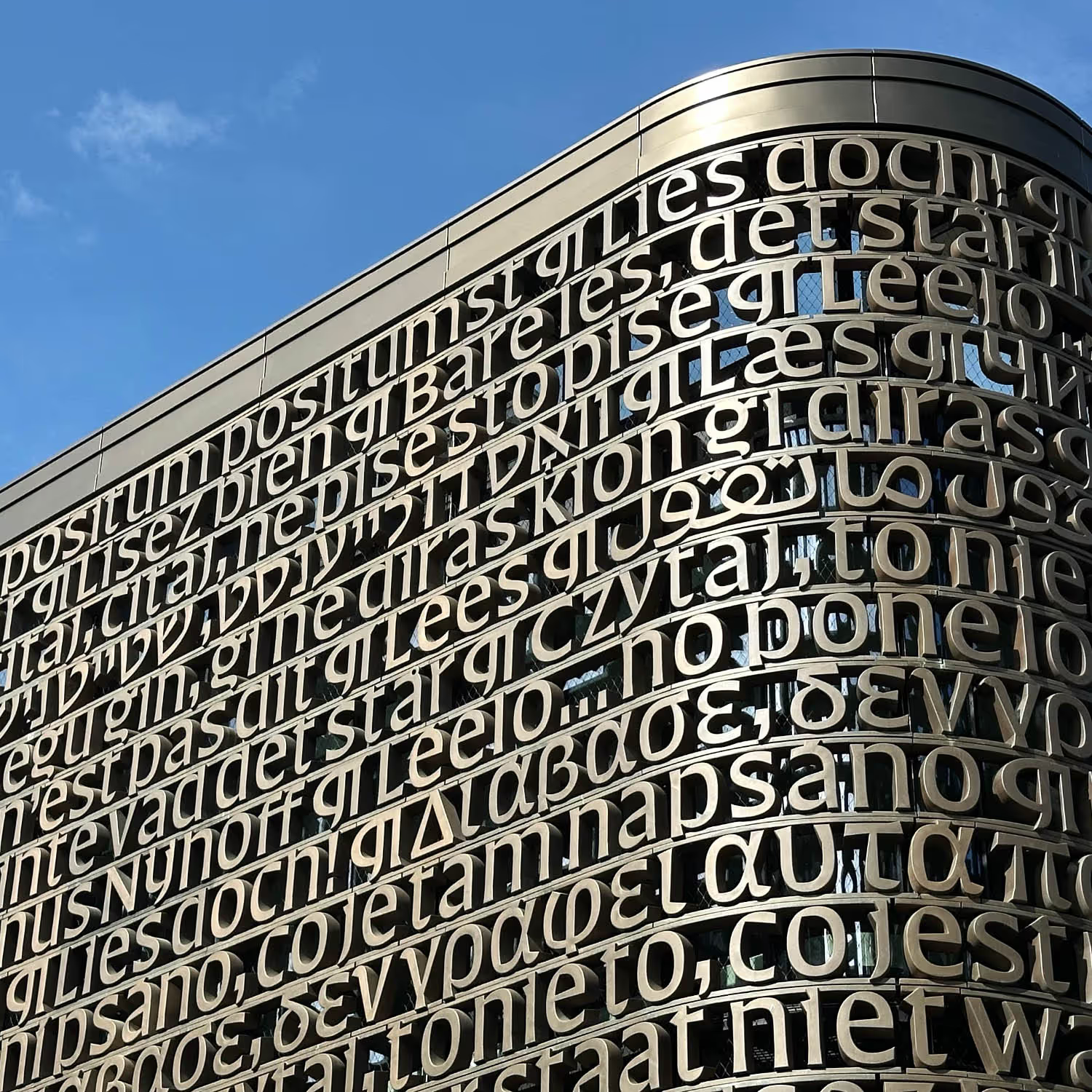
UvA Library at dawn
Photo: Jannes Linders
Lettering for the UvA University Library
23 languages, 6 writing systems: over a kilometer of lettering
The University of Amsterdam, UvA, has a new library designed by MVSA architects. The building, on the corner of the Binnengasthuisstraat and the Doelenstraat needed a screen, a sort of transparent veil, to protect the privacy of local residents as well as the library users. The architect’s design for the bronze-coated screen was part of the permit application submitted to the municipality of Amsterdam.
After explorations of different textures and abstract shapes, the university selected a line by the Dutch writer Martinus Nijhoff: “Lees maar, er staat niet wat er staat,” which the English department of the UvA translated to: “But do read, it doesn’t say what it says”. An interesting choice as it invites readers to be curious and not accept texts at face value. Each language department of the university made their own translations of the line and the final design includes 23 languages in six different writing systems.
The UvA asked for a proposal for the typography of the text and a design for the type. As the languages included Greek, Hebrew, Cyrillic and Arabic, a number of type designers (and TypeMedia graduates) became involved: Aleksandra Samuļenkova, Anya Danilova, Bahman Eslami and Daniel Grumer.
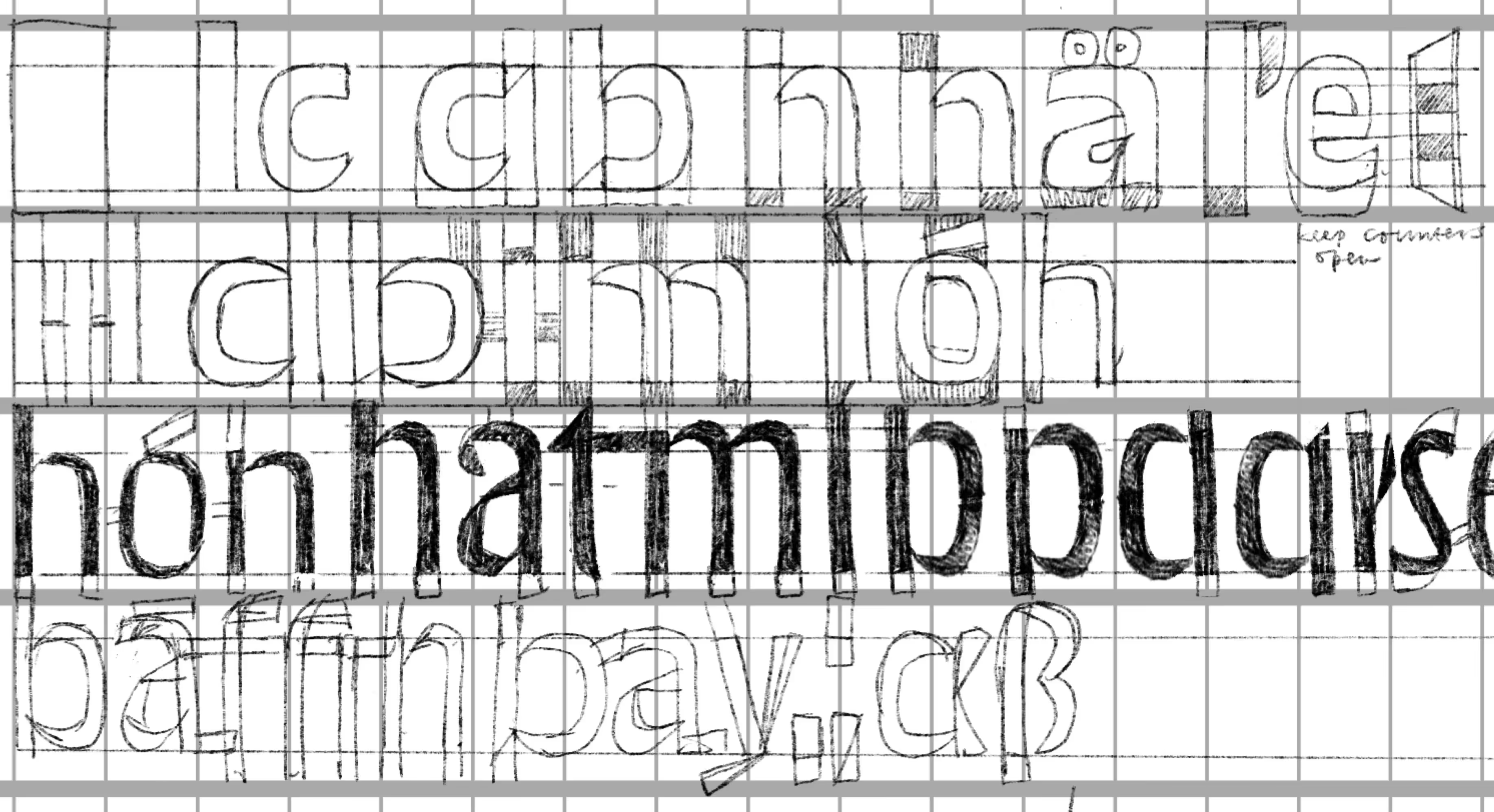
Proportions
The facade screen consists of horizontal beams fixed to the front of the building, between which the letterforms are mounted. The text could not be all-caps and this posed an interesting problem in terms of proportions. By making the descenders and ascenders very short there was just enough room for the lowercase and uppercase for the latin, and then also for some diacritics and the other writing systems.
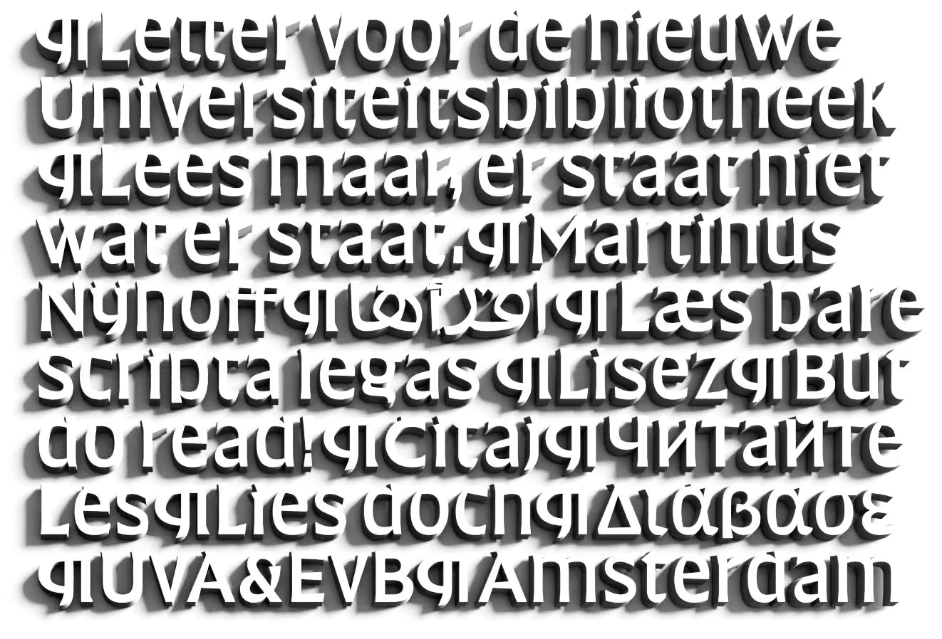
Solid letters rendered only using their shadows.
Writing systems: Some of the writing systems and languages next to each other. The translations vary considerably in length. For the right to left languages the glyph order was reversed. The words “Universiteits bibliotheek” do not actually appear on the building.
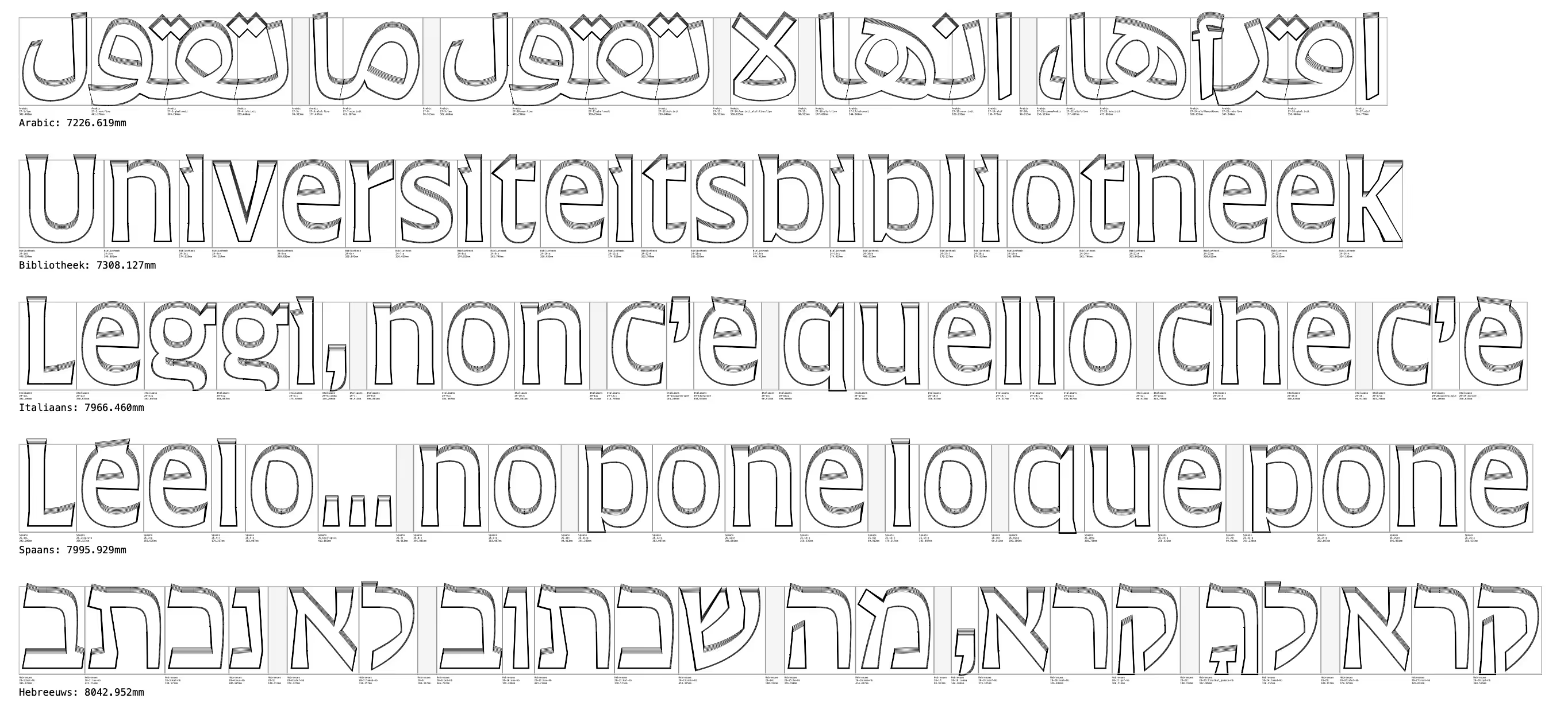
Type
I drew the typeface with a touch of the broad-nib contrast, with very sharp junctions and terminals. Early designs had a weight axis so that the architects could make an informed decision about the density of the letterforms. The very short ascenders and descenders also increased privacy. Being incorporated into a building had another interesting requirement for the design: the tops of the letters had to have a 15° incline to ensure a good water run-off.
The Arabic design was by Bahman Eslami. It was a challenge to fit the shapes in the available vertical space, but he found a good solution. Daniel Grumer signed up for the Hebrew design that is also be used for the Yiddish translation. Together with the UvA we decided to leave most of the diacritical marks. Having three right-to-left languages in the layout proved another interesting challenge: these could not be hyphenated, so the layout had embed them, to keep them away from the edge.
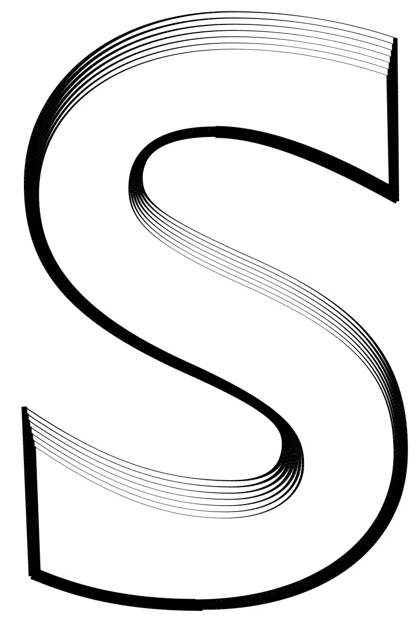
Not a regular extrusion. The transformation from the side facing the street to the side facing the library. It also makes the background a bit larger.
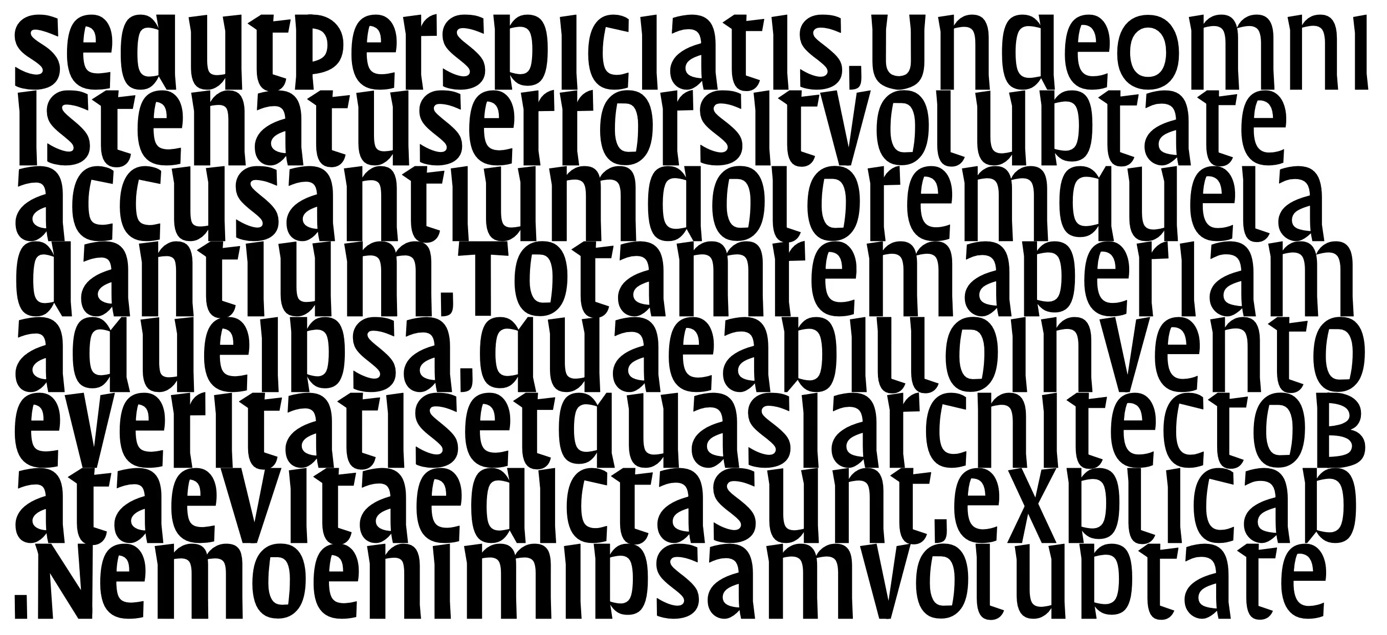
Gradient. With the proportions of the lowercase in place, it was time to examine the options for the weight. This proposed a gradual change that could be used to make some parts of the screen more opaque.
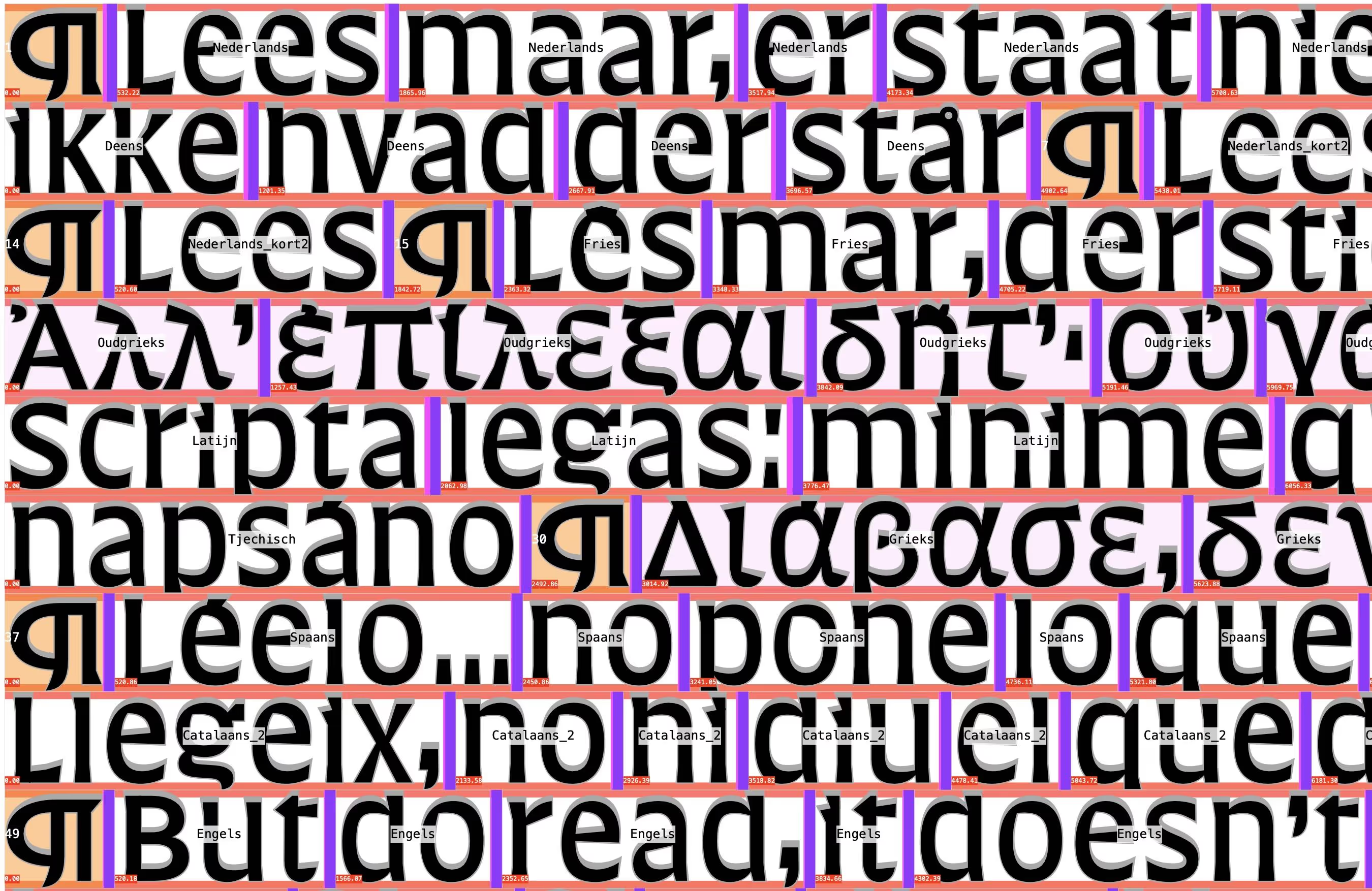
Detail of a proof with the order of the languages and scripts. The justification was calculated (in pink). The construction rules are orange. In old texts the pilcrow ¶ symbol was used to indicate a new chapter. On the building it marks the start of a new language. It is also a fitting typographic flourish.
Design
Python (another language from Amsterdam!), was used to calculate the lines, handle the justification and make the proofing. The order of the languages was determined by eye, looking for a nice fit. Otherwise the vectors flowed straight from RoboFont to PDF and STL. Drawbot was instrumental in proofing and building the layouts. The final data was exported as PDF and the 3D data for the printing was created by MVSA and NedCam.
Test letters at full size
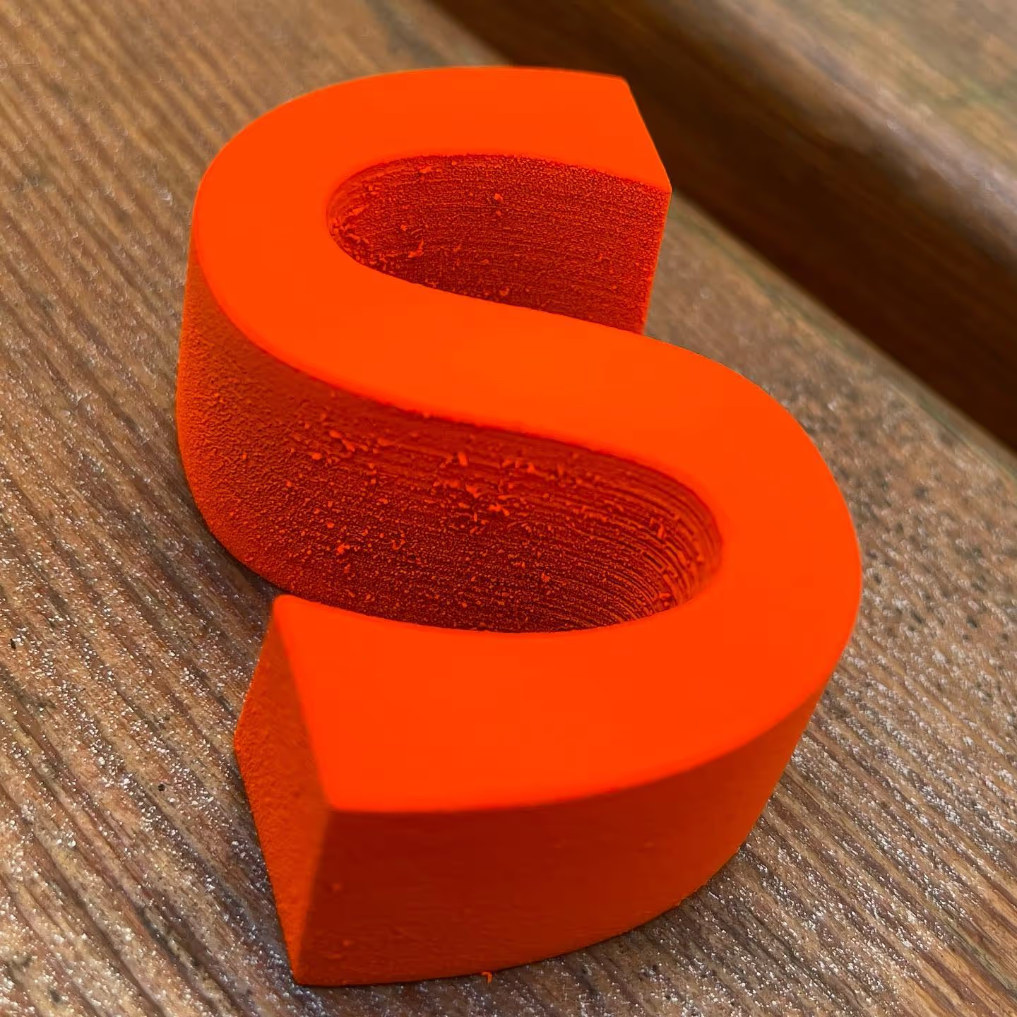
A limited number of letters were produced at full size to present to Amsterdam municipality officials in September 2021. The letters were mounted to a small demonstration section of the steel construction and hoisted by a crane to the correct height in order to assess the letters at their proper perspective. It was great to see the sharp terminals catching the light, everyone approved.
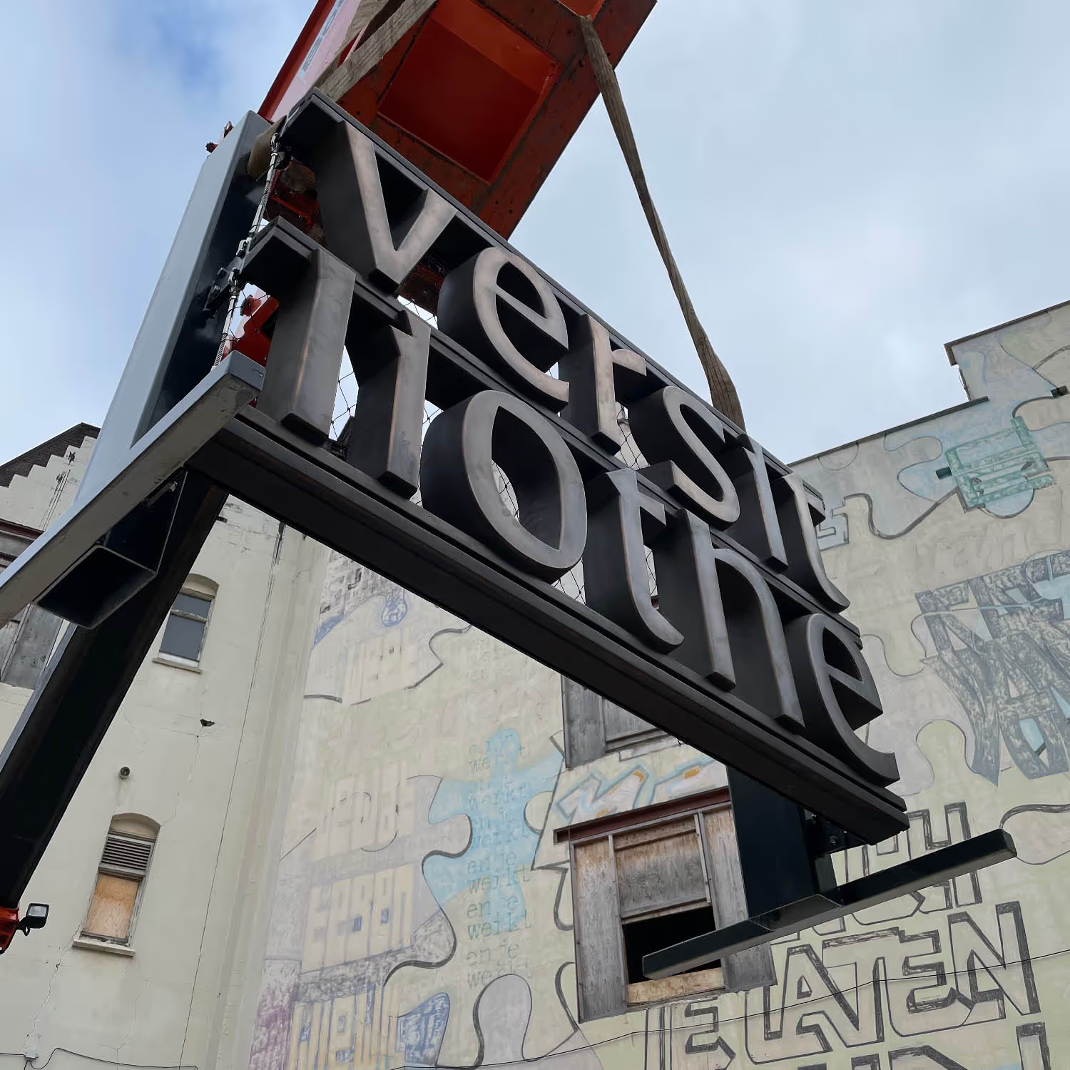
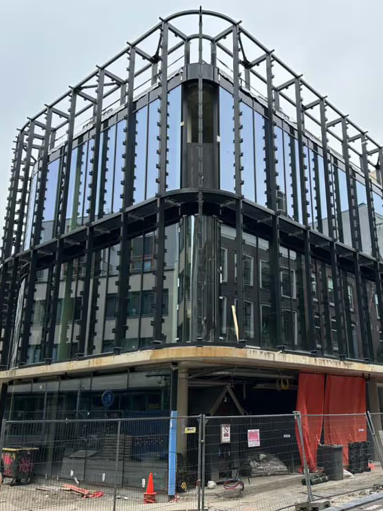
Construction The building with the support framework, August 2024.
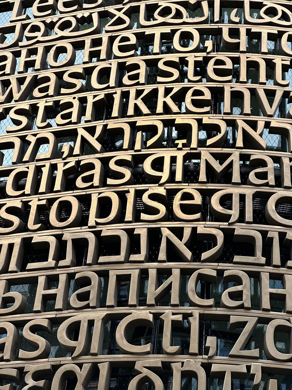
Reflection. Fresh from the factory, the lettering still had a bronze glow. November 2024.
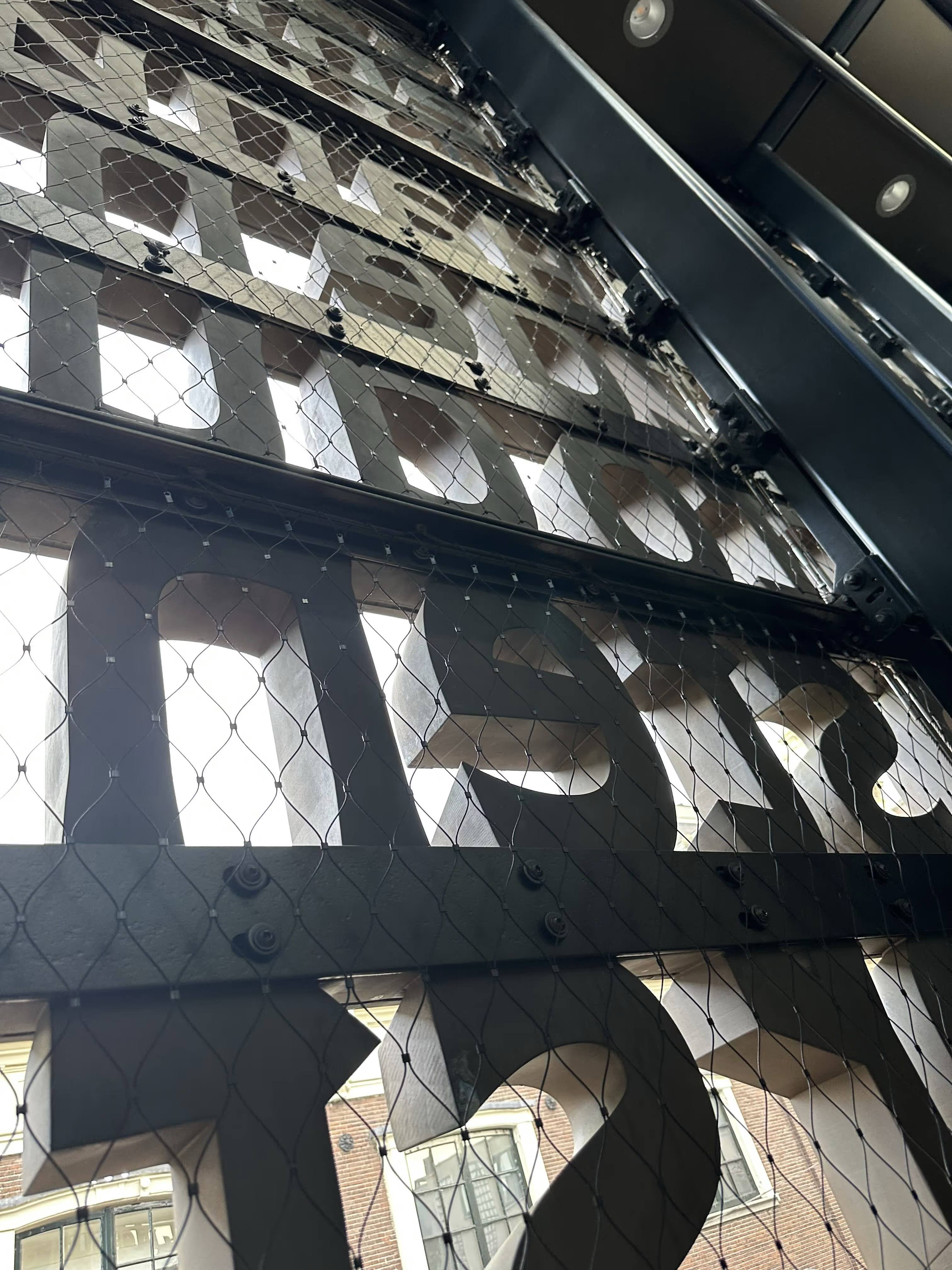
Inside view between the lettering and the building. At this angle the terminals are super sharp. September 2025.
Project Credits
Lettering Team
The typeface, and the layout of the lines were designed by Erik. Based on the Latin Aleksandra Samuļenkova drew the Modern and Classic Greeks, with help from Irene Vlachou. Anya Danilova drew the Cyrillic. Bahman Eslami was responsible for the Arabic. The Hebrew and Yiddish were drawn by Daniel Grumer. The Cuneiform for the Hittite was drawn by Erik, with Prof. dr. J.J.M. Hazenbos. Lars van Blokland made the Blender visualisations.
Universiteit van Amsterdam
Simone van den Brink Huisvestingsontwikkeling, Alex ter Haar Projectmanager, Mathieu Lommen conservator Allard Pierson and Irene Zwiep Amsterdam Institute of Humanities Research.
Architects and engineers
Harry van den Berg and Ana Carmen Gutiérrez Narvarte were the MVSA architects for this project. More details about their work, including the other buildings at the MVSA website.
Nedcam in Heerenveen was responsible for the production of the letters, together with BINX Smartility, MVSA Architects, Fiberneering, JC Straaltechniek BV and VeroMetal. Nedcam made a nice video about the building.
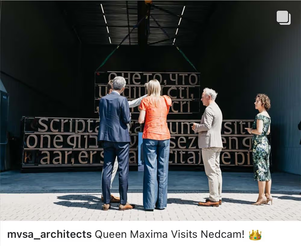
July 2024. Queen Maxima visits Nedcam and has a look at the printed letters. Source: Instagram post by MVSA, @mvsa_architects
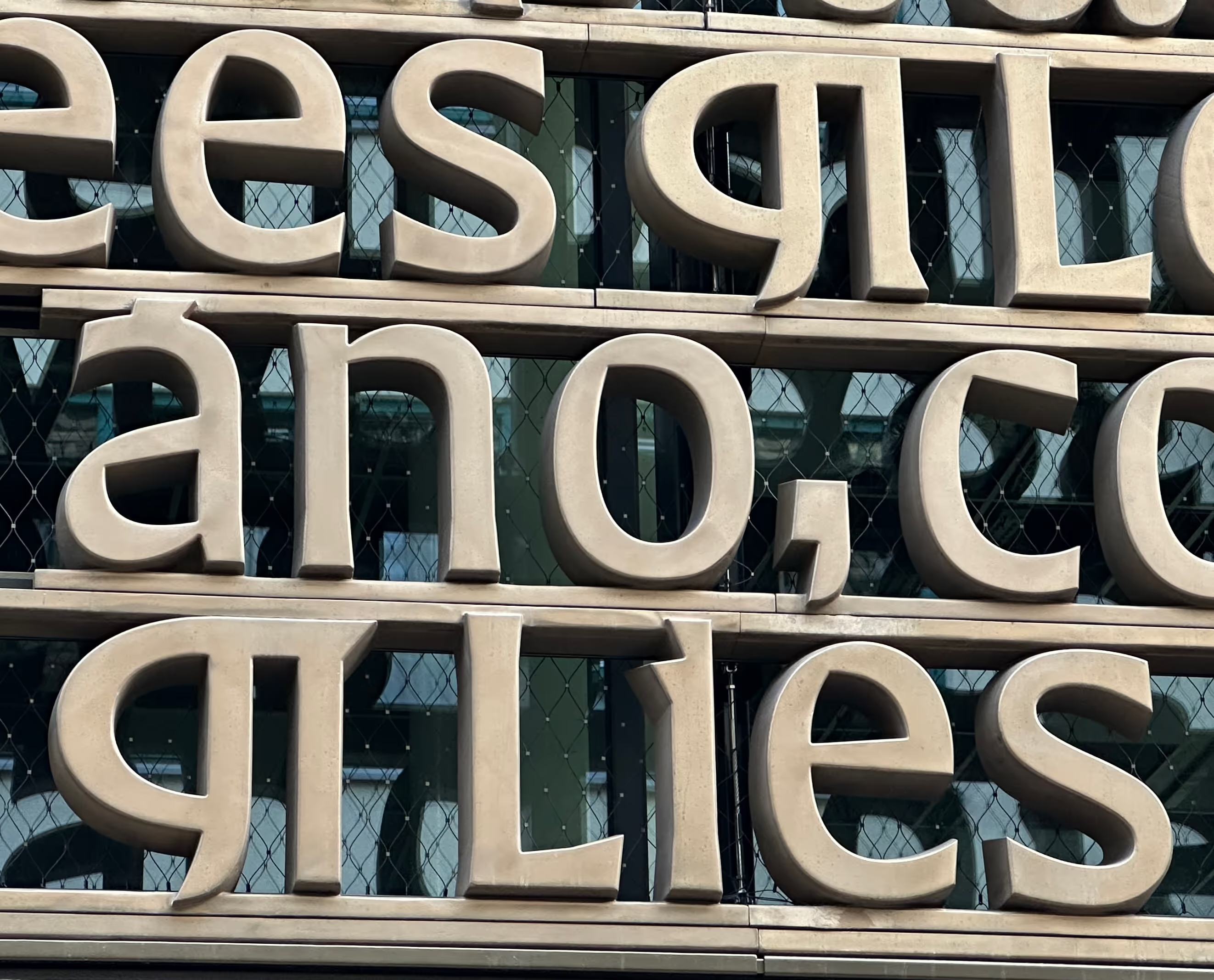
For the careful observer: there is a puzzle to solve with the Pilcrow symbols.