Dirty typewriters:
a guide to all NCND® versions
Over the years this typewriter typeface has been sold in different versions and under different names. This guide will help you identify them in case you need to match or replace a specific one. The versions shown here can all be licensed from LettError Type. Zoom in on the images to see the detail.
While there are differences in detail and texture, the overall weight, widths and construction is the same for all these fonts. All these classic editions come in Light and Heavy weights. The NCND® Variable has all the weights.
The NCND® Classic titles are available as CFF PostScript OpenType fonts. All horizontal and vertical metrics match the previous editions.
All LTR NCND® editions support Latin, Greek and Cyrillic.
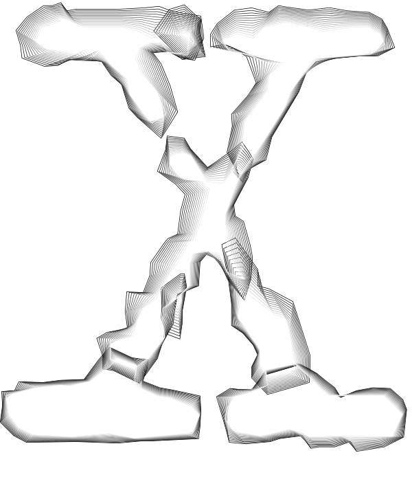
Uppercase X from LTR NCND® Variable. Also happens to resemble the logo for the X-files, a cult TV series of the 1990s. How did that happen? The X-files used this font.
1 Variable
Release: Available since 2023. This is the newest edition of LTR NCND®.
Look out for: Small file size and yet magically variable and animatable. Engineered for the web.
Detail level:
Convincing in motion design and small sizes. We recommend NCND® Variable for all use on the web and any new
design projects.
Weight: variable! A bigger range: thinner and blacker than the
Classic and Rough.
Characterset: Extended Latin, Greek, Cyrillic.
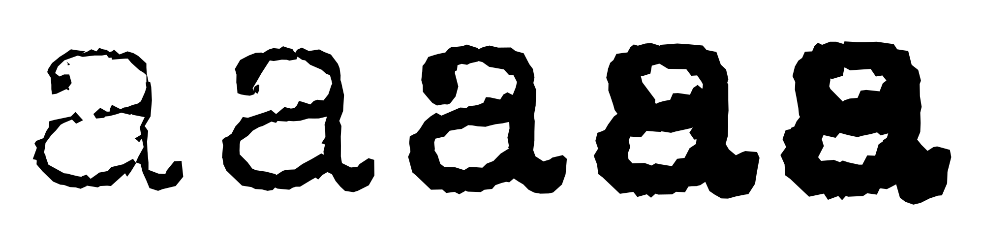
A variable font interpolating rough typewriter letters? Why not.

2 Classic
Releases between 1991, 2008, 2023.
Look out for: The letters in the Light weight have broken up into smaller bits. Dirt and smudges. Characterset support Latin, Greek and Cyrillic.
Detail level: Classic has a convincing texture at small to medium sizes.
Weights: Light and Heavy, no automatic switching or variation between the weights.
Characterset: Extended Latin, Greek, Cyrillic.
Older editions: The versions sold prior to 2008 were Type1 PostScript fonts and support for those stopped a while ago. You should definitely update!

3 Rough
Release: 2008, 2023
Look out for: a distinct appearance from the Classic series. These shapes have a much more detailed, almost lichen-like texture. Debris. Files are still smaller than HD Pro, but still considerable.
Detail level: Rough looks convincing at small to very large sizes.
Weights: Light and Heavy, no automatic switching or variation between the weights.
Characterset: Extended Latin, Greek, Cyrillic.

4 HD
Release: 2008, 2023
Look out for: Extremely detailed shapes rendered in an unique stipple style. These fonts also have multiple weight variants for each letter, and sophisticated OpenType features that create very realistic textures. A bit over the top, as all this detail adds up to massive font files. These fonts are absolutely unsuitable for use on the web. In fact, they are so big we can not sell them through this store!
Format: Available only in CFF OTF.
Detail level: Very convincing ribbon texture
Weights: Various degrees between Light and Heavy.
Characterset: Extended Latin, Greek, Cyrillic.
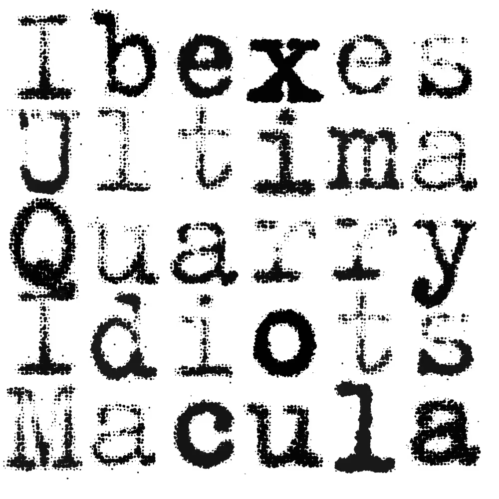
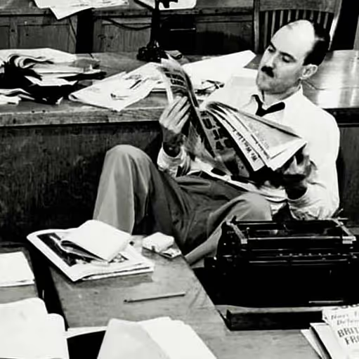
Study these specimens and you will find the right typewriter! For instance: Fred is about to find his typewriter right on his desk. If only Fred could stop doomscrolling. Image Library of Congress.
Immediate atmosphere LTR NCND® has been the go-to typewriter for all sorts of stories.
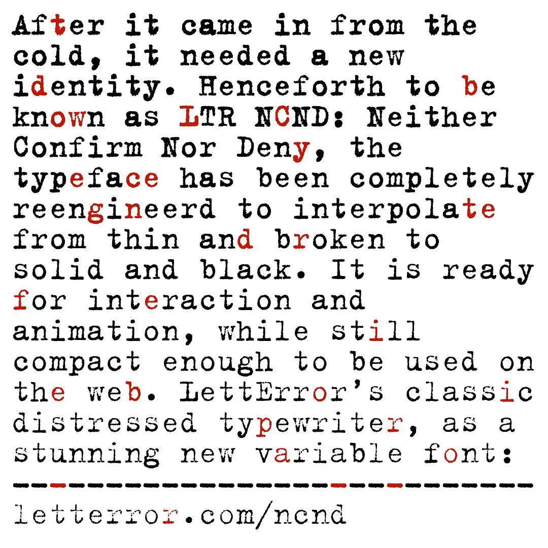
Subtle gradient with LTR NCND Variable, made with one of the InDesign scripts!
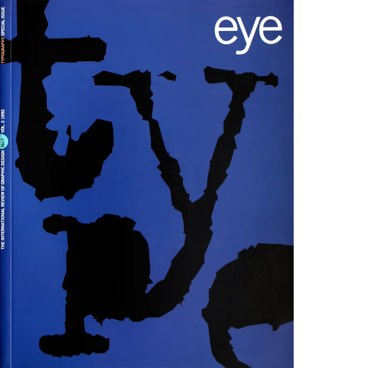
Eye, №.7 Vol. 2, 1992. Cover design by Stephen Coates. Source: FontsInUse.com
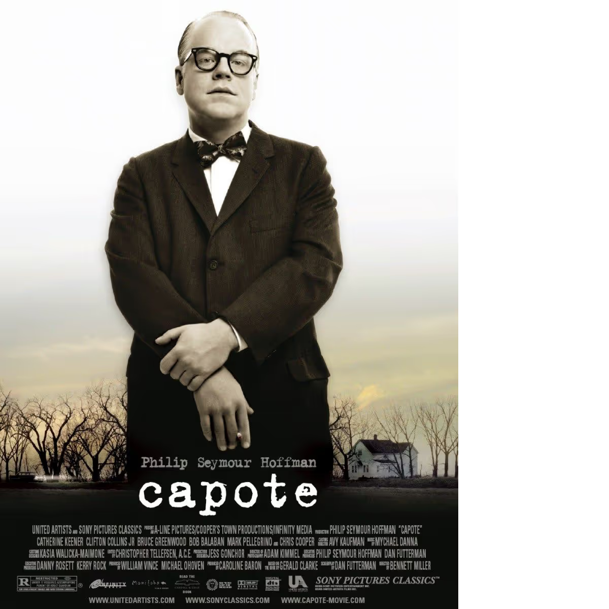
Titling typewriter: titles Capote movie, United Artists, 2005 Source: FontsInUse.com.
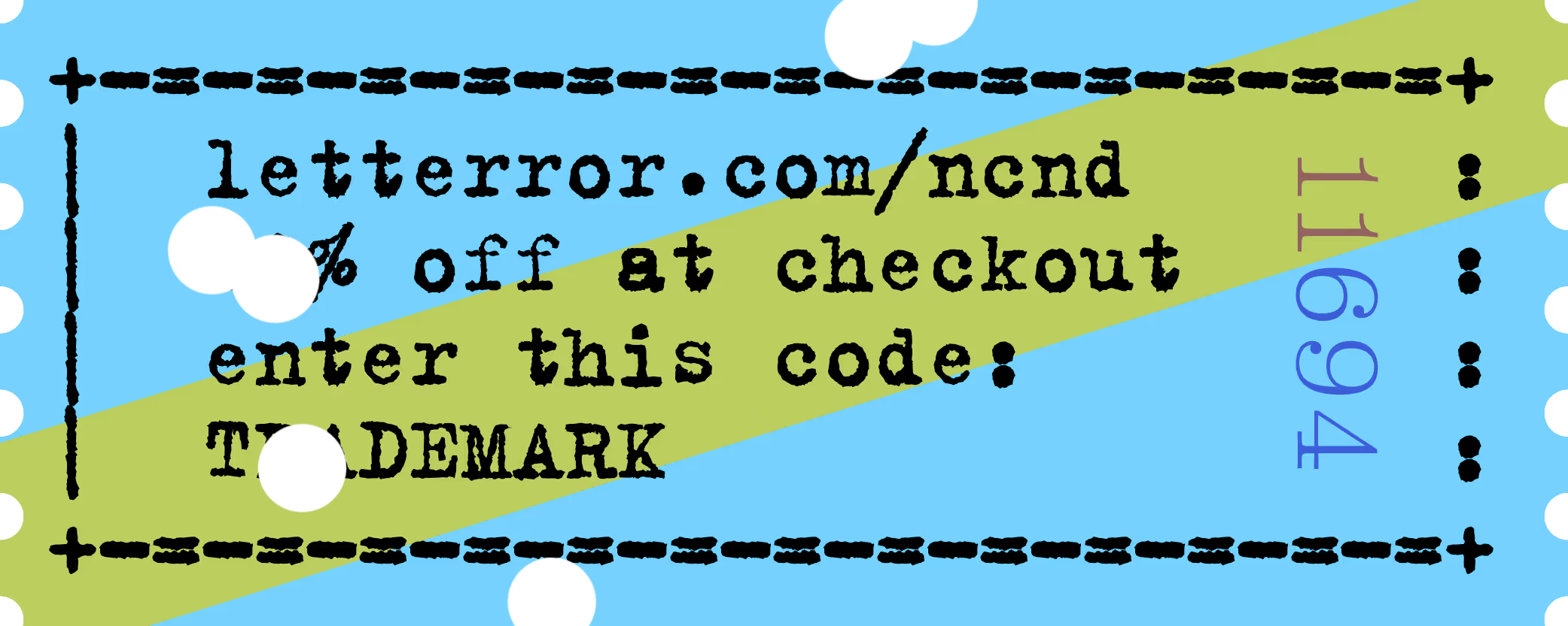
Did you ever buy a version of one of the LettError typewriters a long time ago, at FontShop® or Monotype®? Do you need an update? Show us a copy of the original invoice and you’ll qualify for a discount!