Gold Standard
of money fonts:
LTR Federal
The sources for LTR Federal are well known: the steel engraved plates for the American dollar bills as described by Edward M. Weeks in “Letters Analyzed and Spaced”, (Exposition Press, 1952). Wide letterforms, high contrast, massive serifs.
Over the years, the LTR Federal collection has grown some alternatives, this page shows them all. All LTR Federal styles can be used next to each other.
Useful for movie props, stage money , tattoos, hiphop graphics, magazine and book covers, lottery tickets and all kinds of junk mail. At one point there was a badge for a private investigator, spliff paraphernalia, and even the occasional piece of pop-art? I’m not making this up.
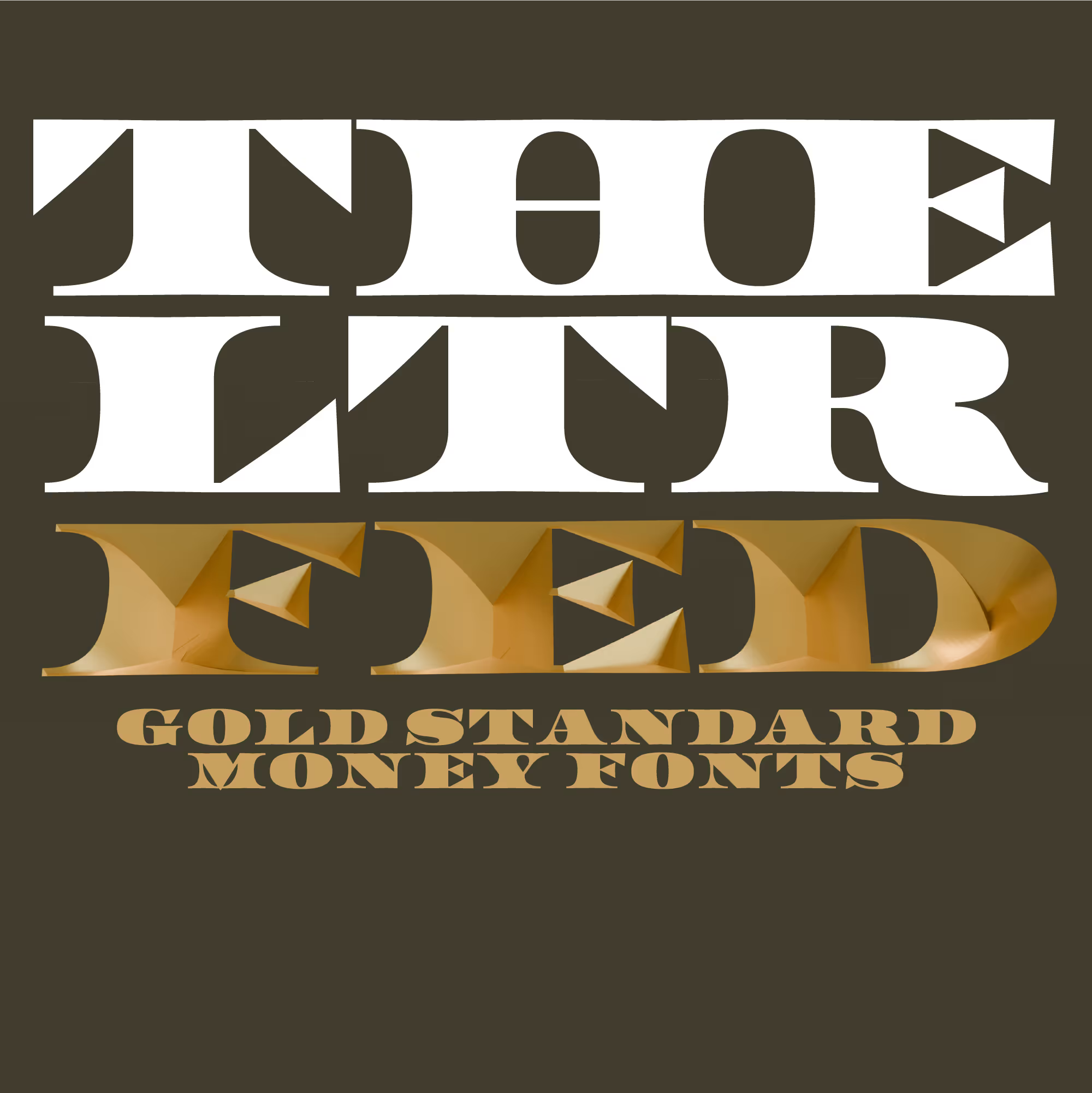
LTR Federal The basic style that can be used on its own, or as one of the layers on the LTR Federal Opticals.
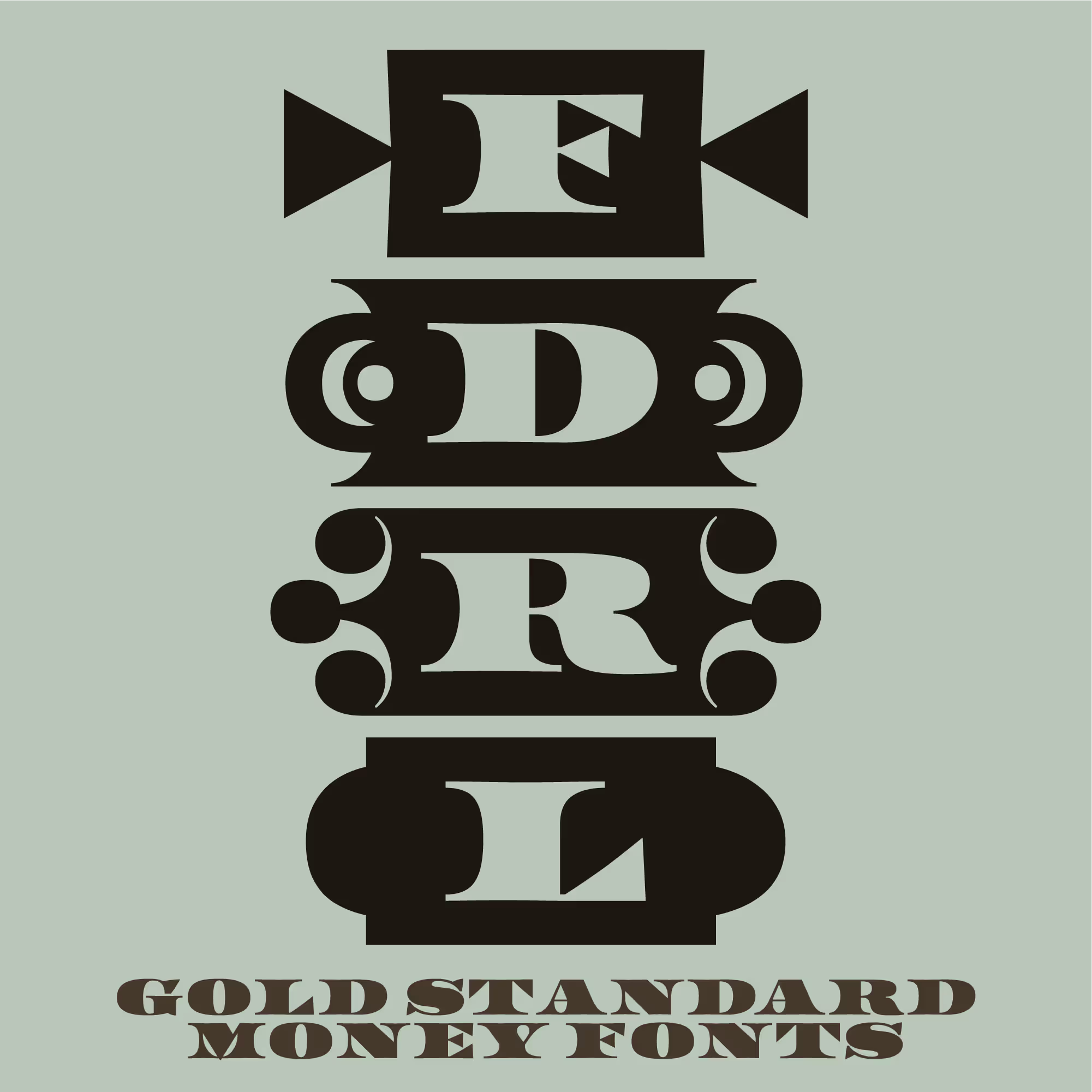
LTR Federal Reserve Boxed in, with different styles for the end pieces that can be changed through OpenType features.
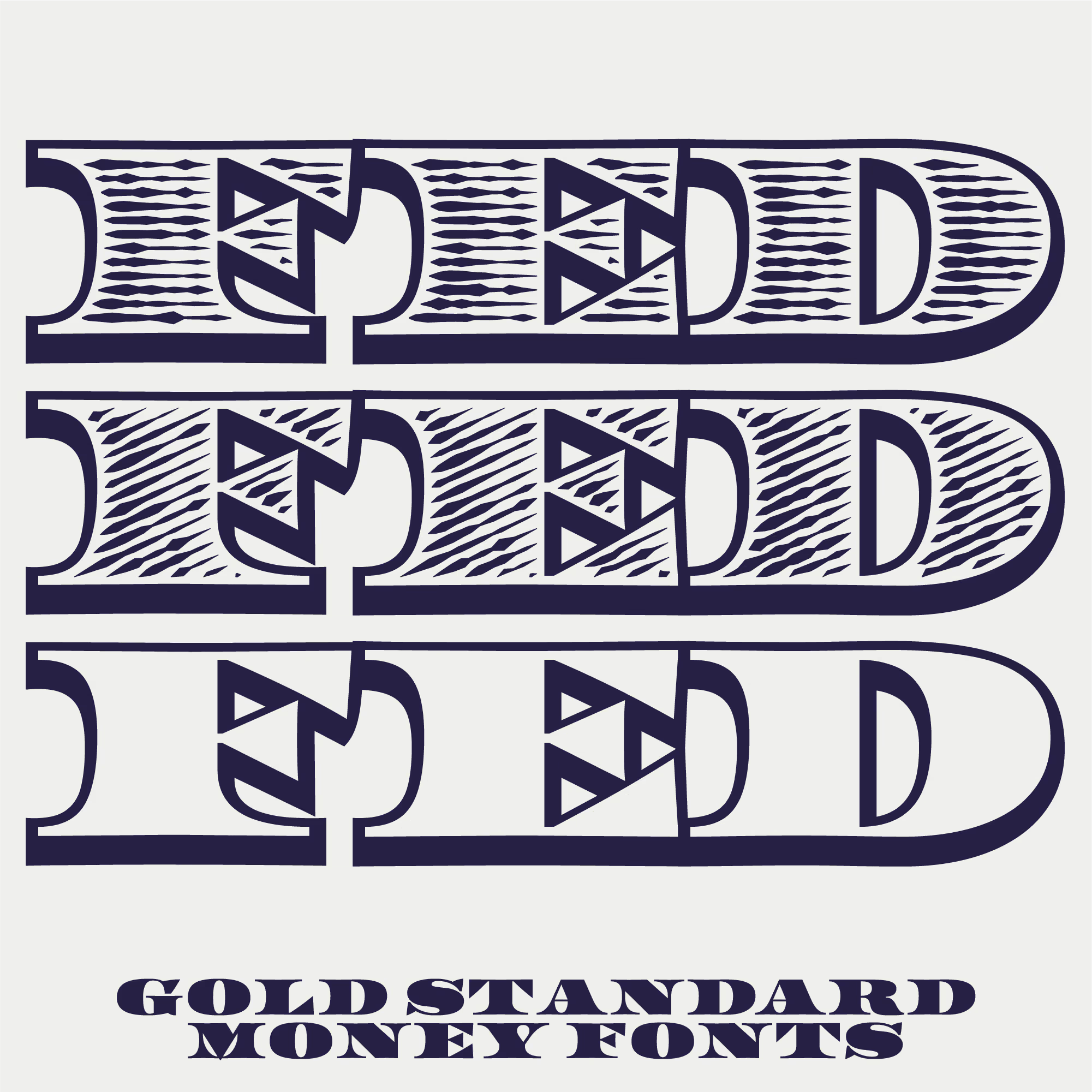
LTR Federal Bureau Outlined and bevelled, with no shade, horizontal shade and diagonal shade. Bureau is similar to the LTR Federal Opticals, but they do not require any layering.
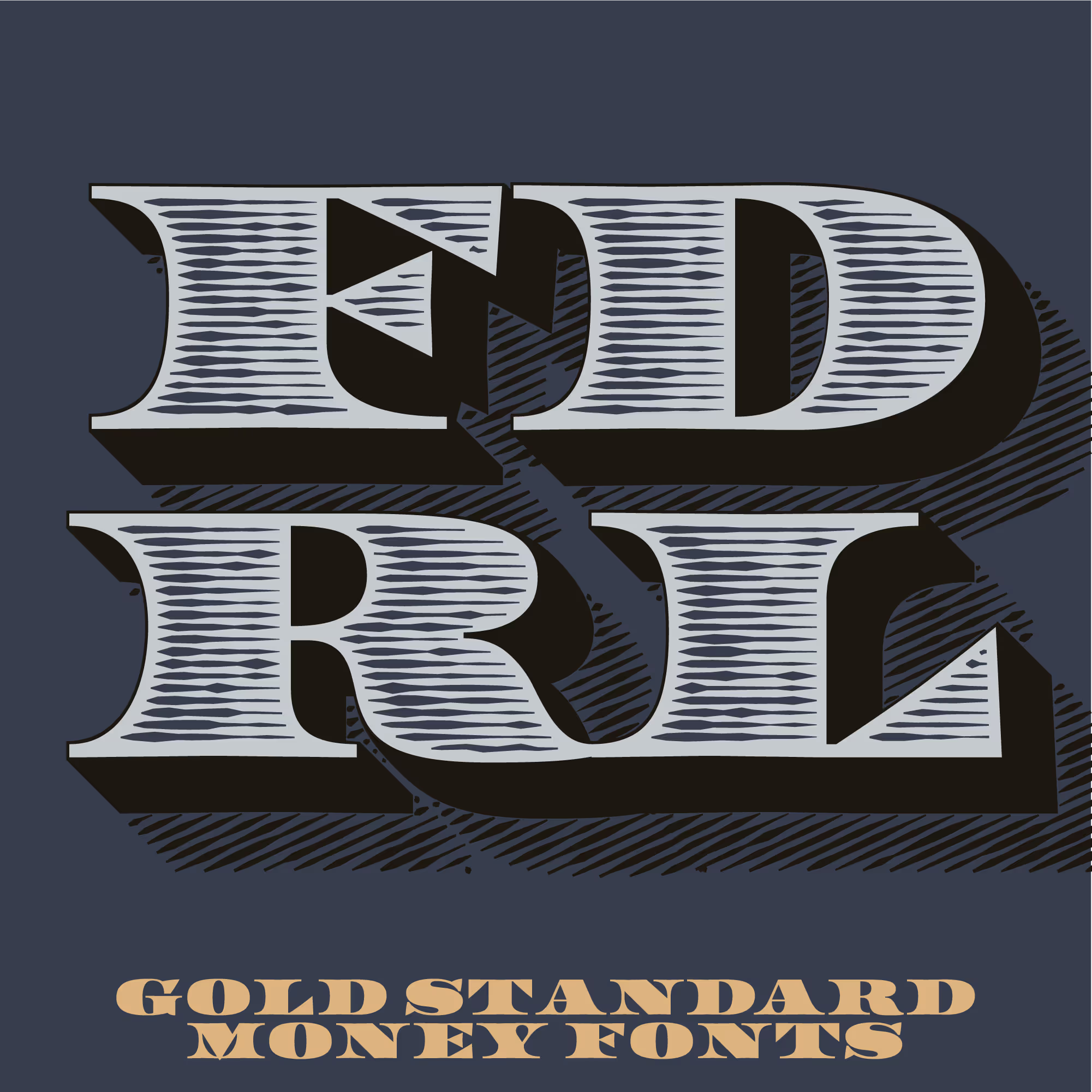
LTR Federal Opticals Separate fonts for separate layers, in four different optical sizes. These let you construct your own engraved styles by stacking the parts. But it is a bit fiddly and you need a design application to do this
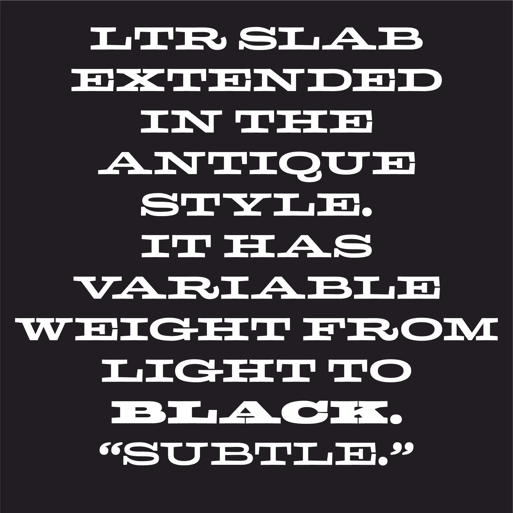
LTR Slab Extended Technically not part of the LTR Federal family, the solid wide shapes of LTR Slab fit comfortable in the Federal universe.

Corruption or celebration? Junkmail or magazine? There are appropriate color schemes for everything.

Rivington Tattoo, NYC. Fed can be punk if it has to be. Photo: Hannes Famira.
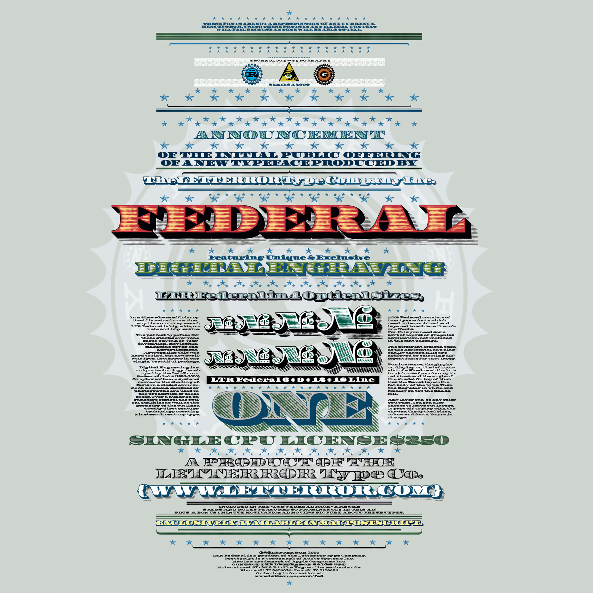
Paired with everything. All the styles, including LTR Slab, together. This was an old marketing sheet for LTR Federal. Careful readers will note the price has dropped considerably since.