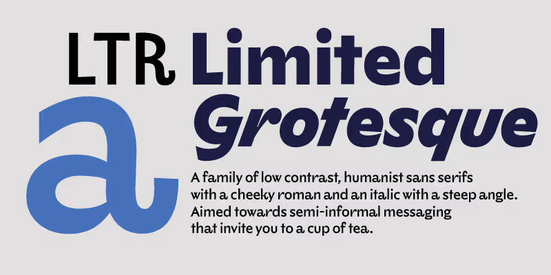
LTR Limited Grotesque is a family of illustrative and humanist sans serifs with a cheeky roman and a pronounced italic. “Limited” contains a collection of carefully drawn styles that, while not always following the established norms of consistency in digital type, appear welcoming and dare we say it, friendly. A typeface loosely based on the lettering by Eric Ravilious for Dunbar Hay Ltd.

| Click for all pricing & licensing options. | |||||
|---|---|---|---|---|---|
| € | 40 | Single style | CFF OpenType | ||
| € | 80 | Variable font with weight axis • VF fonts contain multiple styles in a single file, and are priced accordingly. | TTF Variable | ||
| € | 150 | Collection with 10 fonts & variables | All the fonts | ||
| One-time fee for perpetual use. | |||||
| Available from FontStand | |||||
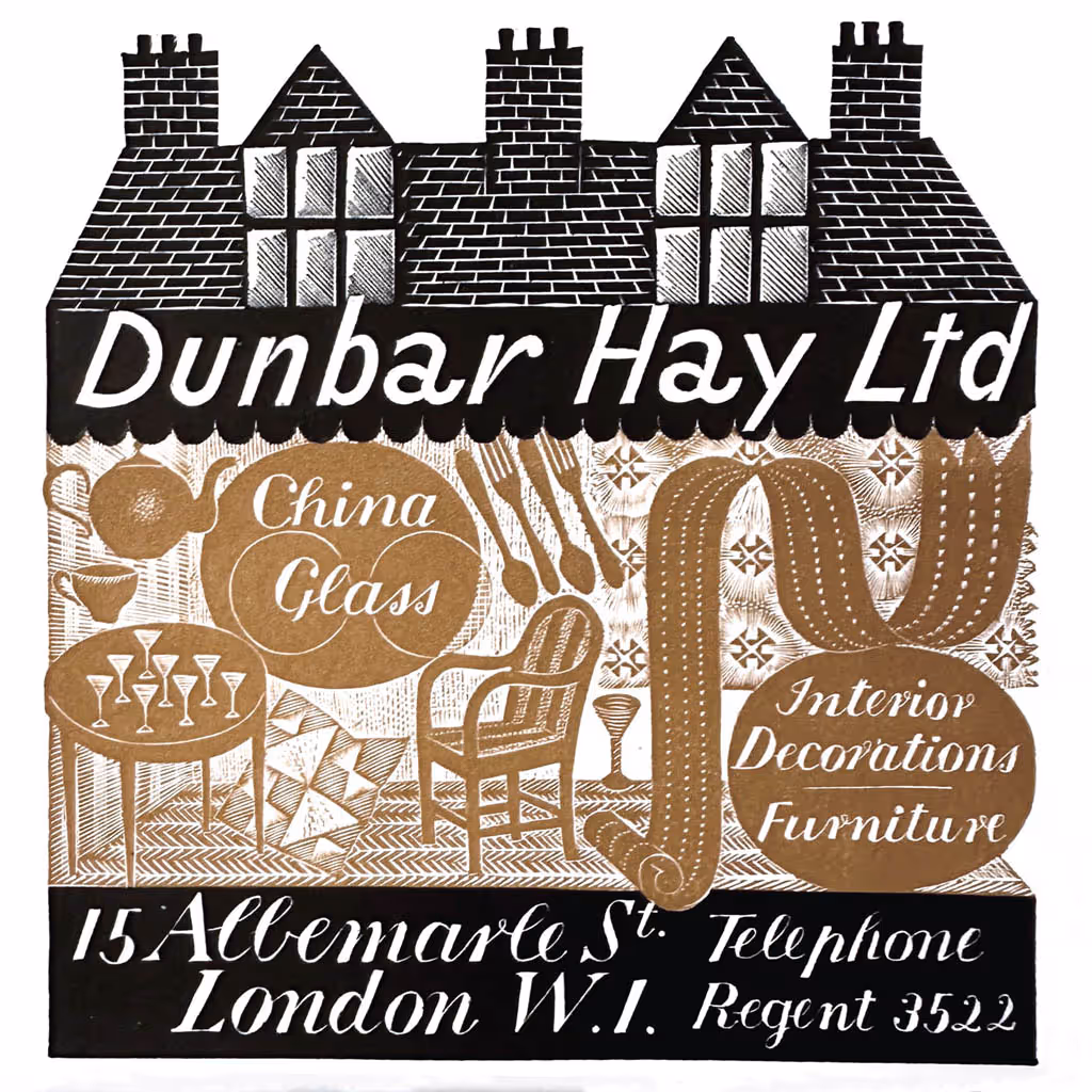
Dunbar Hay Ltd. c. 1937 Crockery Label. Eric Ravilious des. London. Wood engraved label, printed in
black and brown. The companion lettering in the drawing, the high contrast serif with some intriguing
script-like connector strokes is being explored.
Towner Art Gallery, Eastbourne
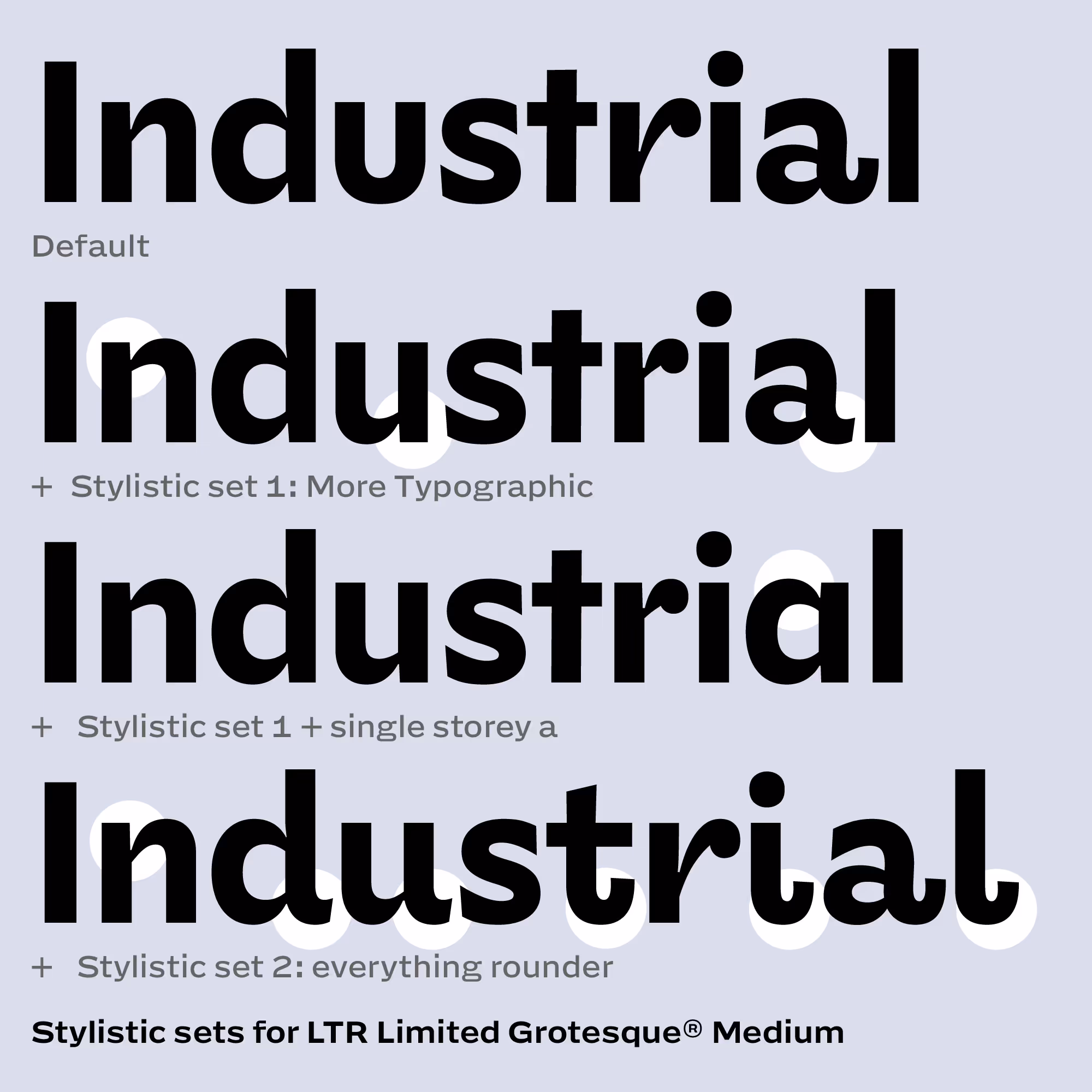
Variations: LTR Limited Grotesque has a touch of the broad brush, with the occasional eyecatching tail. LTR Limited Grotesque® comes with quite a few stylistic sets that swap in different variants so you can stay close to Ravilious’ lettering, make it more typographic or mix your own. Try them right here in the OT Features tab ↗︎


Surely a provocation, this map? Harry Beck turning in his grave, Johnston scholars penning distraught letters to the editor? Is this how LTR Limited Grotesque® connects to society? So presumptuous! Tsk!
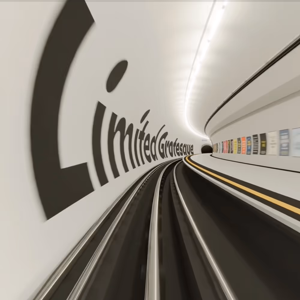
So. Take the Green line from Eric R. towards Edward J., then alight at Dunbar Hay, transfer to the Blue line and then it is one stop to Limited.
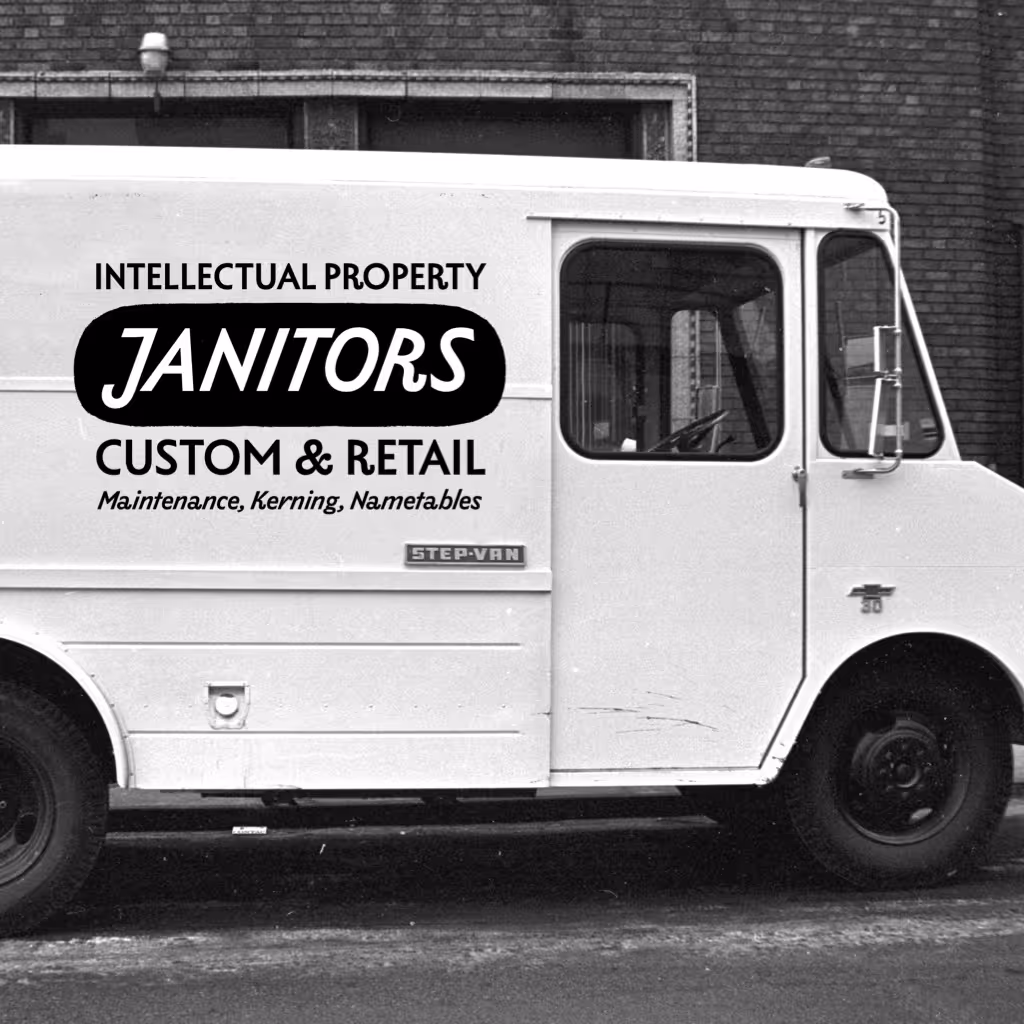
Don’t buy fonts from people who do not care about them. But it is a cute truck and I would not mind this lettering.
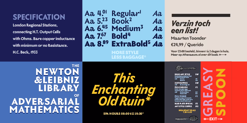
A charmer. More style, less baggage. There are plenty of humanist sans designs around. But few of them are this charming and typical.
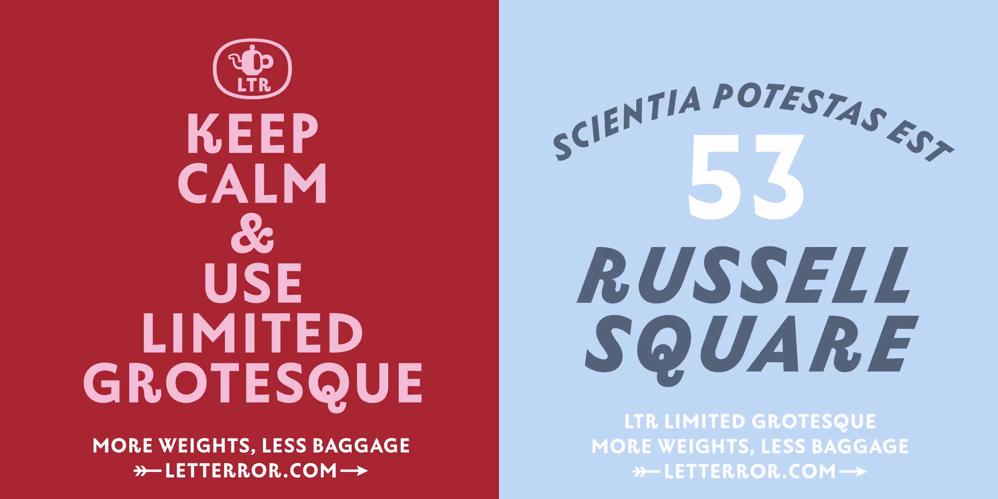
You think know these and yet you do not. 53 Russell Square, should ring a bell for the fans of a particular kind of magical fiction. Imagine Nightingale running into Wolpe on Russel Square? No one? Very well, I will keep this one for myself.
The tail on the lowercase a invited more letters to let their hair down. Check that G.
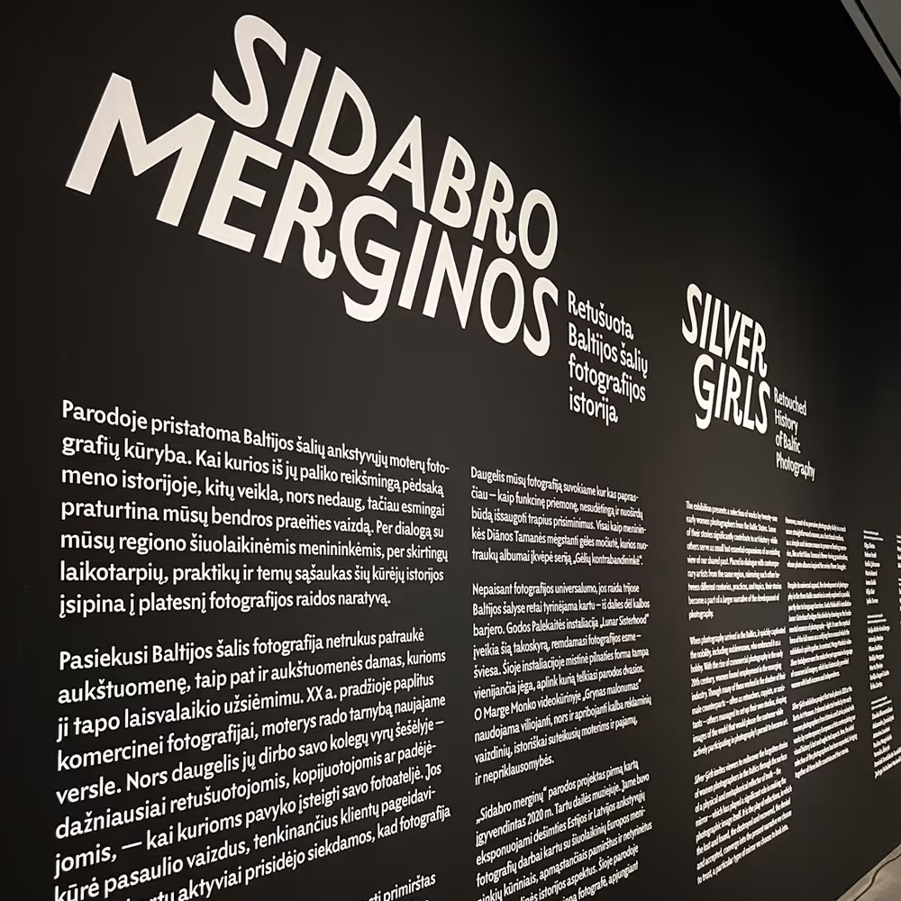
Sidabro Merginos Exhibition design by Aleksandra Samuļenkova. Photography exhibition in Vilnius, Lithuania, 2025
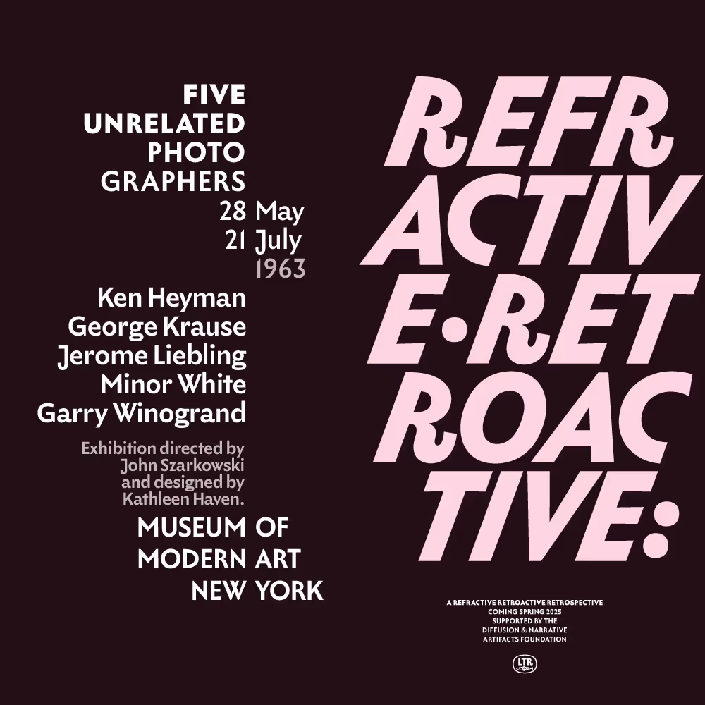
Refractive / Retroactive Imaginary design that explores the range of sizes where Limited Grotesque can function. Did not actually happen.
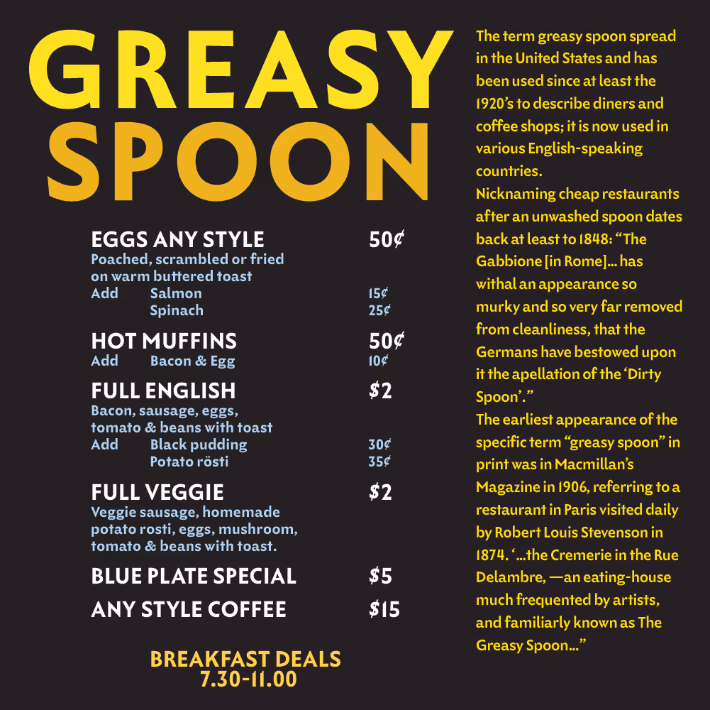
A Greasy Spoon. Low risk information design: from hook to business.

