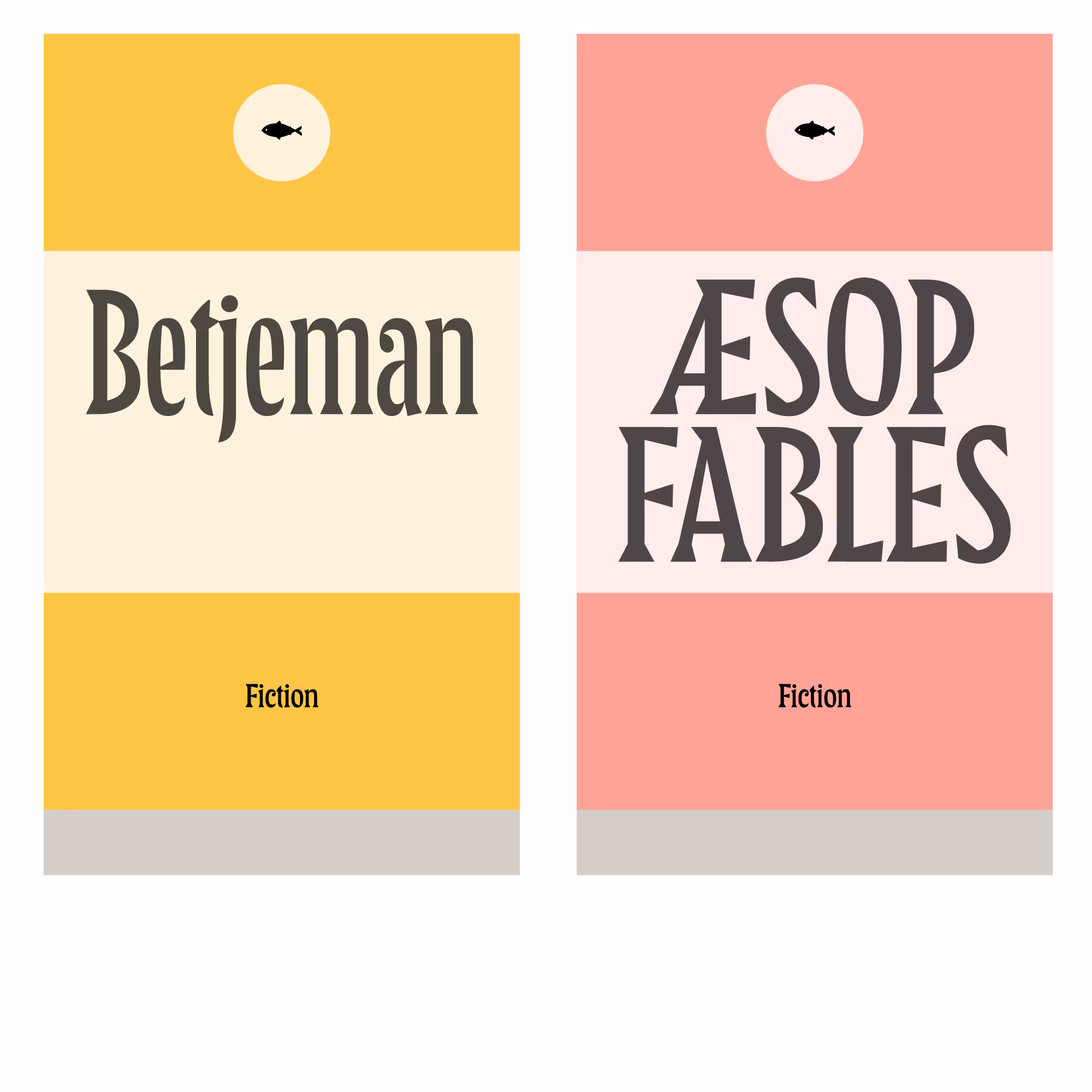
LTR Principia is a cheerful regular-to-narrow variable display serif headliner with very pretty italics. It has a single weight suitable for most applications. Illustrative and playful, it is aware of most rules but not always bound by them. The width axis is useful for fitting words into small boxes.
Fits headlines to boxes and titles to books! When the format is given, and the copy can’t be cut, the type can be tighter.

| Click for all pricing & licensing options. | |||||
|---|---|---|---|---|---|
| € | 40 | Single style | CFF OpenType | ||
| € | 80 | Variable font with width axis • VF fonts contain multiple styles in a single file, and are priced accordingly. | TTF Variable | ||
| € | 150 | Collection with 14 fonts & variables | All the fonts | ||
| One-time fee for perpetual use. | |||||
| Available from Adobe Fonts | |||||
| Available from FontStand | |||||
A brutalist serif, a reviewer observed. But it also has all sorts of silly things, nice curves and ball terminals.

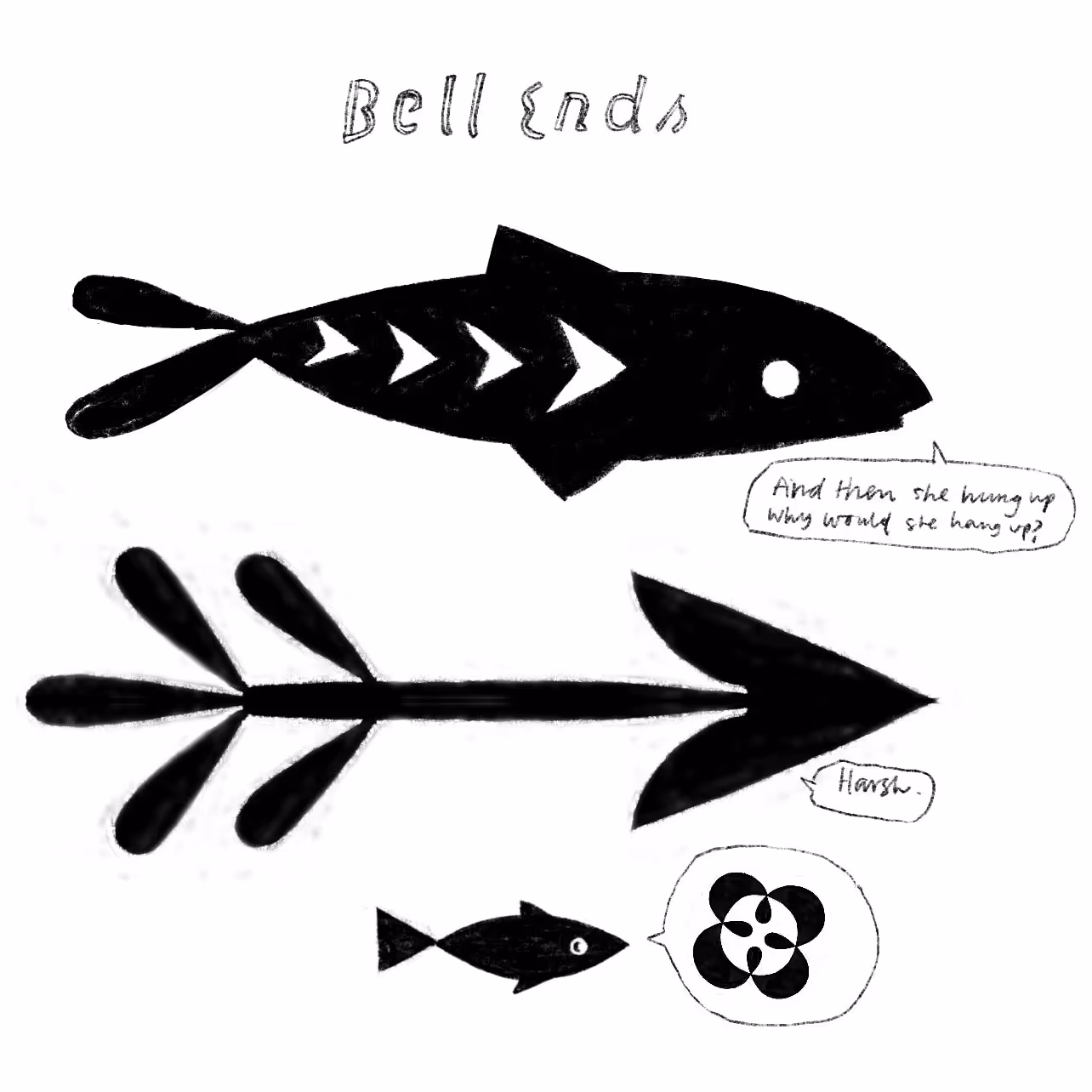
Arrows & fish: with variable width. Italic fish swim one way, the uprights in the other.
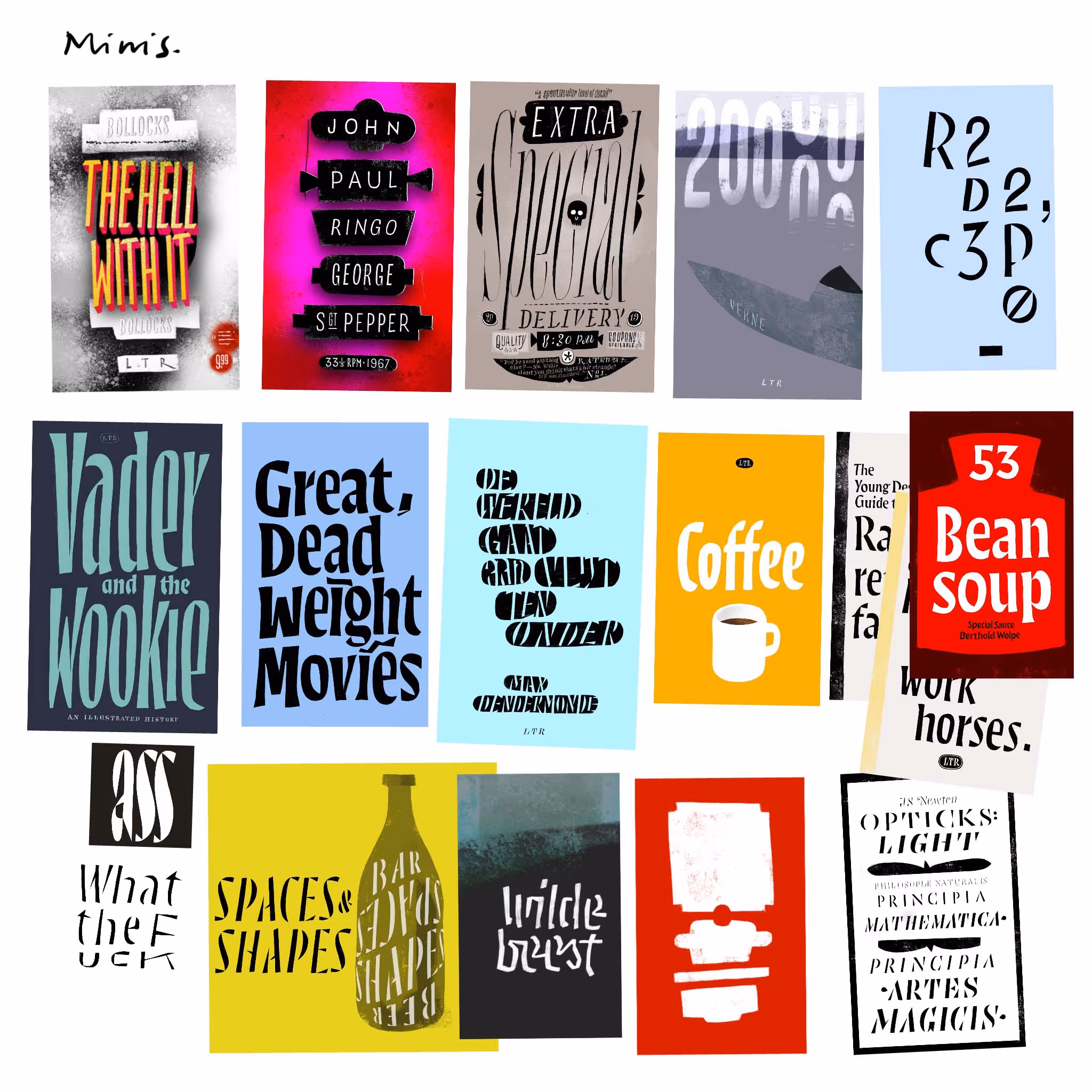
Small books: not exactly LTR Principia but this is where those pointy contrast ideas popped up.
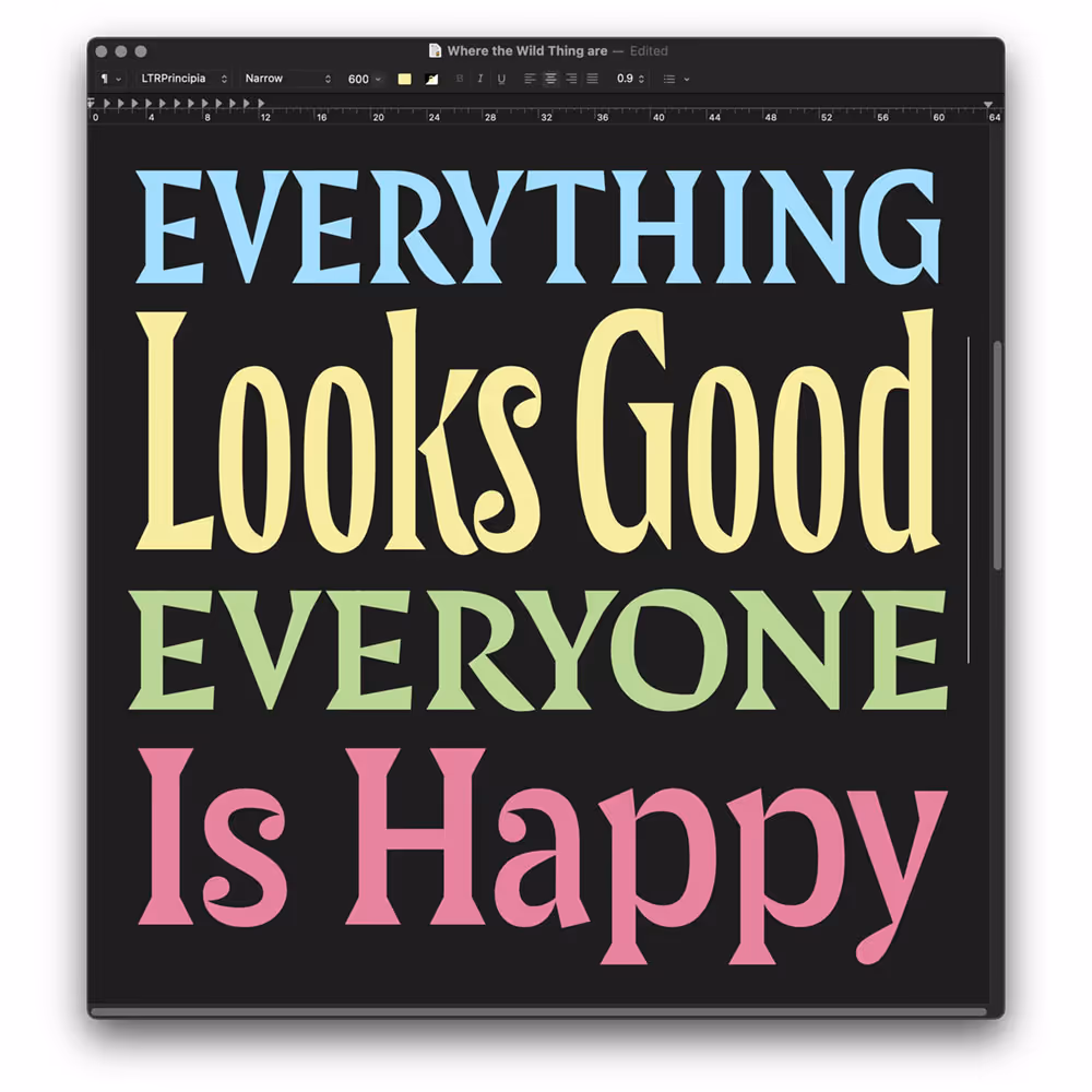
Even in a simple text editor the widths of the non-variable OpenTypes invite playful solutions.
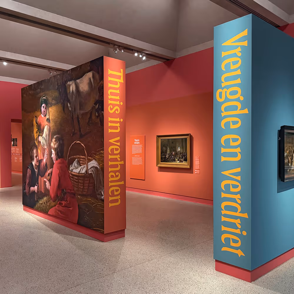
Exhibition design for the Lakenhal Museum in Leiden. Exhibition design and photo: Karen Polder


