
LettError Type can modify and extend existing designs from our catalog, or draw something completely new. We work together with in-house design teams, branding agencies and design studios to develop fonts that perform flawlessly in all situations.
|
|
|
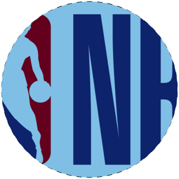
Project: Special cut of the Action Condensed family for all branding and merchandise for the NBA. / Agency: Original Champions of Design and Commercial Type / Team LettError / Read more |
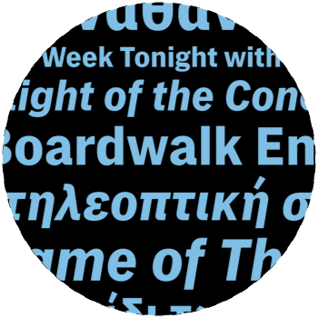
Project: UI typeface for all digital HBO products, apps, website, boxes. With support for extended Latin, Greek and Cyrillic. / Agency: HBO design team, Rob McMurray, James Catel, Ryan Wilkerson, Dave Curry / Team: Carvalho Bernau, LettError, Vlachou, Ruderman. / Read more |
Type used in a very specific context is called lettering. Think logos, opening credits for movies, exhibitions, boat names, even tattoos. Such work always takes place in close collaboration with the design team responsible for the whole project.
|
|
|
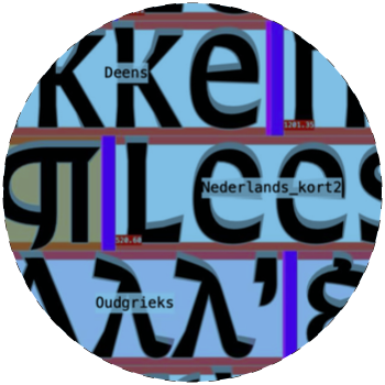
Project Typeface and lettering for the facade of the new University Library building, Amsterdam. / Agency UvA in-house and MVSA Architects / Team LettError. With Danilova, Eslami, Grumer, Samulenkova. / Read more |
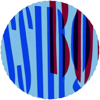
Project Typeface and Logo for Crossing Borders international literature festival. / Agency Jan Heijnen / Team LettError / More lettering |
Sometimes you just need an extra pair of typographic eyes to assess an ongoing project. This can be a quick review of legibility, an appraisal of design coherence or a comprehensive webfont test before taking a site live. A critical eye at the right time can avert costly mistakes.
LettError has over 30 years experience with fonts, trademarks, open sourcing and contracts. We are not lawyers, but we can review and point out issues that might come up in a legal conversation.
|
|
|
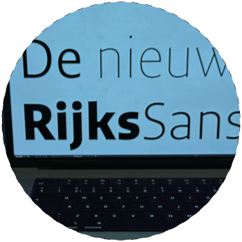
Project: Update to variable fonts of the RijksSans typeface by Peter Verheul. / Client Dutch Government design agency / Team: Type design by Peter Verheul, LettError: proofing, testing. / Farhill Types |
Decades of experience in the type industry.
|
A pricing proposal from LettError Type will factor in the size of the characterset, the number of languages and writing systems, as well as the number of weights and styles. In short any number of special requirements that the fonts need to have in order to perform optimally in your projects. For certain writing systems we will hire outside experts. A proposal will also include options for different degrees of exclusivity. You may choose to own the fonts forever with a full transfer of intellectual property, or opt for a few years of exclusivity after which the fonts can be released as part of the LettError Type library. If you’re not sure exactly what you need, just start the conversation and we will figure it out together.
Depending on complexity, projects can be finished in a couple of days by a single person or require months of team effort. Phases are specified in detail before we start, so you always know what we’re working on and what it will cost. No suprises.
Some big box foundries prefer to charge annual license fees for fonts. These fees are generally fixed for a few years, but can balloon thereafter. At that point you are committed, and any change would also be very costly. You may end up paying fees based on what they think your app, website, identity or brand is worth.
To be clear, our fonts are not free. The site will calculate proper fees for desktop, web and app use. Just ask if you have questions!
Normal LettError Type licenses are all one-off (you pay once) and perpetual. ( Review all our licenses here) There are no annual fees. There is also no monitoring of usage, no forced hosting of fonts, no surveillance or gathering and selling of data. It is none of our business. You will find this is true for most independent type foundries, not just LettError.