
Action Condensed is a compact, sans family with quirky details and a clever duplexed structure.
NBA / OCD In 2017 Original Champions of Design picked Action Condensed for a refreshed version of the NBA logo and identity. Commercial Type and OCD made some small but very cool modifications. Uh, pretty cool to see Action Condensed on such a scale. Link to Fonts In Use with more NBA material.
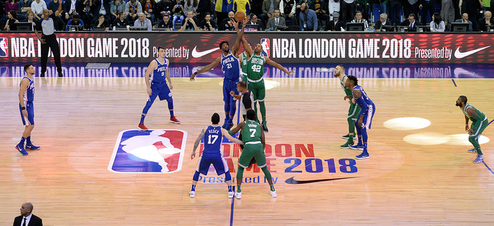
Source: NBA.com License: All Rights Reserved. / Hopefully this falls under fair use.
Available from Commercial Type. You can try ActionCondensed at v-fonts.com. Action Text is a a bit wider, well suited for compact screen typography.
The initial sketches of Action (née LTR Condensed) were drawn in 2010 as a headline font for the Letterror website. Inspired by ‘mobile first’ and responsive web typography, I made a typeface with narrow proportions and relatively large cap and x-heights that would also work on small screens.
Most letters were determined by the choice of stroke-weight and proportion, but round and complex shapes resisted the grid and needed special attention. In the first drawings the terminals varied widely – from extremely loose and round to straight. By testing the fonts at many sizes I found a disparity between shapes that look condensed at large sizes and shapes that behave condensed at smaller sizes. Many illustrative qualities didn’t translate well to the small screen.
P104 is the name of our office space.
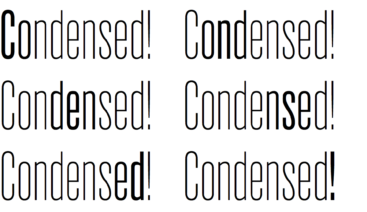
Ermin Međedović wrote in his Typographica.org review of Action Text: A distinctive R, g, y, and 3 give this typeface its own character. And look at the £! The uppercase diacritics are on the edge of visibility and may not be acceptable for sizes smaller than 24 points, but this is more of a concern for print design, and Action is best when it’s big and on screen.
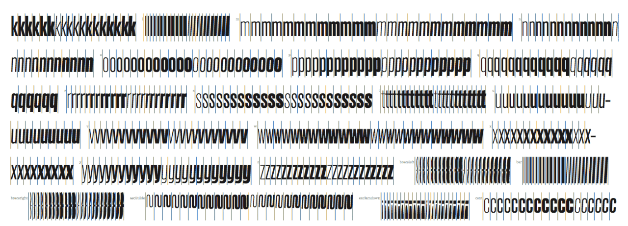
Experimenting with these fonts while rebuilding letterror.com gave me the idea to make different weights with the same metrics, so that the glyph geometry can change without causing reflow. The bolder grades need more heft in the stems, but in a condensed typeface there is not much room if you don’t want the width to change. By choosing the masters wisely it was possible to control the weight and width, the spacing and the counters. The resulting duplexed fonts make dynamic variation possible.
I liked the first results, cleaned it up considerably but made sure to keep it ‘alive’. The project grew to eight masters that could generate 24 fonts in four weights, in three grades and two styles. I was happy to be able to get TM grad Dave Foster to help out. With the help of the folks at Commercial Type, Action developed into a great family.
The grades mean subtle increases in weight without changing the width.
Drawing type for screen involves more than good hinting and robust features that survive low resolution. Type on screen has to deal with totally new conditions and boundaries but still work with the old-fashioned eye. If a column is too wide in a book, it is likely to be too wide on a phone. If type is too thin to read on a page, you’re not going to read it on a phone. Holding a device closer to the eye, or zooming in, are ways of manipulating size but they have practical limitations. There is a role for type design in determining ‘best practices’ for screen typography. We need to experiment and see what this web type thing can do for readers. Action Condensed is such an experiment. It has been designed to be part of animated text, to display selected items in lists, and to acknowledge rollovers and hovers and so on. I’m looking forward to seeing it in action.
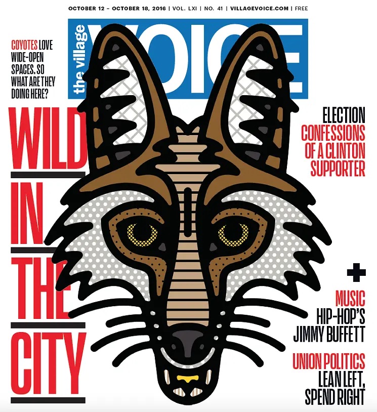
The Village Voice, Vol. LXI, No. 41. Via FontsInUse contributed by Florian Hardwig
Still from the 2016 documentary by Jon Nguyen about David Lynch The Art Life[wikipedia]