_(1000, 1000)_mono.svg)
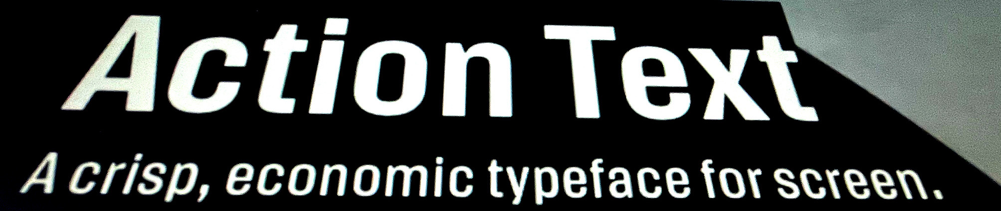
Action Text is the super crisp and tight sibling of Action Condensed. It shares some of the quirks of the condensed, but it escaped the gravitational well of the existing point structures and developed into a thing of its own. Action Text comes in variable and flat formats. Read the detailed release information at Commercial Type.. You can try ActionText at v-fonts.com
Why, Erik, did you think another sans serif would be a worthwhile contribution to the field of typography? Well, I needed something compact for this website. And then for better or worse, I drew something to see what might happen. Some optics, some geometry, a certain bluntness in the shapes. During the design I proofed everything on my phone, tiny specimen on a super crisp retina. At the end of the day I would push the fonts to the server and then just observe and read on a couple of different screens. Later I started using the fonts as the default in my email client, a slow but practical path to finding problems and fixing them.
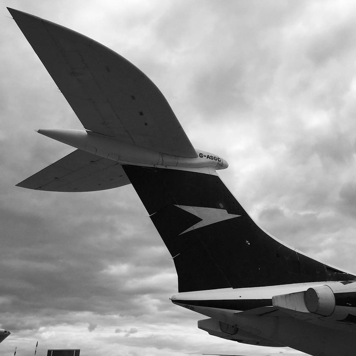
Why are we looking at a (checks notes) Vickers Super VC10? Apart from it being an enigmatic airplane? (Well done for spotting the model!) The tail just looks like it could take off by itself. It is from a time when the idea of what a jet should look like had not yet settled, this is from 1962. The materials and engines made this a viable design, it flew and moved passengers. But just look at the round organic shapes and how they contrast with the sharp cuts. So different from contemporary planes! Obviously such details can’t be translated directly into letterforms, but to me they show that even in harsh conditions there is room for a good curve, that we don’t need to settle for a shape that someone else determined to be the optimal. It can be an arbitrary solution but still a good one. I think I made a similar jump in designing this thing for screen: some decisions concern truths that can not be ignored. The grid. The harsh white light. But there are also places where the design is less bound by the rules of the system. The n may have to fit the grid, the s still has to shine.
It looks a bit like an ð, doesn’t it. Yes, sure does.

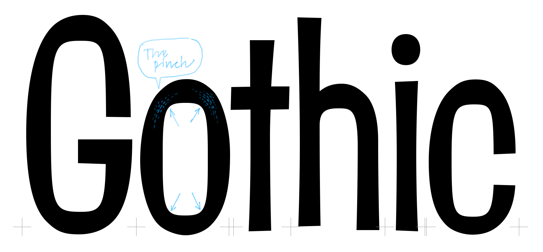
Can you name some of the influences? One of the designs we worked on for the PhotoLettering collection for House Industries was this bouncy gothic by Jimmy D’Amico. The counters are under such pressure that they pinch into the shape. That makes the counters really strong and I wanted to use that. It’s more visible in the lighter cuts. Action Condensed is much closer to a constructed model, it didn’t have room for this tension.

Plenty of currencies in Action Text. Of course the florin was not really used in the Netherlands. Someone should do some research how we ended up with it.

Some of the shapes are a bit, um, can I say this, odd, maybe? - why? For the typeface to be crisp it needs contrast, even in the heavier weights. Often shapes like W and M get cramped into a grid where they don’t really fit: the diagonals are sacrificed for a heavier stem which is convenient. I didn’t want to do that. So these end up a bit wider, but with an honest and logical approach to the shape. Strong rhythm, very even texture, does its job in small sizes, doesn’t look stupid in large.

That cut on the R.. Yes, I knew you’d like that. Action Condensed has it too but a bit less prominent. The bowl of the R can’t get any thinner so the diagonal can have a cut. I imagine a saw cutting a chunk of aluminum out of a wing. The numbersign is a bit overdone, those cuts serve no purpose really. There is no ink to trap, there is no light to keep out of the eyes of the speeding civilian. But in small it will serve its purpose for hashing tags and commenting Python. And in large there is something for the eye to wonder about.
Anything else? Yeah, those flat bits in the S that pinch into the diagonal, yum.

What about this graph? Research? This is the result of a lot of calculations with really funky designspace math. In the end this contributed to the development of Action Text in a really obscure way, but it is those kinds of experiments in Drawbot that provide the occasional fundamental insight in the project. I’m not going to comment on it further, but rest assured that mathematics were used and conclusions were drawn.
Are you going to publish this algorithm? So we can have endless twitter battles about its validity? I predict we will eventually have these discussions without publishing anything.
Wikipedia: In the documentary Dangerous Days: Making Blade Runner, Hauer, director Ridley Scott, and screenwriter David Peoples confirm that Hauer significantly modified the "Tears in Rain" speech. In his autobiography, Hauer said he merely cut the original scripted speech by several lines, adding only, "All those moments will be lost in time, like tears in rain".[10] One earlier version in Peoples' draft screenplays is quoted above. Wikipedia, Tears in the rain monologue. Mainly because it has the word "blinker" in it.
Can you tell us a bit more about the grading? I guess. With Action Condensed I experimented with small duplexed variations of weight. I was curious to see if the glyph geometry could be used to play a part in the design of interactions on screen, for instance confirming a selection or just to acknowledge a hover over a button. Action Condensed is really narrow and it was not easy to fit all the changes in weight and width. For Action Text there was more space to work with and I could construct a simpler designspace. I also reduced the number of grades to two: Dark and Bright. If you’re not concerned with the grading, either of these families will do, their relative weight differences are the same.

If you look at the outlines alone the differences are very subtle. But if you alternate between the Dark and Bright in a text you will notice. The human visual system is very sensitive to such animated changes. So the outlines don’t need to change that much to be effective.
The italics are duplexed with the uprights as well. So you can pop the rollovers to italic if you want.
![]()
What are we looking at here? pixels? While looking for the right proportions and stems, early on, I discovered that macOS does weird stuff when setting white type on a black background. It doesn’t just invert the color values, but also applies an additional transformation that expands the white. Presumably to solve some rendering issue long ago and a typeface far away. But it was a bit confusing at first as the white on black type appeared much heavier with the same glyph geometry. This was not an optical effect but an artefact of the software. Knowledge through observation. It shows that it is not possible to optimise for all devices and screens. There are so many factors involved. But it is good to try and understand as many as I can and I can draw shapes that mitigate some of them.
Could you use it to correct the positive / negative thing? To the extent people notice. White text on a dark background appears bigger. (I did a nice animation about that, remember?). Whether these are modifications are worth the effort remains to be seen. This at least is an honest attempt to provide some material to try out.
Want to post a Gaussian blurred image to prove something? Not really.

Hey That's here!
What else do you think should be mentioned? I think the degree, single and double quotes are related: they are of equal importance in a location, so I like to draw them as big, vertically aligned shapes. Nice and big.
Will you make some more CSS examples? Definitely! I want to show off the variable font stuff in small responsive sketches. Also in combination with Action Condensed.
←16 minutes
EXIT
Keep Clear At All Times