LTR Very Bauble — “Every foundry needs a tuscan.” said no one in particular. But it is a good idea to have a wild and shiny object in the shop window to attract visitors and that is our Bauble.
Slowly bifurcating terminals with a pleasing tension on the stem. Thorns pop up, inlines split and a sprinkling of pips add grit and texture. LTR Very Bauble can be a peaky sans, a sharp serif, and all varying degrees of baublicity in between.
The diacritics unfurl like bunting at surprise party. All this on a single, smooth, easy to animate, variable axis named Serif.

| Click for all pricing & licensing options. | |||||
|---|---|---|---|---|---|
| € | 40 | Single style | CFF OpenType | ||
| € | 80 | Variable font with serif axis • VF fonts contain multiple styles in a single file, and are priced accordingly. | TTF Variable | ||
| € | 80 | Collection with 9 fonts & variables | All the fonts | ||
| One-time fee for perpetual use. | |||||
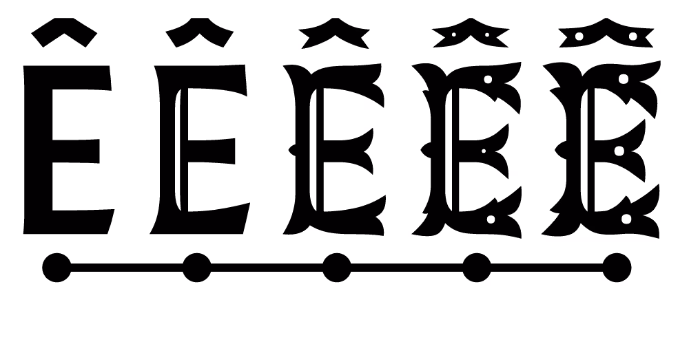
The Bauble, as it is affectionately known in the LTR Drawing Room, is controlled by five separate designs on a single interpolation axis. Each appears at its designated time, like frames in a film. This makes each visual feature appear separately. Exactly when you need them.
This started as a skitchy sketchy headline for the newsletter. (subscribe if haven’t!). Lively caps, highlight from the side, some perky details. The pointy serifs and some tasty, leafy bifurcation! There is a lot to like in this drawing.

The glyphs in Very Bauble Variable are very similar to a theatre stage: there are parts and props waiting for the right time to appear. When you convert one of the Baubles to outlines, all those items are revealed. Use Illustrator’s Pathfinder to unite the outlines and everything will be cleared away. Alternatively, you can use one of the non-variable OpenTypes.

Three stylistic sets offer some control over the details. From the default with pips and lines, (top left), to Pipped: only the dots, then Solid with most of the internal details removed. Lined, you guessed it, just has the lines.
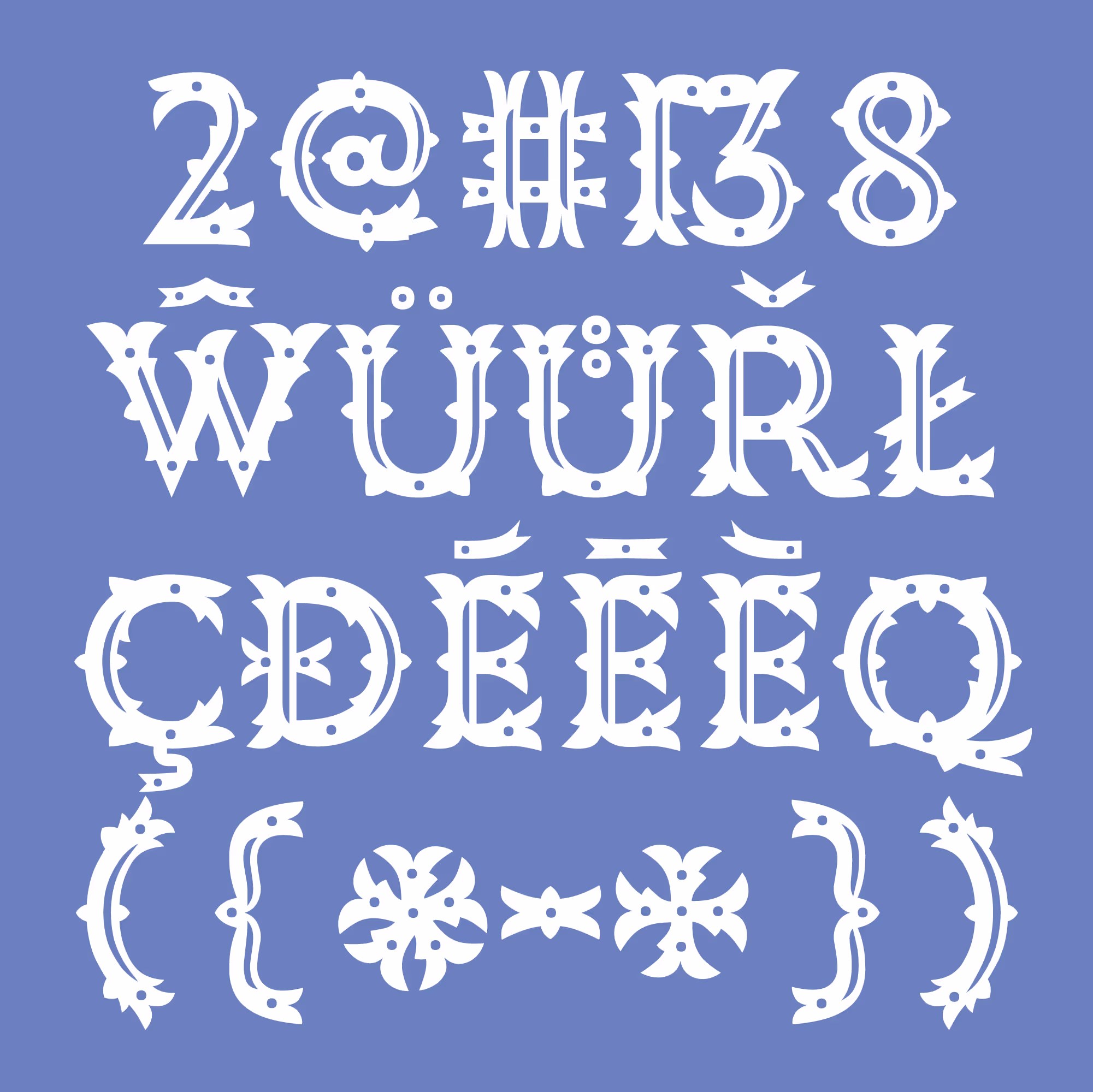
A decent characterset, this Bauble. And the price has taken that into account. Bauble contains uppercase, numerals, some currencies, punctuation and dashes and quite a few diacritics. A lovely ampersand and a fantastic asterisk, a new asterism. Numerals fit for monuments. Three stylistic sets give you some control over the details: the standard (with everything on), a solid (no ornaments), lined, pipped. Not all glyphs have pips or thorns or lines, but they're included in the stylistic sets. Try the testers here to see if the words will work. Don’t forget the main attraction: the Serif slider!

Pareidolia? There are faces everywhere in LTR Very Bauble. Like critters in the woods, looking right atcha.
Ornaments were never a crime. Designers love their aphorisms and Adolf Loos may have had a point, back in the day when those Art Nouveau radicals were causing mischief. But if we were to strip joy from all human expression it would be a dark and miserable world. We have plenty of typefaces at our disposal to generate our austerity reports. We also need wonder.
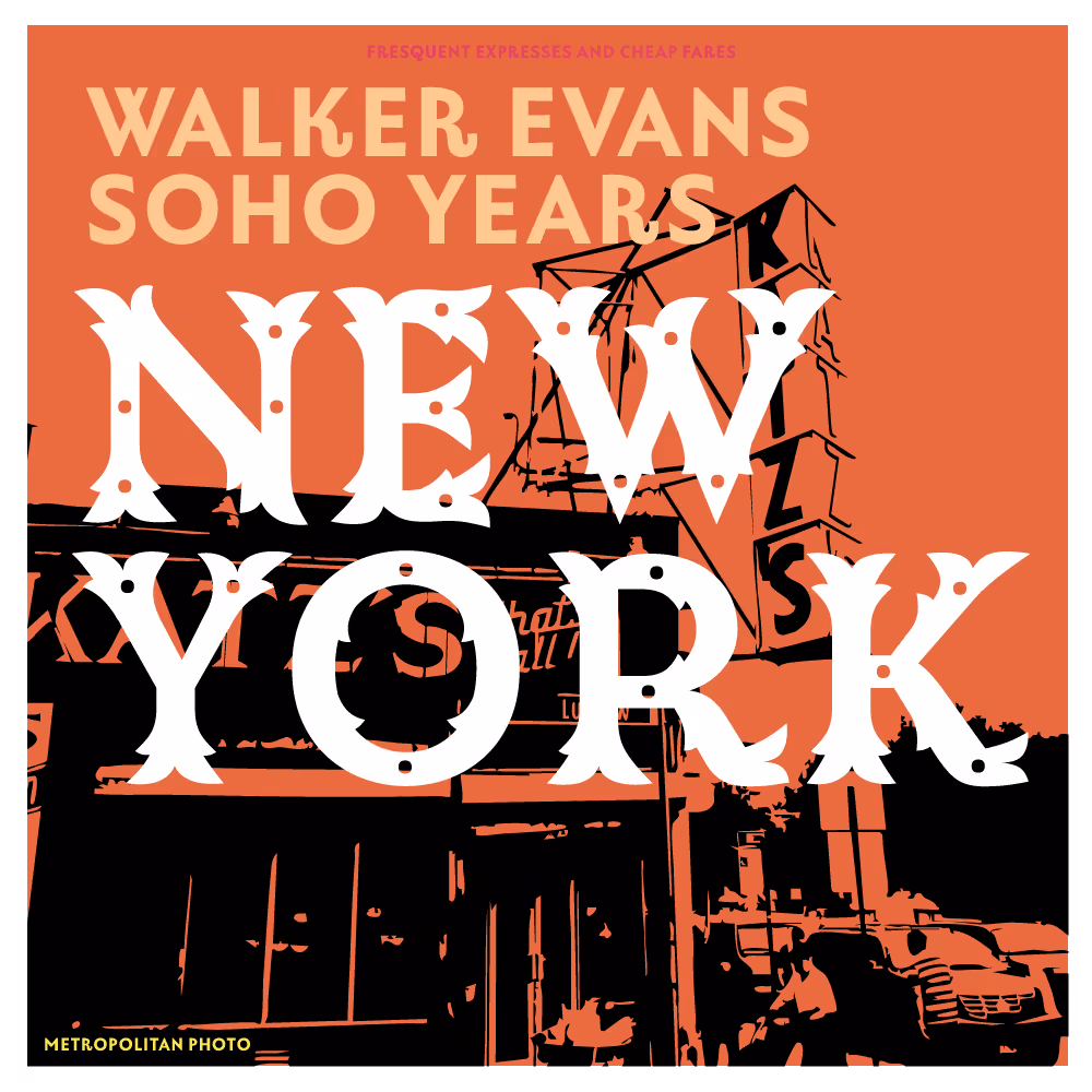
Paird wit LTR Limited Grotesque. Was there ever a book about Walker Evans in Soho?
The Pipped style, or the lines? Always a dash of Tuscan. Nuance is possible!
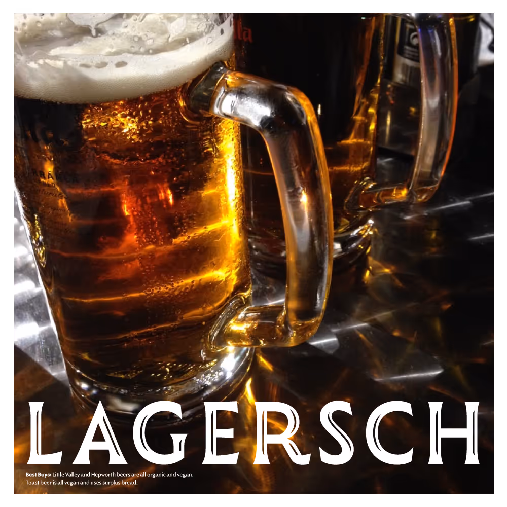
Cheers! Sharp terminals and lines.


