_(1000, 1000)_mono.svg)

Is this the pointy serif you have been drawing for years? Yes! It has evolved into a cheerful regular-to-narrow variable display serif headliner with very pretty italics. It is currently a single weight suitable for most applications. Illustrative and playful, it is aware of most rules but not always bound by them. The width axis is useful for fitting words into small boxes. A bit floppy and tightly spaced for running text, so typographer’s discretion required.
It began as a personal project – a study of shape and contrast, but I was also looking at the process of drawing and interpretation. Using RoboFont together with some new tools, I tried to make most decisions while drawing on my iPad. The method isn’t necessarily more efficient, in fact there were a lot more iterations to make and consider, but other solutions occur when you no longer have to wrangle Beziers. My drawings were very informal; it took effort to lift them out of the warm, comfortable bubble of illustration into the demanding structure of variable fonts.
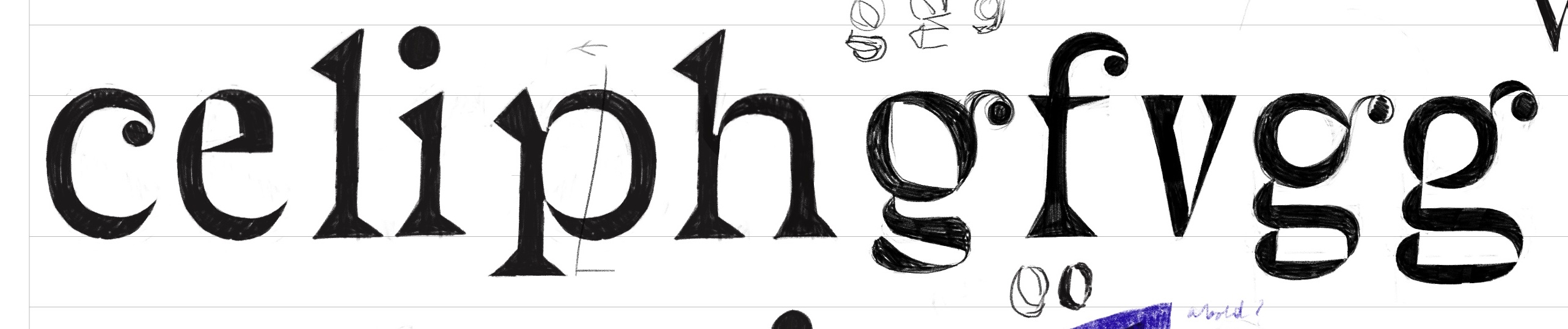
Wild stuff! One of the earlier drawings, 2019.
A lot of the drawing was done on ipad.
What about the widths? The width axis runs from Tall to Slightly-wider-than-normal with lots of relaxed and yet compact moments in between. But really, this is one of those applications where you should just eyeball it. If you get down to the numbers: the condensed is about 50% of the wide. There are pre-defined instances at 100, 89, 79, 62, 55 and 50 percent. At each of these steps the overall width of the text is about 10% narrower than the one before. And that’s also how you can do seven steps of 10% and still end up roughly 50% narrower.
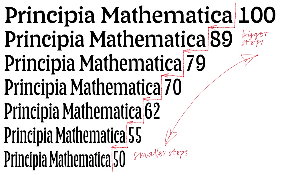
The width progression
Err math? No worries. It just looks right and there are some more fine-grained steps in the narrower range.

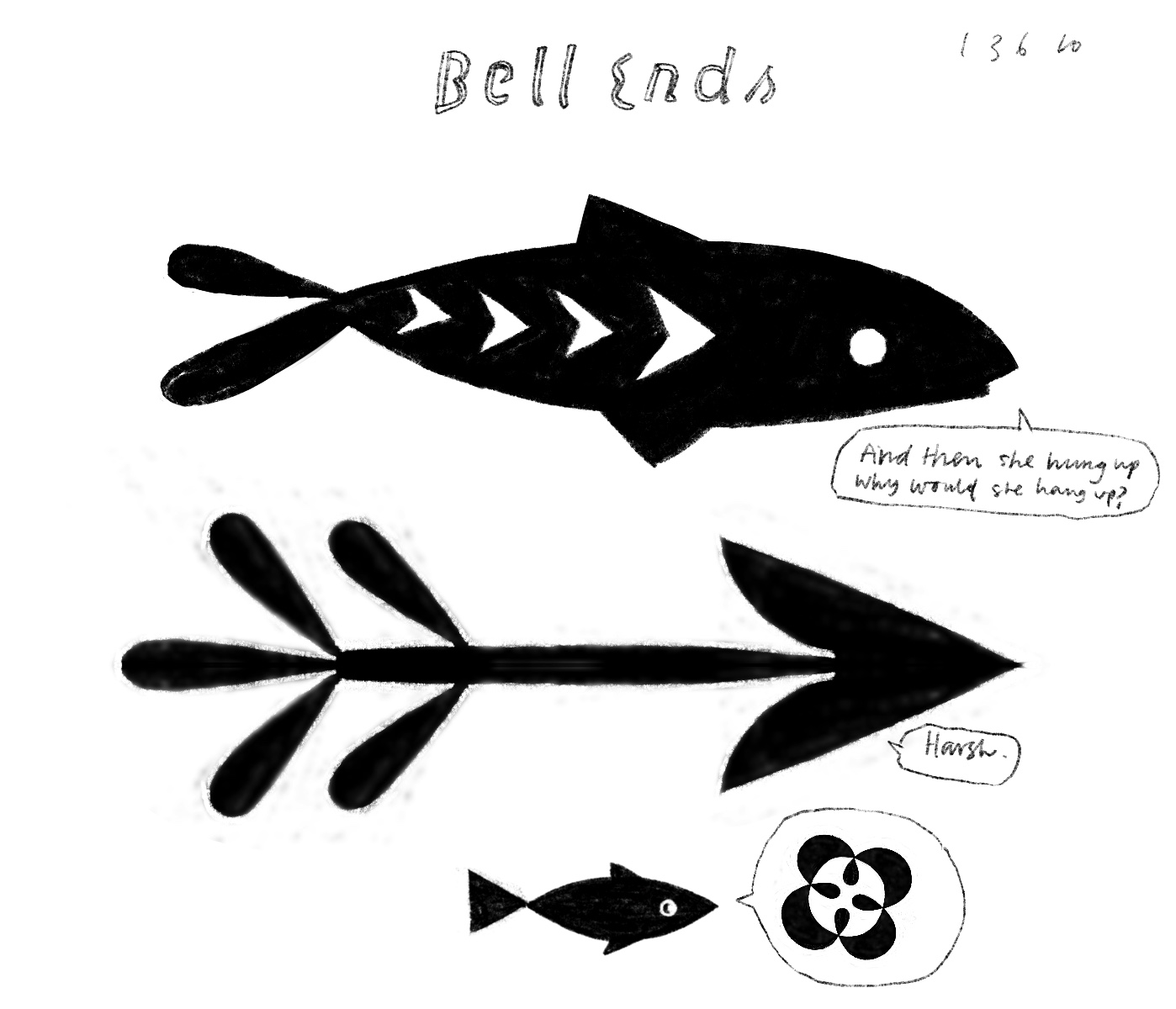
The story of a fish and an arrow.
Bonus: there are fish in the fonts! Italic and regular fish swim in opposite directions, and their widths adapt to the rest of the typeface. The fonts also include a set of pretty, feathery, arrows.

Signs. Single containers with text. A cover. A poster. A card.
I’d like to acknowledge the influence of the lettering by Berthold Wolpe. Certainly not as a revival or interpretation of a specific design. Maybe something in the joy in the letterforms? I’ve been flirting with these ideas for a while, first in my real lettering for fictional book covers and later in the lettering and illustration zines.