
Actually there are some based on existing books, but most of them are fictional titles. Does it really matter? I could argue these are studies and exercises within the typographic constraints of a generic book format in which hierarchy, structure, letterforms but also color and scale inform the layout. But these are not really typography exercises: for starters, there is no brief, no client or required content. But these covers do offer a welcome place to experiment with the process.
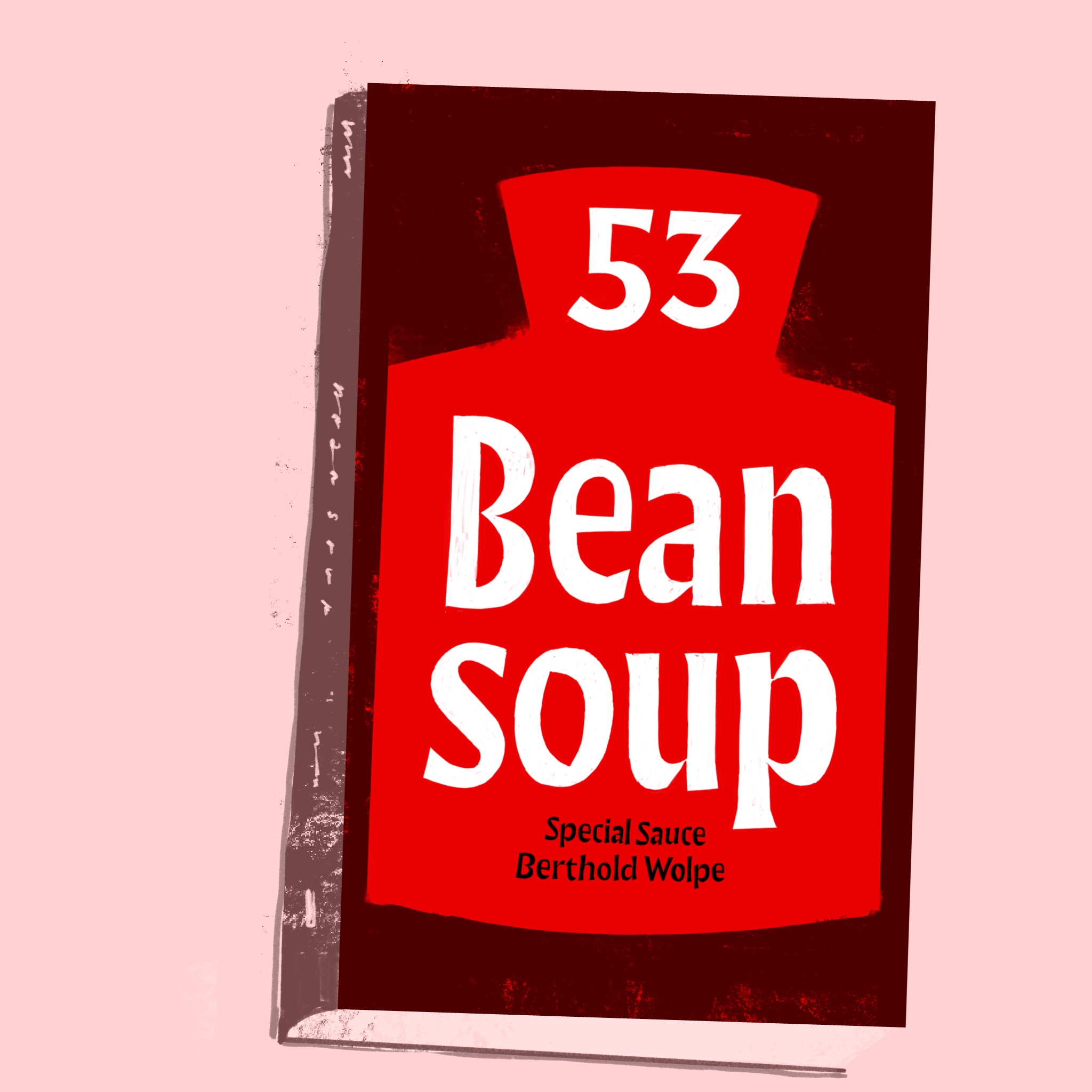
Bean Soup with Special Wolpe Sauce. Some of those letters are irresistable.
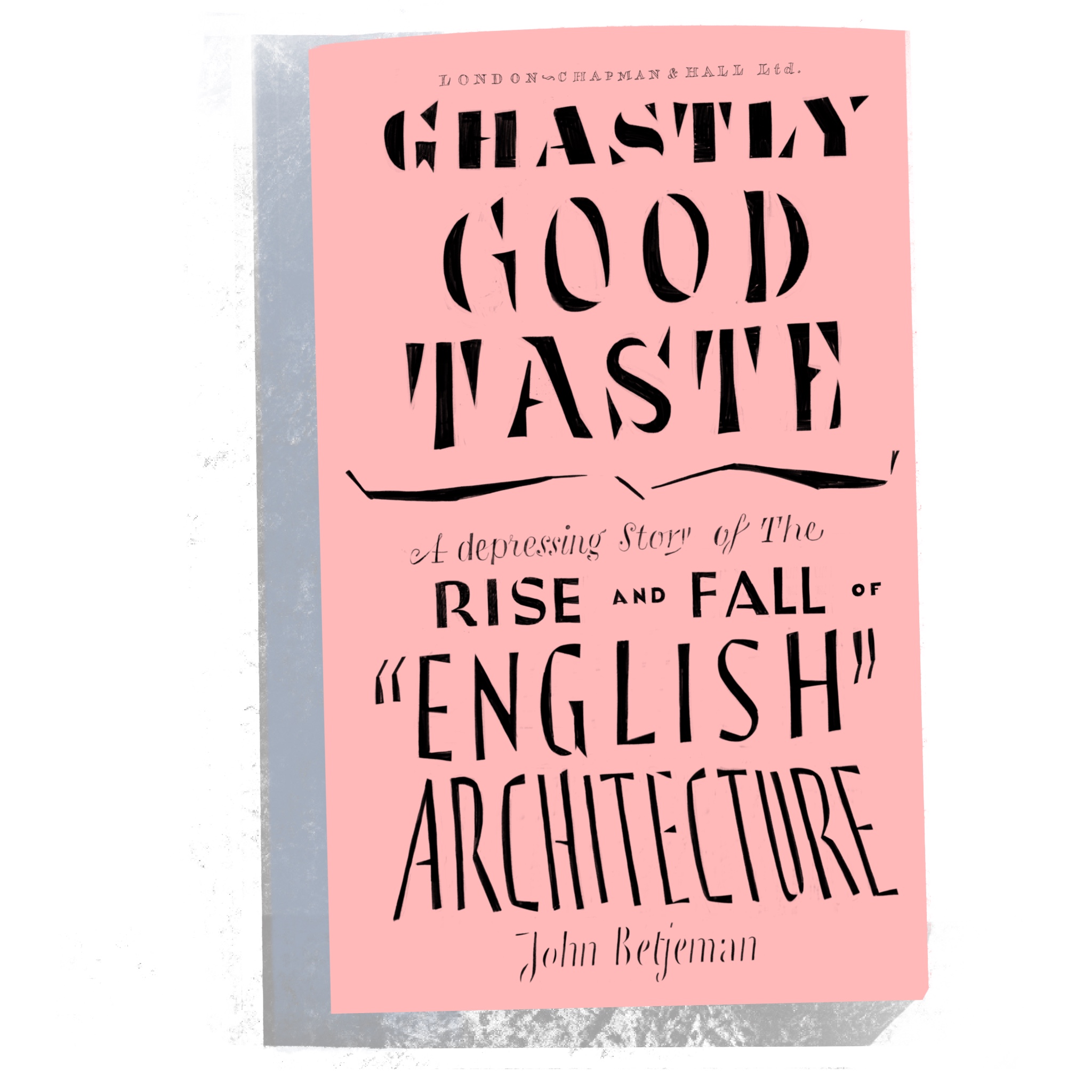
A drawing of John Betjeman's lovely critique of English architecture. The drawing is sloppy.
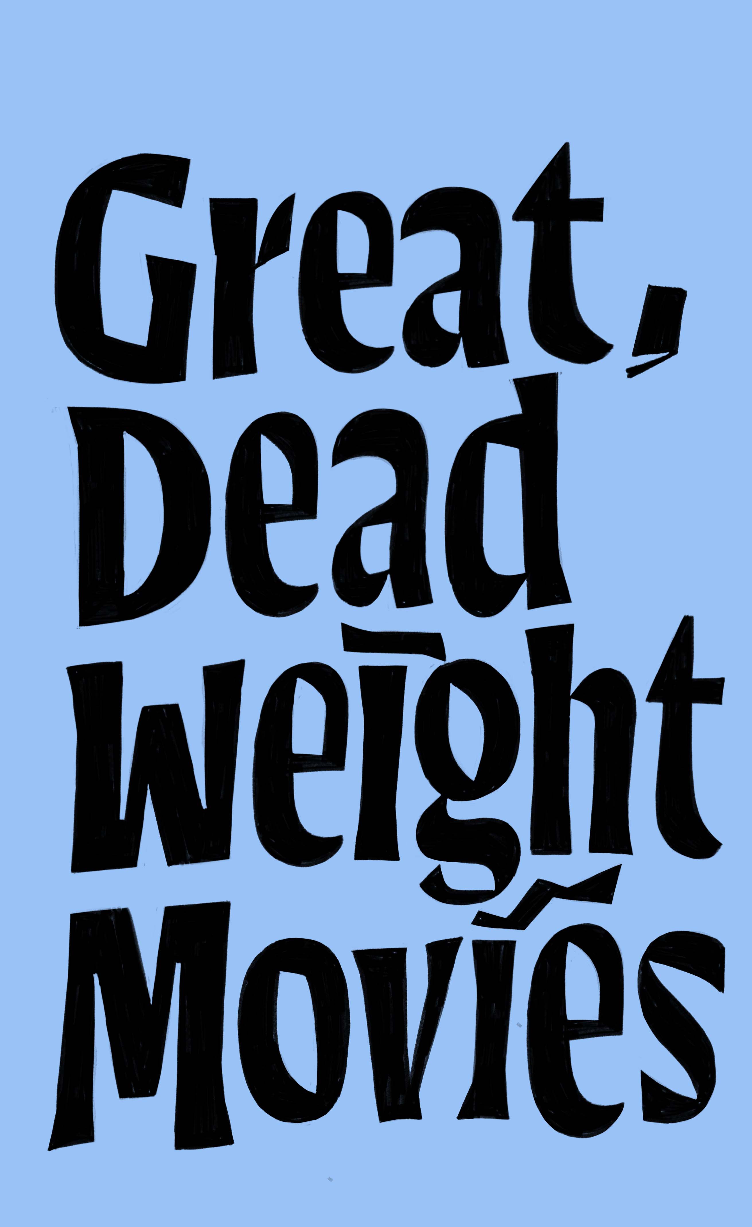
W / M.
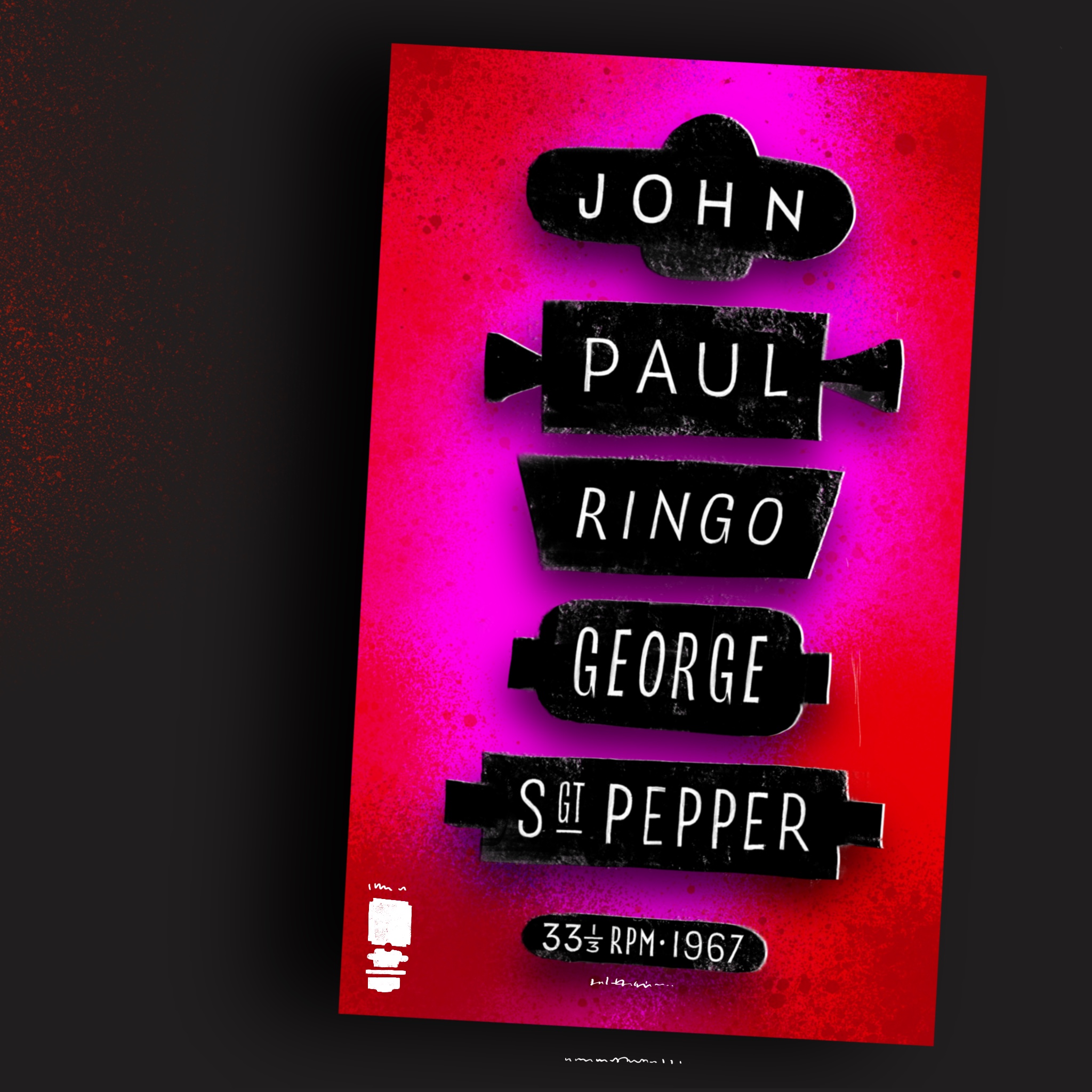
Type in boxes, really vivid colors.
Hahahaha. Open for commissions!
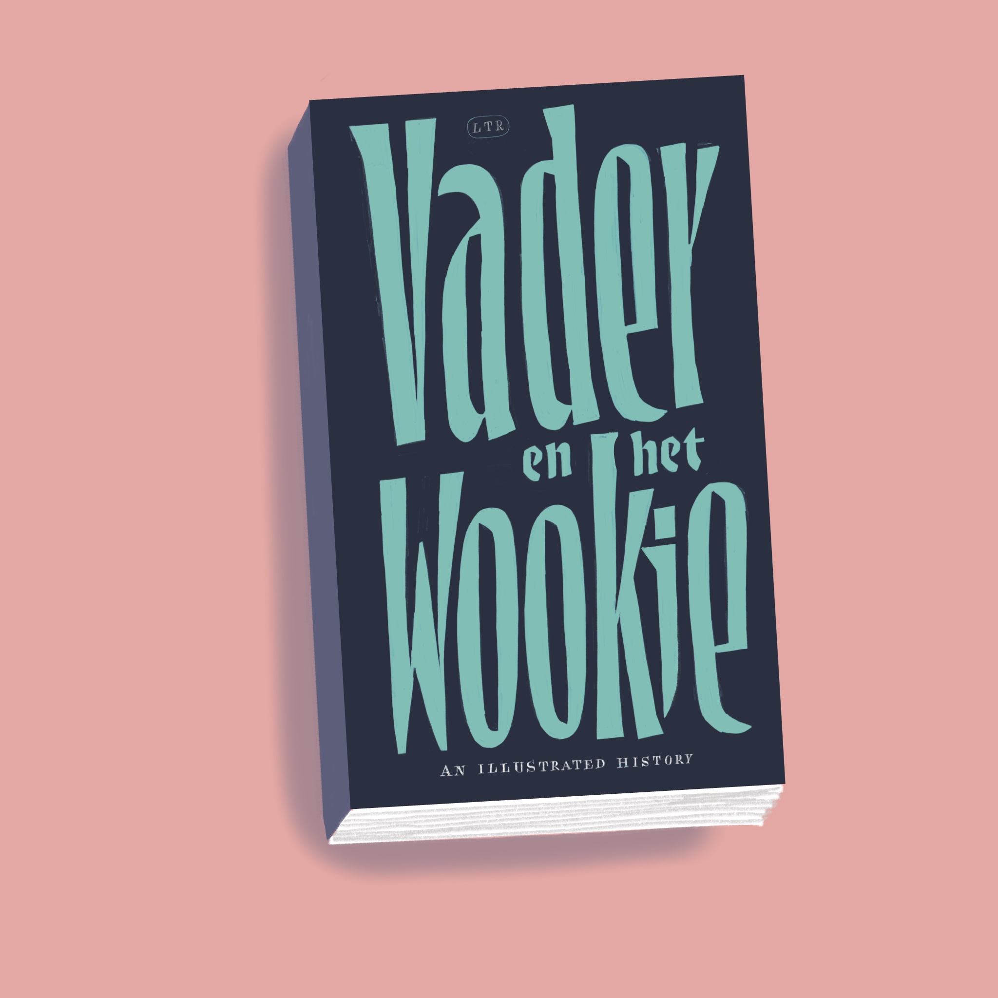
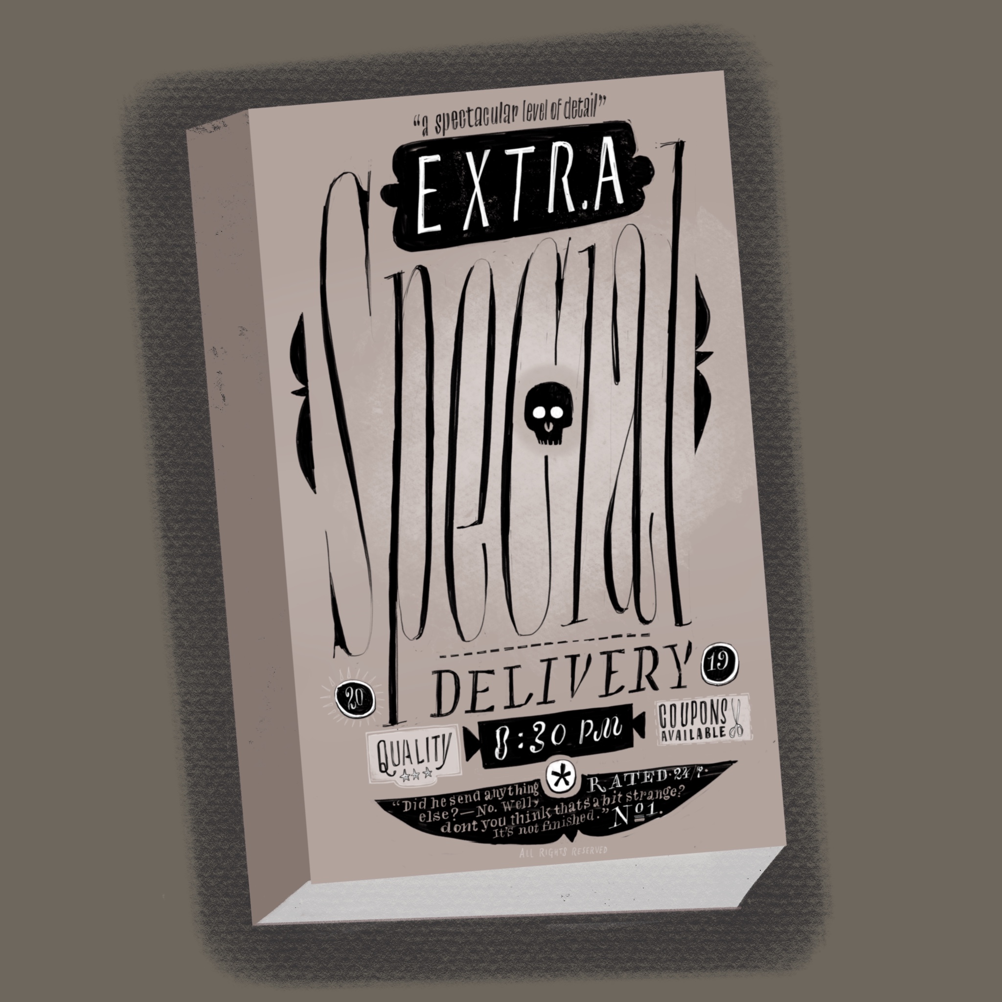
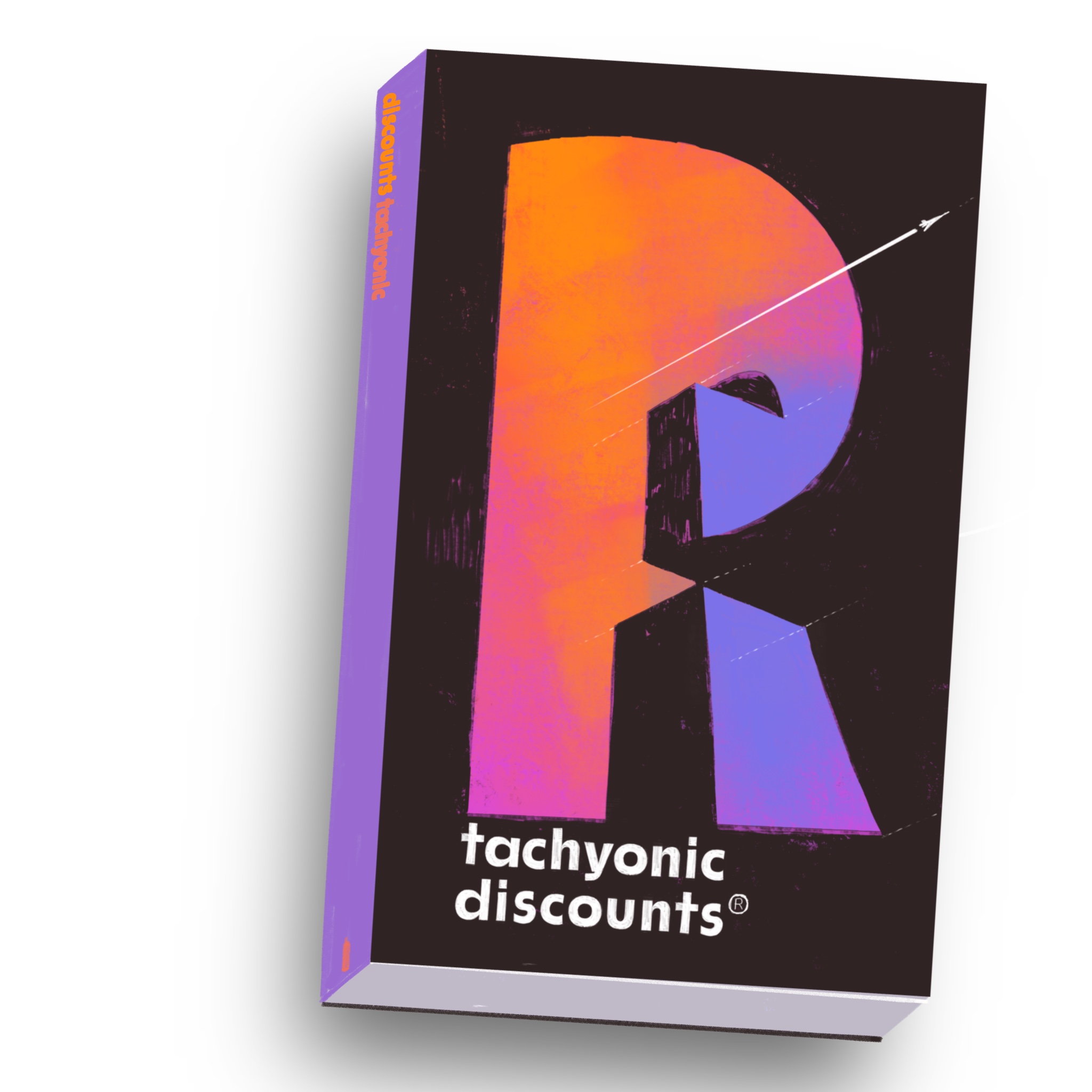
Geometric sans does not want to be drawn. Also, tachyonic discounts are nonsense.
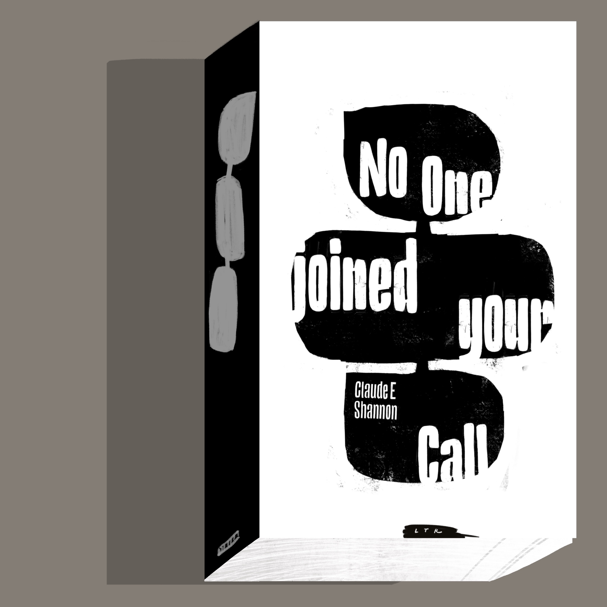
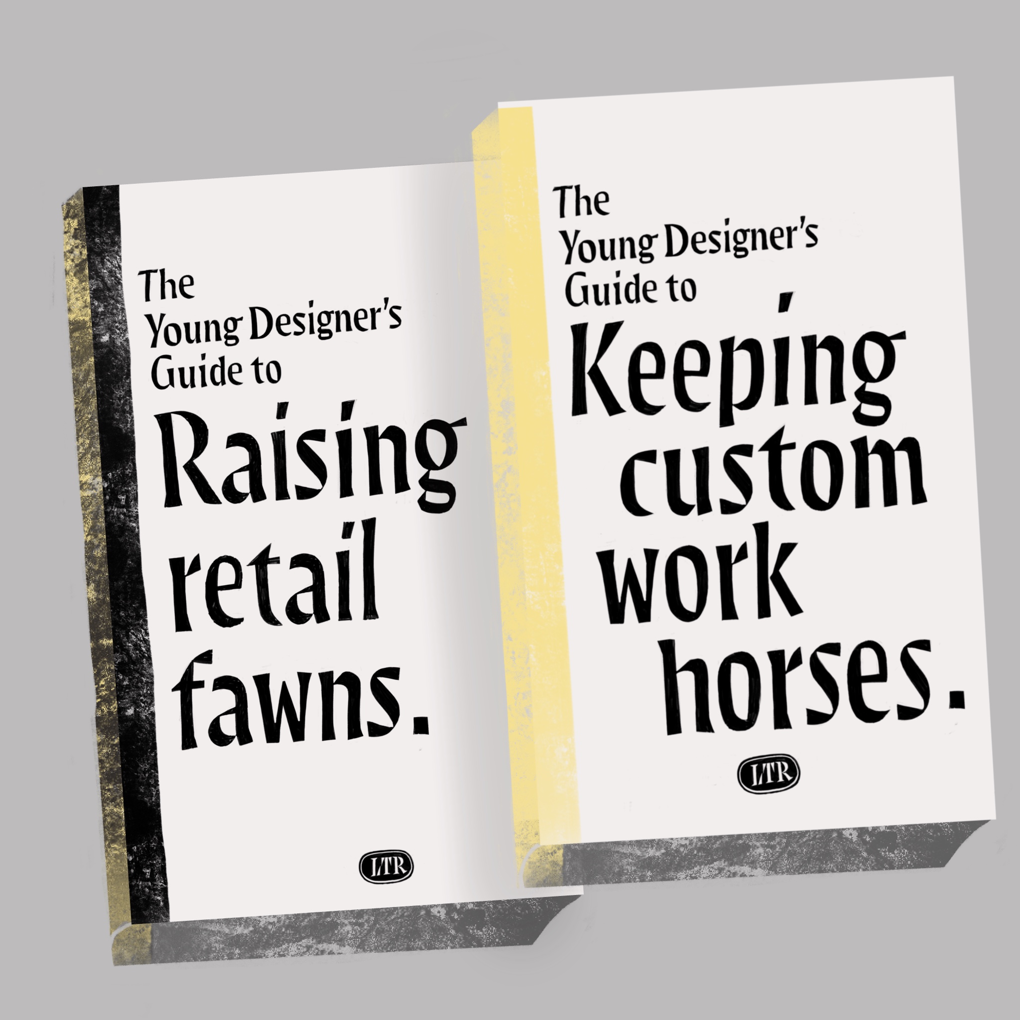
Workhorses and retail fawns, typographic animals.
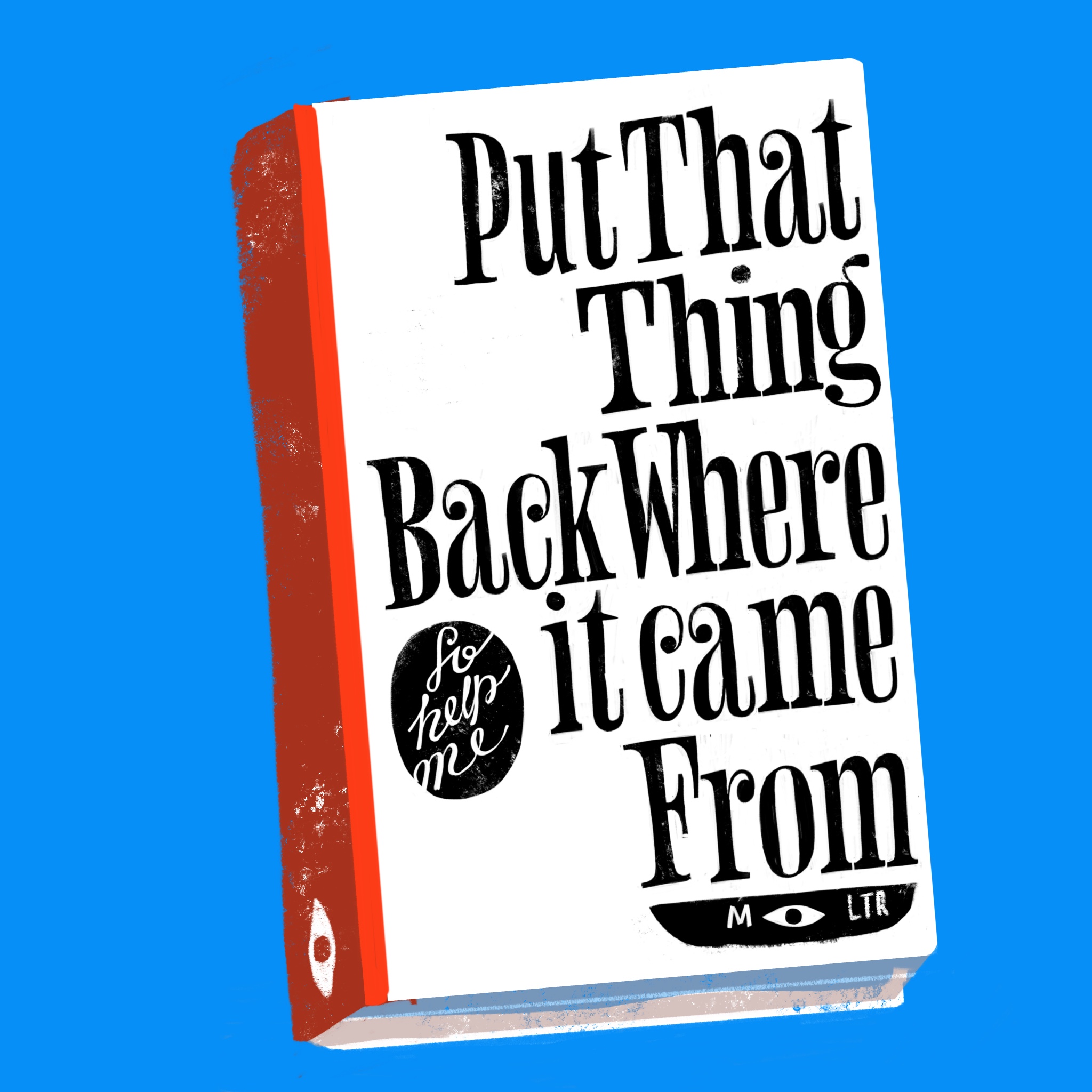
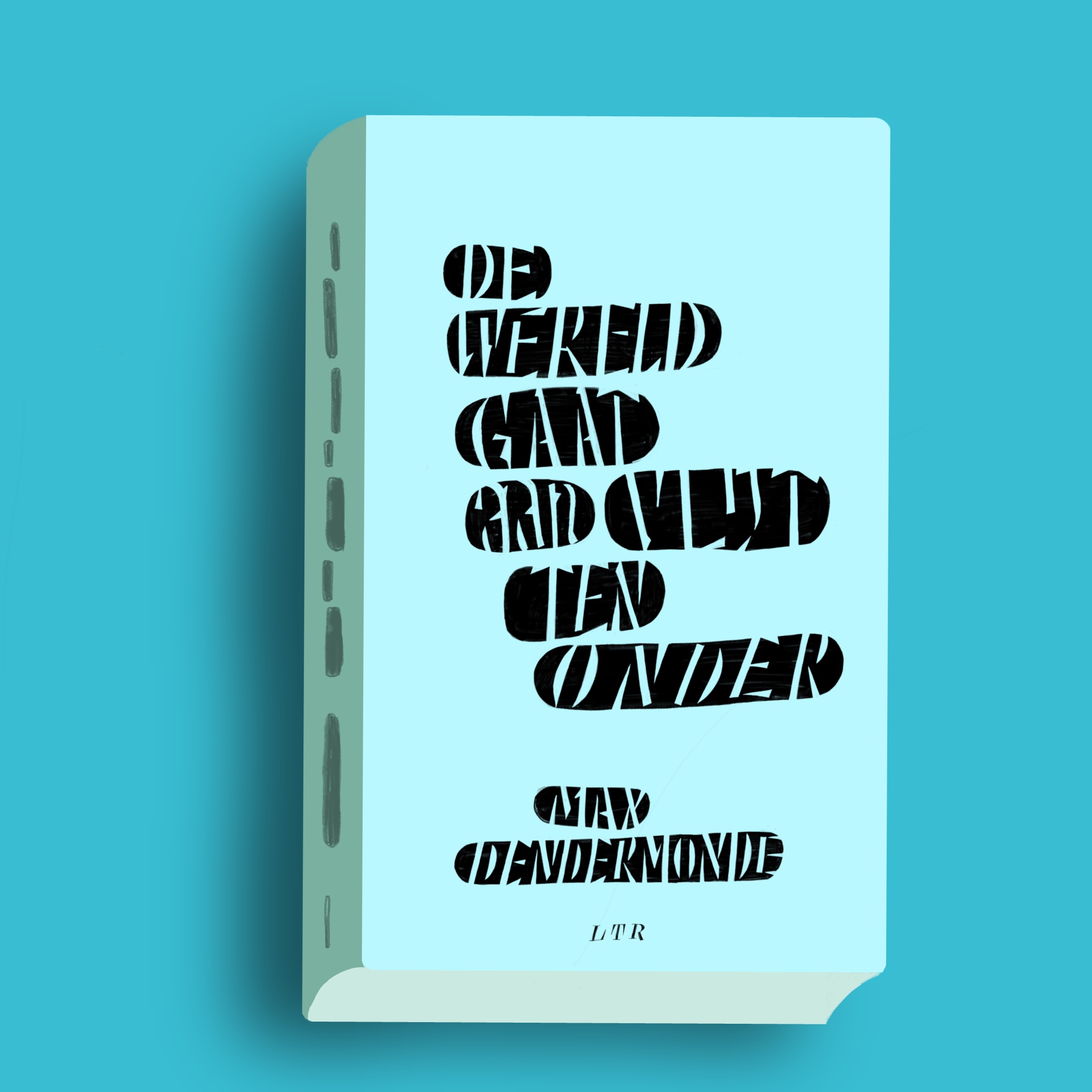
The blue of the endless summer of this Dendermonde classic.


Reproduced small, most things will look good. It’s the scale, Oh! Cute!