Noordzij cube: practical research in theoretical models
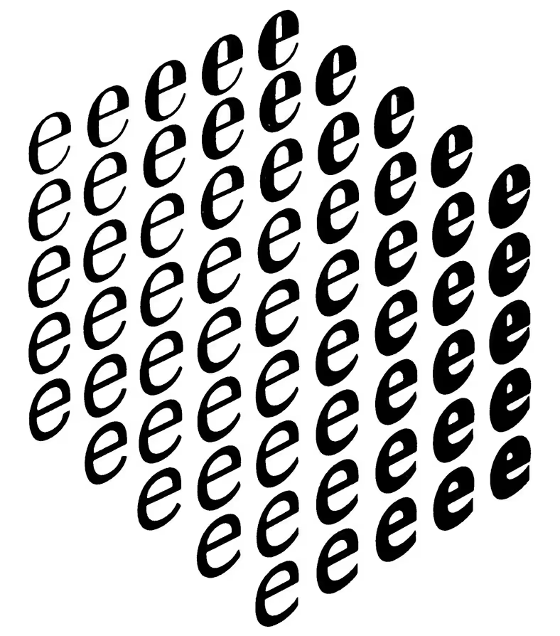
Noordzij cube, 1981 edition.
The cube. Most typedesigners will be familiar with this iconic image by Gerrit Noordzij. He used the cube on the covers of his books and to illustrate his writing. But as a physical object it reveals more. Here’s how I built one.
What do we see? In all versions of this image, the cube consists of 5×5×5 letters. This implies a cube of 125 items, although only 61 are visible. The other 64 letters (4×4×4 = 64) are hidden. The image appears to be some sort of isometric projection, but on closer inspection it shows some perspective. When I showed him the model in 2019, Noordzij confirmed there had been a photographic step when he made the image.
Perspective. For various publications Noordzij made versions of the cube with an isometric projection, without perspective. Perspective projections were note common in vector based design programs. For the reprint at De Buitenkant, Just van Rossum created a version of the cube with some perspective. Rendered in Drawbot with exact and razorsharp vectors. Gerrit approved of this version.
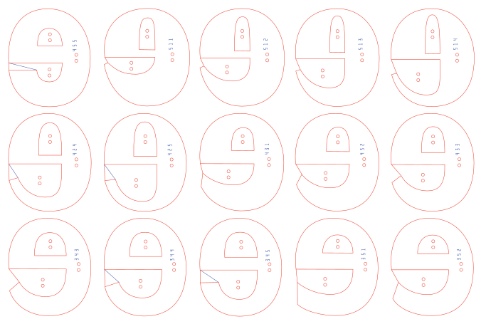
I wanted a real cube. Using outlines made from the original Ikarus drawings by Petr van Blokland, I made a designspace with axes for thins-become-thicker, thicks-become-thicker and flavor. Then I wrote a DrawBot script to calculate the interpolations and position them on a panel with the right dimensions for the laser cutter. I thought it was necessary to code a simple outline alphabet to engrave the coordinates on the back of the letters. Each object, letter and the counters got a number so I would be able to tell them apart. Laser cutting was done at the Maquette Atelier.
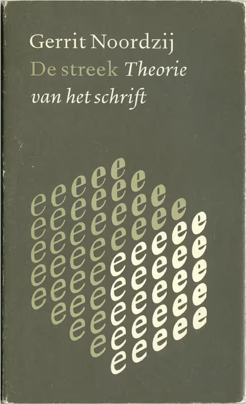
According to Noordzij, this cube was based on a photograph, and has a bit of perspective. De Streek Theorie van het Schrift Uitgeverijj ICS Nederland BV, 1991.
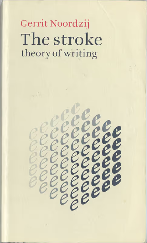
For the Hyphen Press edition Gerrit drew a new isometric projection. A perfect hexagon but no perspective. The Stroke, theory of writing, Hyphen Press, 2005.
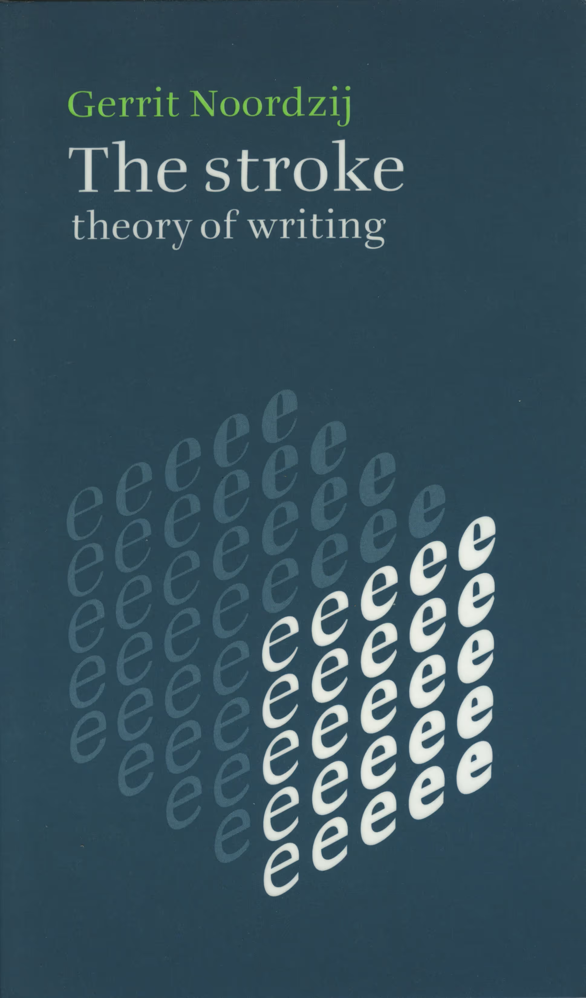
For the 2021 edition Just van Rossum calculated a new cube with perspective. The Stroke, theory of writing, Uitgeverij de Buitenkant, 2021.
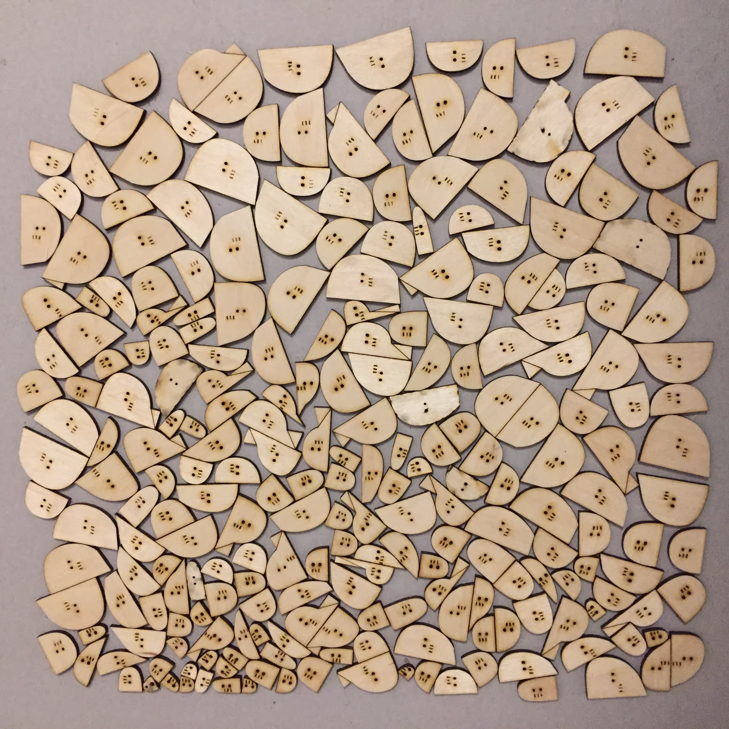
250 different countershapes.
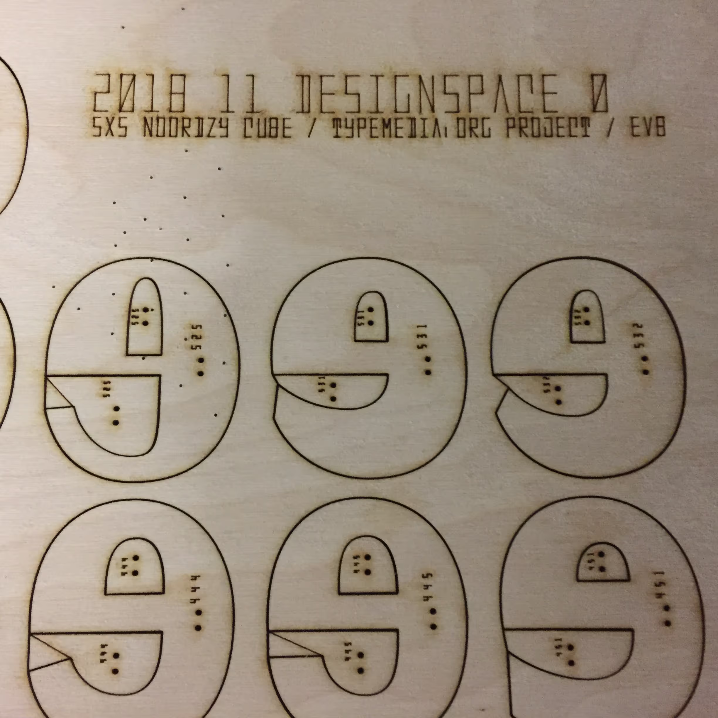
The terminal at the bottom makes a wild rotation between expansion and translation. This required an extra line in the bottom counter. Not sure why the counters got positioning holes as well.
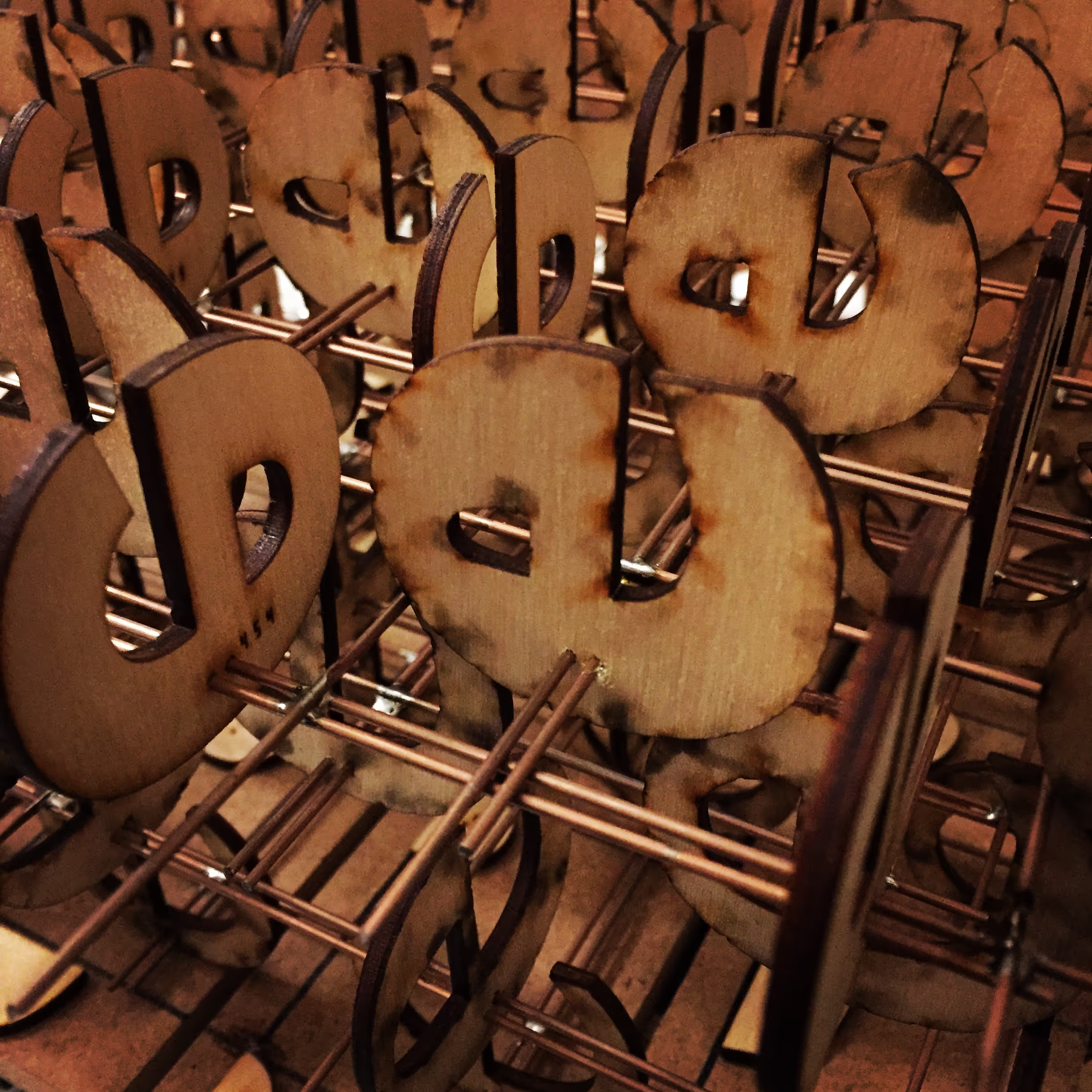
Letters skewered on supports, ready for assembly.
Assembly
A board cut to the right size with spacers helped to position the letters on the wires and also to solder them together. From front to back the letters were mounted on two wires to reduce torque. Diagonals were added for structural strength, a bit improvised but they look alright. Then a quick coat of spray paint to finish it off.
From theory to practice
When Noordzij made his cube it was to show his theoretical model. It indicates how a designer can think about shapes, the degrees of change available. The cube really was the first conceptual designspace: it has evolved into a model of interpolations and variable fonts. Not just the shapes a designer can think of, but all the shapes a font can make. These were not necessarily the same thing. That means the design needs to be good in every region of the designspace. Noordzij’s image shows seven of the eight contributing masters, but less than half of the results. The actual physical cube shows all of them.
Discoveries
Having the cube as a physical object really helps to discuss the ideas it represents. It reveals the shapes at the center: low contrast things that look like everything and nothing. Also, surprisingly, lifting the cube at the top center shows it is not balanced: it is heavier on one side. The weight of the type manifests itself!
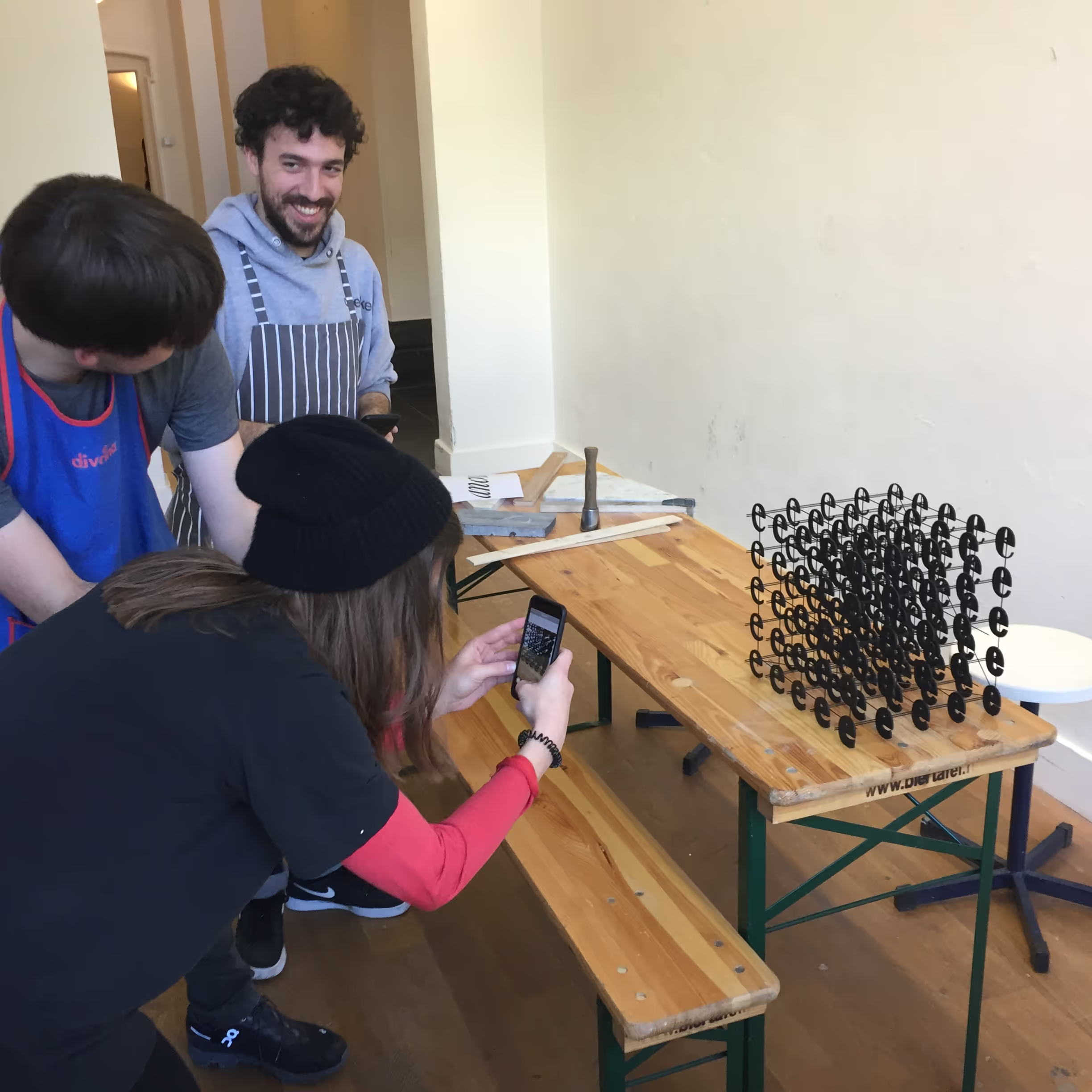
May the cube be with you. Impress friends and family with your own Noordzij Cube!
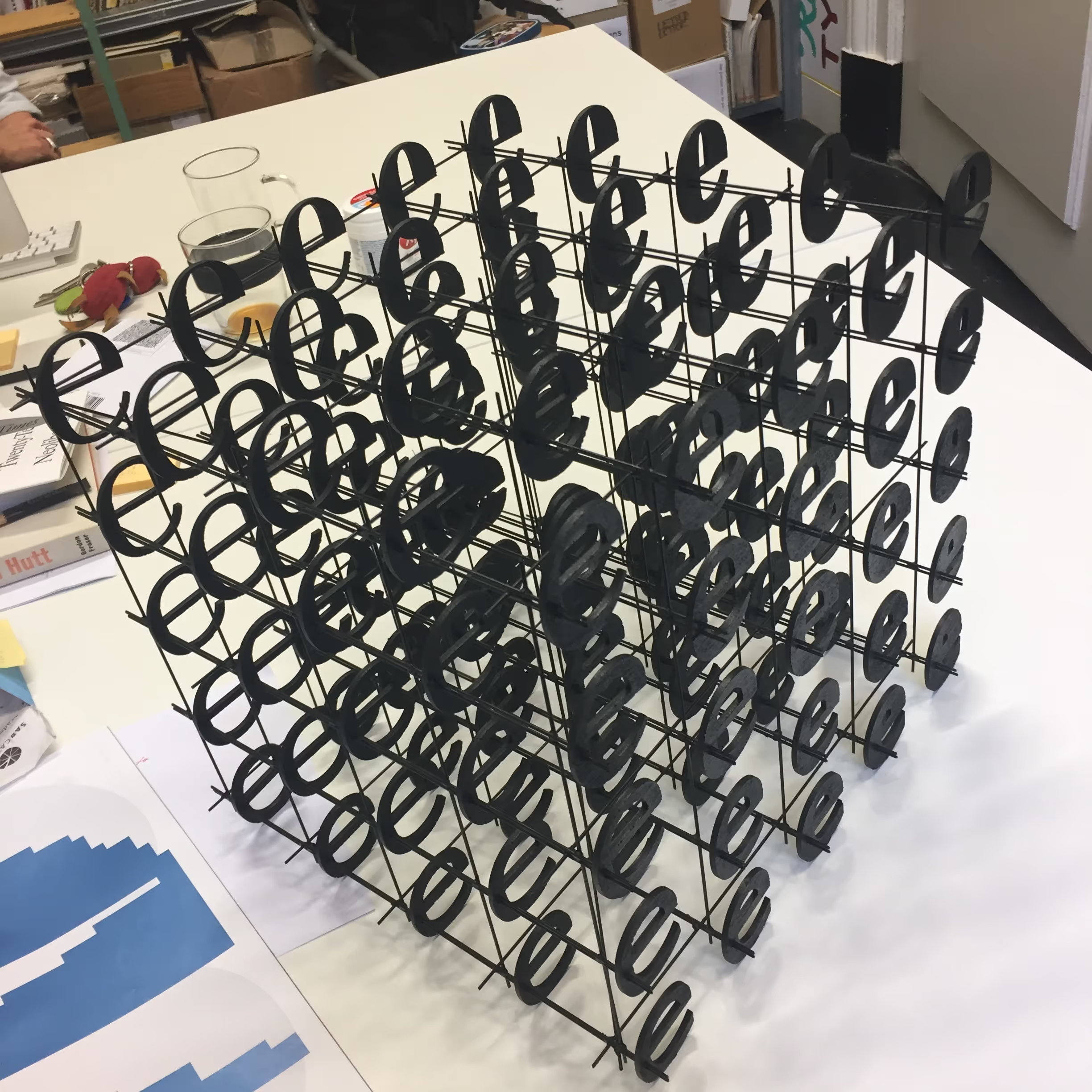
While its theoretical implications are massive, the actual object fits on a desk.
Detail of the laser outlines, generated with Drawbot.