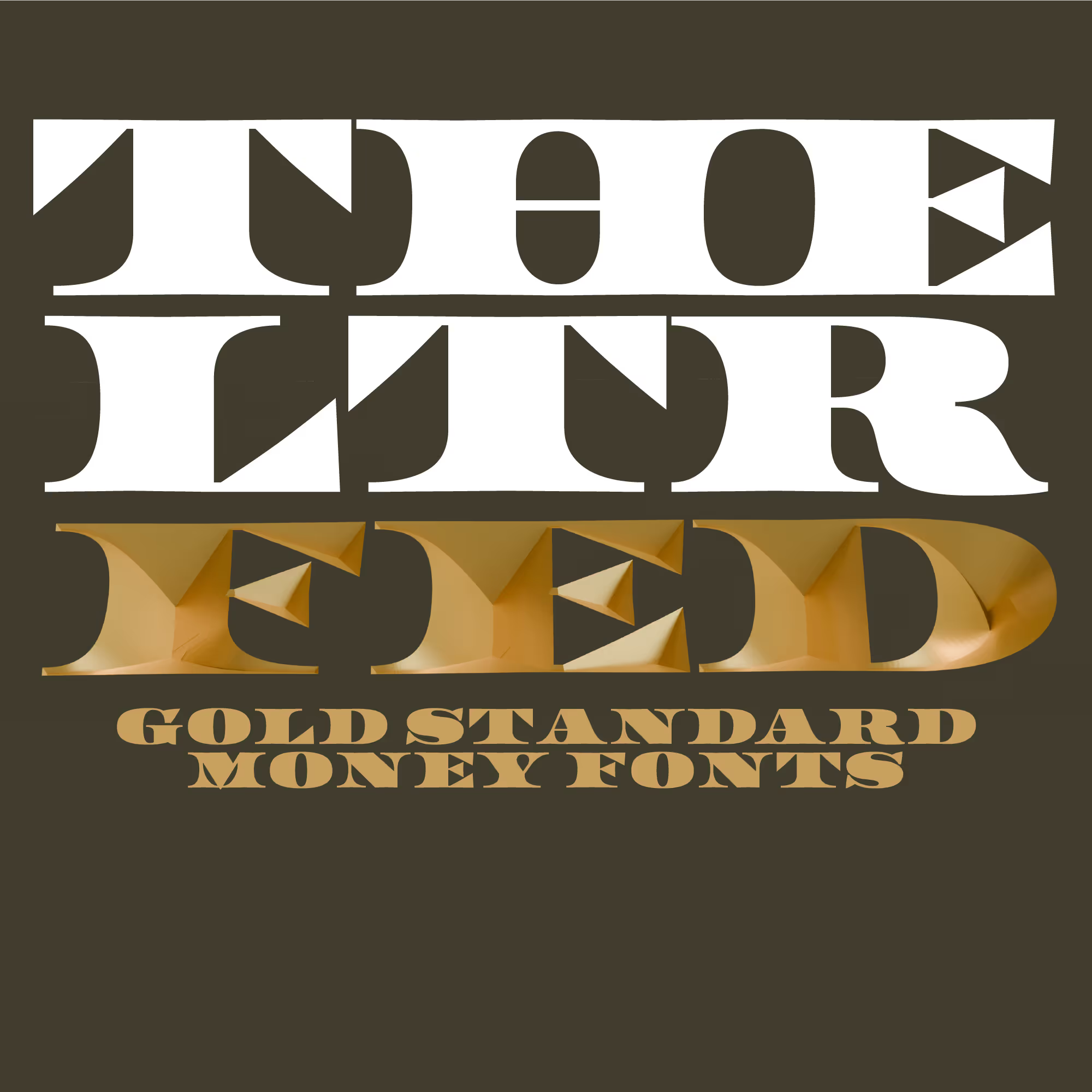
LTR Federal is drawn in the style of the Federal Bureau of Engraving and Printing, but it is not a literal revival. This is the basic style that can be used on its own, but also incombination with the LTR Federal Optical Layers.

| Click for all pricing & licensing options. | ||||
|---|---|---|---|---|
| € | 40 | Single style | CFF OpenType | |
| Available from Adobe Fonts | ||||
| Available from FontStand | ||||
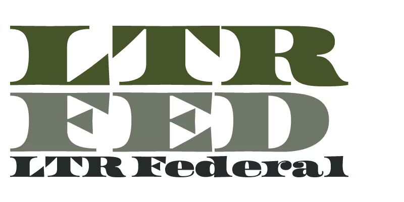
Let the serifs do the talking, they’re loud enough. The lowercase is an appropriate fiction, with massive ball terminals and stems that curve from cap to baseline.
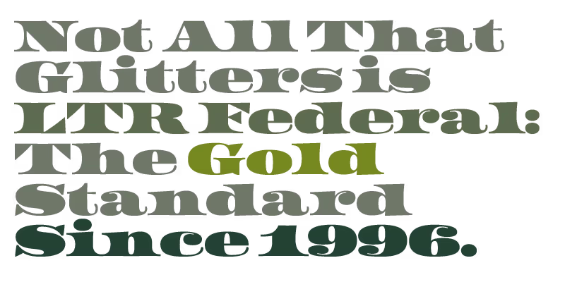
Gold standard, silver standard or even bimetallism? Whatever. LTR Federal is cut from steel and that is what counts.
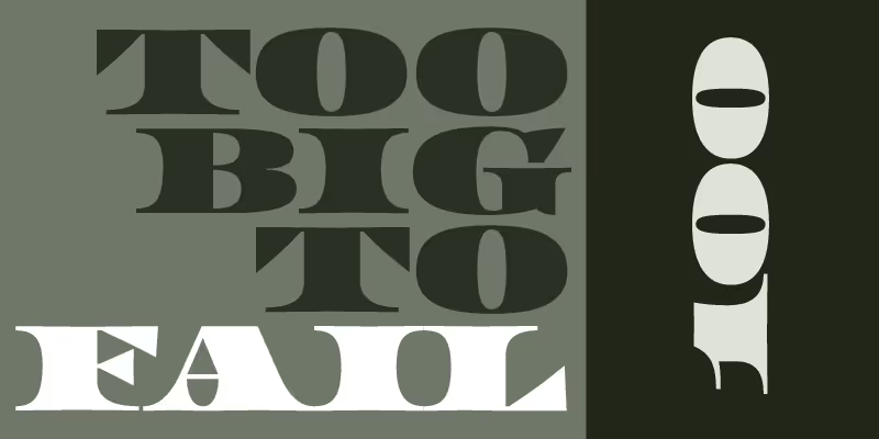
When the global markets crash again, you can rely on LTR Federal to typeset am accusative headline.
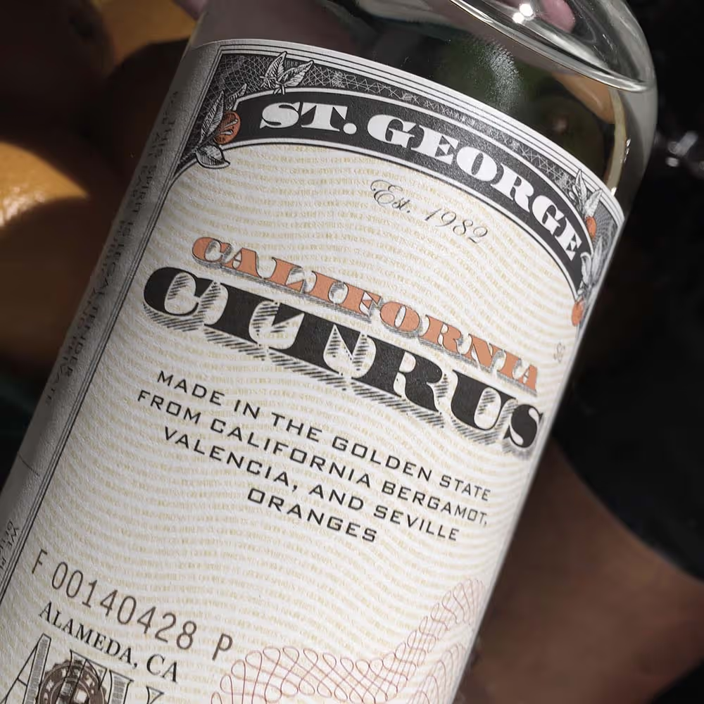
LTR Federal and a slightly modified Shadow from the Optical Layers, and any other carefully picked fonts, used very handsomely on many labels of the St. George Spirits distillery. Designs by Juli Shore Design. These are so good that Fonts In Use wrote an article about them.
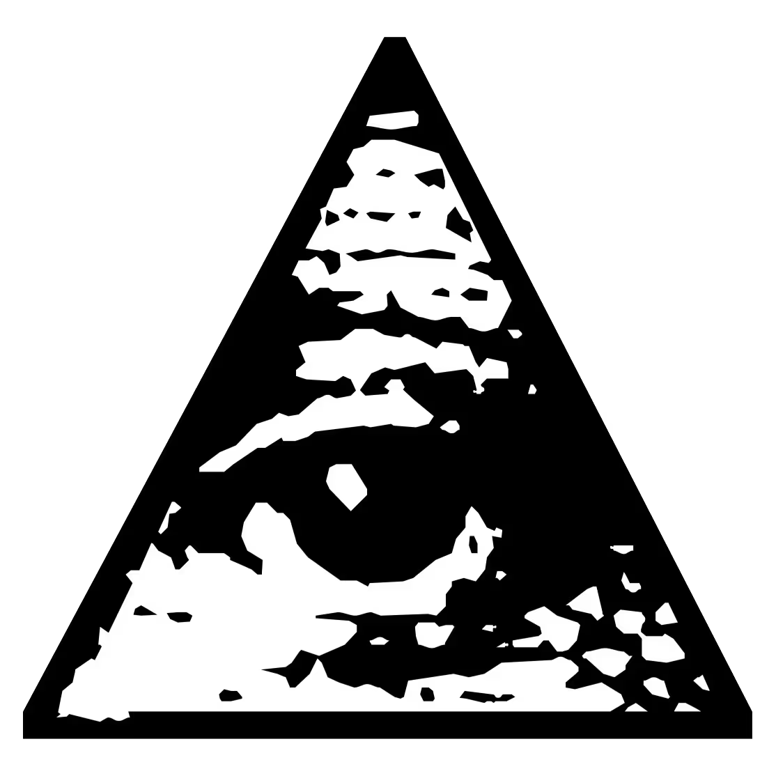
Don’t be dumb: LTR Federal can not be used to counterfeit things. Eh, not because we say so, but experts will be able to tell. Also: included in each font, this eye. It sees you.
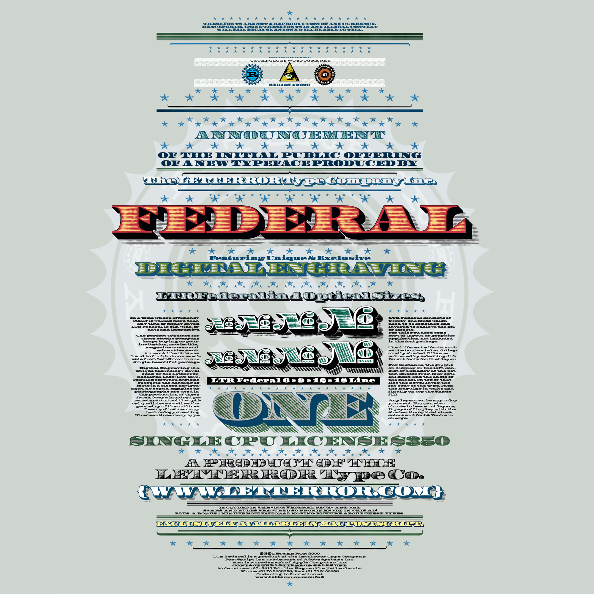
LTR Federal in combination with the LTR Federal Optical Layer sets, and some LTR Slab Extended for the small print. And some really clever use of colors in the layering.