Eames Century Modern: a refined text and display modern for the Eames Office and House Industries. Available at House.
Eames Century Modern
House Industries
Eames Century Modern was designed by LettError and is available at House Industries
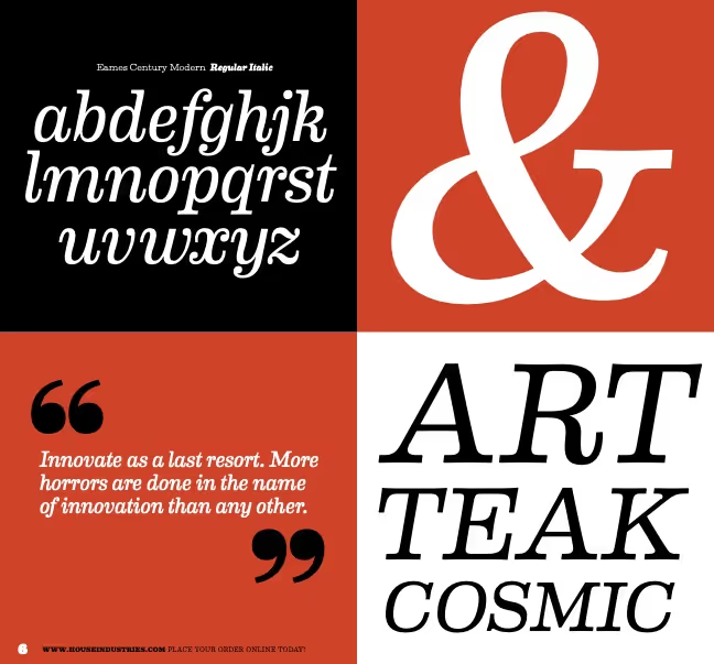
A refined modern for House Industries and the Eames Office. Additional stencil and poster styles. LettError × House Industries. A collaboration with Ken Barber and Andy Cruz. The thins and blacks are excellent display weights, with lovely curves and details that like being at the center of attention. At the same time, the center weights can be used at reading sizes, with a full complement of typographic niceties as smallcaps, superior and inferior figures and fractions.
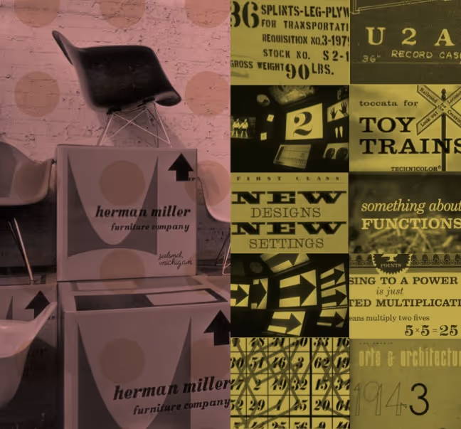
Ray and Charles Eames did not design a typeface. But (as the catalog reads) did leave a lot of clues about what they liked in type and typography. Victorian lettering, wood types and circus posters keep coming back in their works. Such temptation was hard to resist. Together with The Eames Office, House Industries set out on a typographic quest: if they had done a typeface, what would it have looked like?
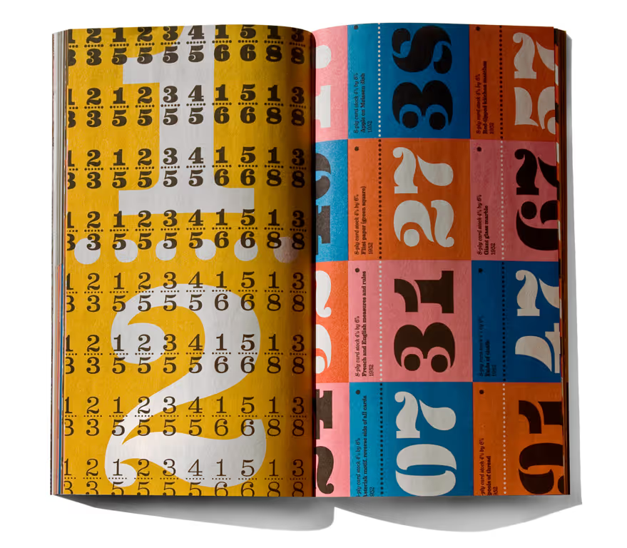
House Industries Eames catalog, 2010, design Bondé Prang, Andy Cruz et al.
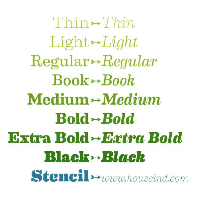
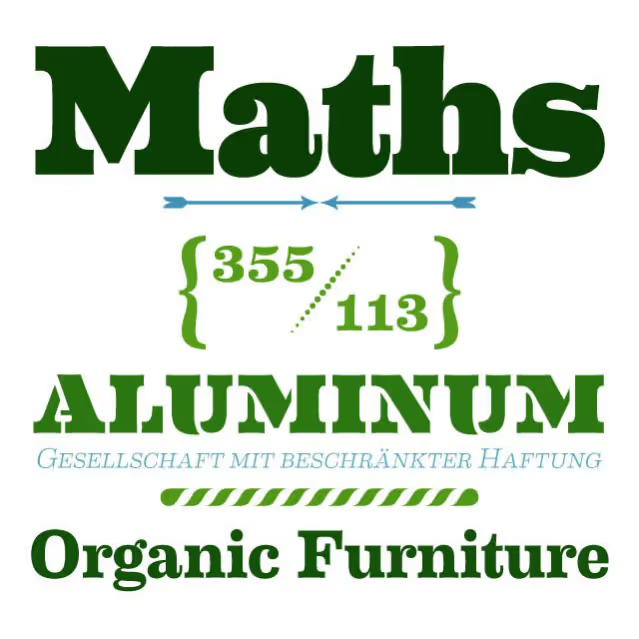
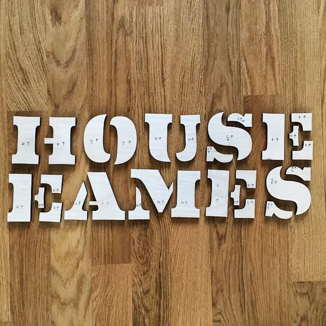
House Industries Eames Century Modern is a mouthful. The eight weights in upright and italics is a lot as well. The Regular through Extra Bold will do great at text sizes. The Thins and Blacks need to big to shine. With a really fun stencil that captures the plywood curves.
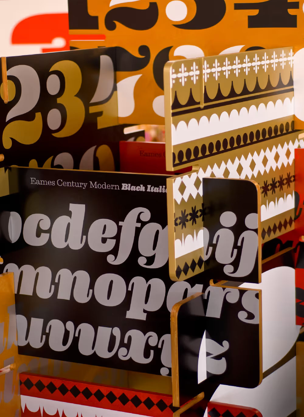
Exhibition with larger than life Eames Century Modern objects at the Eames Office, Los Angeles, 2009.