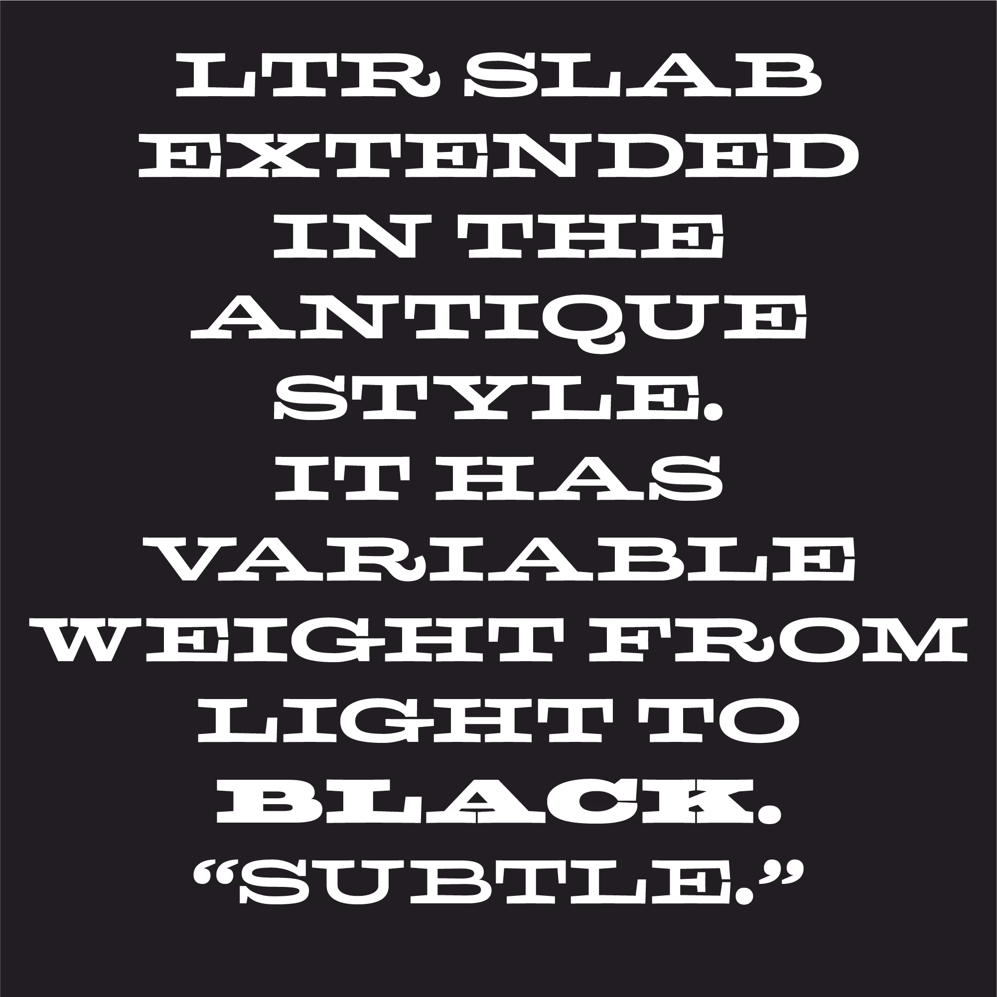
LTR Slab Extended was inspired by historic models but it is not a revival. This low-contrast, slab-serif is the perfect choice when you’ve got all kinds of space to spread out. A variable font, the weights can be dialed way up for page-filling professing. Combine lines of different weights to liven up long lists. Its name is so wide and heavy we can only show it abbreviated.
LTR Slab can be used as a period-correct support-act next to any of the LTR Federals. For instance for smaller sizes, as a contrast to the shaded materials.
| Click for all pricing & licensing options. | ||||
|---|---|---|---|---|
| € | 80 | Variable font with weight axis • VF fonts contain multiple styles in a single file, and are priced accordingly. | TTF Variable | |
| Available from Adobe Fonts | ||||
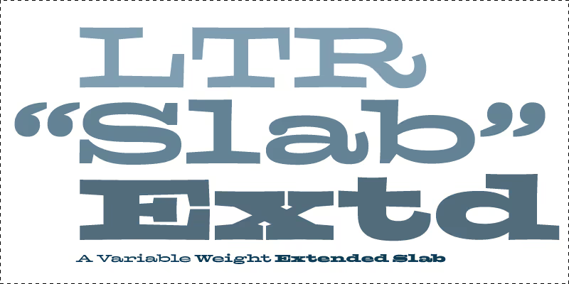
A headliner so wide it can’t even show its full name.
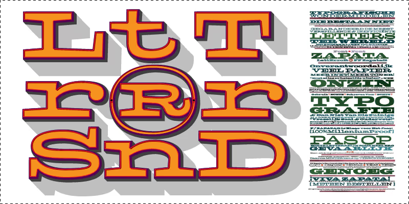
It does not take much to make a logo with LTR Slab Extended.
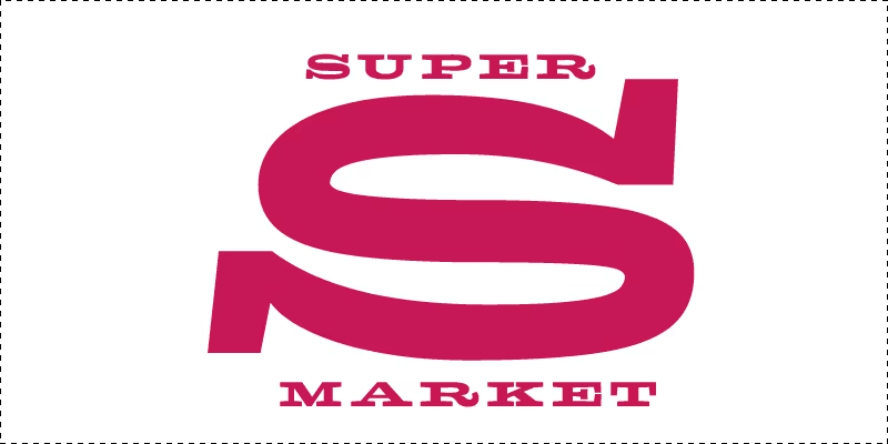
Not Superman®, surely. But each letter in LTR Slab Extended has weight superpowers and could be your next logo, just like that.

“LettError is seditious enough to give color to the faded image of internet as a formal innovator. An ironic element is that the expression chosen by LettError betrays a nostalgia for the printed medium in the last stage of its progress: the newspaper. This is where the graphic forms of typography and cartoon flourish…” — Gerard Hadders, The LettError Book, 2000.

The Frank Sinatra School of the Arts, identity designed by Pentagram. Documented on Fonts In Use.

More architectural use in the LettError front door. Three milimeter stainless steel keeps the critics at bay.