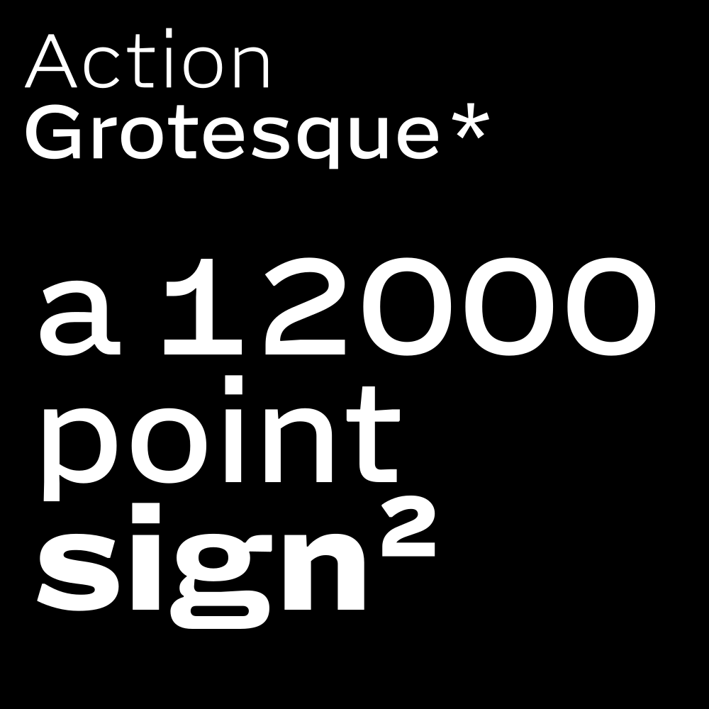
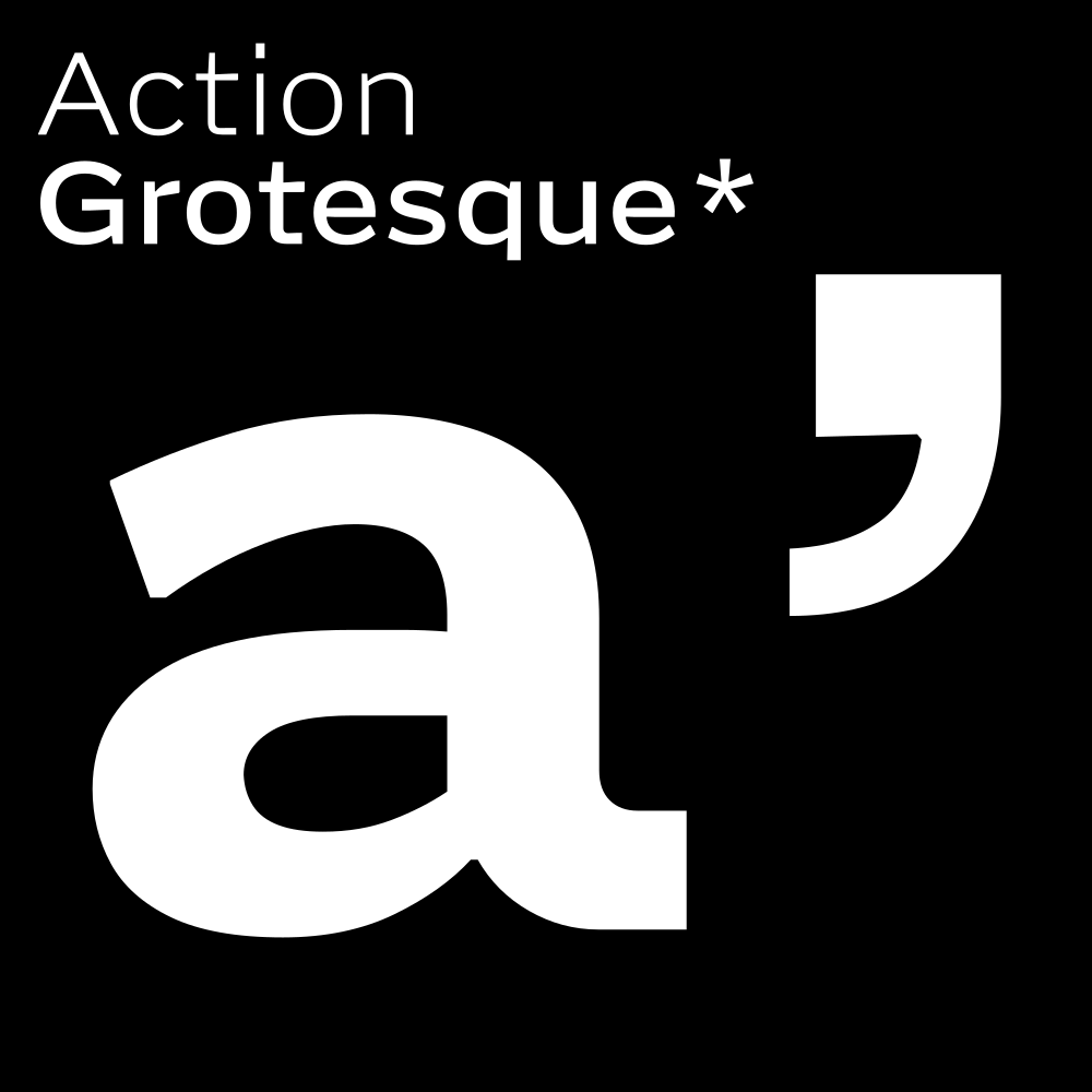
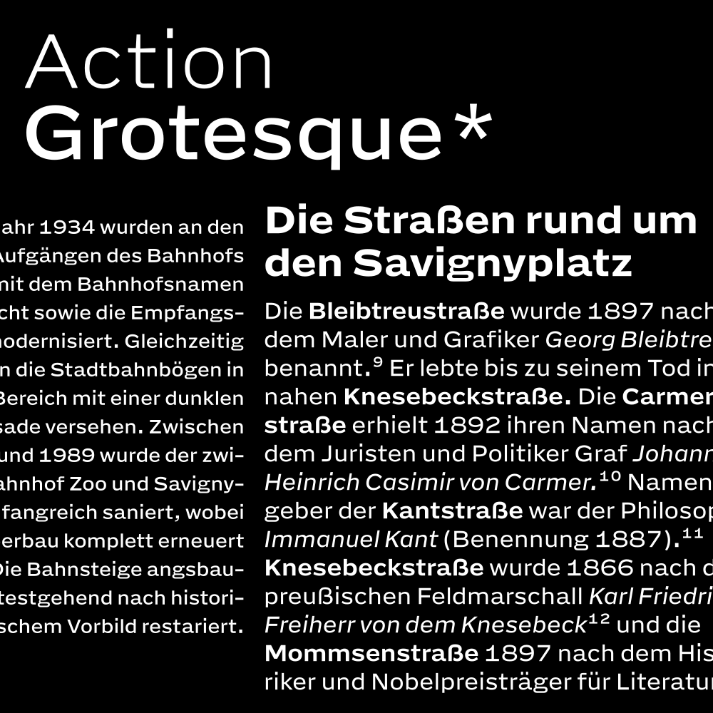
Designed to work from the smallest decipherable shape to a comfortable reading text on a device. → You could even slap it on a wall with an arrow and it will get you somewhere.
This is Action Grotesque: the screen-first, variable-first, reading-first companion to Action Condensed.
For readability and legibility you must pay attention to the font size and weight, as well as the
distance to the reader
But before that you need to pick a good typeface, and Action Grotesque is here to help.
“AG” shows up for work at 7 point and keeps going. It offers very fine control over
text density and hierarchy
and has an extended characterset, including matching italics for all your semantics.
These pages have a responsive grid and can show more columns on wider screens. The text wants to show off its skillz in the small, so be prepared to squint and don’t be affraid to follow the footnotes. There is also a page showing off AG’s big type energy.
What are we looking at?
Comfortably at the center of the Noordzij cube , safe from most historic and calligraphic references. Low contrast, no extreme weights, no super tight kerning, a bit boring. AG is drawn for complex, structured information with fine-grained control over weight. The thins are readable, the bolds are bold, the figures and punctuation stand their ground, and the diacritics stick around for as long as needed.
Bright, crisp, modern screens are amazing, and AG was drawn to behave well on all of them. While hinting can improve the appearance of some shapes on some screens, this entire typeface was built readable in small sizes, and the short descenders create room for slightly bigger capitals and x-height.
If you need to convince someone in your organisation, pitch to senior leadership, present to a client or just kick it up the escalation framework: copy these useful points to a powerpoint and speak the words with confidence:
|
unclaimed brand potential |
Showpony!
|
|
“This typeface offers essential micro typographic controls that are vital for our responsive publication portfolio.” |
Guaranteed*
|
100 Thin + Italic. 250 Light + Italic, 400 Regular + Italic. 475 Book + Italic, 550 Medium + Italic, 700 Bold + Italic, 800 Heavy + Italic, 900 Extra Bold + Italic.
Characterset
This edition starts with quite a comprehensive Latin that includes support for Vietnamese. While it is debatable how useful these metrics are, according to Hyperglot Action Grotesque supports 385 languages, around 3.1 billion speakers. This includes the Koeberlin S glyphset. Before we embarrass ourselves decorating English words with diacrïtics they really do not need, this page has an overview of the complete characterset.
Bạn đã tìm thấy bản dịch rồi!
AG doesn’t squish the diacritics, it stacks them. Translated with Google.
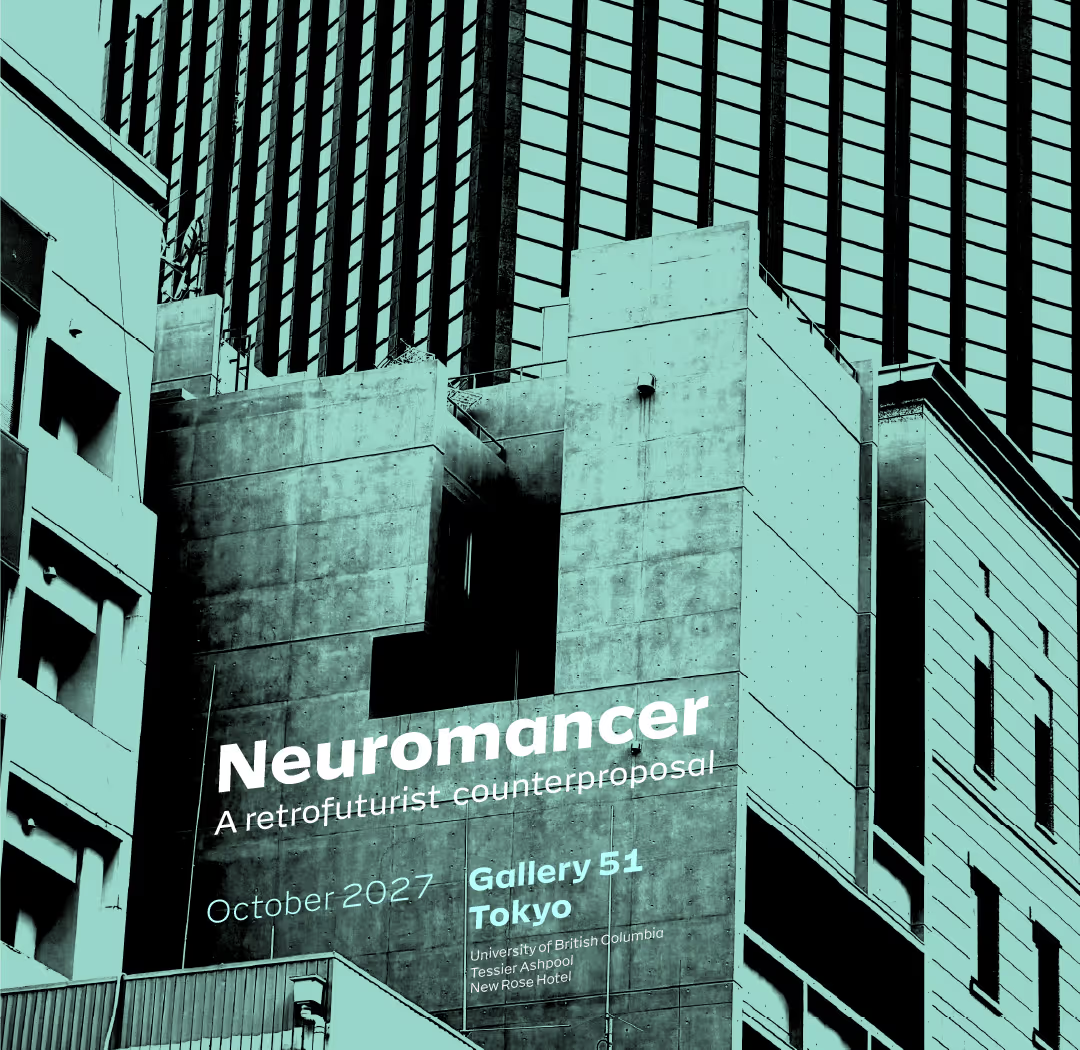
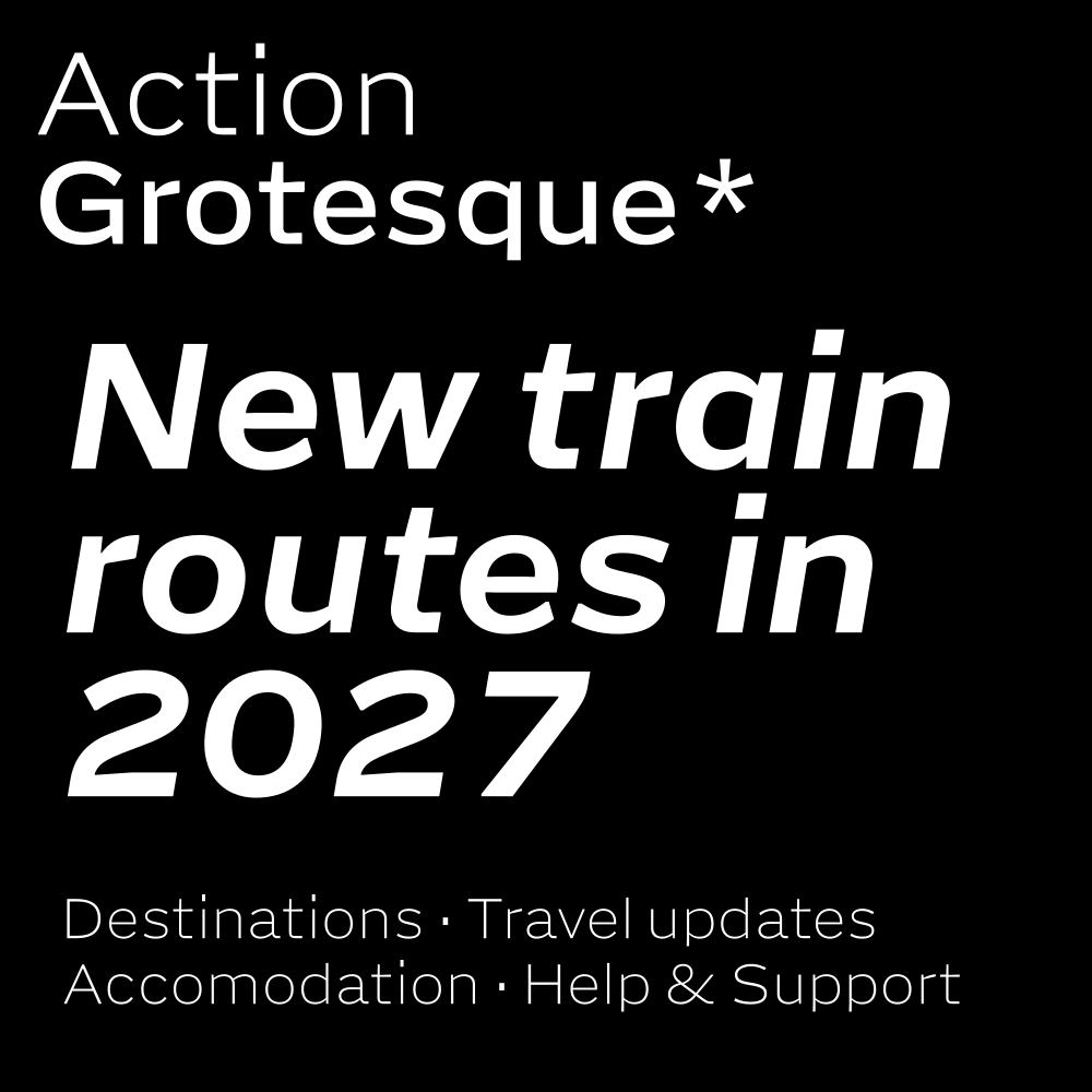
Scale: Is that lettering on a building? Or a photo with cleverly placed text? What’s the scale here?
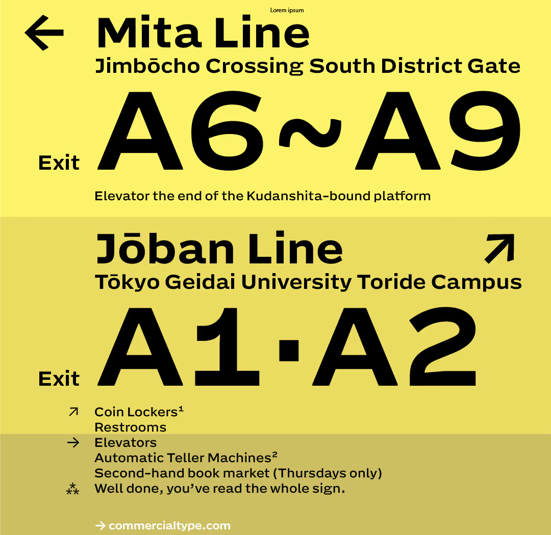
Far and further: polydirectional arrows tell you where to go today. A typographic system for small and distance.
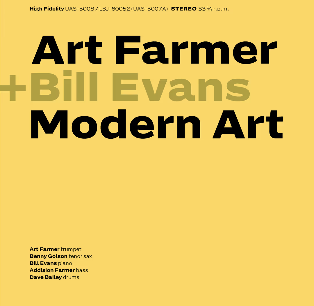
Size and structure: Hierarchies in weight and size in Extra Bold & Light.
Proportions and sizes
| Weight |
Size
em units |
|
|---|---|---|
| Thin | Hmp, | 45 |
| Regular | Hmp: | 84 |
| Extra Bold | Hmp. | 207 |
|
Tabular width
in all weights and italics. All currencies at tabular width as well. |
0=23
9+76 $€₼₦ |
800 |
|
Arrow width. Two arrows are as wide as three tabular glyphs.
This may not serve any practical purpose, but there it is. |
|↑↓|
|123| |↙↘| |
1200 |
Really Good Arrows
Action Grotesque wants you to go places. It has a set of carefully designed arrows ←↑→↓ which are rotated for the diagonals ↖↗↘↙. All nicely proportioned and positioned to fit in running text, matching weight and angle. ←H↑b→g↓. Will work anywhere.
Exit↗
Above: a text with an arrow that fits aesthetically pleasing between baseline and cap-height. The strokes on the arrows have some modulation. Note I did not put some unexpecting citizen in a shopping trolley, roll them through an empty building at considerable speed and risk in order to question them afterwards about any signs they may have recognised on the way. Did not happen.
And yet. Trigonometry has an observation to offer: if shapes work in the very small, they will work at a distance as well. Action Grotesque will do fine on your walls, pointing your peeps to their destinations.
Plan your visit →
What’s on →
Tours →
The tabulars
Hey, aren’t these called figures? Yes, you are right. In all styles and weights the figures {pause, stare} have the same width of 800 units. This might be useful if you are making tables and want to emphasise some of digits in a different weight. Big whoop, you might say. But dear reader you are reading the captions in a type specimen and this is absolutely the type of information one can expect here. So I expect some understanding.
100,000,049
213,161,503
679,389,209
999,999,937
Four 9-digit prime numbers, in different weights. Can you tell which ones are missing? Call them and see what happens!
Useful OpenType® things
Some alternate shapes are included for variation, readability, disambiguation, stylistic sophistication and perhaps a bit of pedantry.
|
Barred uppercase I, J
and hockeystick l. |
Illustrée Jupe |
| Schoolbook a | Aabenraa |
| Open tail g | Ingredients |
| Proportional width alternate for the figure 1, pnum. |
010
010 |
| Optical size variants: smaller versions of things that are very small already. |
a™ a™ a™
a® a® a® a@b a@b a@b |
| Variants of the percent: The default shape lines with the numerals, works great in text at small size but is a bit wider than tabular. The second percent is tabular but not lining, it uses the available vertical space to keep the zeros big enough. The third percent is both tabular and lining but does not have room for open zeros. |
1%
2% 3% At size: 1% 2% 3% |
| Superiors and inferiors, slashed zeros, fractions |
CO2=mc2
C3P0 12 ½ 1/2 ³⁵⁵⁄₁₁₃ |
| Uppercase variants for containers and some punctuation |
[T](P){B}
N-P ¿H? E@L |
No ligatures
Very rarely are ligatures a solution to a real problem: most of the time they just sit around, ill-proportioned and badly spaced, only to pop up when you least expect or need them. Therefore AG has no ligatures. But it does have connecting alternates for the lowercase f and t, creating some combinations with the next letter. Mostly to give such combinations some room to breathe.
betting
office
With discretionary ligatures on, the t will connect with some more letters.
mighty
outfits
The flag of the f has to be tucked in with the other ascenders. A smidge taller than the cap height, but shorter than the first tier diacritics. dfbfi. The combination of ascender size, and counter-opening trapping makes the f resemble a Star Wars® stormtrooper. But see, in small: it is just an f.
Ifdfbfj
The diacritical friends below look a bit chonky, perhaps, closeup. But I wanted them to be unique enough so that at the smallest size there is enough material for disambiguation. This page has an overview of the complete characterset.
Ặṗçļą
At 8 point: Ặṗçļą HẶHnṗnçnļnąn
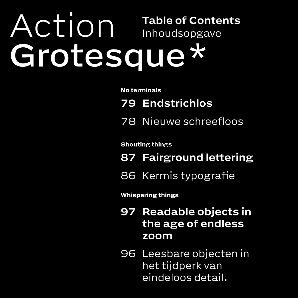
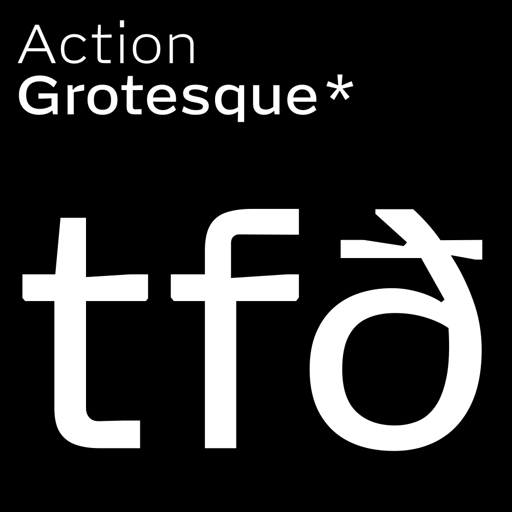
Rarely seen
Tiny cuts and flat bits help rasterisation. Are these inktraps then? Strictly, no: there is no ink to trap. But by adding some space between incoming and outgoing line segments, the counters become a bit clearer? Do I have scientific proof for this? Nothing beyond my own observations. The nick at the tail of the R is also present in Action Condensed.
R
Uppercase Q with a tail, lowercase q with a descender. Some will say the Q takes up too much room, whereas the q will be too short? Well. Quosque tandem! I think both of these shapes make sense at the small size. The Q needs to disambiguate from O, and maybe also the Ǫ, so the tail should not be reduced in size.
Small Print Book Club
Were they? Consulted I mean? Well, yes, the books were. It’s not a particularly long list, is it? I suppose. I mean, I can also take it out? No, leave it, it’s fine. It is always nice to have a list of books.
-
De Vinne, Theodore Low, Plain Printing Types, Oswald Publishing Company, New
York, 1914. p.315.
De Vinne could afford to have strong opinions about type. He was not trying to sell fonts. “Gothic: the simplest and rudest of all styles.” I’m sure he would have something interesting to say about Action Grotesque.
Also footnotes 10. - Mosley, James, The Nymph and the Grot, Friends of the St. Bride Printing Library, London, 1999.
- Noordzij, Gerrit The Stroke, theory of writing. Current edition Uitgeverij de Buitenkant, Amsterdam, 2021.
- Tracy, Walter, Letters of Credit, David R. Godine, Boston, 1986. Lots of practical information about proportion and size.
Colophon
This typeface, the typography of this mini-site, most of the writing*, the CSS, by Erik vB, so a convenient one-stop for blame. ©2026. All rights reserved.
Many thanks to Frederik Berlaen, Tal Leming, Just van Rossum, Amy Ramsey, Petr van Blokland, Paul Barnes, Christian Schwartz, Peter Verheul and Aleksandra Samuļenkova.
No chatbots or LLMs consulted, all written, drawn and coded by hand.
*Some of the text borrowed from Wikipedia, sources listed wherever possible or relevant. Persons and organisations mentioned in the sample text do not endorse, support or even know about Action Grotesque.
Fontversions
Action Grotesque Upright __version__
Action Grotesque Italic __version__