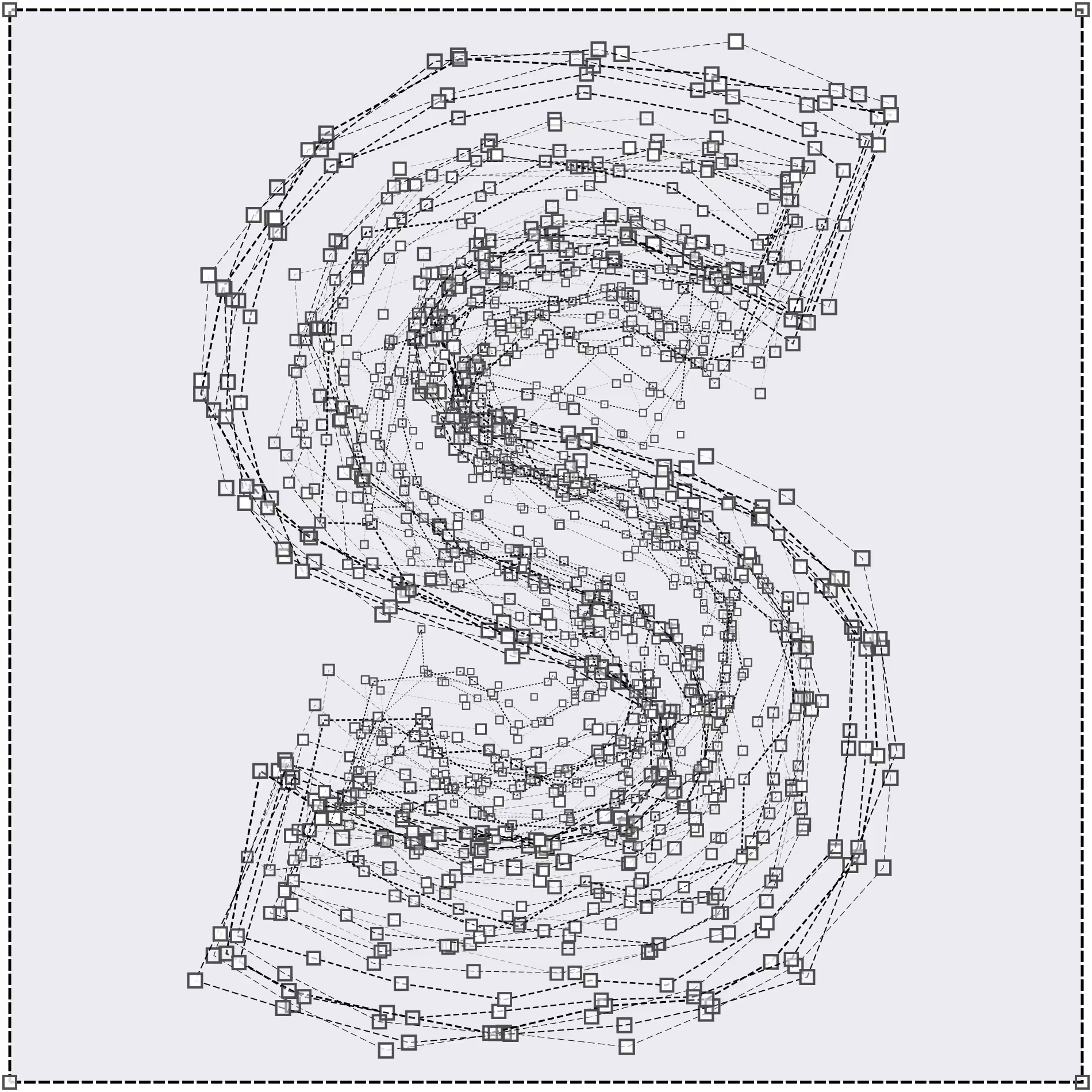
LTR BeoSans is the sans serif alternative to LTR Beowolf, drawn by Just van Rossum. Each
character in LTR BeoSans cycles through six different iterations. The appearance is undeniably random, but
it also means the processing can be done in finite time. While we appreciate the stark philosophical
aesthetics of the warmer Postscript, we can not actually discount the pleasure of printing a page.
These sanses are available in regular and bold weights. As for the hard and soft versions: these you need to
check out for yourself, the textures are very different. Each style includes three degrees of
pre-computed jaggedness (R11, R12, R13) for a total of twelve distinct variations.
Design: Just van Rossum, 1990.
| Click for all pricing & licensing options. | |||||
|---|---|---|---|---|---|
| € | 40 | Single style | CFF OpenType | ||
| € | 220 | Collection with 20 fonts | All the fonts | ||
| One-time fee for perpetual use. | |||||
| Available from Adobe Fonts | |||||


Different outline styles: All straight lines and angles in BeoSans Hard. The Soft on the other hand has no straight lines at all.

Six fully randomised variations for each glyph, in both the Soft and the Hard Beos. That means the letters in your copy will not show repetition until way down the line.

Different degrees of randomisation: from almost normal to wild.
Critical reception for Randomfonts
Clippings from the time when a freestyling PostScript printer was somehow world news.

Museum of Modern Art in New York: “The sameness of type seems an arbitrary thing that we can do away with in certain cases.” In order to achieve this effect, they substituted the programming commands “lineto” and “curveto” in the PostScript code (PostScript is a computer program that describes what the outlines of letterforms are designed to look like) with their own command “freakto.” “Freakto” causes a letter to be randomly generated with erratic outlines.” LTR Beowolf in the permanent MoMA design collection
Emily King, Frieze: “While Beowolf and their subsequent random fonts have broken with current typographic convention, LettError view the standardisation of letterforms that resulted from mechanical typesetting not as typographic perfection, but merely as a phase in a much longer history of written communication.” Frieze, 1995. Profile on LettError
Emigré #18: Type-Site: “While working on Randomfont we became aware that if we treated typefaces as computer data, instead of fixed letterforms, we could create some very bizarre systems.” Article text. / See the whole magazine at the LetterForm Archive

Robin Kinross: “LettError has investigated how things might change, and how you might set up a system that accomodates and provides useful change. One can see this even in the progression from Beowolf, which had an excess of variation, and to no great effect to the Flipper fonts that followed.” LettError: Nypels Prize. Unjustified Texts, perspectives on typography. Hyphen Press, 2002. New release at Editions-b42
David Berlow: “After letting each apprentice make my Laserwriter cry for its motherboard, I taught them what I could, about output that could be designed. And Beowolf, as it became called, faded into a typo-technical dream-time, waiting for the united motherboards of planet earth, or something, to lighten up!” Review of Beowolf and BeoSans on Typographica in 2008
David Crow: “Their aesthetic clearly celebrating the handmade and the physical, LettError harnessed digital technology to create letterforms by art-directing the multiple possibilities programmed into their bespoke software engines.” Eye Magazine, Winter 2008
John L. Walters, Fifty Typefaces That Changed the World, 2013: Beowolf, true its almost-namesake Beowulf, remains an uncaged beast, and in its ingenious subversion of digital code the typeface anticipates the process-driven and interactive design of the twenty-first century.
Erik Spiekermann, Wired Magazine, 1995 You made the first “random” typeface, called Beowolf, by replacing the commands “lineto” and “curveto” in the PostScript code with your own command “freakto”. The new command calls up a random generator that makes the character outlines irregular. When you created Beowolf, were you trying to prove something, or was it just a joke? Article
Willem Velthoven, MediaMatic, 1990: Seemingly trivial and maybe aesthetically not very pleasing. Beowolf is of important polemical value. Van Blokland and Van Rossum proved it possible to part with the rigidness that has characterized type since Gutenberg. If the forms of a character can be modulated by a random figure it also becomes possible to let a character interact with its environment, be it either typographical, semantic or semiotic. Article