LettError is a studio for type design and typography, based in The Hague, Netherlands. Making headlines since 1989.
Hello!
LettError has been producing category defying designs since the early days of digital type. Curiosity about why things are done as they are, combined with a dedication to developing new tools, has resulted in a diverse body of work that pushes the boundaries of what type can be and do.
The groundbreaking ideas for the Randomfonts and all subsequent irreverence was in collaboration with Just van Rossum.
LettError is not a portfolio with IP and trademarks, managed by private equity after a leveraged buy-out. This is a busy studio for new type design and typography, based in The Hague. People making stuff for other people? Owned and operated by Erik van Blokland. All fonts and trademarks owned by LettError unless specifically mentioned otherwise.
LettError newsletter: Sign up!
Inquiries & Support
License LettError fonts
- Right here on LettError.com
- Commercial Type for the Action typefaces
- House Industries for Eames Century Modern
Adobe Fonts
Activate LettError fonts for Creative Cloud
FontStand Fonts
Activate LettError fonts on FontStand.com
Socials
Github
Friends
- TYPETR: Petr van Blokland
- Shapes for Cash: Timothy Donaldson
- TypeSupply: Tal Leming
- RoboFont: Frederik Berlaen
- Bold Monday: Paul van der Laan & team
- Type By: Fred Smeijers + team
- Hex Projects: Nick Sherman
- XYZ Type: Ben Kiel & Jesse Ragan
- Future Fonts:
- Boom Type: Promphan Suksumek
- Vette Letters: Donald Roos, Donald Beekman & team
- Font Club Belgica: Frederik Berlaen & Dries Wiewouters
MA TypeMedia, KABK
P104
So lucky to share the space at Studio P104 in The Hague.
Misc., Stickers
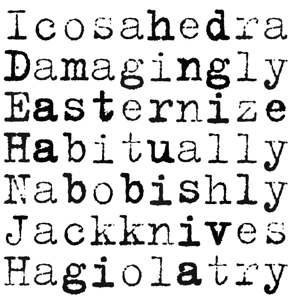
Animated colorfield, calculated with MutatorMath, a Python library for complex type interpolations. But also useful for abstract motion.
Animated digital V-cut in Blender, with Lars van Blokland. For the book “Lettercarving for type designers” by Françoise Berserik.
Critical reception for Randomfonts
Clippings from the time when a freestyling PostScript printer was somehow world news.

Museum of Modern Art in New York: “The sameness of type seems an arbitrary thing that we can do away with in certain cases.” In order to achieve this effect, they substituted the programming commands “lineto” and “curveto” in the PostScript code (PostScript is a computer program that describes what the outlines of letterforms are designed to look like) with their own command “freakto.” “Freakto” causes a letter to be randomly generated with erratic outlines.” LTR Beowolf in the permanent MoMA design collection
Emily King, Frieze: “While Beowolf and their subsequent random fonts have broken with current typographic convention, LettError view the standardisation of letterforms that resulted from mechanical typesetting not as typographic perfection, but merely as a phase in a much longer history of written communication.” Frieze, 1995. Profile on LettError
Emigré #18: Type-Site: “While working on Randomfont we became aware that if we treated typefaces as computer data, instead of fixed letterforms, we could create some very bizarre systems.” Article text. / See the whole magazine at the LetterForm Archive

Robin Kinross: “LettError has investigated how things might change, and how you might set up a system that accomodates and provides useful change. One can see this even in the progression from Beowolf, which had an excess of variation, and to no great effect to the Flipper fonts that followed.” LettError: Nypels Prize. Unjustified Texts, perspectives on typography. Hyphen Press, 2002. New release at Editions-b42
David Berlow: “After letting each apprentice make my Laserwriter cry for its motherboard, I taught them what I could, about output that could be designed. And Beowolf, as it became called, faded into a typo-technical dream-time, waiting for the united motherboards of planet earth, or something, to lighten up!” Review of Beowolf and BeoSans on Typographica in 2008
David Crow: “Their aesthetic clearly celebrating the handmade and the physical, LettError harnessed digital technology to create letterforms by art-directing the multiple possibilities programmed into their bespoke software engines.” Eye Magazine, Winter 2008
John L. Walters, Fifty Typefaces That Changed the World, 2013: Beowolf, true its almost-namesake Beowulf, remains an uncaged beast, and in its ingenious subversion of digital code the typeface anticipates the process-driven and interactive design of the twenty-first century.
Erik Spiekermann, Wired Magazine, 1995 You made the first “random” typeface, called Beowolf, by replacing the commands “lineto” and “curveto” in the PostScript code with your own command “freakto”. The new command calls up a random generator that makes the character outlines irregular. When you created Beowolf, were you trying to prove something, or was it just a joke? Article
Willem Velthoven, MediaMatic, 1990: Seemingly trivial and maybe aesthetically not very pleasing. Beowolf is of important polemical value. Van Blokland and Van Rossum proved it possible to part with the rigidness that has characterized type since Gutenberg. If the forms of a character can be modulated by a random figure it also becomes possible to let a character interact with its environment, be it either typographical, semantic or semiotic. Article