Lettering for the Kloosterkerk
An interesting typographic challenge before summer (2026), as part of the renovations of the Kloosterkerk in The Hague.
The church renovation team wanted to accentuate the entrance. GVB Architects from Leiden planned a semi-circle in Belgian Bluestone, with an inscription: the name of the church and two lines. One to be read by those entering, and one for the leaving: peace for those who come here, a blessing for those who leave from here. I was asked to look at the proposed typography.
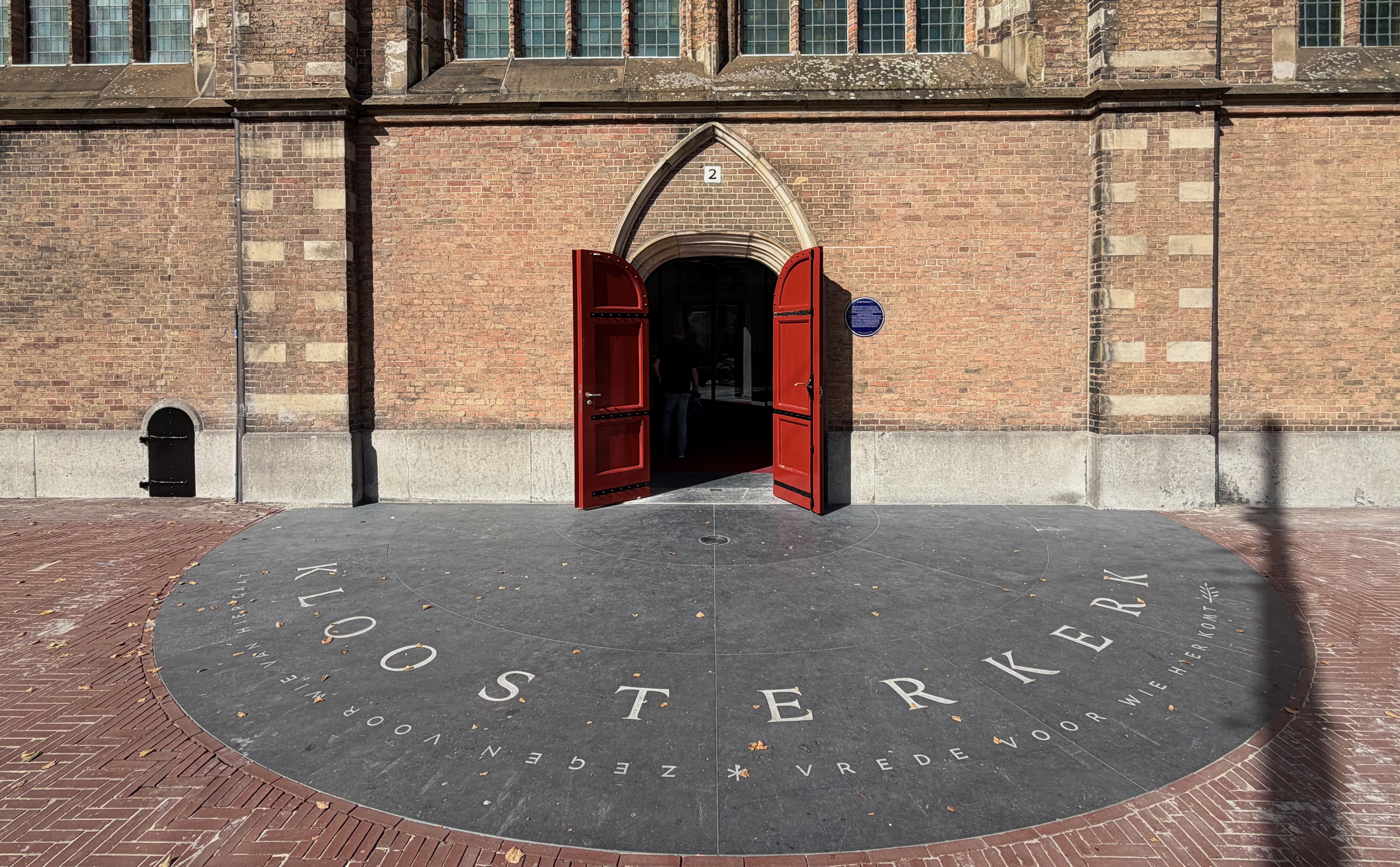
The entrance and the tiles are in place. September 2026.
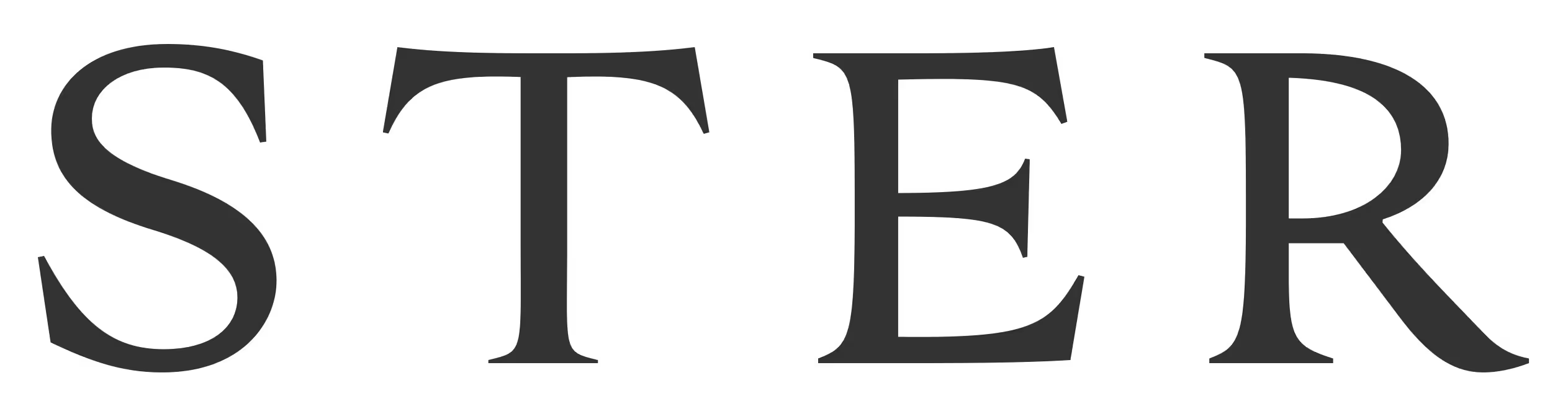
Not too calligraphic or brushy, but with a recognisable reference to pre-modern proportion and contrast. The horizontals in the T and E bend a little with their curved path. Joyful swooshy shapes for the tails in R and K: the name has five total and it would be a shame to force them all into formal, confining serifs. Something about recognising humanity within the formal.
A carved serif would start at the stone’s surface before it digs into the material. But sandblasting makes the depth even everywhere, even in tight corners. I kept a small, blunt edge on those.
New letters
Using any existing typeface might try to pin the inscription to a particular typographic era and none of
them would make sense. So of course I drew some new letters for this!
To get an idea of the scope: three weeks to prepare a design for the masons. The layout of the tiling was
already, uh, set in stone. The masons,
Boot Natuursteen, had started work on those already. The inscription would be sandblasted and textured. There was no time
to consider carving (I asked). With quick iterations, nimble clients and some helpful math in Drawbot we
made the deadline before everyone left for summer.
The text needed to jump elegantly over the edges of the tiles. I used generous letter spacing to create some wiggle room that would allow the tile edges to fit between letters, without intersecting. This in turn invited some shapes to become a bit wider. All were drawn in RoboFont, then a script in Drawbot read the paths directly and positioned them based on polar coordinates. This offered better control over each letter and some freedom to visualise the lines in different sizes and positions (radius). Proofing in context!
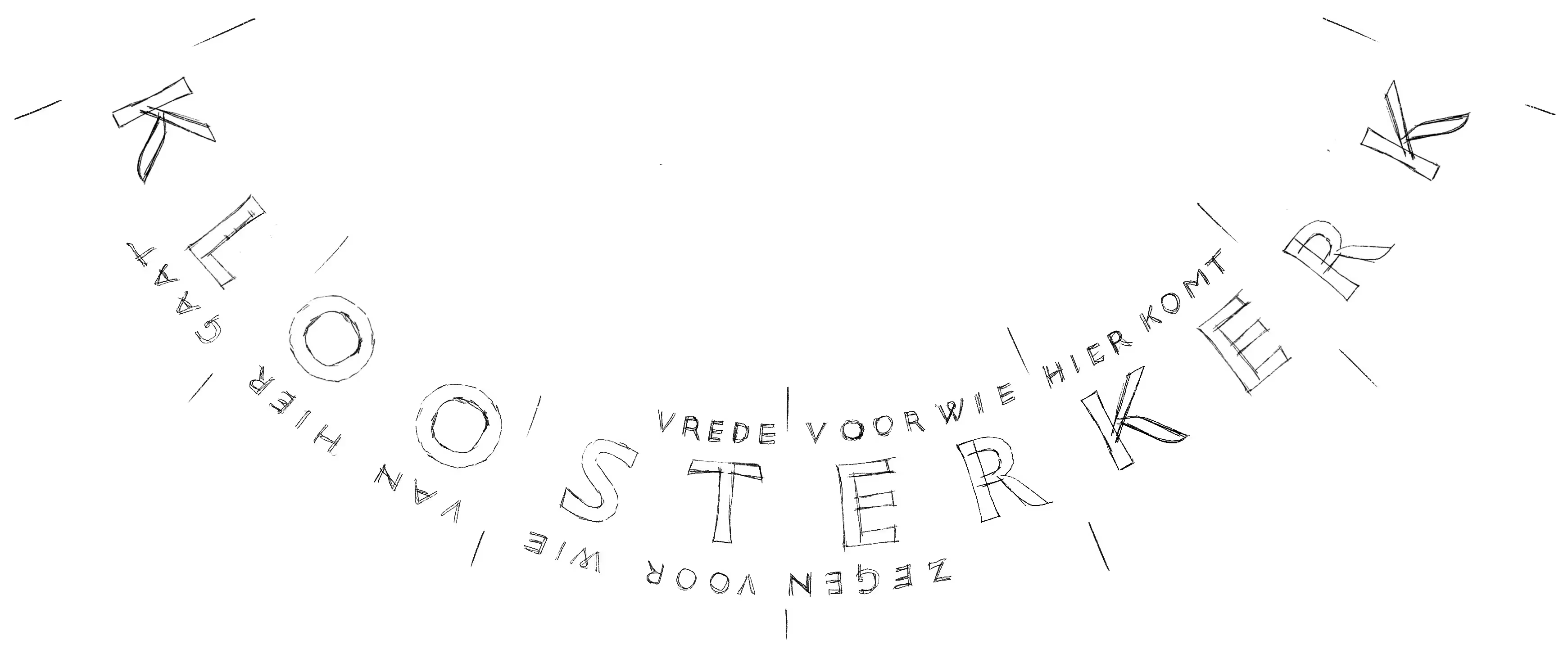
I did some explorations for relative size and contrast and turned one line upside down to make it readable from the position of the leavers. As the two lines are not of equal length I suggested a fish to balance. The renovation team preferred an olive branch, fair enough, will not fight over that.
The diameter of the circle is over 8 meters, The tiles are 130cm tall, the cap height was 25cm— for the name. The small lines are about 6cm. I thought the lower contrast shapes I started with would be too heavy so I reduced the weight, added serifs, and made it all a bit lighter. I drew the smaller lines in a different style to emphasize that these are distinct from the name.
It was a privilege to be able to work with the church renovation team, the architect and the masons, and draw letters for such a historic location. I hope these letters can humbly contribute something to the rich typographic texture of The Hague.
Sketch for layout and proportion. The name is still in the heavier, lower contrast. What
can I say, drawing helps to dismiss early assumptions and gain insight. Flipping the line was a good idea.
↓
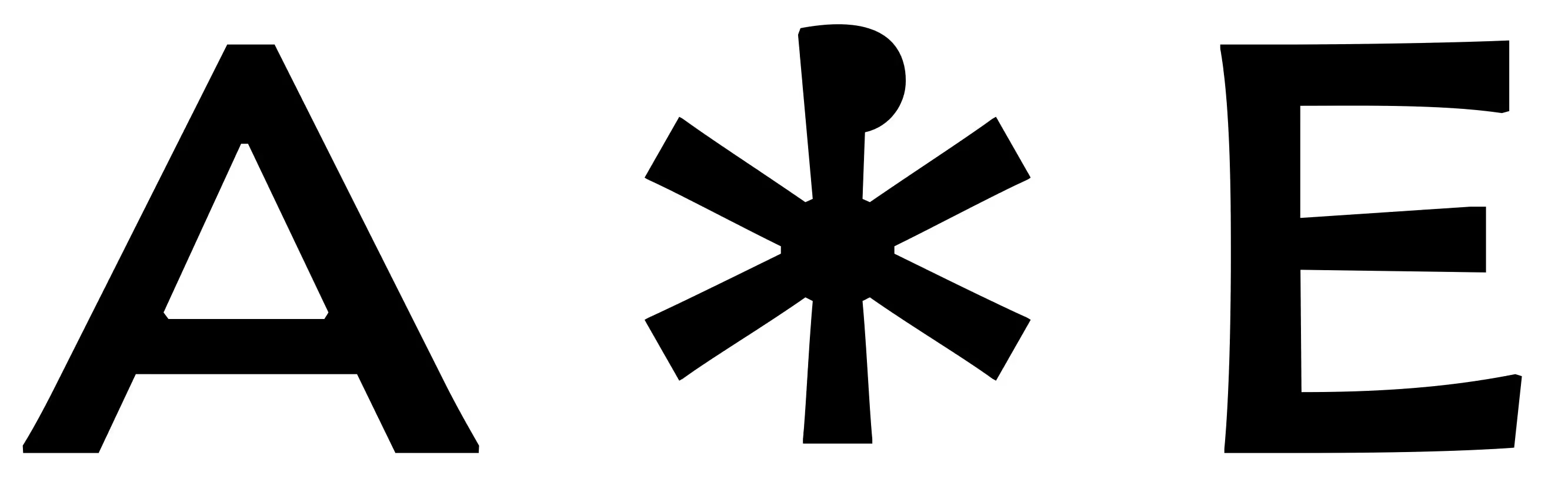
Smallcaps The two lines are considerably smaller. I kept the contrast low so that the thin strokes would have some surface area. Facetted corners, but then some modulation in the strokes and terminals with budding serifs. These horizontals also acknowledge the curved line.
Some of the small letters are the same shape for the arriving and leaving readers. The M and W for instance. This was not absolutely necessary, but definitely a fun discovery for a shoegazing yet typographically astute pedestrian.
Chi Rho: We wanted to mark the division between the arrival and departing line. The church renovation team suggested the Chi Rho Christogram. Drawn to fit the words in matching proportion and weight. With some artistic license: I left out the counter as it would be too small.
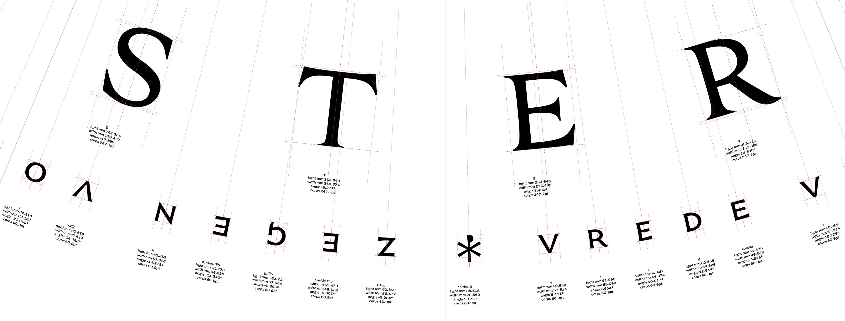
Section of Drawbot output, showing the size and orientation of each letter. Keen observers will note that the upside down letters were flipped in the font, not in the layout. This made the positioning a lot easier. The angle values controlled the spacing and were tuned manually.
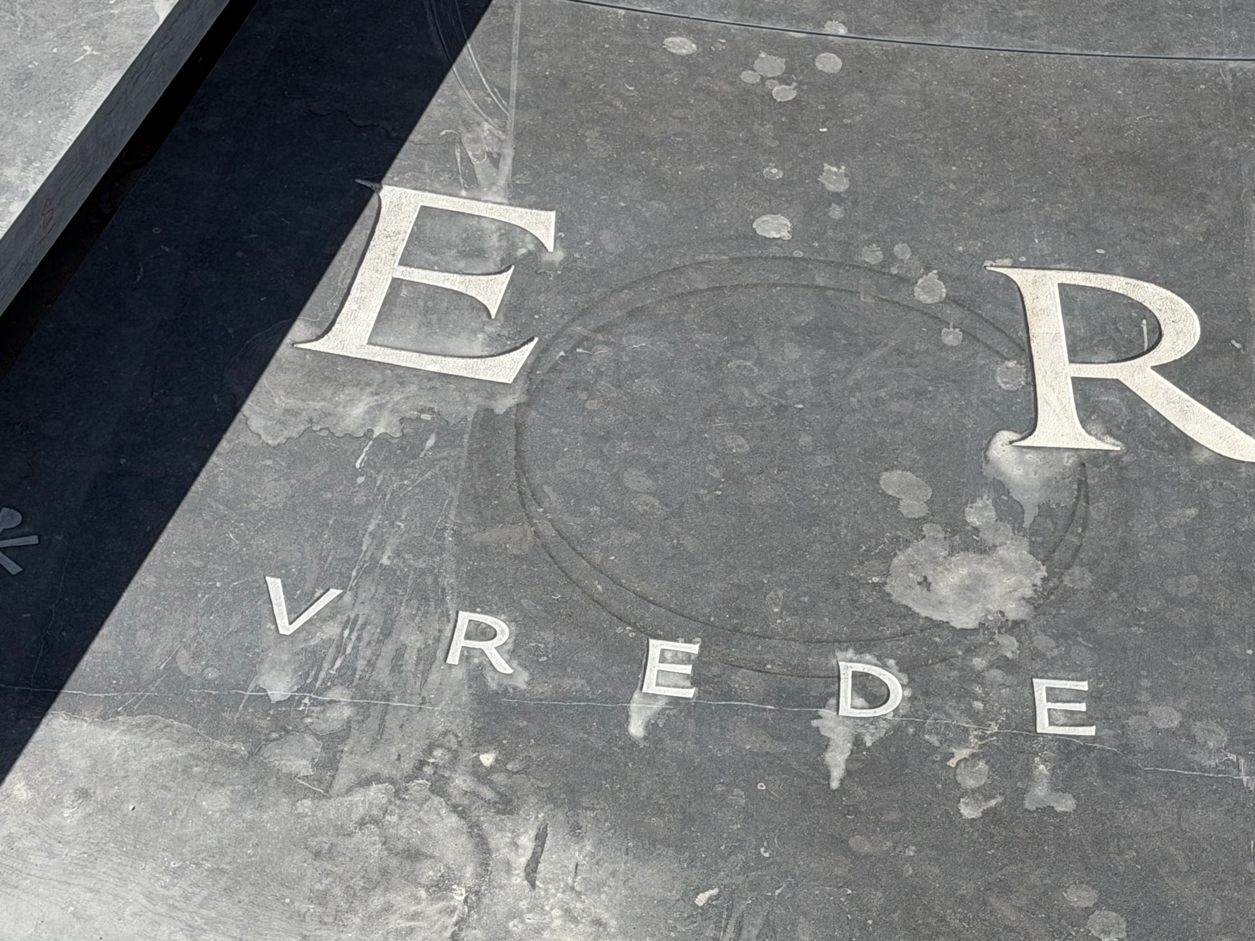
Proportions. The big and the small. One tile temporarily parked during construction, traces of the lifting crane.
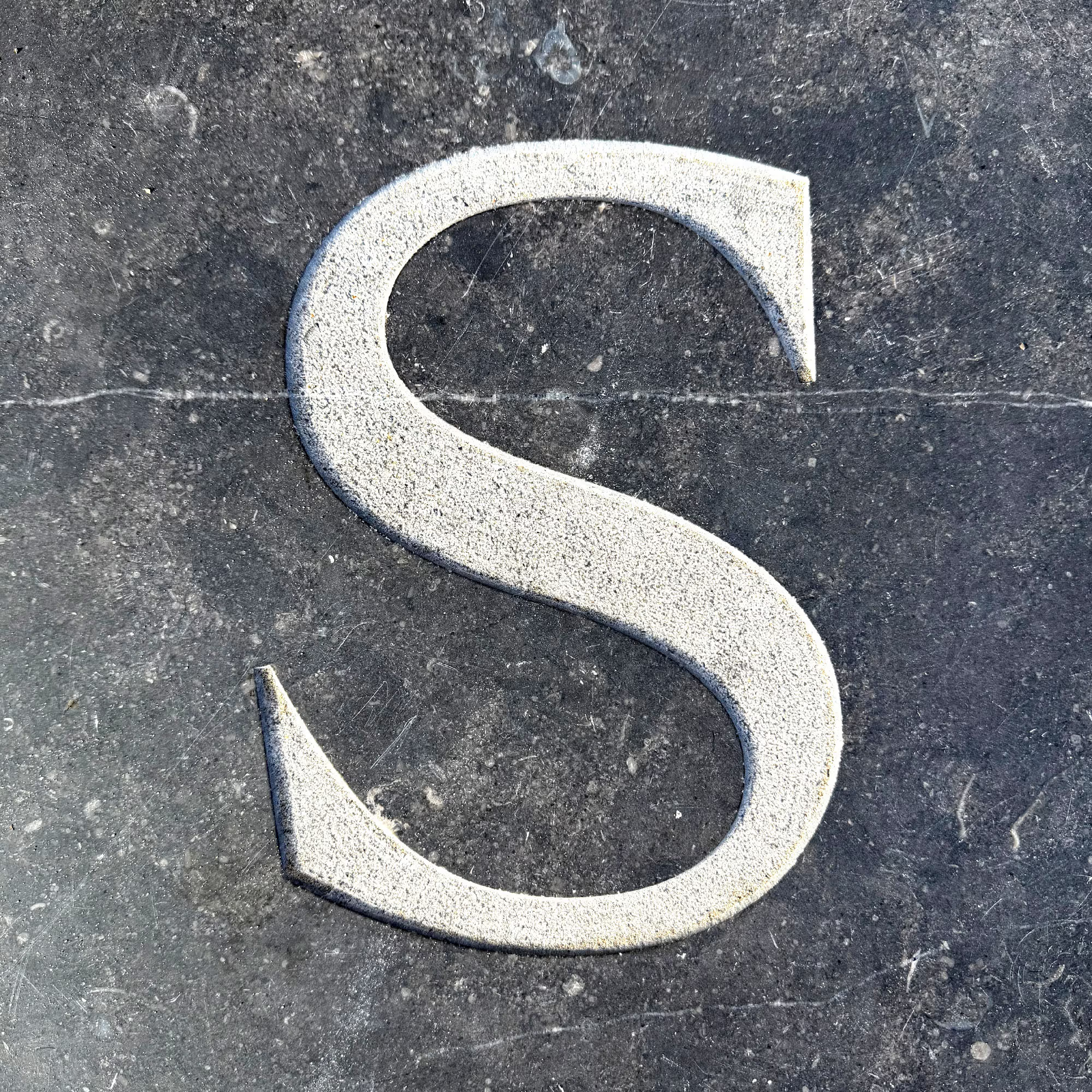
The evening sun enhances the depth of the letters.