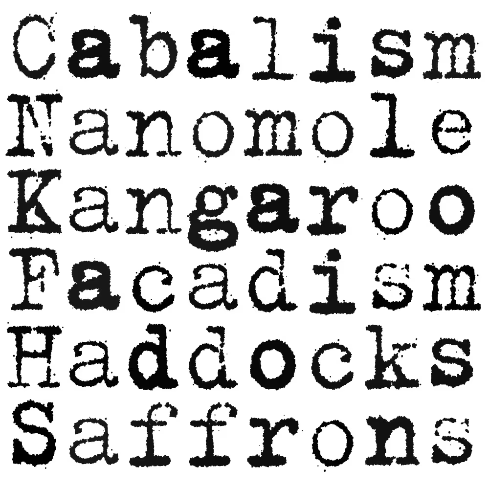
LTR NCND® Rough offers more detail and texture. Otherwise identical to NCND® Classic in every way that matters. If you want to use these classic typewriter shapes really big, in a logo or a title, (and file size is not an issue) consider NCND® Rough. The detail is hyper-realistic: close up real typewriter impressions are actually rather gray and undefined. This rough texture was specifically synthesized to break the straight lines and trick the eyes.
| Click for all pricing & licensing options. | |||||
|---|---|---|---|---|---|
| € | 40 | Single style | CFF OpenType | ||
| € | 80 | Collection with 2 fonts | All the fonts | ||
| One-time fee for perpetual use. | |||||
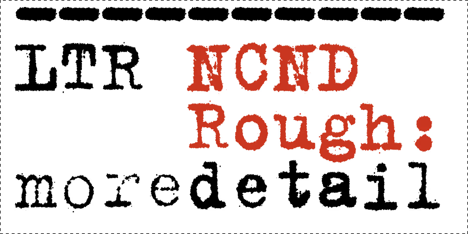
More detail and texture. This means more data and larger fonts. So maybe not for the web.
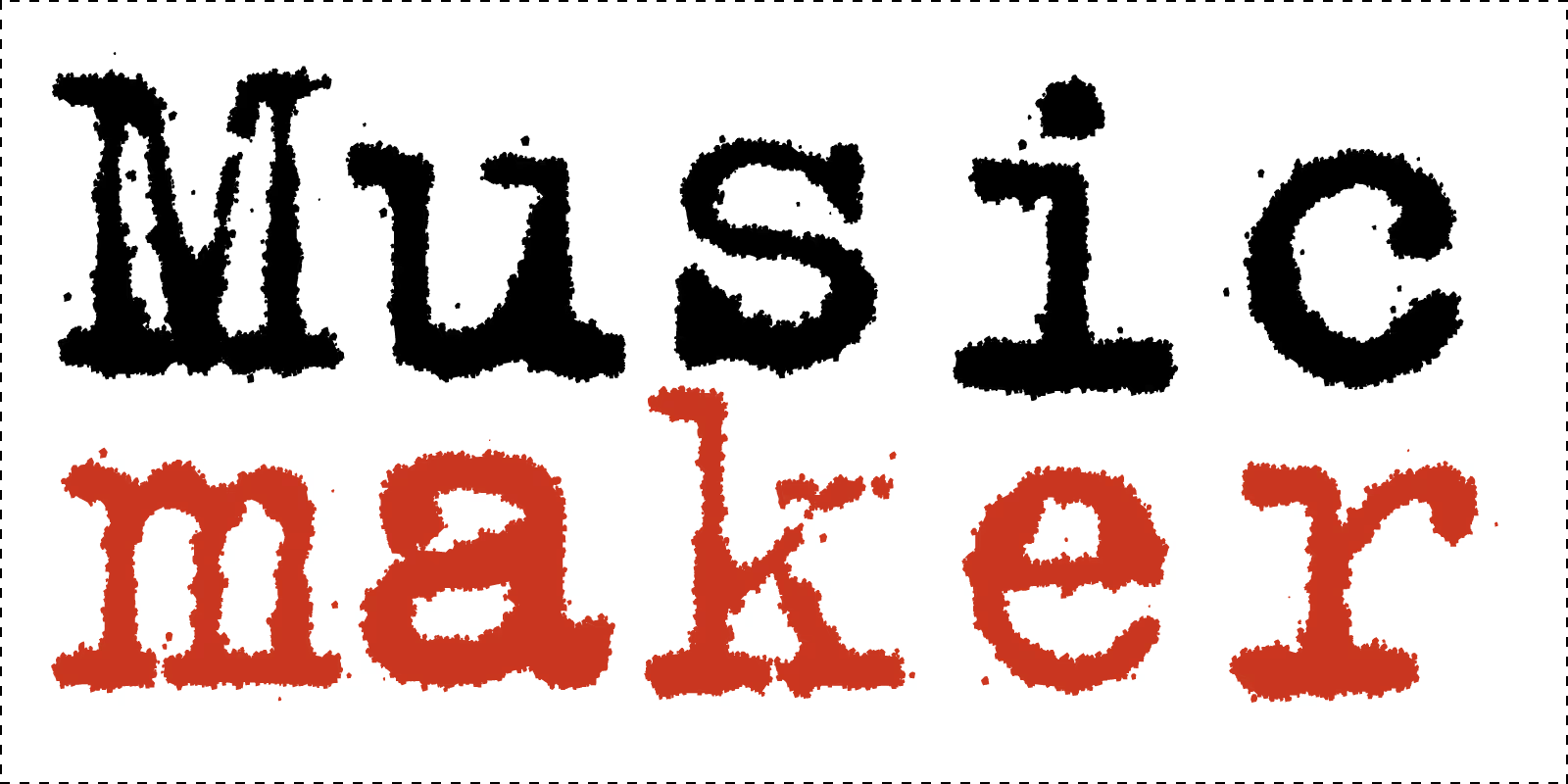
Close up? Make sure there is some texture to look at.
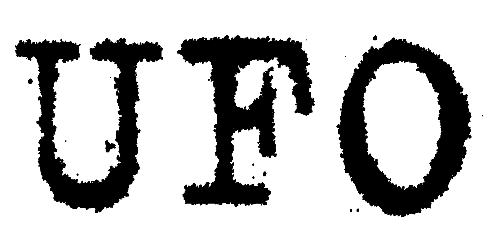
Very good for making props and on-camera hero objects that need some typewriter charm. Not good for forging historic documents that need to withstand scrutiny.
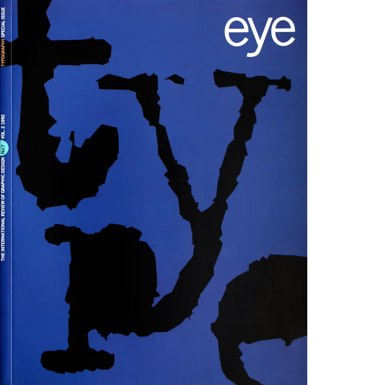
Eye, №.7 Vol. 2, 1992. Cover design by Stephen Coates. Source: FontsInUse.com
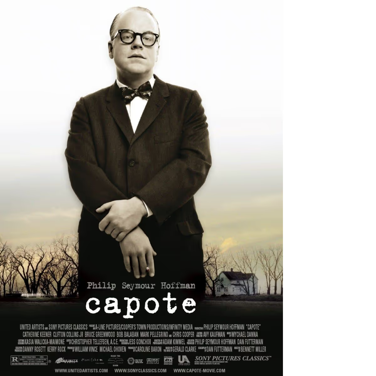
Titling typewriter: titles Capote movie, United Artists, 2005 Source: FontsInUse.com.
Did you ever buy a version of one of the LettError typewriters a long time ago, at FontShop® or Monotype®? Do you need an update? Show us a copy of the original invoice and you’ll qualify for a discount!