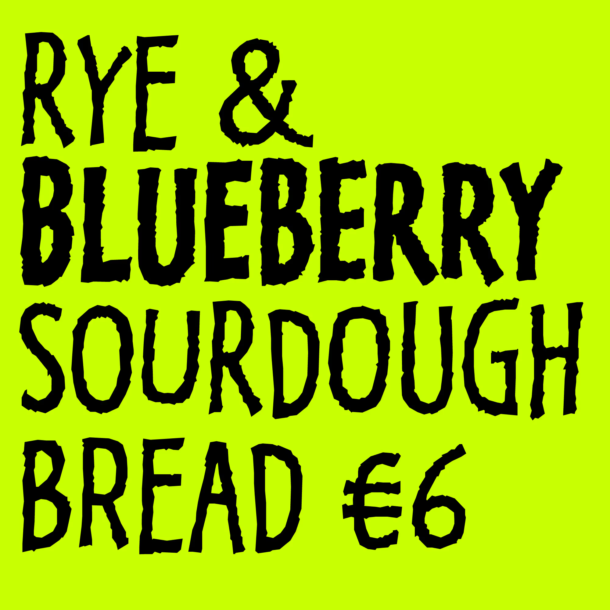

LTR Kosmik addressed the exciting but unpredictable appearance of the Randomfonts. LTR Kosmik offers a more subtle flavor of variation in which each glyph has three distinct, handdrawn shapes. A clever OpenType feature then prevents each shape from repeating, thus tricking the erwder in assuming all shapes are different. This also creates some interesting animation possibilities, see below. Styled as a sketchy, textured sans in two weights. Apparently a great typeface for campsites, petting zoos, farmer’s markets, oatsy diary and all the delicious organic foods. LTR Kosmik is also an excellent alternative for bloody Papyrus.
Oh, I don’t know what we were thinking back then, but LTR Kosmik is spelled with two k’s.
| Click for all pricing & licensing options. | |||||
|---|---|---|---|---|---|
| € | 40 | Single style | CFF OpenType | ||
| € | 70 | Collection with 2 fonts | All the fonts | ||
| One-time fee for perpetual use. | |||||
| Available from FontStand | |||||
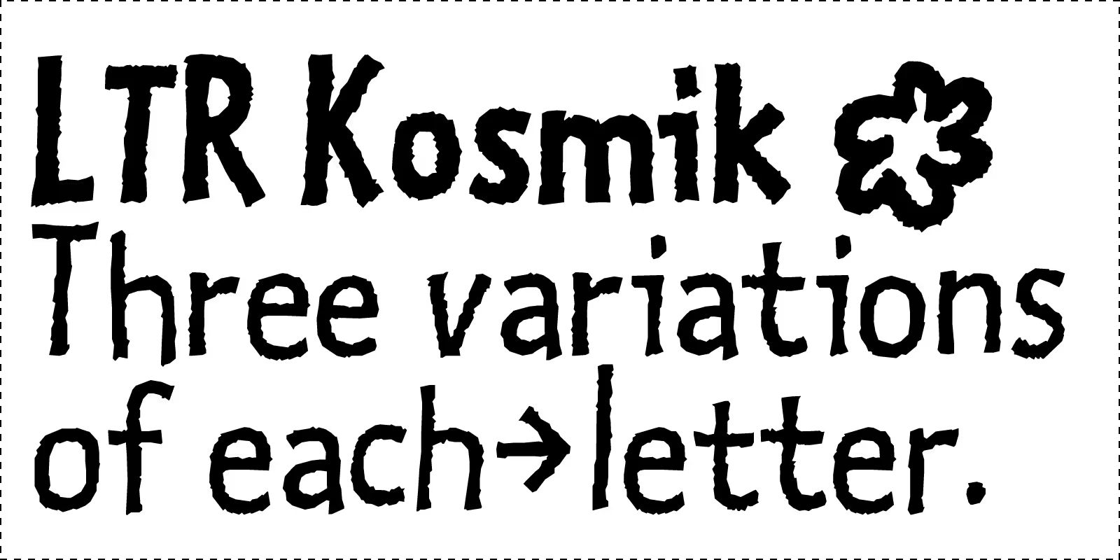
Charm, texture and variation Research showed that with three alternates for each glyph, most repeating patterns could be solved. The German “Sauerstoffflasche” a popular example.
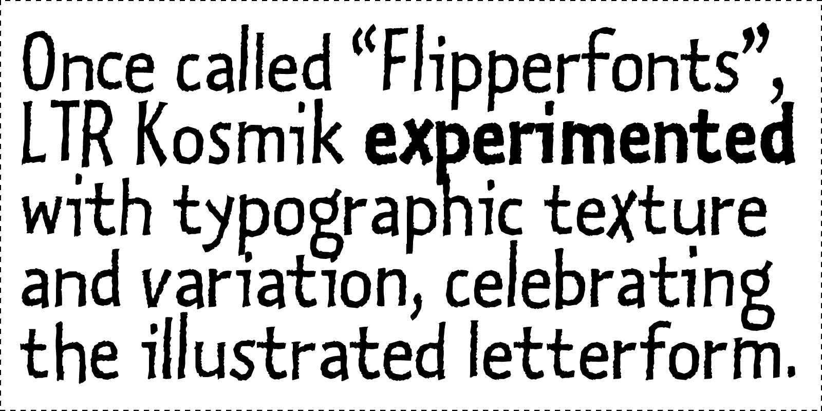
LTR Kosmik offers something for the eye at any size. In smaller sizes, when the rough texture is not visible, the variation in strokes offers new scale of liveliness.
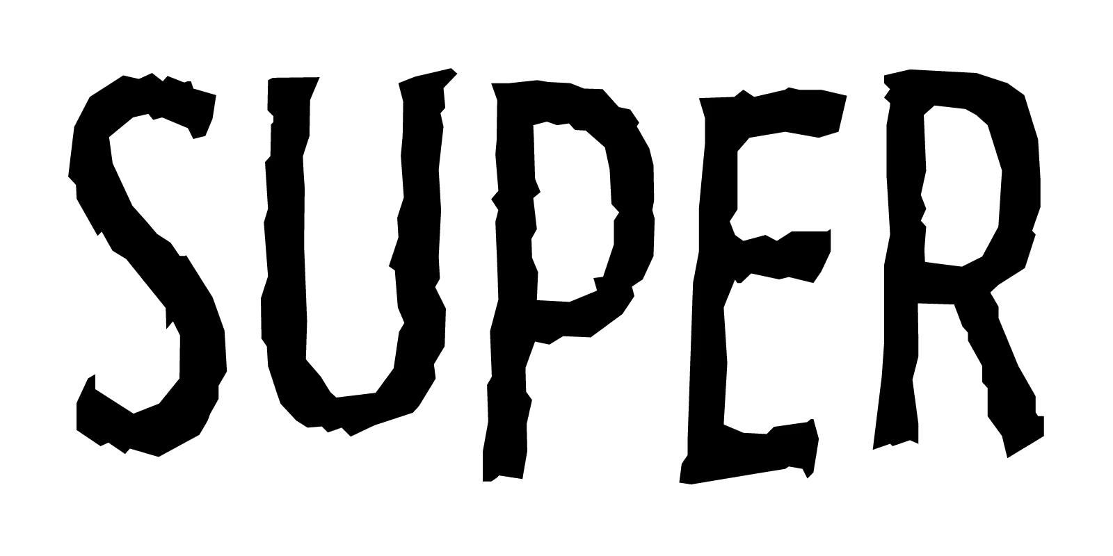
Baselines are boring. LTR Kosmik loves to dance around. There are plenty of well behaved fonts, type something in Kosmik and you have a party.

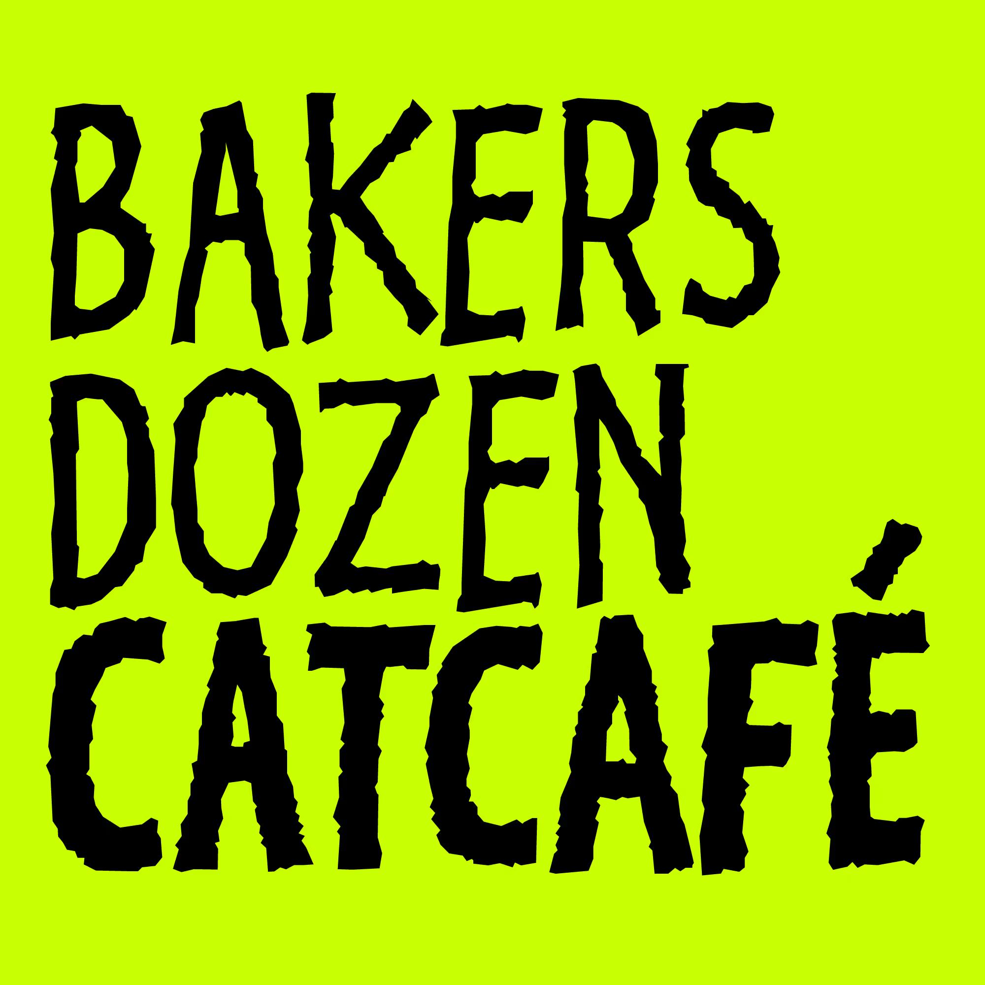

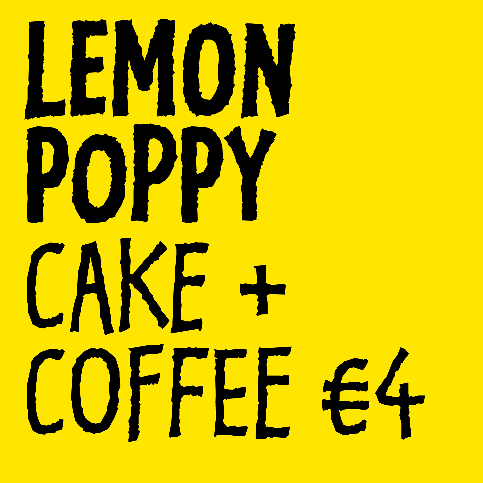

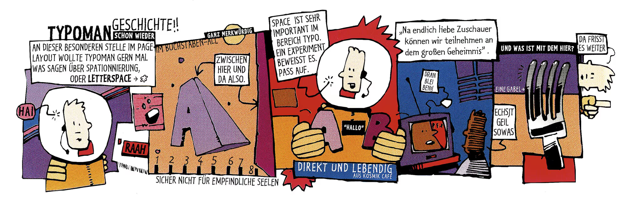
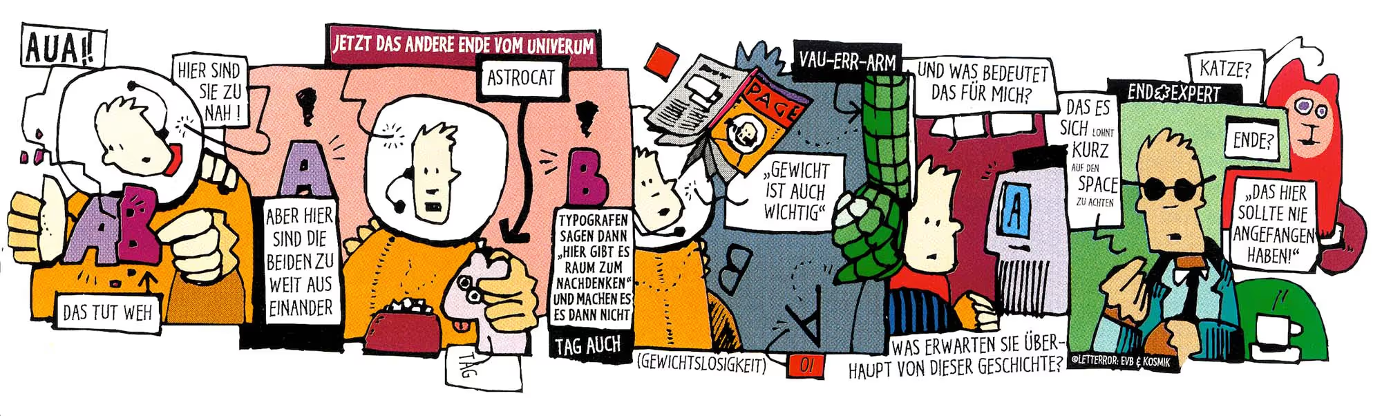
Typoman cartoon with lettering in LTR Kosmik drawn by Erik. Rare German translation. Highly collectable, mint condition, circa 1993.
Text with low-key animated texture. Not the smooth interpolations we now know from variable fonts, but a bit jumpy. Like typographic stop-motion maybe?

Contextual alternates switch the three variations around. Would you believe we had all of this working in pure PostScript before OpenType came along?