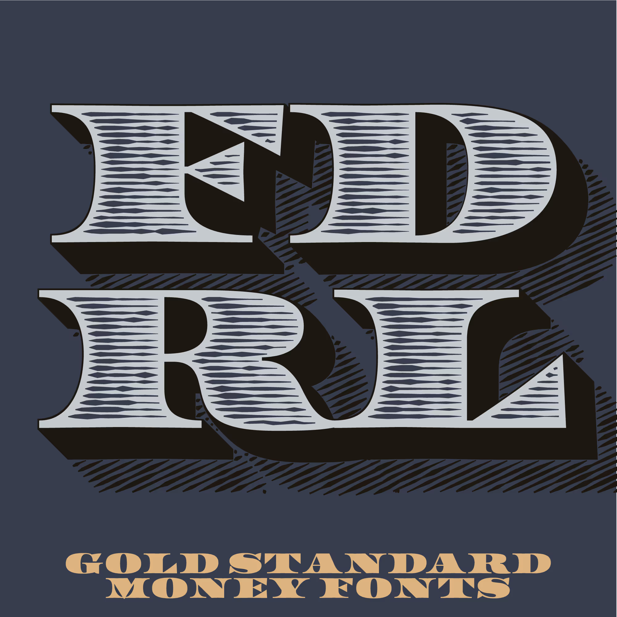
LTR Federal Optical Layers contains four levels of detail in horizontal and diagonal shading. Six, Nine, Twelve and Eighteen Lines, to be used from very small to very large respectively. These need to be combined with LTR Federal. A lot of different combinations can be made, but you need to have a design application to do the layering.
Note: These are not color fonts. In order to arrange the layers properly you need to be familiar with design tools such as Figma or Adobe CC. Use LTR Federal Bureau for shaded effects that do not require layering.

| Click for all pricing & licensing options. | |||||
|---|---|---|---|---|---|
| € | 40 | Layering set for optical size | CFF OpenType | ||
| € | 70 | Collection with Six, Nine, Twelve and Eighteen optical sizes, 20 fonts | All the fonts | ||
| One-time fee for perpetual use. | |||||
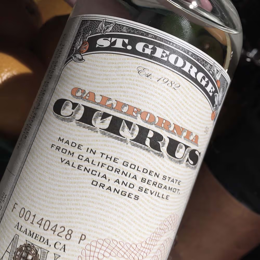
LTR Federal and a slightly modified Shadow from the Optical Layers, and any other carefully picked fonts, used very handsomely on many labels of the St. George Spirits distillery. Designs by Juli Shore Design. These are so good that Fonts In Use wrote an article about them.
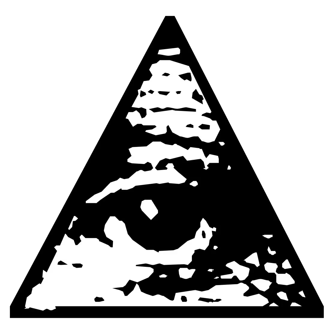
Don’t be dumb: LTR Federal can not be used to counterfeit things. Eh, not because we say so, but experts will be able to tell. Also: included in each font, this eye. It sees you.
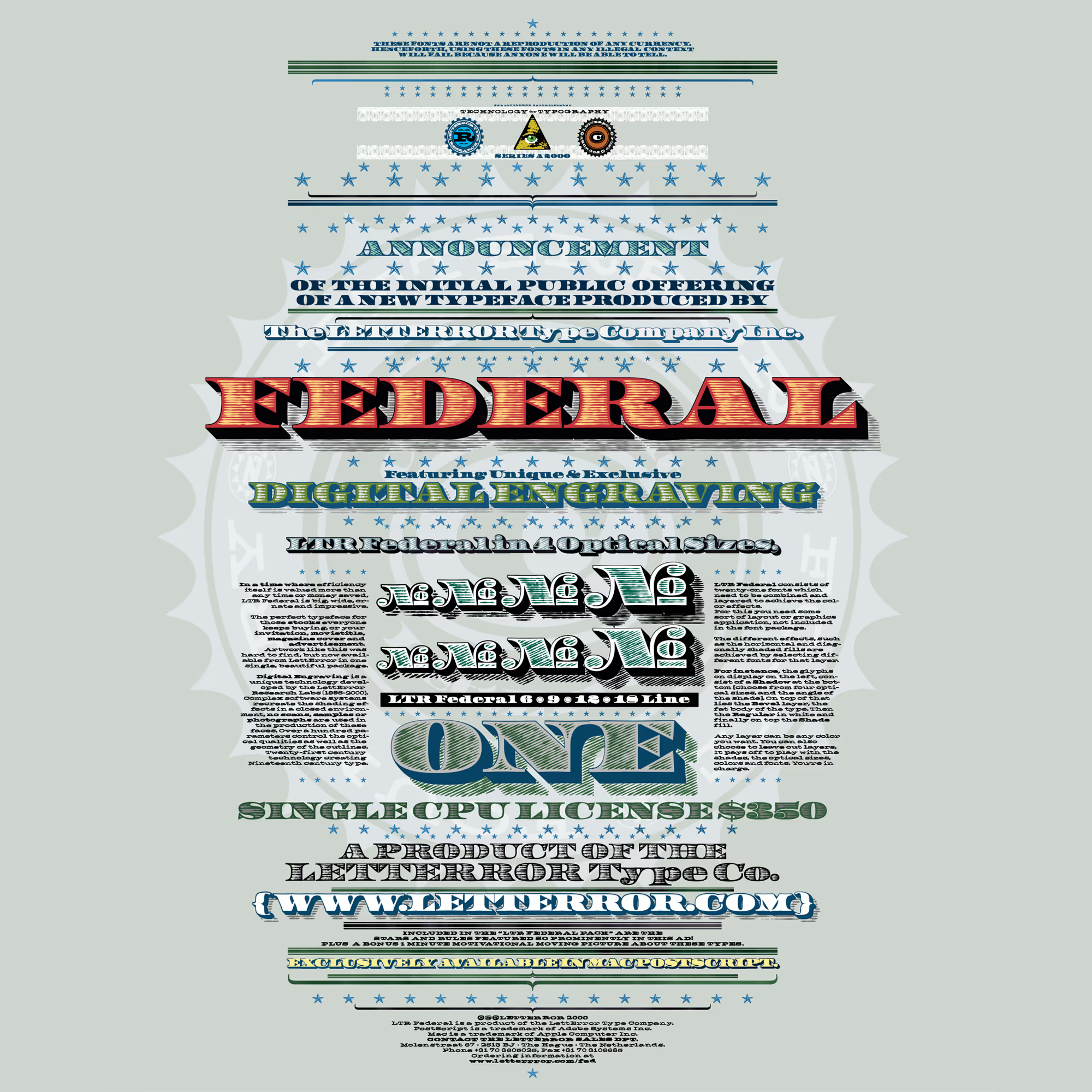
LTR Federal in combination with the LTR Federal Optical Layer sets, and some LTR Slab Extended for the small print. And some really clever use of colors in the layering.

The Eighteen Line Optical Layer in combination with LTR Federal Regular. Each layer can get its own color. Be daring.