A new chapter has begun in the life of this very familiar, textured typewriter face. Conceived in Berlin soon after the fall of the wall, it was a true product of reunification when West-side boy met East-side typewriter. Thirty-odd years later corporate machinations forced a change of identity, and inspired an update.
Henceforth to be known as LTR NCND: Neither Confirm Nor Deny, the typeface has been completely reengineerd to include seamless interpolation. It is now ready for interaction and animation (some ideas here), while still compact enough to be used on the web. Try the testers on the details page, where you’ll also find the complete characterset and all the features. Answers to the most pressing questions can be found in the FAQ, And there is a very nice specimen in pdf. And please check out ChatLTR: our electro-mechanical chatbot for the typewriter age.
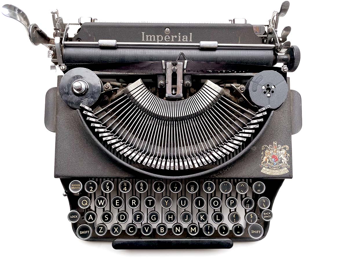
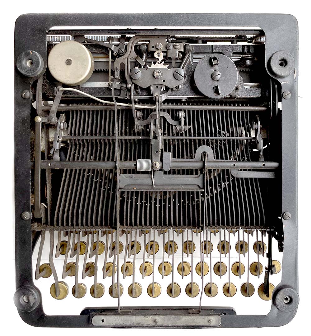
 The Imperial portable typewriter model “Good Companion”, Pica 411, 1951. Typewriter sleuths will know this is not the Triumph Durabel Norma that the typeface is based on. That one is lost to the ages.
Pricing starts at €50, Variable €80
![New York, New York. Newsroom of the New York Times newspaper. Reporters and rewrite men writing stories, and waiting to be sent out. Rewrite man in background gets the story on the phone from reporter outside. 1942 Sept. Collins, Marjory, 1912-1985, photographer. Library of Congres, LC-USW3- 009017-D [P&P] LOT 242](/assets/images/ncnd/newsroom-1942-cropped-2.jpg)
“At times it looked like it might cost them their jobs, their reputations, and maybe even their lives.”
Movie directors and screen writers can’t get enough of the typewriter. Just take a look at The Typewriter (Supercut) by Ariel Avissar to see what we mean. An opening shot at an author’s desk sets the tone, and then pushes the action along. Maybe you need quick date stamp or a location? Or you want to introduce a political scandal? LTR Neither Confirm Nor Deny has your back.
With a typewriter there was a tactile relationship to the written word. A light touch resulted in thin, uneven print: hardly the type of document to present confidently to an official. While the assertive, heavy handed typist could overcompensate; proclaiming bold lies as cold facts. With the extended weight range of LTR Neither Confirm Nor Deny you can control exactly how heavy handed the words will be.
Experimental geometry
While the mechanics of the tabulating typewriter are a matter of record, we’re not sure how to imagine a mechanical interpolating typewriter. And yet, with LTR NCND Variable, we have a functioning examplar right on our desk. Early experiments with textured geometry for interpolation convinced us that such transformations are visually striking: the way separate shapes grow together to form bigger structures. But it took 30 years for the necessary technology, the web, WOFF, and Variable Fonts to come together and make it possible; and tools like RoboFont to facilitate the necessary curiosity-driven research into animated, textured geometry. LTR NCND vastly extends usability, while keeping the appearance of the familiar weights we know and love.

CSS values for the LTR NCND weight axis. The classic Light and Heavy are located at 350 and 850. We added Thin at 250 and Black at 900 as new extremes, and we’re happy to introduce a new Medium weight at 550. For reasons too arcane and frustrating to go into here, there is no predefined Regular (400) or Bold (700), although you can dial them up with the Variable font. You will notice that we used the weights of LTR NCND in this ASCII-art diagram to emphasise the new members of the family. Check the diagram on the Gallery page. to see the weights set in their own value.
This typeface originally had only two weights, Light and Heavy. Through interpolation we now have a full line-up of Thin, Light, Medium, Heavy and Black. The new Medium is doubly special as the texture is a bit smoother and most of the gaps have been closed. The Variable Font edition contains all the weights and introduces the unique fluid animation of these familiar rough textures. Variable Fonts are supported by all modern design applications and web browsers. If you’re on an older platform (no judging, as you can tell we love old machines) that does not support Variable Fonts, the single weights still have you covered. Question about variable fonts? let us know!
In this table you see we offer these new fonts in a couple of different packages. Check the shop for even more options. The best value is LTR NCND Collection which has all the weights and the variable font. If you just want a bit of an update, LTR NCND Additional contains the three new (non-variable) weights. LTR NCND Basic: the definitive cut of last season’s (non-variable) Light and Heavy: you love the classics and we respect that.
| NCND Collection | NCND VF |
TrueType Variable |
| NCND Thin | TrueType | |
| NCND Light | TrueType | |
| NCND Medium | TrueType | |
| NCND Heavy | TrueType | |
| NCND Black | TrueType | |
| € 180 | Desktop license |
|


|
Best value: LTR NCND Collection includes the variable font, the two classic weights (Light and Heavy) as well as the 3 new weights (Thin, Medium and Black). | |
|
|
||
| NCND Variable |
NCND VF | Variable TrueType |
| € 80 | Desktop license |
|

|
One amazingly animatable variable font. No fixed styles.
|
|
|
|
||
| . | ||
| NCND Additional | NCND Thin | TrueType |
| NCND Medium | TrueType | |
| NCND Black | TrueType | |
| € 120 | Desktop license |
|
  
|
The three new weights, as single styles. |
|
|
|
||
| . | ||
| NCND Basic | NCND Light | TrueType |
| NCND Heavy | TrueType | |
| € 80 | Desktop license |
|
 
|
The two classic weights, compatible with earlier editions of this
dirty typewriter. |
|
|
|
||
and stormy
night.” (•°°)
Credits and thanks
LTR NCND is built with RoboFont and open platforms like FontTools and UFO (Unified Font Project). Visual research with Drawbot. Shop built with FontDue.com. CSS and animated headlines: PixelAmbacht.nl. The animated headlines in this site use the weight axis of LTR NCND, but also CSS color and fade effects that are not part of the font. LTR NCND is not a color font. The cover and poster in the Gallery from FontsInUse.com. The video of Jam GX is from the Vimeo channel of FontLab Ltd., used with permission. The Typewriter (Supercut) with permission from Ariel Avissar. ChatLTR based on the Eliza implementation by MassWerk, used with permission. ASCII art from Patorjk.com. Typewriter photos collection LettError. Newsroom photo from the Library of Congress, Prints & Photographs Division, FSA/OWI Collection, LC-USW3- 009017-D [P&P] LOT 242.
This website is published by LettError.

References
Berlin Station is a quote from the blurb on The Spy Who Came in from the Cold, a book by John le Carré, 1963. It was a dark and stormy night is a reference to the metafiction written by Snoopy in Charles M. Schulz’ Peanuts series, 1965. Though the line itself is much older. No images from Peanuts used in this site. The line “At times it looked like [...] their lives” is a quote from All the President’s Men, a movie by Alan J. Pakula, Warner Bros, 1976. ChatLTR and one the movies contain references to WarGames, a movie by John Badham, United Artists, 1983. The X on the Gallery page is the latin capital letter X from LTR NCND. These references are solely intended to illustrate the importance of typewriters and authors in popular culture, and do not imply any endorsement or affiliation with the respective works.
Trademarks
OpenType is a trademark of Microsoft Corporation. Adobe Creative Cloud is a trademark of Adobe in the United States and/or other countries. Apple, TrueType and presumably GX are registered trademarks of Apple Inc. The X-Files is a trademark of Twentieth Century Fox Film Corporation. Snoopy and Peanuts are trademarks of Peanuts Worldwide LLC. NCND is a trademark of LettError Type.
Trademarks, expired
These trademarks appear to be expired: Imperial by the Imperial Typewriter Company, Leicester, United Kingdom. Olympia by Olympia-Werke AG. Triumph Durabel by the Triumph Werke, both in Germany. GLOMAR by the Global Marine Exploration Company, USA.
Paul Barnes in EYE Magazine
“the typewriter,
the ultimate
vernacular”
Wired Magazine
(on the first edition, July 1, 1995)