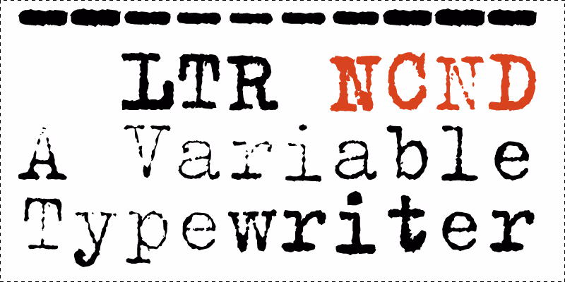
LTR NCND® Variable is the newest edition of the classic LettError typewriter from Berlin. Released from its corporate bonds. The unique variable weight offers new animation and interaction opportunities. A carefully tuned texture makes it a comfortable file size for the web. LTR NCND® Variable is compatible with all the previous editions and can be used as a drop-in replacement.
Variable Grunge: Paul Barnes in Eye.
InDesign scripts for automatic textures
| Click for all pricing & licensing options. | |||||
|---|---|---|---|---|---|
| € | 40 | Single style | CFF OpenType | ||
| € | 80 | Variable font with weight axis • VF fonts contain multiple styles in a single file, and are priced accordingly. | TTF Variable | ||
| € | 80 | Collection with 5 fonts & variables | All the fonts | ||
| One-time fee for perpetual use. | |||||
| Available from Adobe Fonts | |||||
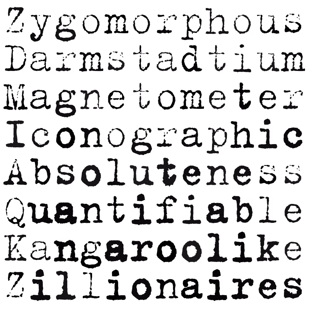
Variable font with variable weight. Compact enough for web use. Latin, Greek and Cyrillic support. Monospaced brutalism.
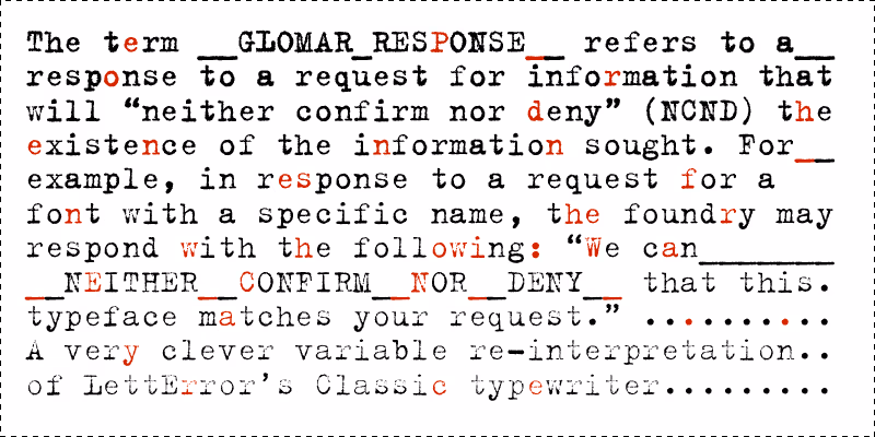
GLOMAR RESPONSE: a pragmatic answer to a question that can not be answered for legal reasons, though it is obvious to everyone there is an answer. For instance: “Is this the old typewriter font you published in the 1990’s”. The answer is “NCND”.
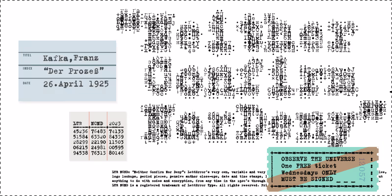
Very good for making props and on-camera hero objects that need some typewriter charm. Not good for forging historic documents that need to withstand scrutiny.
Typewriter animation! With variable weights for each key. Of course you can aim a camera at a real typewriter. However using NCND® the copy remains editable and translations can be dropped in. That includes Greek and Cyrillic and well as the extended Latin.
Slowly breathing Subtly alive, in this animation the variation axis is used to create a slow moving change in tone.
Immediate atmosphere LTR NCND® has been the go-to typewriter for all sorts of stories.
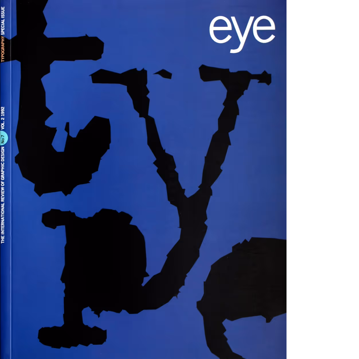
Eye, №.7 Vol. 2, 1992. Cover design by Stephen Coates. Source: FontsInUse.com
Titling typewriter: titles Capote movie, United Artists, 2005 Source: FontsInUse.com.
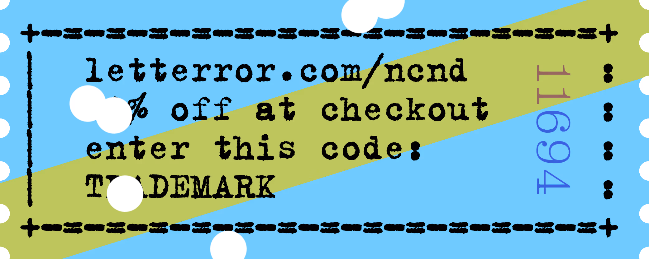
Did you ever buy a version of one of the LettError typewriters a long time ago, at FontShop® or Monotype®? Do you need an update? Show us a copy of the original invoice and you’ll qualify for a discount!
Overlaps in the NCND® Variable make the animations work. But if you need to cut these letters from film, remove the overlaps first.
