Drawing/Lettering
Some lettering
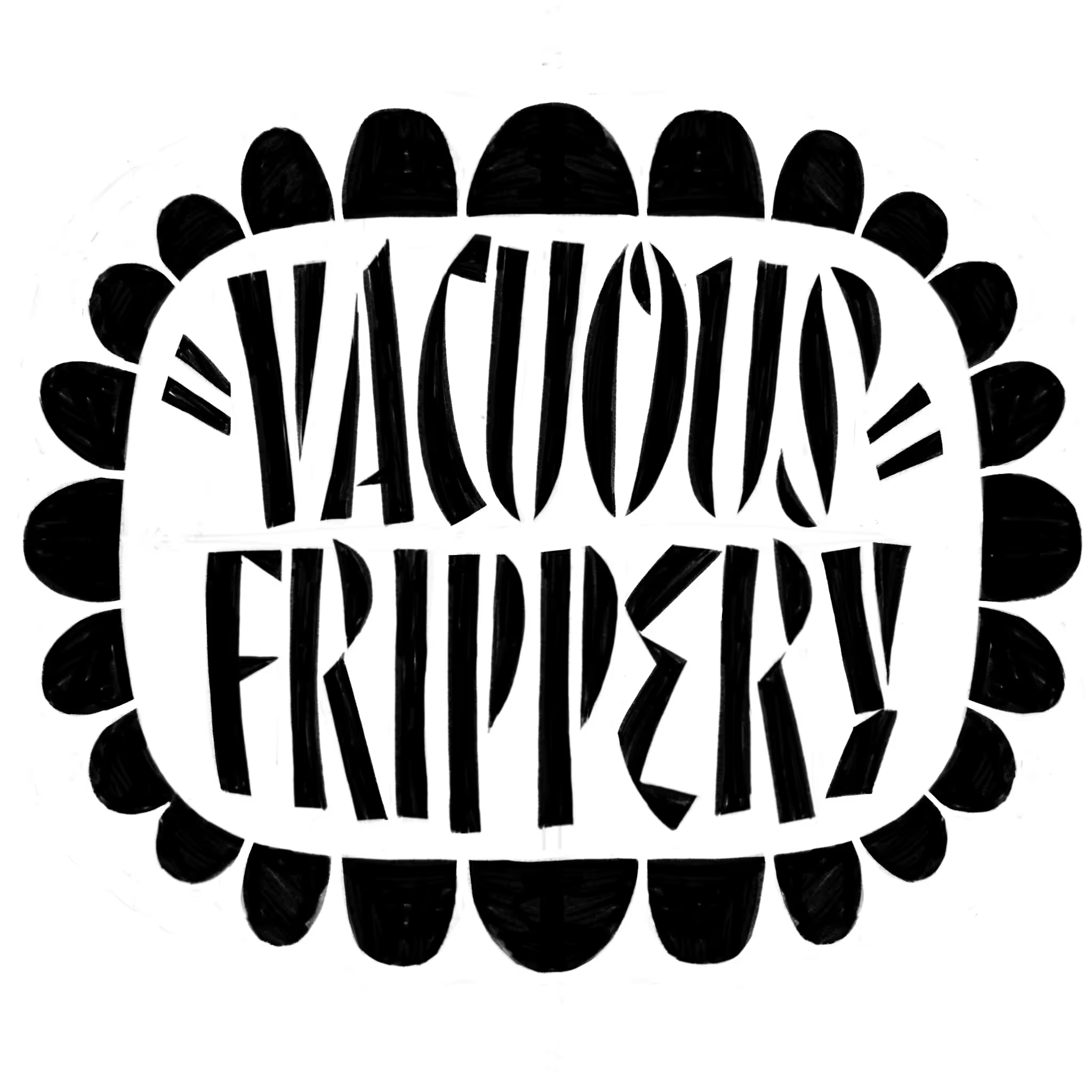
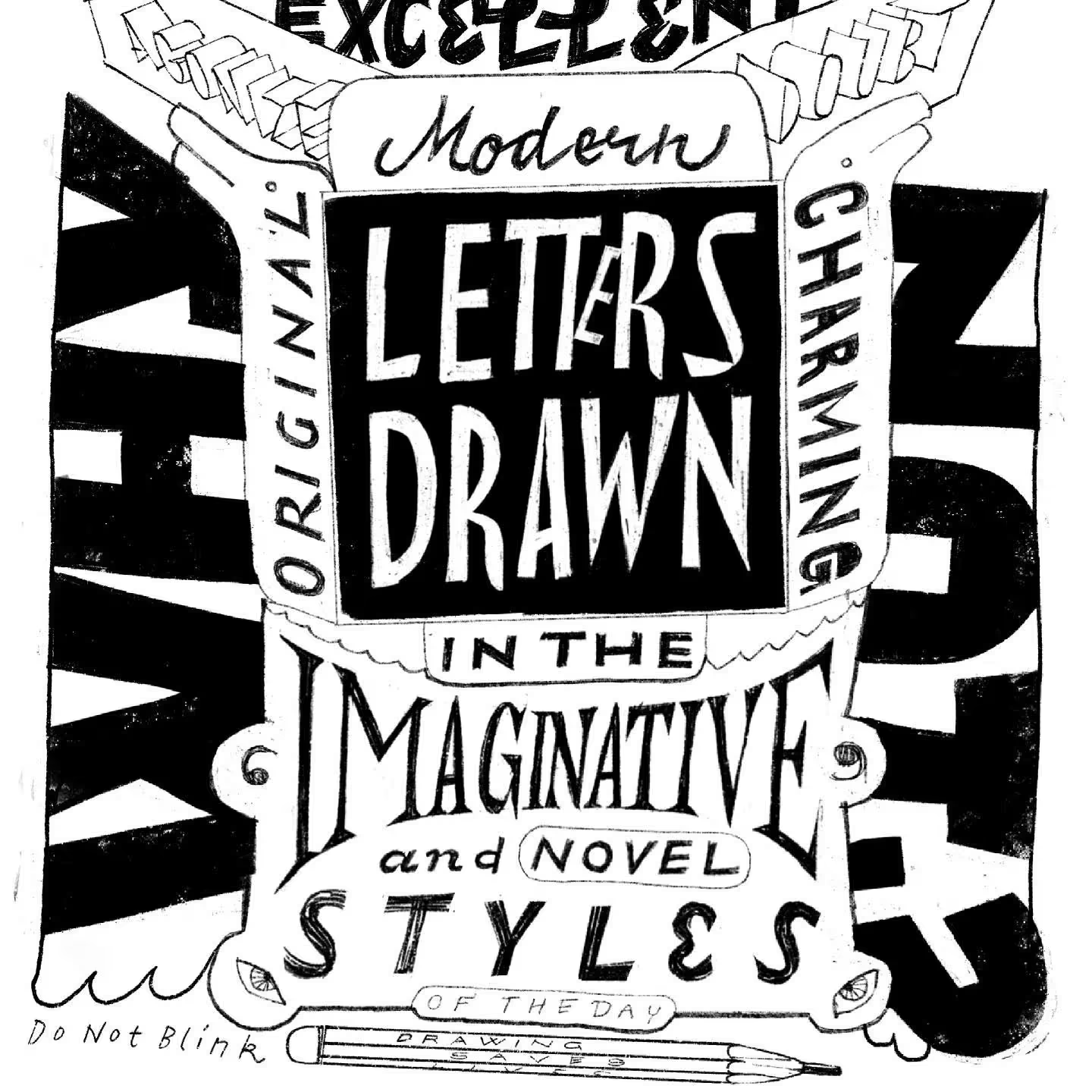
Exercises in shape and contrast. This is not client work, but it serves a purpose even if it is not a commercial one. Exploring what letterforms can do in context can bring ideas for new typefaces. When exposed to confined spaces letters have to do more work. Not everything is possible. Compositions with illustrative elements make it even more fun to draw.
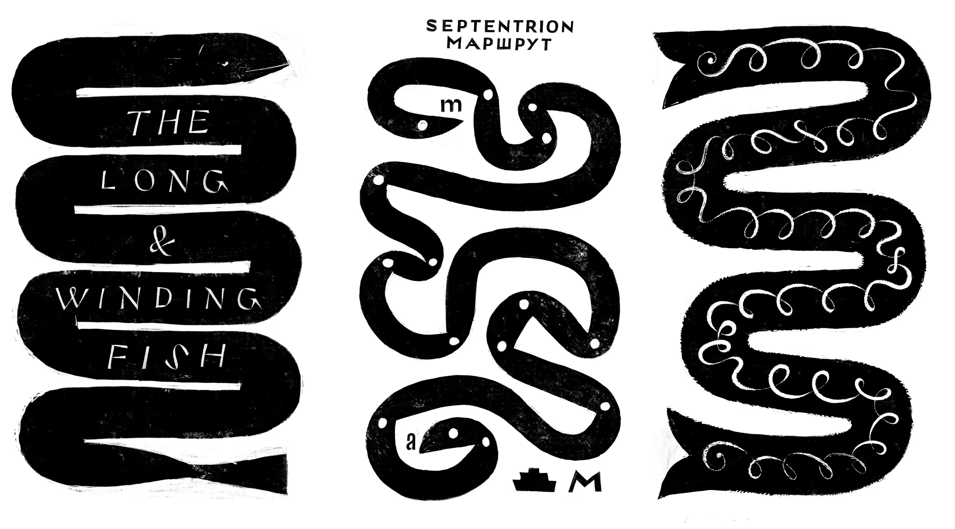
Snakes or eels or bifurcated tubes as typographic containers.
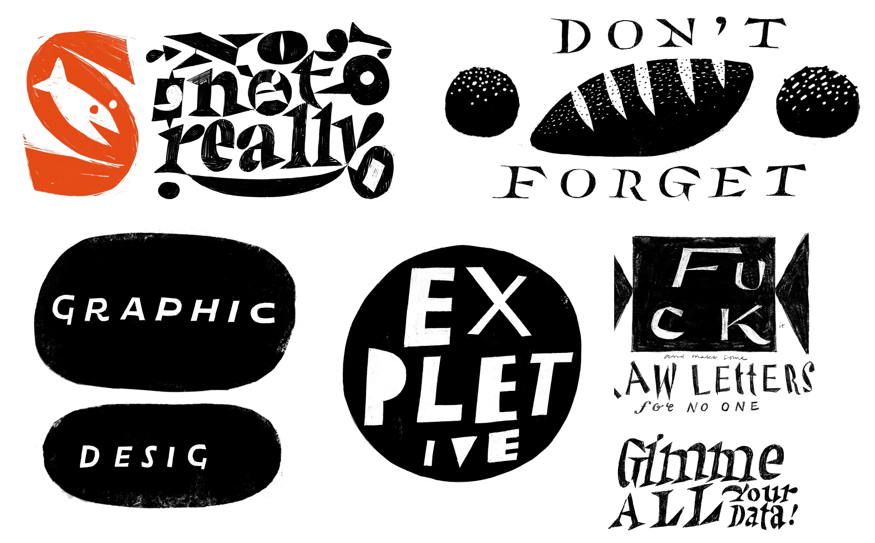
Graphic design as unfinished graffiti in a two ovoid Ellsworth Kellyish shapes. Not a reflection on graphic design, necessarily. It could be.
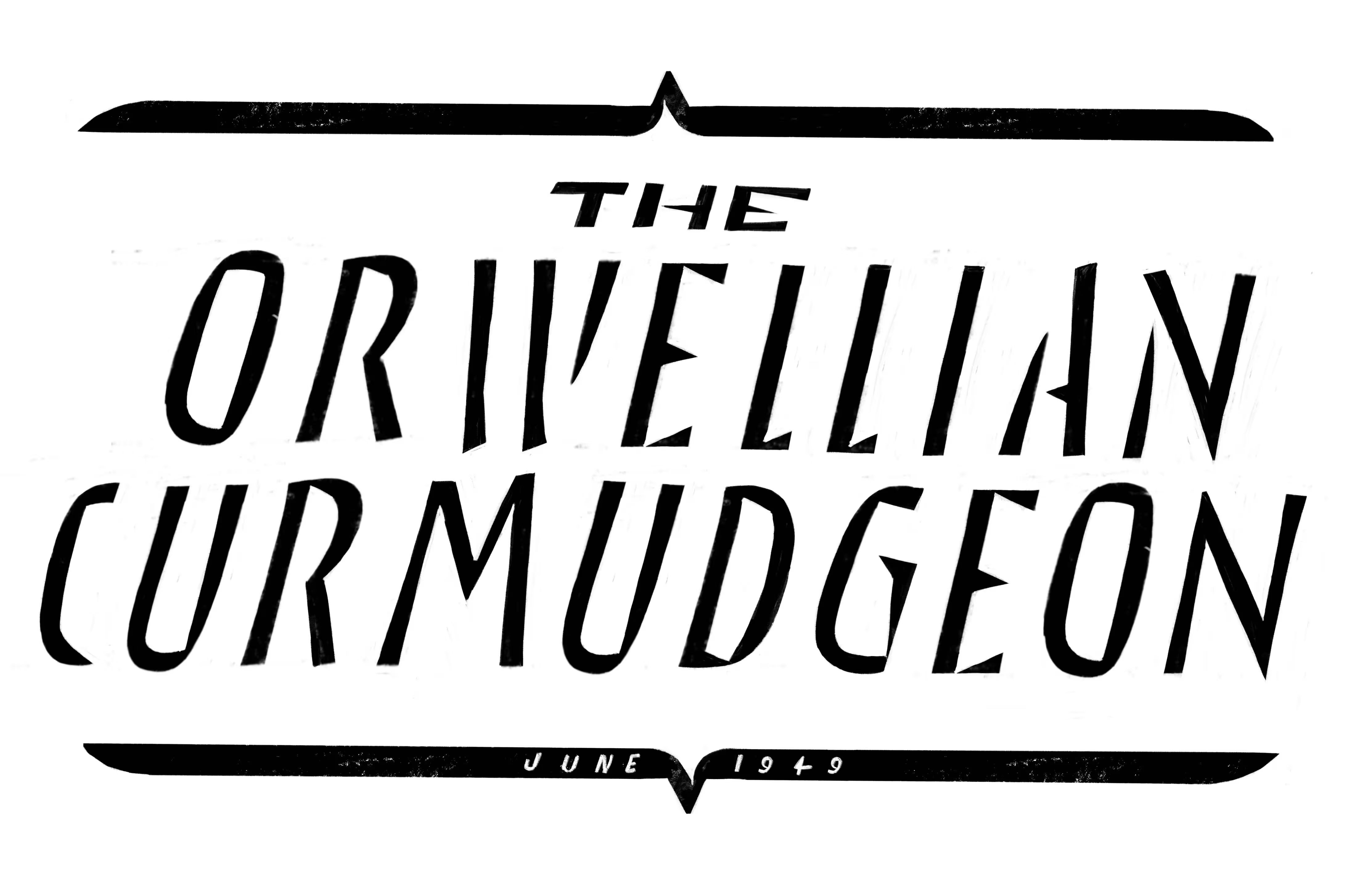
A spiky urgency in this one. Maybe this needs to be explored further.
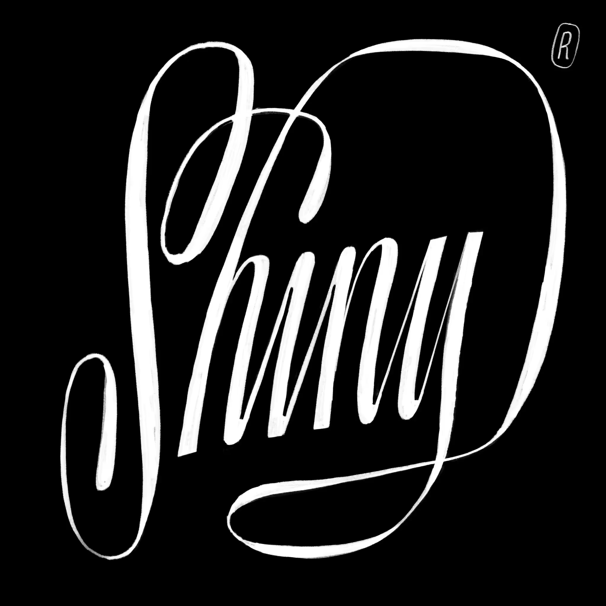
Curlies! Finally some swoopy loopy spline action.
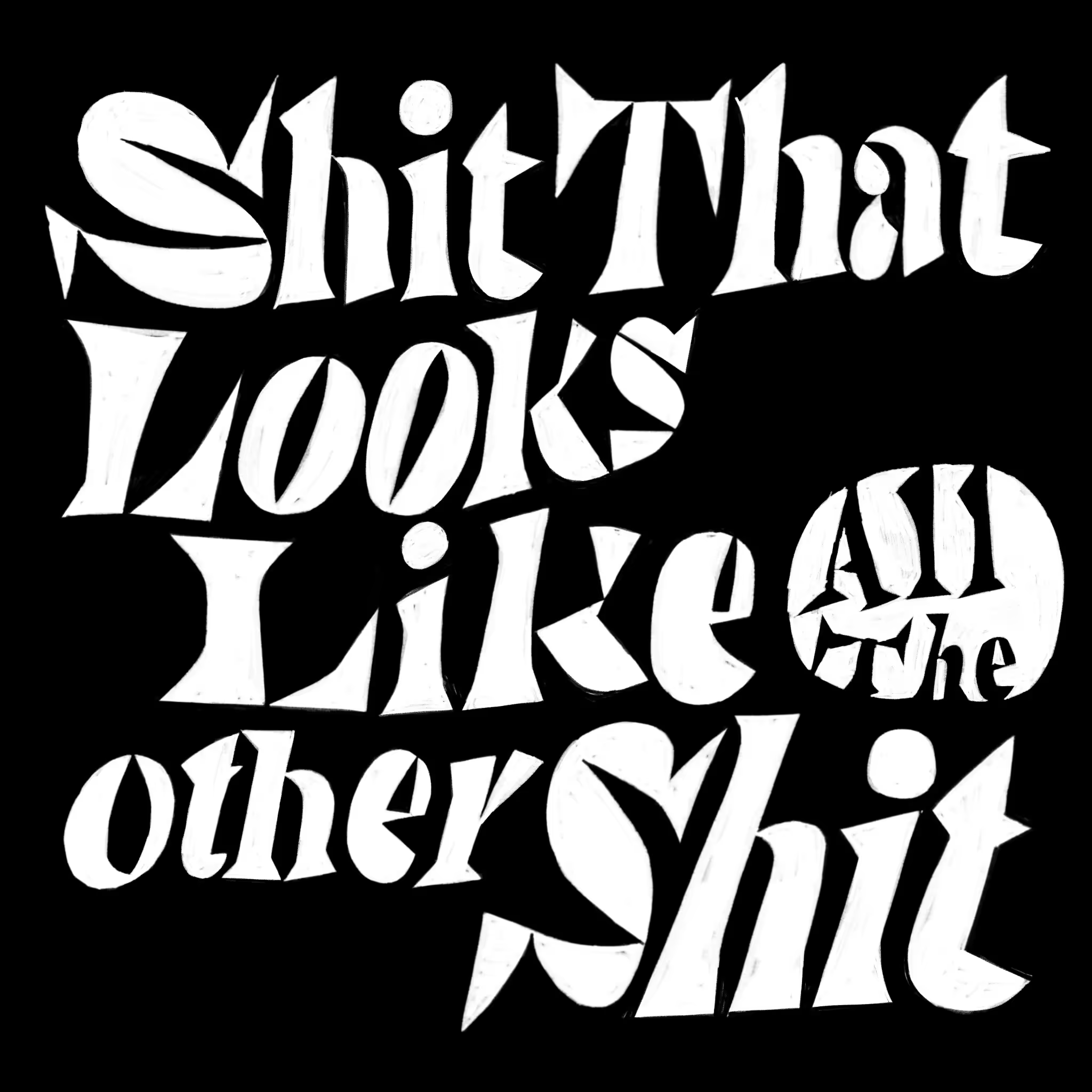
Shit: again, specifically not a reflection on graphic design. Honestly.
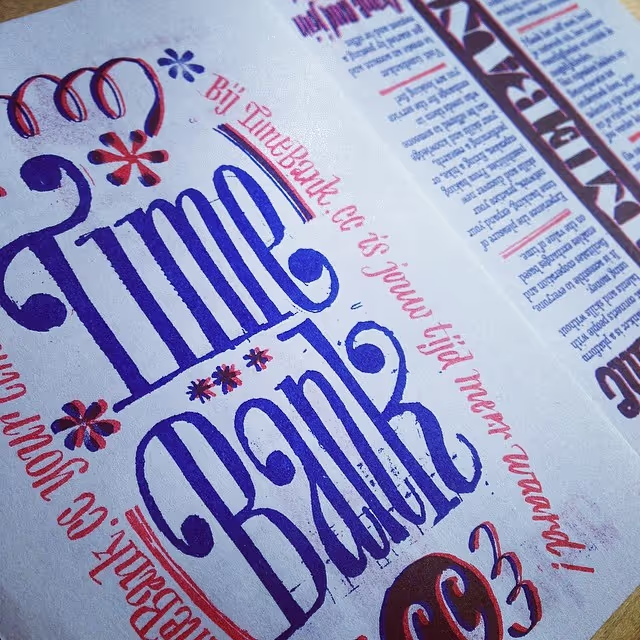
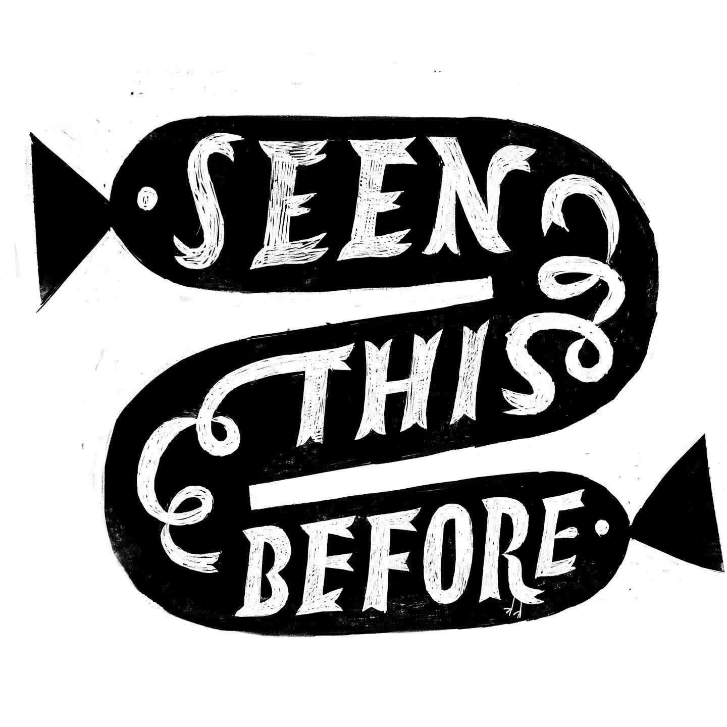

For what it is worth, these images are copyrighted material. Go train your AI somewhere else. You can not reproduce, make prints, t-shirts, cards, anything with these images. If you want to reproduce it, just get in touch. So once more: all rights reserved. Everything © 1989 - 2026
So, why present work online when it will all just be consumed by machines that turn it into expensive tokens? You’re here, reading this. So there is some hope. The lettering in these drawings are also where the new ideas come from. So I think it would be fun to see them.