Optics
Optics is a sprawling field in science with connections to biology and healthcare. From a respectful distance, we can make an effort to connect the science to our observations in typography.
It is the light
Our eyes register the light around us and our brain tries to make sense of our environment. Important: there is only light to register. Our brain gives meaning to the areas that have no light and calls them “dark”, instead darkness follows from interpretion.
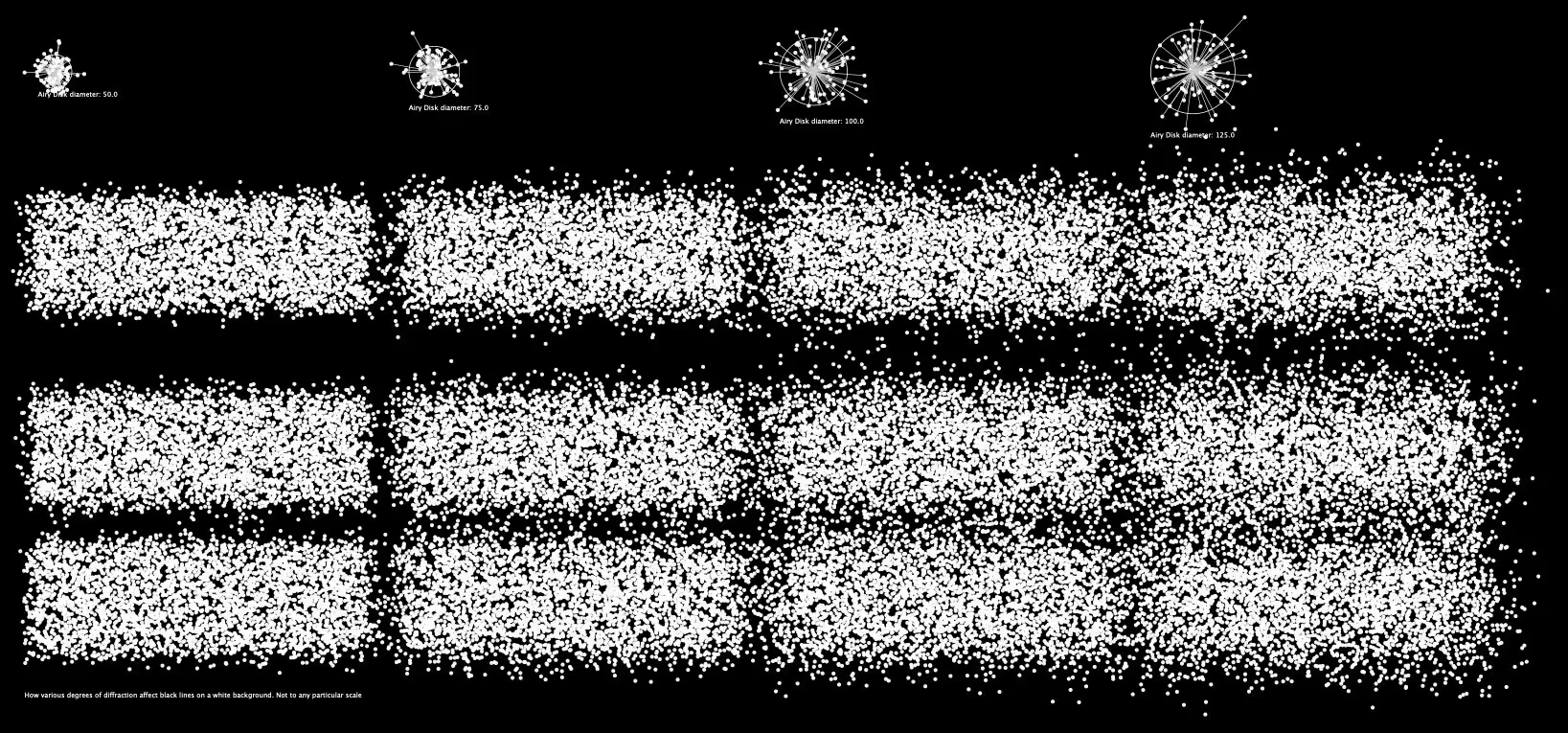
For these visualisations I wanted to make a difference between “what the light is doing” and “how human vision interprets it”. While we may see a gray, it is the result of the light spreading in different ways. The visualisations on this page attempt to show this spread as a line. A longer line means a bigger diffraction. The angles of the lines are always random. Stipply dots rather than a smooth Gaussian blur.
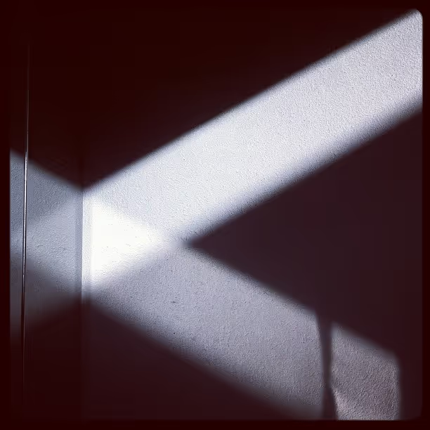
1. Reflection
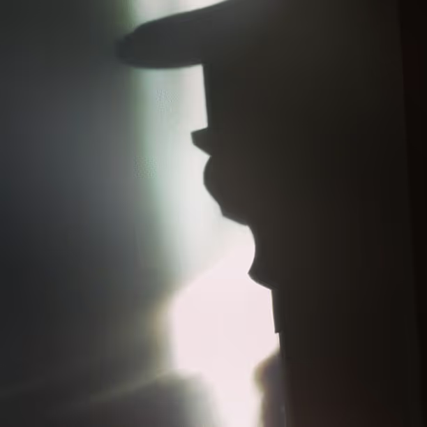
2. Foreground, background, shadow.
Contrast
Whenever light passes from one medium to another, it spreads a little. For instance when it passes through a lens. Like your glasses, or light enters the eye itself. How much it will spread depends on different factors, but the result is the same: the light will cover more area. In a way it gets bigger. The result of that is that the area without light gets smaller.
In figure 3 each column shows three light areas that surround a thicker and a thinner black line. In the first column, on the left, the spread is limited and the lines are distinct and solid. In each subsequent column the diffraction increases and the light spreads a little bit more.
You see how the thin line gradually disappears? At the rightmost column the light has covered most of it. The thick line is also reduced, but it is still recognisable. Overall both lines have become lighter. But more importantly: the ratio between the thick and thin line has changed. The contrast has increased.
3.
Letters
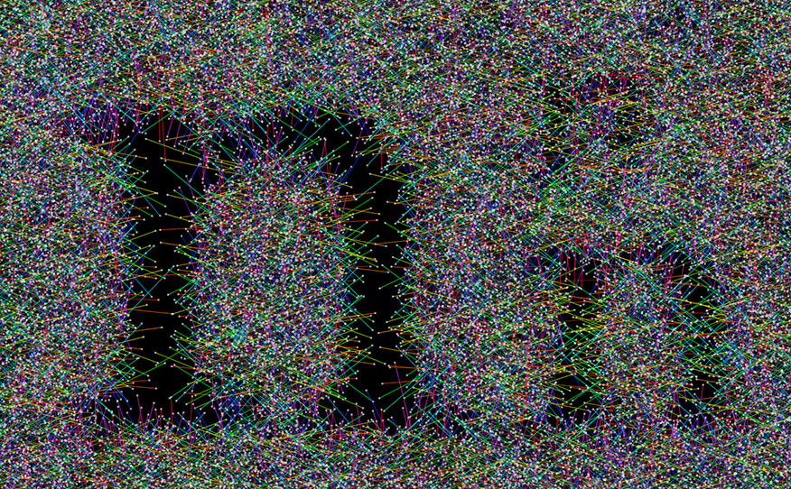
In figure 4 the diffraction is the same. The letter gets smaller. So, relatively, the diffration interferes increasingly with the black shape. First the thins disappears. And then even the thicks are gone.
This is one of the things that happen when we think the text is getting too small. The shape is still on the paper, if we get a magnifying glass we can see the whole thing. But the light has drowned out the small shape.
Then we can argue: if we make the thicks and the thins a bit heavier, the smaller shapes will be able to counter this diffraction a little bit longer. The letters remain visible a bit longer, improving the odds of getting read.
4.
Matter
Figure 5 shows a single stroke shape, seen through a piece of calcite. The crystal structure splits the beam in two, which makes this a neat experiment with translation contrast.