Twin Cities: a typeface system that responded to the Minneapolis weather.
2003 Design Celebration
The Twin Cities typeface was an initiative of the Design Institute of the University of Minnesota for their Twin Cities Design Celebration in 2003. Jan Abrams and Deborah Littlejohn invited six designers to make a proposal: Peter Biľak, Gilles Gavillet, David Rust, Sybille Hagman, Conor Mangat and Eric Olson and the one Just van Rossum and I made, were published in a neat book Metro Letters.
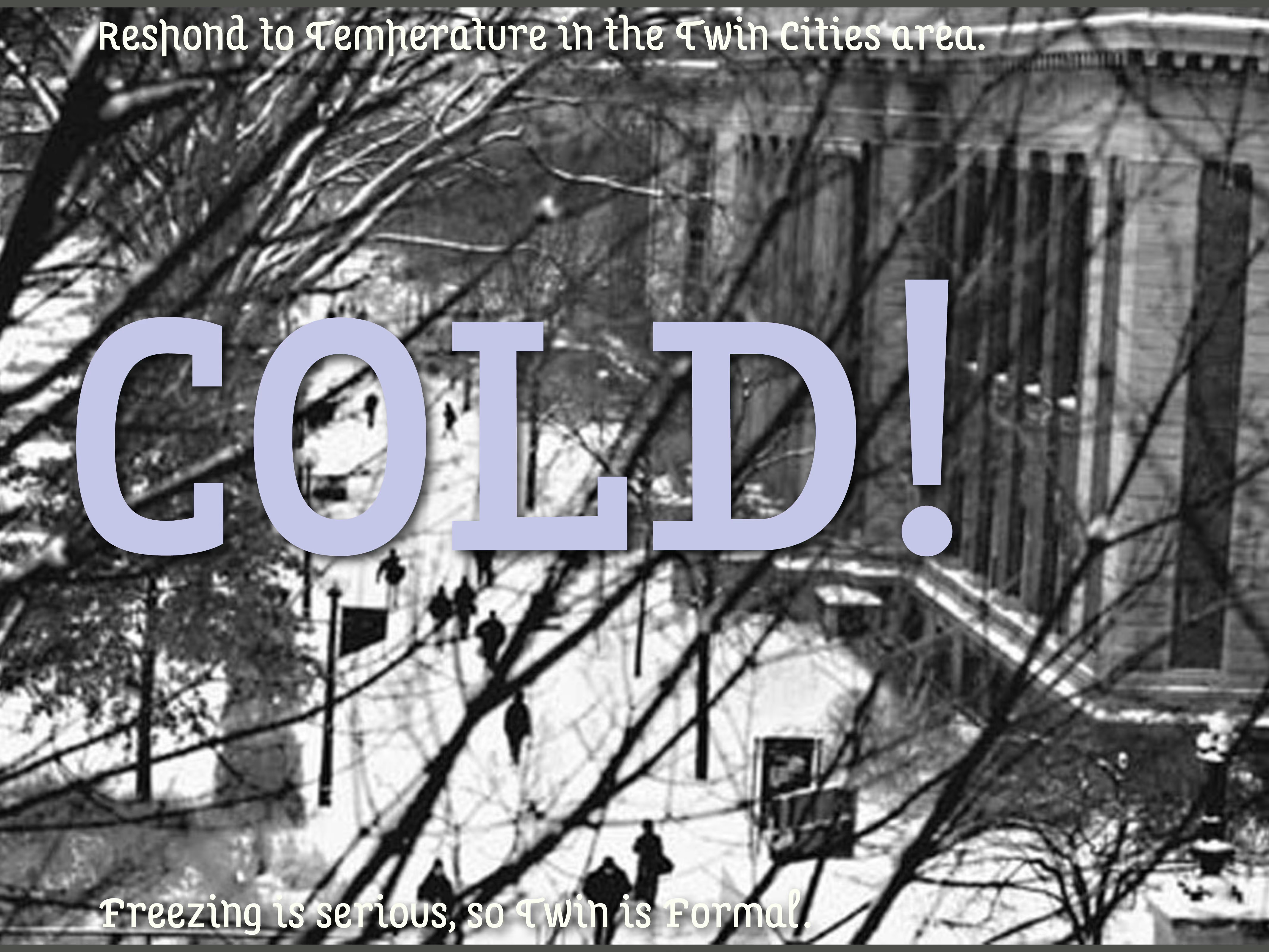
In cold temperatures the Twin font would present as a serif.
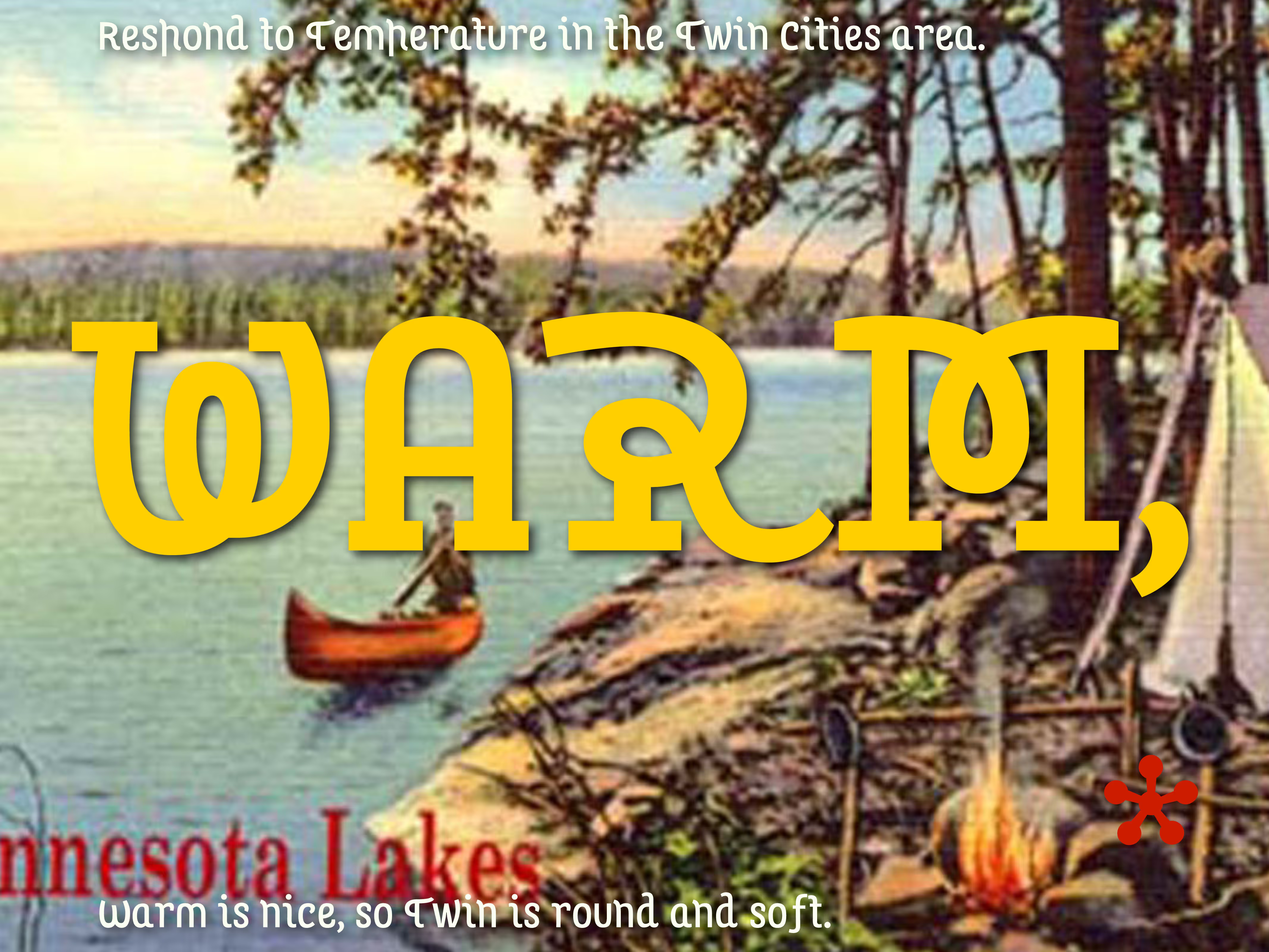
In summer on the other hand, all stems grow and curl.
Panchromatic Hybrid Style Alternator
At the time I wrote: In July 2002 the Design Institute of the University of Minnesota asked six design teams to make a proposal for a typeface for the Twin Cities. The brief indicated that the typeface should reflect the characteristics of the cities. This was a problem because we had never visited Minneapolis before (or left the airport). How to make a typeface for a city I had never seen - or worse yet: how to make a typeface for any city? Rather than to come up with one particular style, I wanted to try out an idea about a system that could collect ad hoc typefaces based on a large characterset. The “Panchromatic Hybrid Style Alternator”. This frightened the jury and the project was selected.
Twin became a typeface that couldn’t make up its mind. It did not force one particular style on a diverse group of people. Instead it became a machine everyone could play with and find something appropriate. The results was as individual as possible, yet all results belonged to the same typeface.
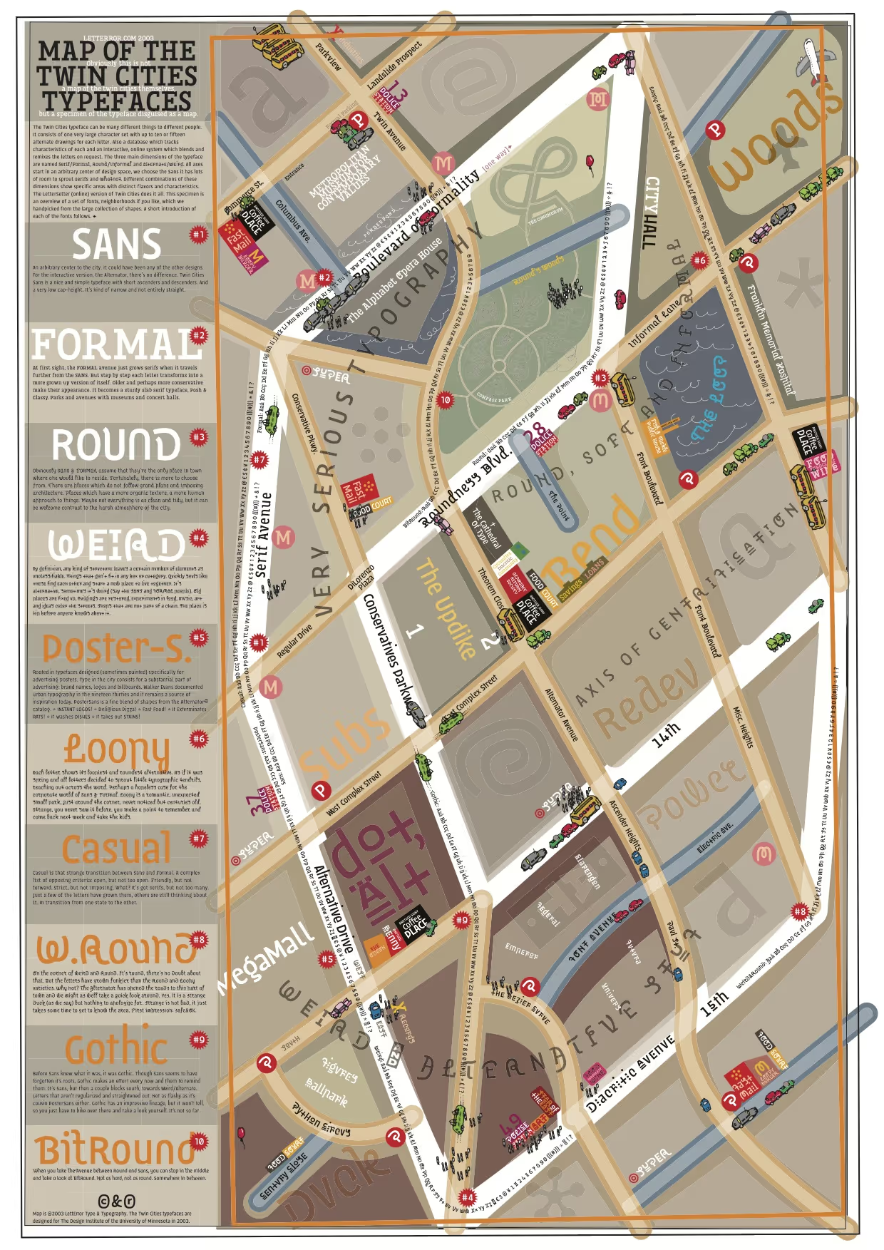
A map of the designspace, not Minneapolis. It shows the Sans / Formal / Round and Weird regions of the typeface.
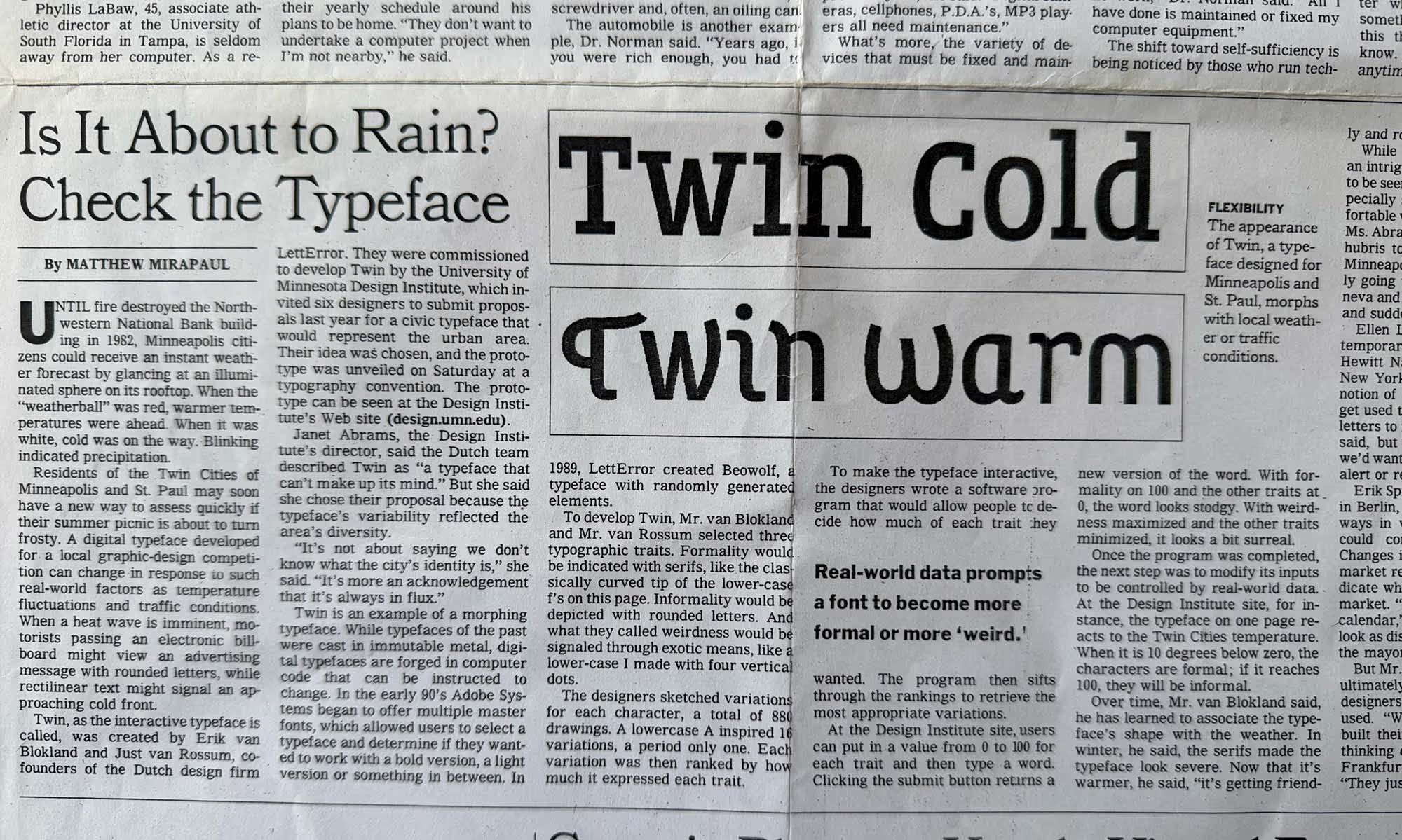
New York Times? Is It About to Rain? Check the Typeface. New York Times, July 24, 2003. Link, paywall
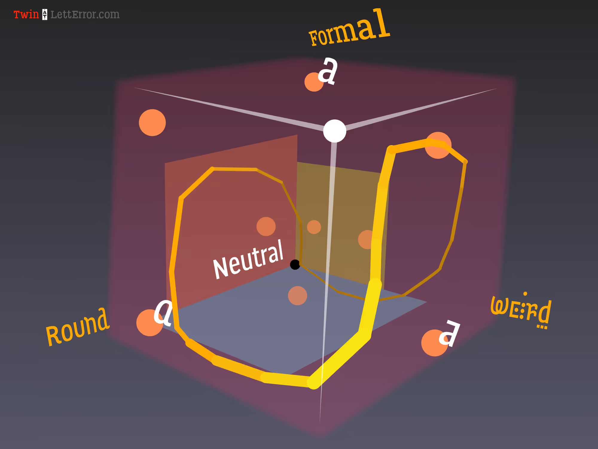
All good type projects have a cube. Starting at a neutral, three axes shoot out in different directions, Weird, Round and Formal.These axes are not exclusive, so any glyph variant has a position in this cube.
Sketches for the Twin character set. We wanted to have a basic set of shapes to build a prototype with. The Alternator idea was yet untested and before committing to a large number of drawings we wanted to see if it worked at all. The prototype with (later named Twin Sketch) exceeded expectations, we could start drawing the smooth version and extend the characterset.
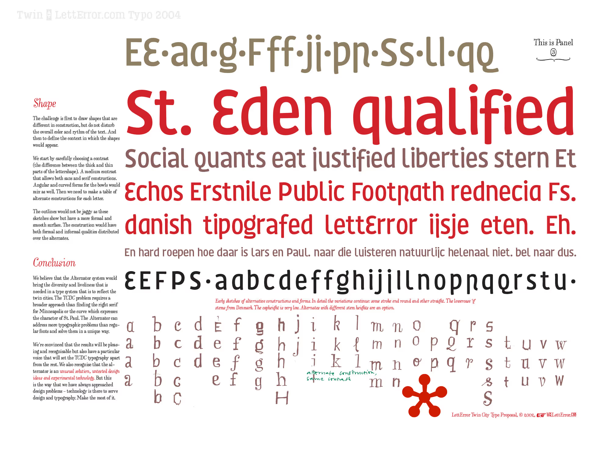
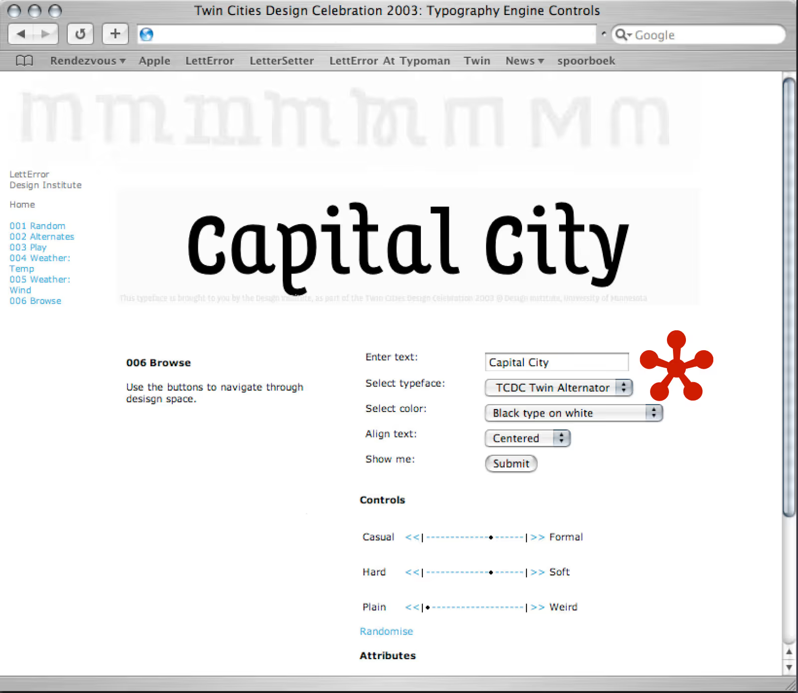
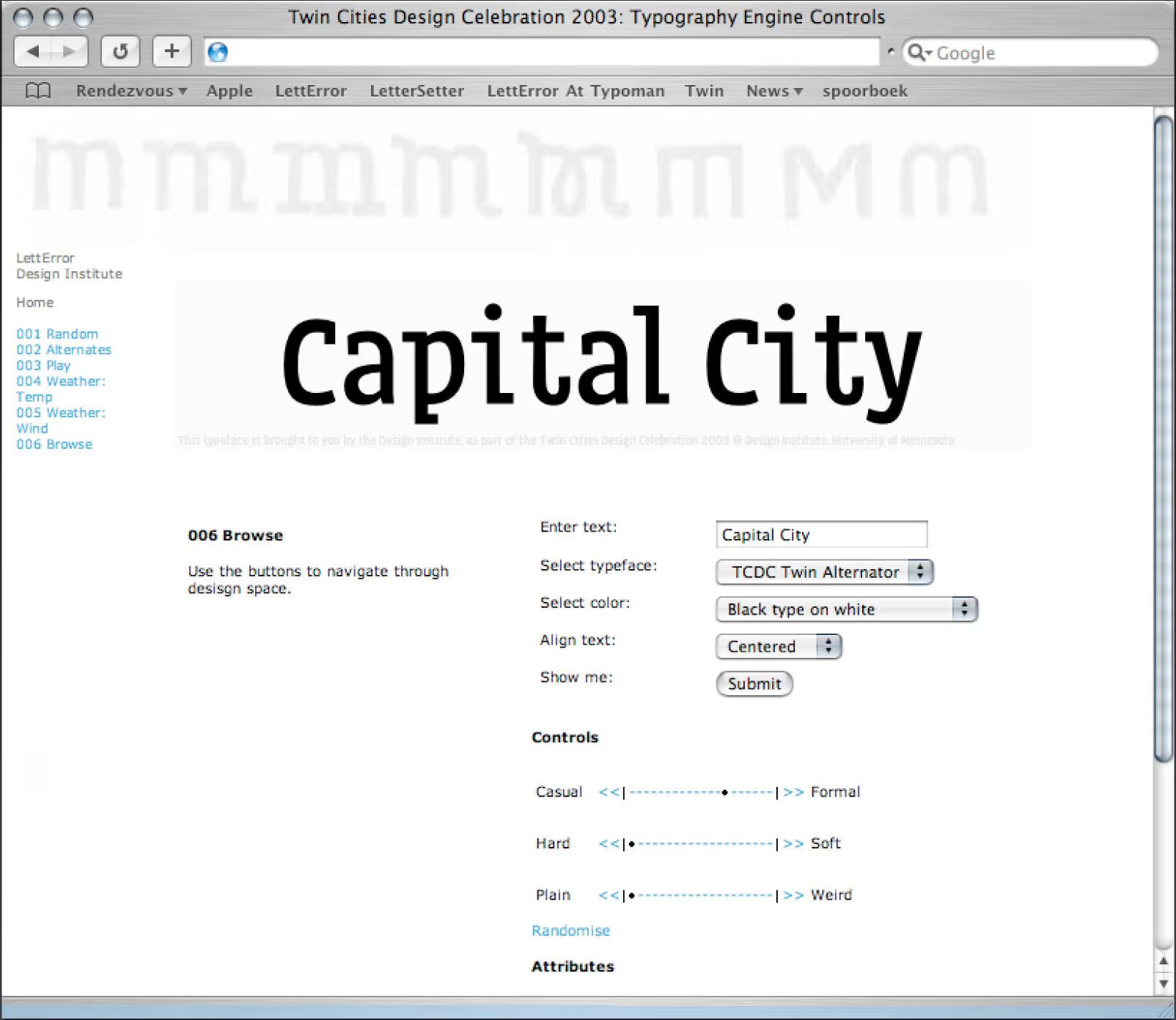
The web interface for Twin. The reader had a web interface with several controls for the Twin font. Twin was not really a typeface, but more an application that runs on the web. People found the controls and played with them. So each image was generated fresh, which makes it possible to look up environmental factors of the Twin Cities, such as the weather, and incorporate them in the letter forms.