
Premium streaming and broadcast service HBO is available on a variety of devices with an array of typographic requirements. From the large but low-resolution TV screen across the room, to the crystal-clear but narrow phone in your hand.
Together with Carvalho-Bernau, LettError developed Street, a custom family of screen-first, graded typefaces. At home on a wide range of screens and platforms, from the living room to mobile, Street provides high quality typographic versatility and brand coherence for a myriad of display technologies.
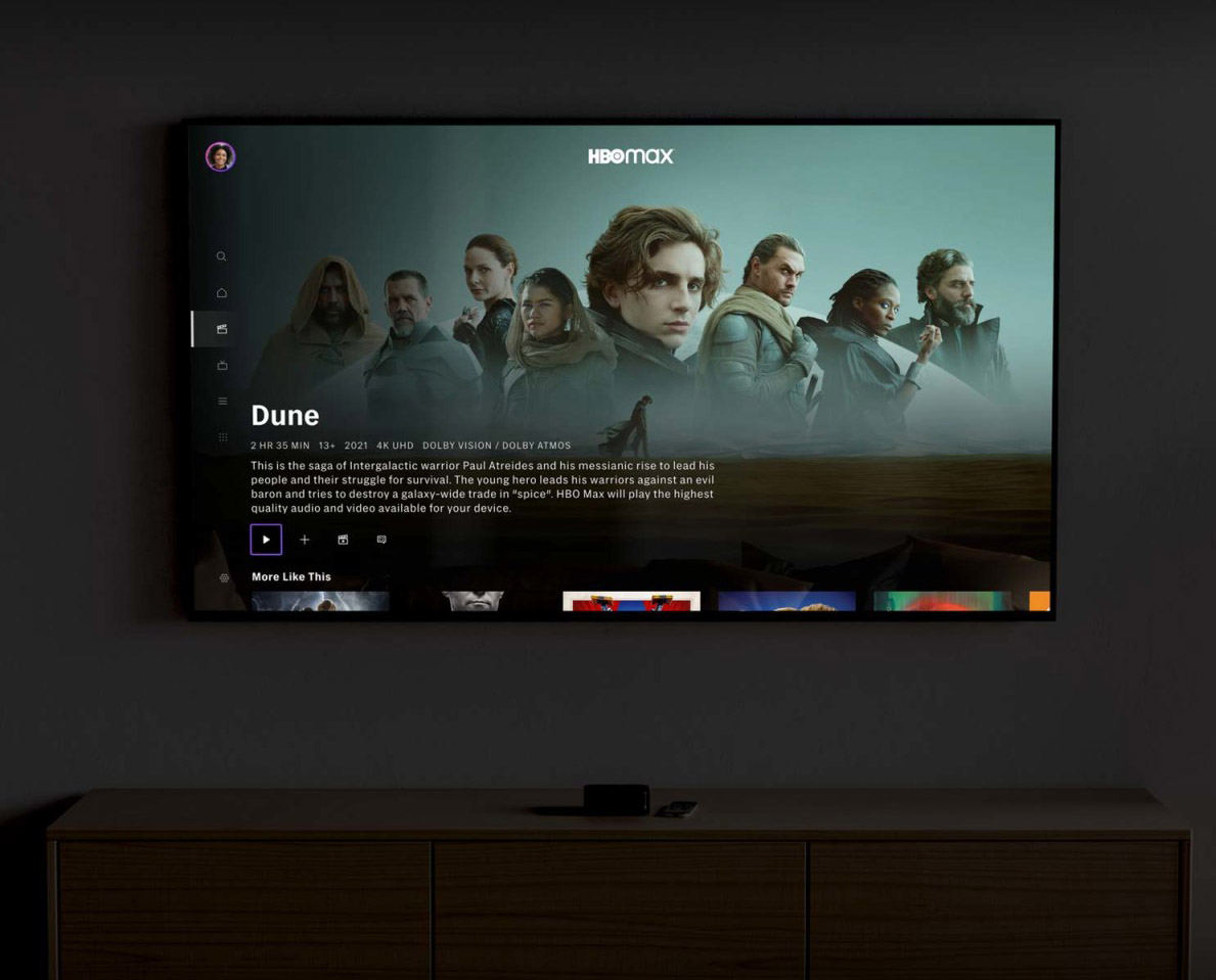
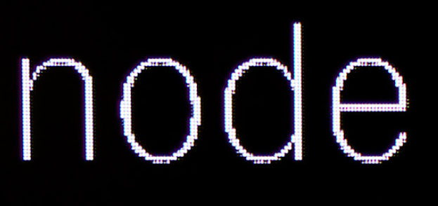
Brilliant type for small screens and wall screens.

HBO Street LCG Bold, grade 2 at various sizes.
When HBO recognised that the typeface system they were using was no longer suited for the new and ever more complex tasks ahead, they asked us to help them understand and solve the challenges of highest quality typography across a diverging device landscape.
Overseen by Director of Digital Products Ryan Wilkerson, and in close collaboration with HBO’s digital designers James Catel and Rob McMurray, we focused on brand expression and consistency. Especially the typographic and technical challenges that come with all the different platforms on which HBO has a presence.
In 2021, we were asked to extend the typeface with Cyrillic and Greek scripts under the direction of HBO Max’s Dave Curry and his amazing team. The script extensions were drawn by Ilya Ruderman and Irene Vlachou, respectively.
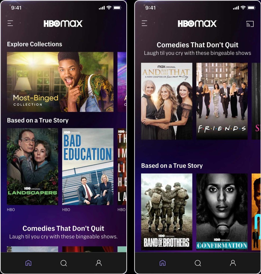
Screenshots of the HBO Max app, vertical phone format, c. 2023.

HBO Street LCG Thin, grade 2 at various sizes.
Street adds European precision and sophistication to the popular American Gothic genre of typefaces. The typeface expresses HBO’s brand values: an accessible but premium experience, while the genre’s ubiquity makes sure that it is “invisible” enough to never compete with HBO’s premium content.
The design takes many cues from the great American classics by Morris Fuller-Benton, particularly his Lightline Gothic, Monotone Gothic and of course Franklin Gothic, as well as the flat-sided shapes of Jackson Burke’s Trade Gothic.
That said, HBO Street is not a revival. Rather than adapt a visual language optimised for print technology, Street was designed and tested on screen from the very first sketch to the final proof. The very real and complex requirements, both functional and aesthetic, dictated the final design.
American Typefounders’ Lightline Gothic, Morris Fuller-Benton, c. 1908 (magnified from a 10pt showing)
Linotype Trade Gothic, by Jackson Burke, c.1945.

Drawings for an early stage of Street which established the vertical and horizontal proportions, relative weights and contrast, c. 2015.
Every step was proofed on many different screens while drawing. These rough pixels were produced by a particularly old Sony flatscreen and a XBOX rasteriser.
Variable fonts deliver weight and grade variations in a single file.
Because HBO is at home on many different platforms, with different screens and resolutions, rasterizers and viewing distances, we took great care to make sure the user experience is consistent and reliable across the board. The typography in the titles, menus and bios must be consistent regardless of rendering technology or resolution. With normal typefaces, text that looks great on one platform can render too heavy or too thin on another.
HBO Street offers grades to balance the rendered results on different screens: every weight has a lighter and a darker variant. A heavier grade can be deployed for environments that render text lighter (such as Microsoft and Chromium-based platforms), and a lighter grade can be used for platforms where text is rendered heavier (hello, AppleTV!)
Within each weight, the grades have identical metrics and kerning: there will be no text reflow when switching between grades.

Can you see the difference between the columns?
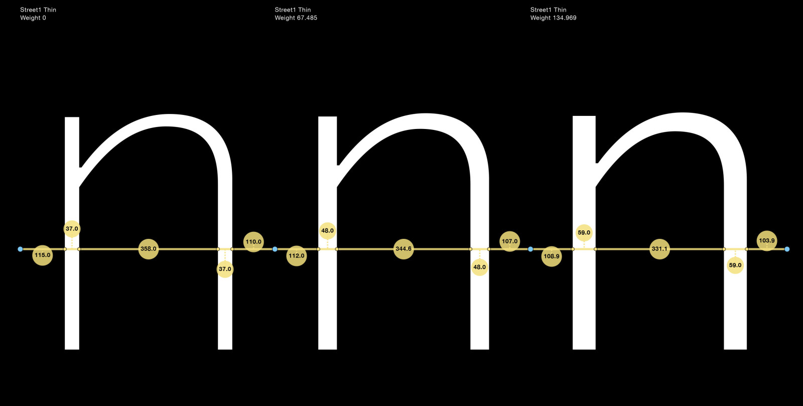
Comparison of grades in Street Thin: -11 and +11 units. These values were established after tests with different screens and viewing distances.

HBO Street Thin and Bold, in 3 grades.
HBO Street comes in 4 weights × 3 grades (or as a variable font with weight and grade axes), including italics, small caps, extended Latin, Greek and Cyrillic character sets, arrows, lining and small cap numerals (each in lining and tabular variants) and special number fonts, you name it. HBO Street is pretty complete.
Creative direction, technical concept, type design: Carvalho Bernau (Susana and Kai) and Letterror (Erik van Blokland)
Art direction: HBO digital products; Ryan Wilkerson, James Catel, Rob McMurray, 2016. HBO Max; Dave Curry, 2021.
Greek type design:
Irene Vlachou
Cyrillic type design:
Ilya Ruderman
Hinting: Mike Duggan
Mastering:
Eigi Eigendorf, Alphabet Type
All the titles and shows referenced on this page, for instance Last Week Tonight with John Oliver, Flight of the Conchords, Boardwalk Empire, Game of Thrones, The Sopranos, The High Life, Westworld, K Street, Extras, We Are Completely Besides Ourselves, How To Make It In America, The Neistat Brothers, The Newsroom, Silicon Valley, True Detective, Big Love, Treme etc. as well as any branding, trademarks and logos, are all property of, or registered by, HBO or its subsidiaries.
All rights to HBO Street are with Home Box Office Inc.
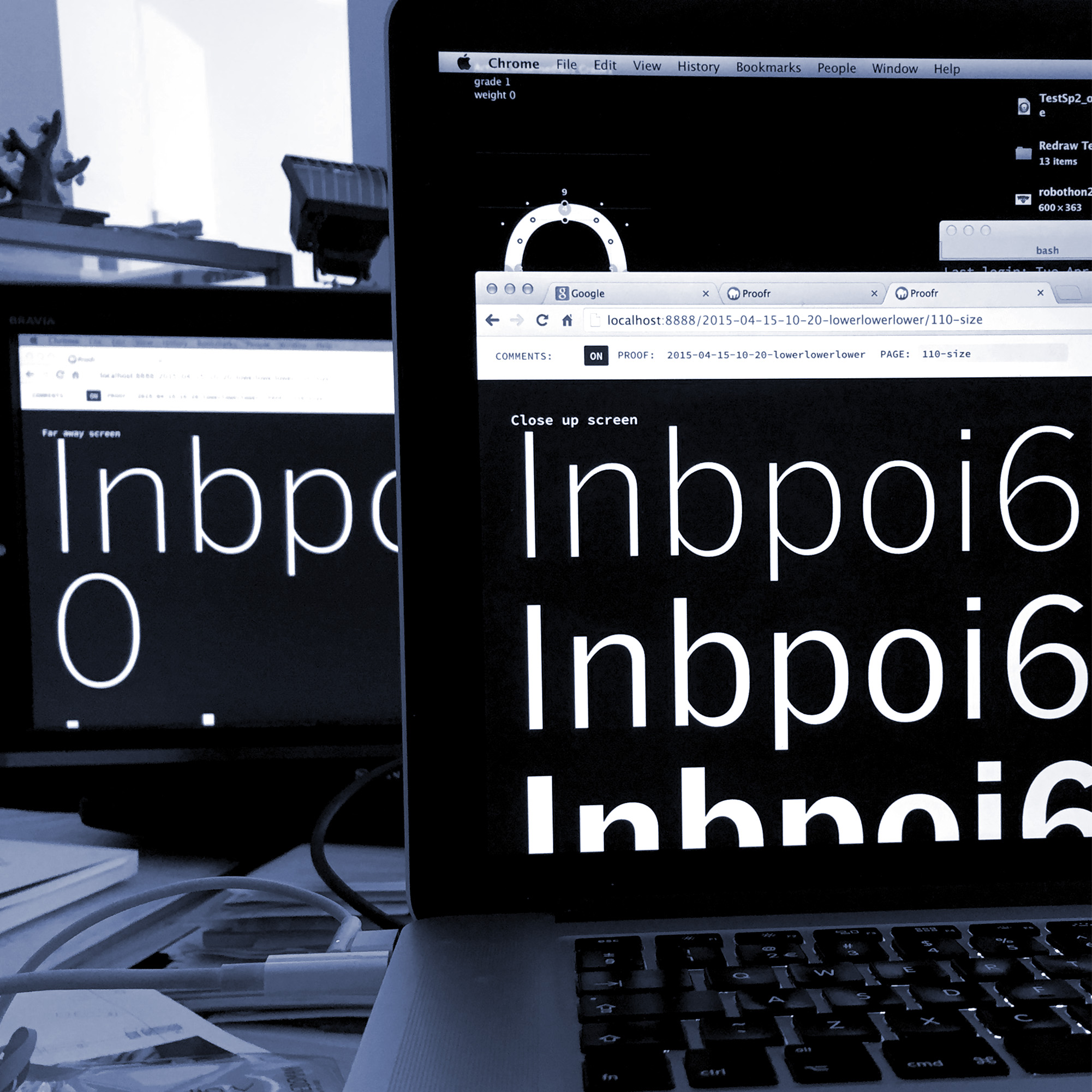
Proofing on screens close and way back in the studio. The eyes work different at a distance.
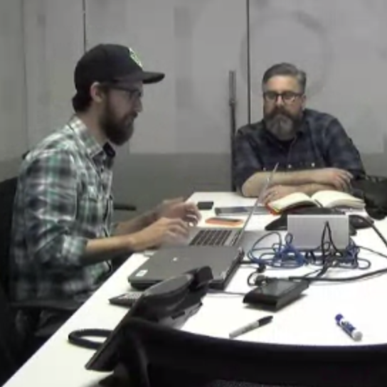
Rob McMurray, James Catel in Seattle.
In closing, brilliant letters at a distance and a Seattle fish.
_(1000, 1000)_mono.svg)