
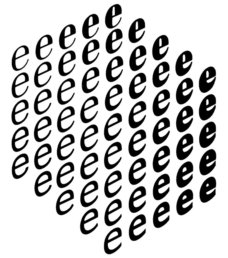
Noordzij cube, The Stroke, 2009, Hyphen Press.
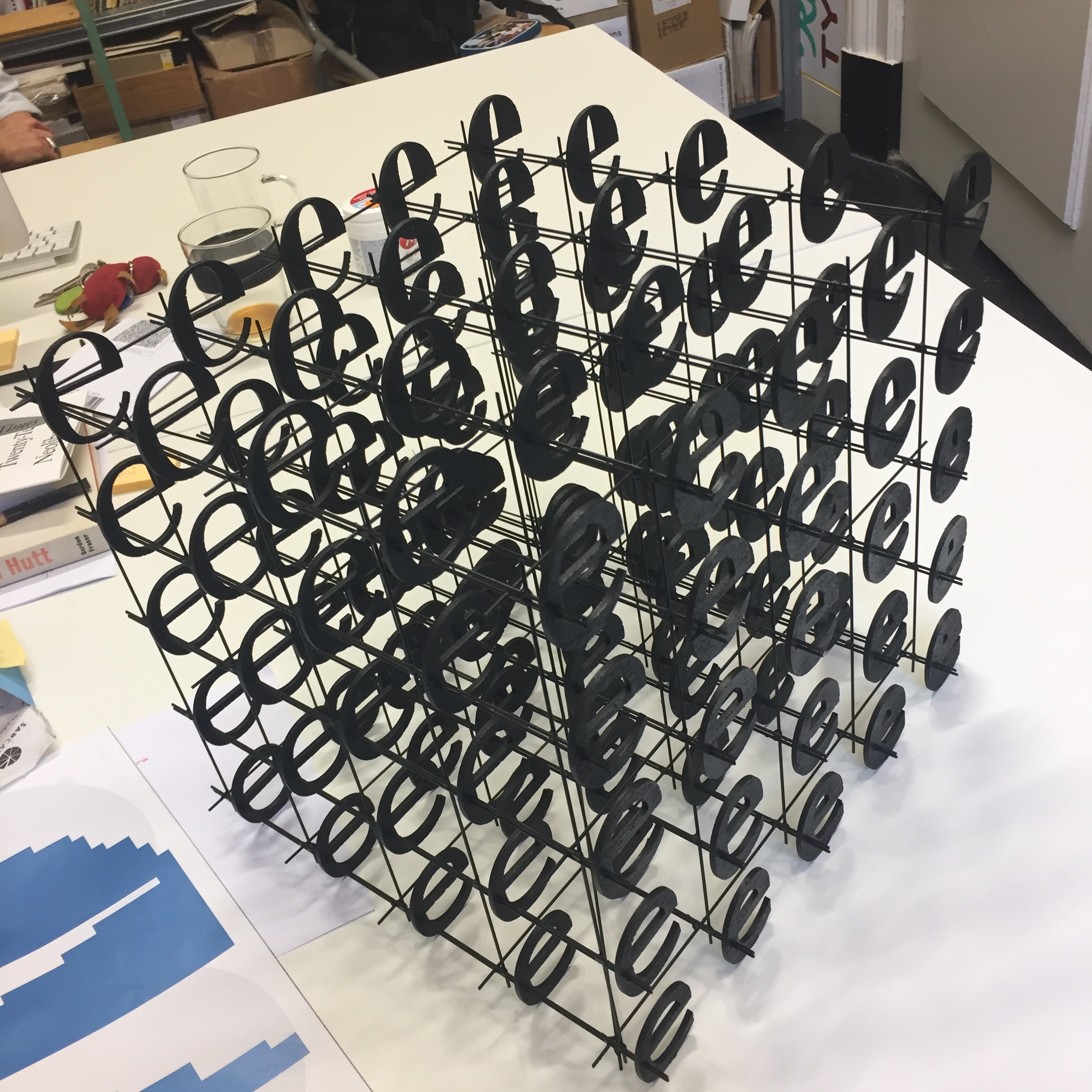
Most typedesigners will be familiar with the iconic image by Gerrit Noordzij. But as a physical object it reveals more. Here’s how I built one.
My talk at the Type@Cooper: The Cube: practical research in theoretical models.
The image shows a grid of 5 by 5 by 5 implies a cube of 125 items, although only 61 are visible. The other 64 (4 by 4 by 4 = 64) are hidden. The image appears to be some sort of isometric projection, but on closer inspection it shows some perspective. Noordzij confirmed there was a photographic step when he made the image.
Detail of the laser outlines, generated with Drawbot.
Lazorz
Using outlines made from the original Ikarus drawings by Petr van Blokland, I made a designspace with axes for thins-become-thicker, thicks-become-thicker and flavor. Using Drawbot I made a script that calculates the interpolations and positions them on a panel that fits the laser cutter. I thought it was necessary to code a simple outline alphabet to engrave the coordinates on the back of the letters. Each object, letter and the counters got a number so I would be able to tell them apart. Laser cutting at the Maquette Atelier, The Hague.
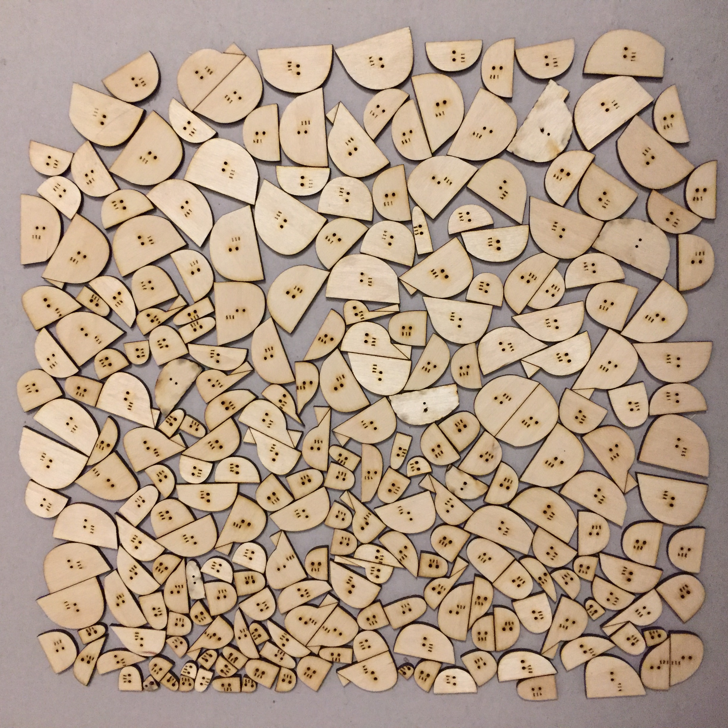
250 different countershapes.
Then I constructed a rig, a couple of planks cut to the right size, to space the letters and then soldered them together with lengths of 1.5mm welding wire. From front to back the e are mounted on two wires to reduce the torque. Then a quick layer of spray paint to finish it off.
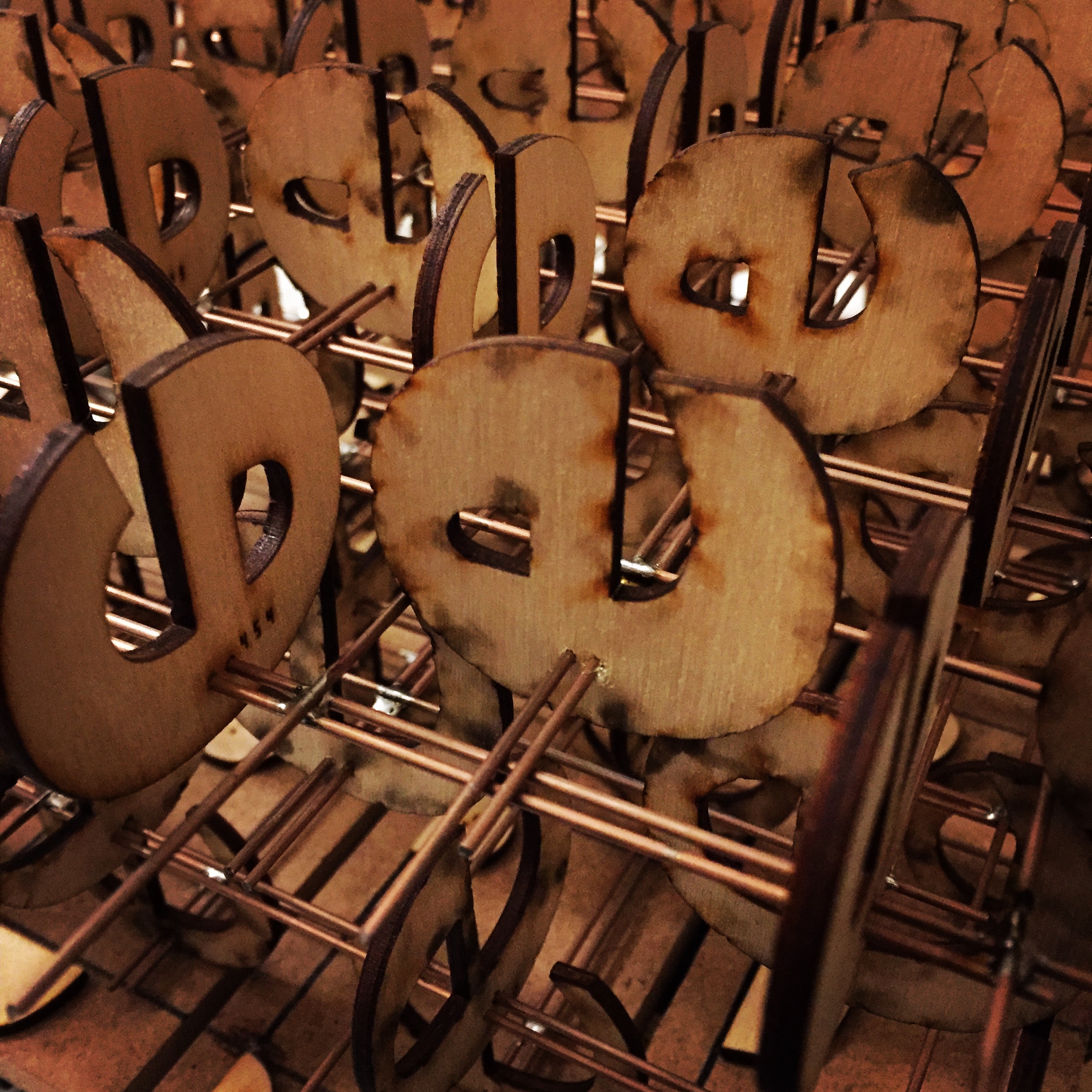
Ready for final assembly.
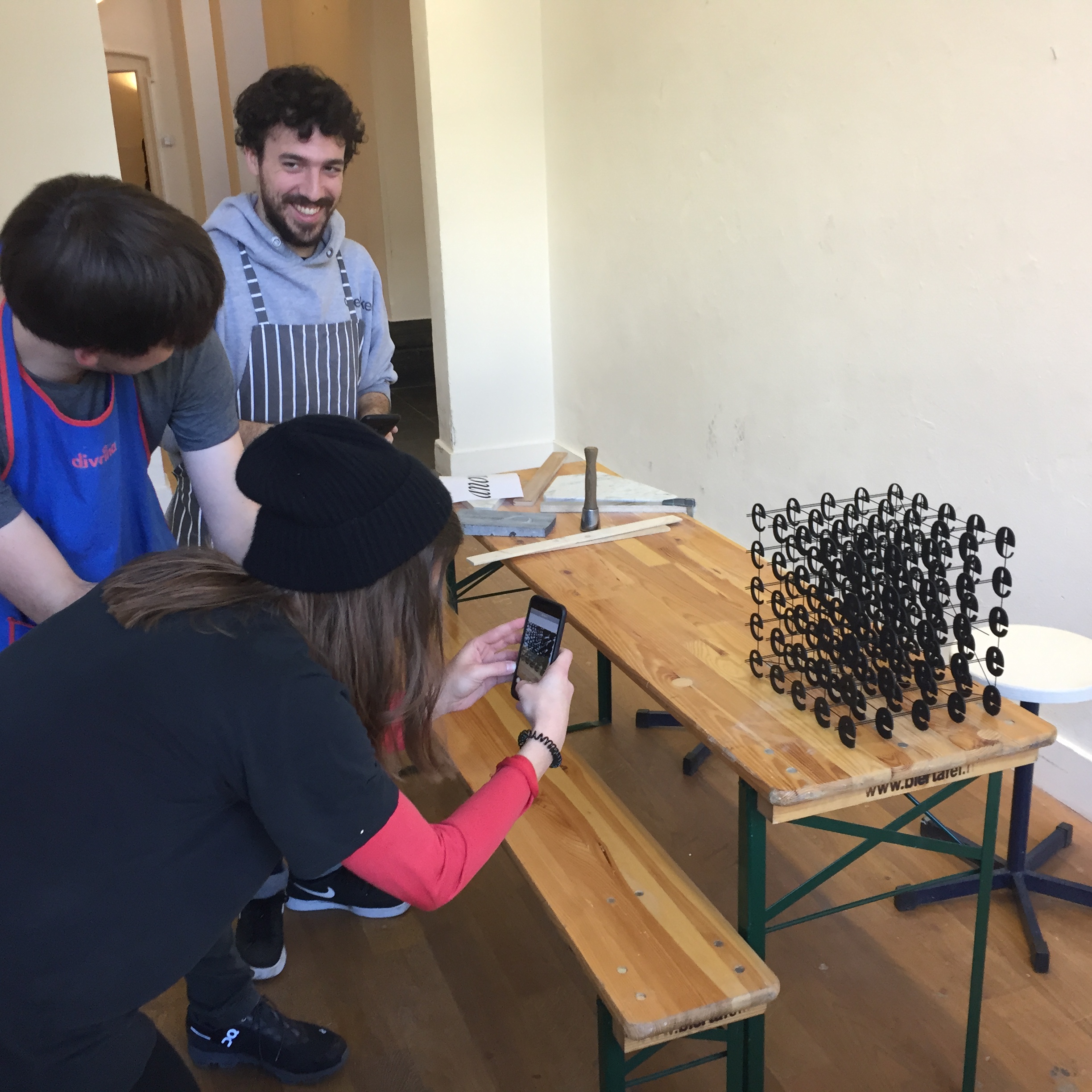
Impress friends and family with your own Noordzij Cube!
When Noordzij made the image it illustrated his theoretical model. It indicated how a designer could think about shapes, the degrees of change. It really is the first designspace: it has evolved into a model of interpolations and variable fonts. Not just the shapes a designer can think of, but all the shapes a font can make. These are not necessarily the same thing. That means the design needs to be good in every region of the designspace. Noordzij’s image shows seven of the eight contributing masters, but less than half of the results. The actual physical cube shows all of them.
It’s not that big.