_(1000, 1000)_mono.svg)

LTR Limited Grotesque is a family of low contrast, humanist sans serifs with a cheeky roman and an italic with a steep angle. Aimed towards semi-informal messaging that invite you to a cup of tea. Limited contains a collection of carefully drawn styles that, while not always following the established norms of consistency in digital type, appear welcoming and dare we say it, friendly.
LTR Limited Grotesque PDF on Stylistic Sets.
|
Licenses for Desktop, Web, App.
Pricing starts at €40 |
|
It has, as Gerrit Noordzij might have remarked, a touch of the broad brush. But nothing fancy, just solid blocky strokes doing their job. Every now and then, an unexpected extra tail or curve. Not too much, we are not jumpy, but enough to let the reader know there were humans. Check that R, K and Q.
The lowercase r and a also stand out. A really long upstroke and pretty unique ball terminal on the r make it, hm, interesting to space. The curly tail on the a is similarly typical. That is type-marketing speak for “Will look great in a logo”. So, these Limited Grotesques are fitted with a stylistic set that swaps in the better behaved variants.
The design of the numerals now follow a more Johstonian flavor. Not tabular, not oldstyle. Not as curvy as the first release of this typeface. The older design is available from stylistic set 7, Fruity numerals. But we think that this new set will do fine for you settings.
Pricing starts at € 40 for single weight OpenTypes and €80 per variable style, including all weights between Regular and Extra Bold. € 150 for the pair of variables. € 200 for the entire collection.

Interpreting lettering is fun but also a challenge. Because the original shapes are drawn freely, as part of an illustration, they are not bound by the systems of typography. When re-imagined as type, however, some things have to change. As with all individuals functioning as a group, there are rules and expectations.
Another hurdle is the number of available shapes. The Dunbar piece is only twelve letters long, and two of them are double. Clearly there is a need for interpretion and imagination to extend this into a full alphabet (and an additional 530 glyphs). The result is neither a revival nor a reproduction, but rather a sort of typographic fiction. Also, I did not reproduce any artwork by Ravilious in the font. It has a fish and a teapot, but I drew those.
There are other examples of low contrast, sans serif lettering in Ravilious’ work. While clearly different, these are clues on how the capitals might be drawn. For instance, the 1934 engraving for the BBC shows an A with a sharp top, a nice wavy flag on the R and a gorgeous broad-nib S with sharp terminals.
The 1946 Faber and Faber publication Notes on the Wood-Engravings of Eric Ravilious2 is a wonderful book with crisp reproductions. The preface by writer and designer Robert Harling3 has some unexpected criticism:
“[Ravilious] could deal with alphabetical characters qua characters in a masterly manner, and he had a deep interest in letter-forms […], but when those alphabetical characters were made words, and those words made titles, this mastery left him and his designs were less happy. He was never able to handle these letter-forms with the certainty that Eric Gill gave to lettering.”
Harling might have a point, but it’s exactly this uncertainty that imbues the characters with character. Ravilious’s lettering is joyful and spontaneous, and has the same energy as the other elements in his artwork. He understood letterforms and their needs very well, and was not drawing typefaces.
1, 2 Notes on the Wood-Engravings of Eric Ravilious. Robert Harling. Faber & Faber, 1946.
3 Robert Harling, (1920-2008) Wikipedia
Pricing starts at € 40 for single weight OpenTypes and €80 per variable style, including all weights between Regular and Extra Bold. € 150 for the pair of variables. € 200 for the entire collection.
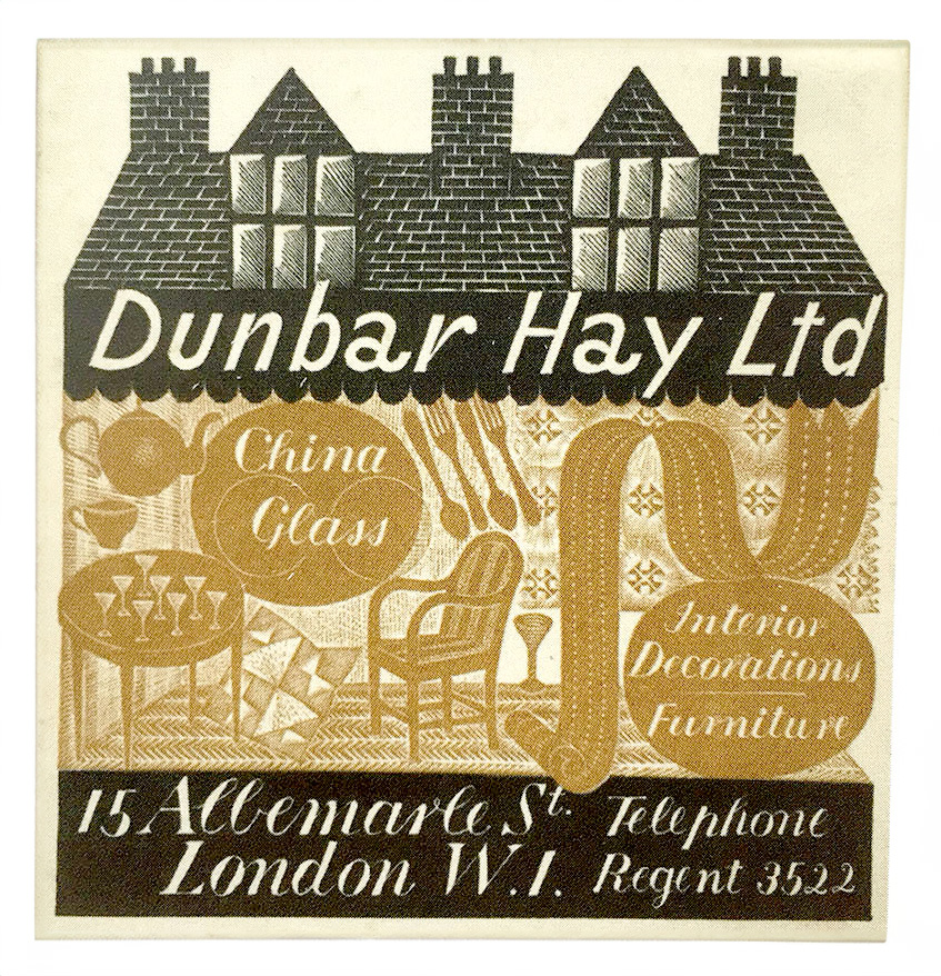
Dunbar Hay Ltd. c. 1930 Crockery Label. Eric Ravilious des. London. Wood engraved label, printed in black and brown. The companion lettering in the drawing, the high contrast serif with some intriguing script-like connector strokes is being explored.
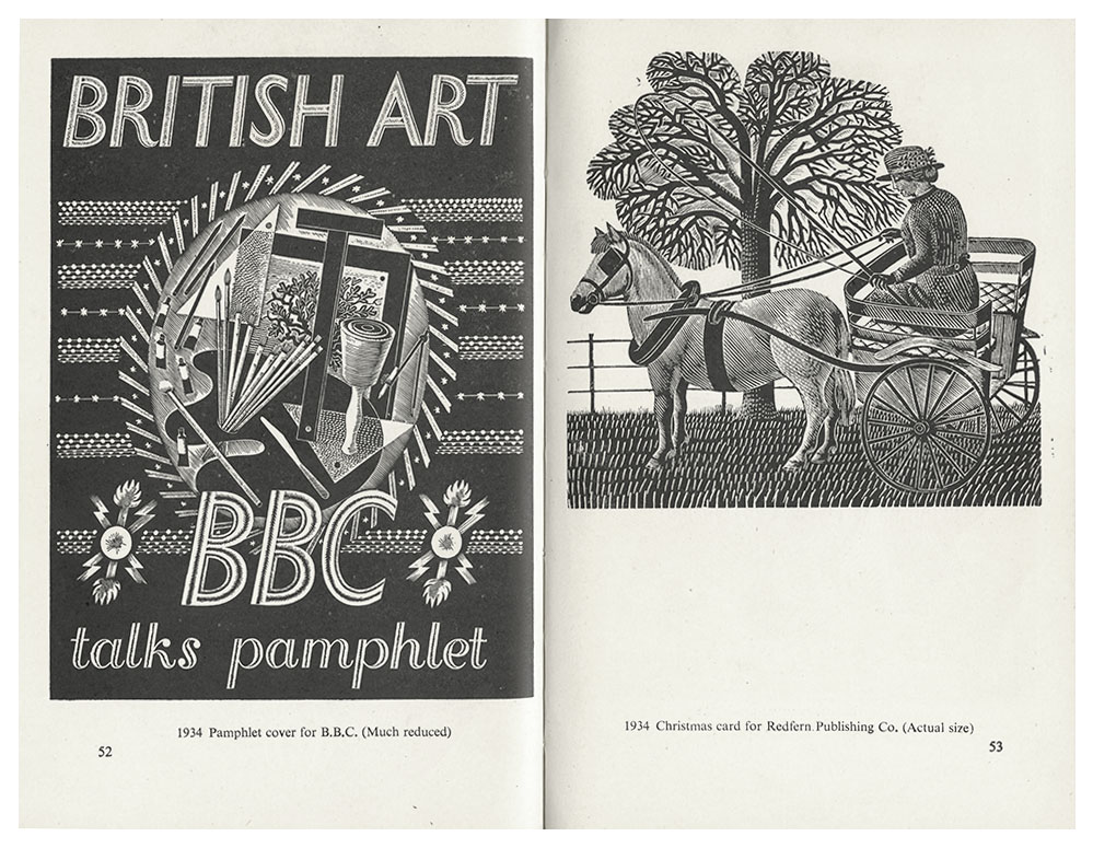
References for capitals. Pamphlet cover for BBC 1934, from Notes, p.52. 1
Eric Ravilious was an amazing artist and if you’re not familiar with his work, you should look him up on Wikipedia, or perhaps this essay on the Public Domain Review and visit the Ravilious Gallery at the Towner Eastbourne museum in the UK.
Stylistic sets Not all applications provide access to the stylistic sets in OpenType fonts. Design tools like Adobe CC does it well. But Apple Pages or Microsoft Office for instance, do not.
Colophon Minisite for LTR Limited Grotesque version 2.0 July 2024. All rights reserved, LettError Type, 2024. Service Announcement video by Lars van Blokland.