Think of all the optical processes that collectively enable reading. Not the cognitive steps (hard to observe unless you happen to be a neurologist with a spare MRI2), but all the moments before that. Anything to do with surface, shape, light, angular size, distance, cornea, lens, diffraction and retina. If you are a typographer, or a keen observer of the world in general, you will be familiar with these terms.3 This text explores some of the ideas that floated around in my head while I drew AG.
Chaps · Reading · Big Things · Optical Words · Saccades · Excessive line length · Draw Something · AG Weights · Not a Revival · Render comparisons · Figures · Specks · Smaller specks · Read a Bauble · Proportions · Optical size · Footnotes
Squint1
Smaller, bigger
As a reader you have some control over the process (of reading), but less than you think. You can only hope the materials were prepared with some care. The most comfortable reading takes place between arm’s length and somewhere near your nose, depending on your ability to accomodate and your age. The readable object, a book or device, can easily be moved closer or further as the eyes demand, possibly single handedly. This puts some practical limits on the weight and size of the object. Book designers know, some device designers know too, web and app designers definitely should know.
The typographer has to find a balance for the type size on such a readable object, while keeping in mind the needs of economy and comfort. Smaller type allows for more words on a page, but inevitably means the object has to be closer to the nose. Thus the hand brings it closer. Then the eyes have to work harder to accomodate and focus, so the hand moves the object further away again. As readers we do this almost automatically and if we manage to find a balance, there is a chance that some reading might take place. Failing that, headaches and frustration. Often the type size is to blame. You might not always know it when that happens.
For signage, posters, lettering on a wall, etc. your only means of adjusting the text is to move yourself through space. This is where typography for faraway objects branches off from typography for nearby objects. If a sign gets it wrong the reader might not be able to get any closer. Traffic, architecture, height, other people, there are many reasons why this might not be possible. You cannot switch the whole street to dark mode. You cannot pinch and zoom over the shoulders of the person in front of you. The cost of getting it wrong is higher. The typography has to work harder.
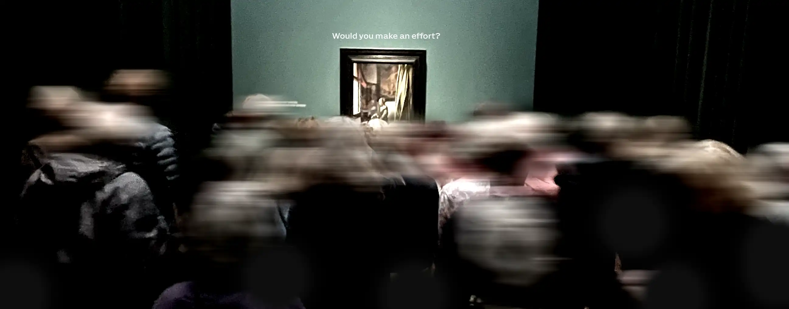
The text in this image is not small, but it is further away. Even if you want to read it you might not be able to move yourself to a point where you actually can. You are forced to consider whether it is worth making the effort, or just let it slide. In that case the typography has failed.
Some optical words
Angular size: imagine a 360° degree circle with the head of an observer at the center. Then think of the small part of this circle that is taken up by a line of text, from bottom to top. We can measure this section of the circle in degrees. However, the objects are so small it is more common to use the arc minute, 1/60 of a degree. That number is the angular size of a text.
We know everything gets fuzzy once it is small enough. The moment we can no longer tell two separate points apart is the Rayleigh limit. This is not a fixed value, but it can be approximated for optical apparatus like cameras or telescopes and indeed the eyes of individuals. The Snellen4 eye chart at your glasses shop uses this principle. Once things are smaller than this limit information is lost and you end up guessing. This applies to shapes, but also to countershapes! There is no real way to counter this, it is a physiological reality. But by being aware of it, you can find ways to emphasise a shape and give them a bit more room, if possible.
The eyes make quick movements in order to observe the world. These were described by Emile Javal in 1907 and 5are called saccades. During reading, the eyes alternate these jumps along the line of text with brief moments of fixation. The fixation points do not overlap so you do not see all letters, but as long as the ones you do see contribute to words that make sense the brain will plan another jump forward along the line. This saccade planning is informed by your parafoveal vision i.e. information from the retina outside the foveal area. Sketchy stuff at best, and why proofreading your own text is dicey as your brain can fill the gaps with what you intended to write making it easy to pass over mistakes. The brain cannot change the movement once the saccade has started, so if the letters at the fixation point no longer make sense (and you can’t fit any words to the letters you think you saw) the saccade planner sends the eyes back somewhere on the line. This is called a regression. A certain number of regressions while reading is normal and happen mostly unnoticed, but if a text triggers excessive regressions, the smooth reading experience is interrupted.
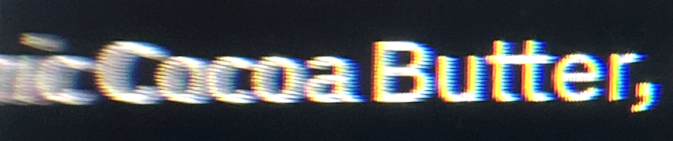
Do we even know how to visualise the optical component of parafoveal vision? No idea to be honest. But I know it is probably not a Gaussian blur. This is a photo from a magnifying glass, on a display, at the edge of the lens where it really starts to distort. Would parafoveal vision have such color aberrations, like “Butter”? Might it have direction, like “Cocoa”? Not my field, but I’d be curious to find out.
Extreme line length can also disrupt reading. At the edge of the column the eyes need to make a saccade to return to the beginning of the next line, and the saccade planner is not very good with long jumps. If the column is too wide, or the lines are too close together, this jump can fail and you lose your place in the text. Graphic designers like to make the line length fit a grid on the page, often resulting in uncomfortably wide text columns and promising a laborious reading experience. Related: having to scroll horizontally to read a line, and then scroll back! Shivers! So bad.
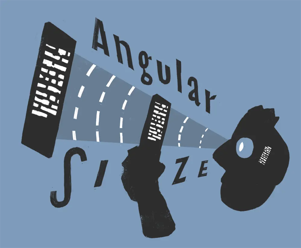
Familiarise with the angular size. Some things may appear exactly the same, even if they are further away.
That is all very interesting, but how does it relate to this typeface? Well, these are not problems to solve per se, but they sketch out the reality in which this typeface was drawn and the conditions in which it can be used. I wanted to acknowledge the optical/neurological phenomena because these things affect design decisions. Large x-height, large weight range, and shapes that support the smallest detail, in white and black, in thin and extra bold. It offered a clear direction.
Draw something already
Rather than “crank out another sans”, 6 let’s take this opportunity to study proportion and weight and maybe do some practical research into the process of drawing type. For instance, are there ways to optimise proofing type at the right size, from the very start, at the small end of relevant reading sizes? 7 If the design of the process itself determines the outcomes, this should have some effect.
Complex text needs typographically relevant and observable differences in weight and style at the smallest size. If the contrast between light and dark and between the upright and the italics is unclear, the message is unclear. “Style” might give the impression that it is optional, but if emphasis is lost, the reader is in trouble. AG has enough steps on the weight scale that you can make a regular and a bold even at the smallest sizes. Typographers are invited to use the full range of AG’s weight axis! The italic angle (9.4623°) was picked not only to be obviously different from the upright, but also to result in some nice antialised gradients when the angled shapes are shown through a pixel grid.
The design cycle focussed on screens and was as short as possible. Generate a webfont, perhaps write some more test lines and CSS for the new shapes, open it in a browser, and squint.8 All of this happened mostly automatically: a script generated everything and opened the page in a browser. 9 This proof exercised the glyphs in all sorts of brutal ways, and as the typeface grew so did the proof. If I could not observe the effect of a particular intervention, then maybe it was not necessary. This was a useful approach to assessment and decision making.
Weights
AG was drawn as a variable font: the weight axis has three stations: thin, regular and extra bold. I drew the key characters of the regular and extra bold first, paying attention to counters and spacing. The thin started as an extrapolation in which the last glowing embers of the pixels on my screen determined the minimum stem; still functional, but on the edge of observable. Initially the thin and regular existed in a duplexed state, but each weight developed its own needs and I let go of the requirement. But, the thin and regular still run quite close.
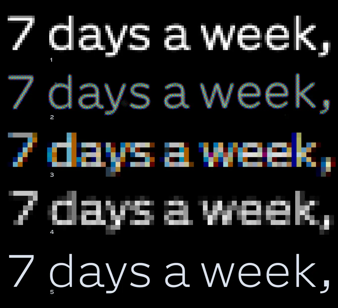
AG is not a revival of any specific historic style. That means it misses out on some nice images of source materials. On the other hand, that means it does not always have to follow sans doctrine. In the small there is some wiggle room between the shape suggested by the vectors and the resulting glowing LEDs. There is also an infinite number of theoretical outlines that could light up the same LEDs. So, as long as the rasterisation on all the test screens meets expectations, there is some freedom for the outlines to be what they want.10 Pixels are never square and white is never white. Rather than optimise for one of them, AG aims to produce useful results on all of them. The comparison below shows AG in the same weight, on different platforms. Not all of them, obviously. But you should get an idea of the variety of pixel shapes, rasterisations, resolutions and sizes a font will encounter.
|
7 days a week That is how big this is. You can also see this line in context at the Micro page. |
These four rasterisations above are of the same 6.5pt AG, weight 200, on different screens and operating systems. This is indeed very small, thin type. This is intentional! A stress test. I do no want to prove that one is better than the other, but rather illustrate how different the demands of these environments are. On each of the screens the line has more or less the same angular size. Observe how different the pixel sizes are! |
|
1
MacOS Sequoia, Safari. Rasterised on an Apple Studio Display. Enlarged screengrab. |
Antialiased in black and white. Some weight differences between the stems, but otherwise all shapes came out well. |
|
2
iOS 26.1, Safari. Rasterised on an iPhone 14Pro. scanned at 4800 dpi, contrast increased. |
The LED layout for this iPhone screen is very different from the standard vertical RGB bars. In this pattern the LEDs will always have the same orientation relative to the word when the device is held vertical or horizontal. |
|
3
Windows 11, FireFox. Rasterised on a Dell Latitude 3440 14" FHD Touch. Enlarged screengrab. |
The colorful effects are intended for subpixel rendering by Microsoft ClearType® which has some amazing properties. Note [11] This platform would even accept some light hinting, but this specific font was not. ClearType® needs vertical bars to work, so you can find it on laptops, but not on phones if they are to be used in different orientations. |
|
4
MacOS Sequoia, Safari. Rasterised on a Apple Thunderbolt Display, enlarged screengrab. |
How the mighty have fallen. This was once an expensive, upscale display. You can see the rendering is really struggling. No hinting, letters bleeding into each other, stems are no longer distinct, the diagonals a right mess. But remember, this is 6.5pt. The counters in a and e are still visible, so I guess that is a win. There is some subpixel magic at work, the two e are different, possibly to maintain spacing. |
|
5
Actual AG outlines, weight 200. |
The outlines where all these rasterisations started from. |
Figures
The mind tries to associate words with the letters observed at the fixation point. But with numbers that does not work. You cannot guess, you need to inspect every digit for your interpretation to be accurate. The numerals for AG had to fight for their size. Initially I would draw them too narrow and they would disappear, so they became wider at each iteration. That means that the 1 might feel a bit stretched, even with a impressive bar at its base. There is a proportional 1, somewhere in the stylistic sets. The wider feel is also present in the superior⁵ and inferior₅ versions of the figures.
Then it is always practical for some of the symbols to follow the tabular width, particularly our arithmetic friends: plus, minus, divide, etc. These are also drawn a bit taller than usual. A welcome gesture to the reader of the small, and hopefully a useful tool for the typographic designer who would like to consider the + as an alternative to the ampersand.
Specks
Punctuation can be smaller than the dust motes on your screen. The period, comma, the full circus of quotes; they all face a real risk of disappearing into the background. But without these semantic punks the fabric of the text starts to disintegrate, so I drew them relatively big, with generous spacing, because you need them.
As Richard Feynman once said: “there is plenty of room at the bottom.”12 Eh, Feynman the nuclear physicist? Yes, I know he meant atoms, not margins. But at small scales the relationship with its surroundings changes, because in relative terms the page is huge. So there is no need to skimp with punctuation, there is plenty of room.
Smaller specks
Diacritics, like their speckly punctuating relatives, struggle to remain visible. In a design for bigger sizes I might get away with compressing a diacritic into the main letter, or making a shape that relies heavily on context to be recognised, but I am not sure that works the same way in the small. I kept the diacritics as clear as possible for as long as possible, which sometimes meant keeping them a bit lighter in the heavier weights.
Some of the diacritics became a bit abstract, the cedilla resembles a slipper close up, but it rules its small cedilla kingdom. Stacked diacritics maintain reasonable vertical space between them to prevent glomming together, because if two shapes become one thing both will lose their meaning. Remember the Rayleigh limit! Or in this case, the limits of my own eyes and the screens on my desk, whichever value is worse.
Read a Baubles
AG has the usual complement of informally named readability shapes, accessible through various OpenType features. There is a “schoolbook” a and an open tailed g. There is a barred uppercase I, barred uppercase J. And the friend of all readables, the hockeystick l. Generously spaced and tested at size. I think there is a time and place for these things, and I did not mind adding them. These are not default, but check these footnotes that use them! For the purists, a double storey a and looped g are also available in the italic, but admittedly of limited use.
In conclusion, all these interventions for the small make the typeface look a bit more solid in bigger sizes. I don’t mind this at all. These fonts work at 8 point and are just as comfortable delivering your lines at 20cqi. In this context, Harry Carter’s “Optical Scale in Typefounding”13 deserves a re-read. He noted in 1937 how the manual punch-cutters varied the functional features of a design, to suit the scale on which they worked. Carter pleaded for careful observation and size-specific work. These are words to take to heart, because the need for adjusting type for small sizes has not gone away. Our eyes still have the same shortcomings, our readable objects are just as small, their surfaces more precious than ever (and the typographers are pressed for time as ever).
I hope all of this adds up to something useful. Everything written, drawn, coded and edited by skilled, breathing, enthusiastic humans.
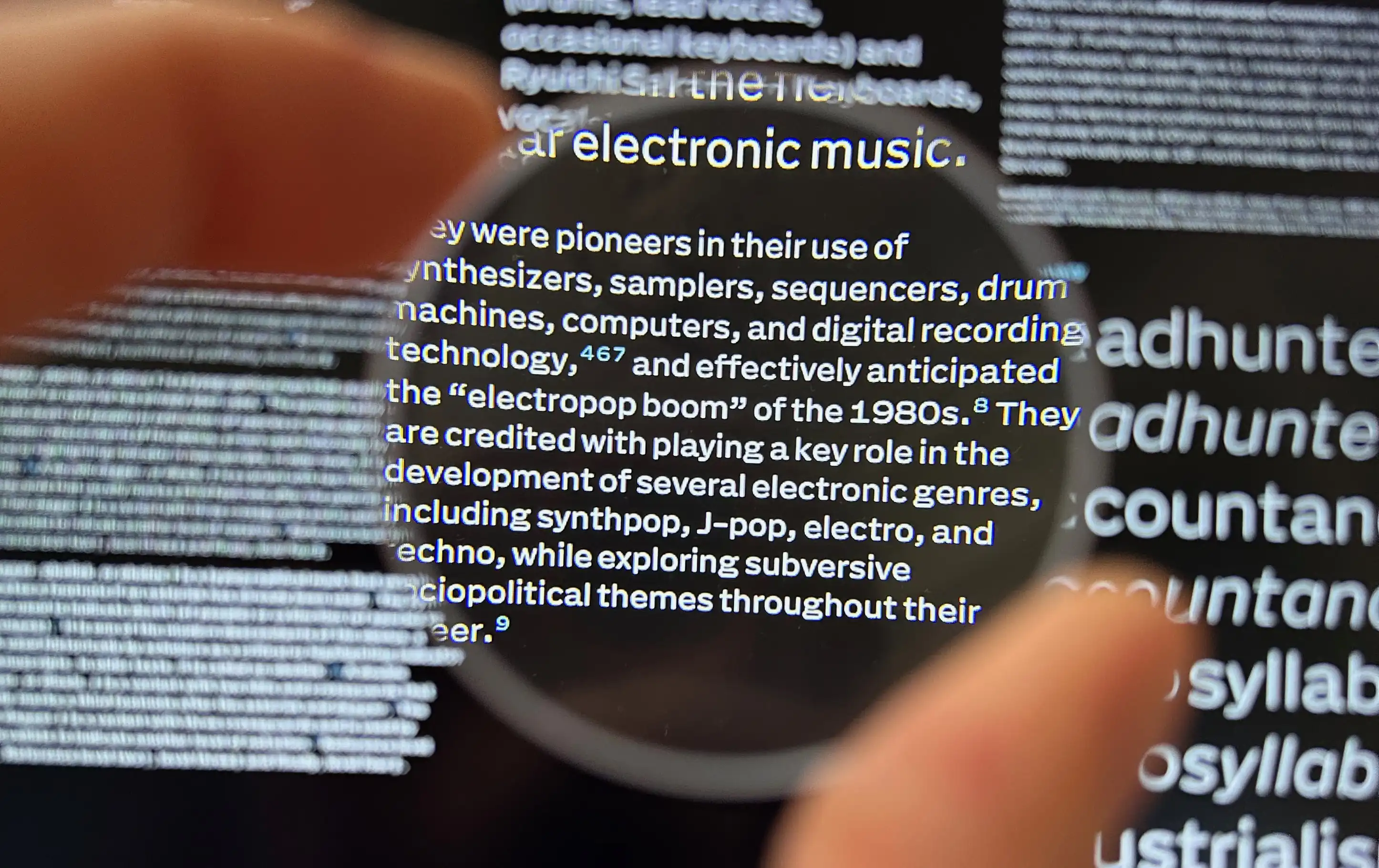
Take a good look. Do you see what is happening? A hand holding a round lens in front of proofing text on screen. The pixels are rough, but the letters remain clear. Anyway, here are the footnotes.
Notes
-
Squint for the small stuff! You will not believe your eyes when you check footnote 8 and find out about this a famous squinter!
↑ -
Dehaene, Stanislas, Reading in the brain. Penguin, London, 2010. The author did have a spare MRI. A detailed nuts and bolts account of everything that happens when we read. And how remarkable it is that humanity figured out how to do this at all.
↑ -
It is literally in front of you.
↑ -
Snellen, Herman A Snellen chart can be used to measure visual acuity. Snellen charts are named after the Dutch ophthalmologist Herman Snellen who developed the chart in 1862 as a measurement tool for the acuity formula developed by his professor F.C. Donders. Source: Wikipedia.
Rayleigh limit Source: Wikipedia.
↑ -
Javal, Emile. Die Physiologie des Lesens und Schreibens. Verlag von Wilhem Engelsmann, Leipzig, 1907. A rare translation to German by Dr. med. F. Haass, “Augenartzt in Viersen”. Wikipedia also offers a useful: Eye movement in reading
↑ -
This a subjective and I’m exaggerating some. A lot of lovely work is done in the sans genre. But that does not mean that there is nothing left to investigate.
↑ -
Proofing is of course central to all type design, so that is not the invention here. But AG did challenge my own assumptions about proofing and they improved as a result.
↑ -
Dwiggins, W.A. WAD To RR. A Letter About Designing Type. Harvard College Library, 1940. “I have a diminishing glass that reduces the letters to something like 12 point size when I put the drawing on the floor and squint at it through the glass held belt high. This gives a rough idea of what the reduction does to curves and things.” So Dwiggins was a squinter. This publication is based on a letter Dwiggins wrote to Rudolph Ruzicka. It discusses his drawing and design process.
↑ -
RoboFont for the win. Build your own tools to make your own thing. MetricsMachine, DesignspaceEdit, Longboard, Drawbot, UFOStretch, EyeLiner, FeaturePreview, Prepolator and the whole UFO ecosystem.
↑ -
This can reduce the need for hinting. This is not to argue that hinting can improve the rasterisation on some platforms, because it can. But rather that it would be nice to have reasonable results on all platforms. And that requires a different way of drawing. This does not have to mean that all these rasterisations have to be the same.
↑ -
ClearType is Microsoft’s implementation of subpixel rendering technology in rendering text in a font system. ClearType attempts to improve the appearance of text on certain types of computer display screens by sacrificing color fidelity for additional intensity variation. This trade-off is asserted to work well on LCD flat panel monitors. Source: Wikipedia.
↑ -
Feynman, Richard, There’s Plenty of Room at the Bottom: An Invitation to Enter a New Field of Physics. American Physical Society meeting at Caltech on December 29, 1959. Source:
Wikipedia.
↑ -
Carter, Harry, Optical scale in type founding Typography 4, autumn 1937. Reprinted Printing Historical Society, Bulletin 13, September 1984. He wrote about the punchcutters adjusting their work to the size. “They did so instinctively because they corrected their work by eye, and they had the wisdom not to let mathematical rules override their judgment.” These would be the rules of the pantograph, scaling large templates to microscopic movements of the drill. But you see it applies to digital font technology as well.
↑